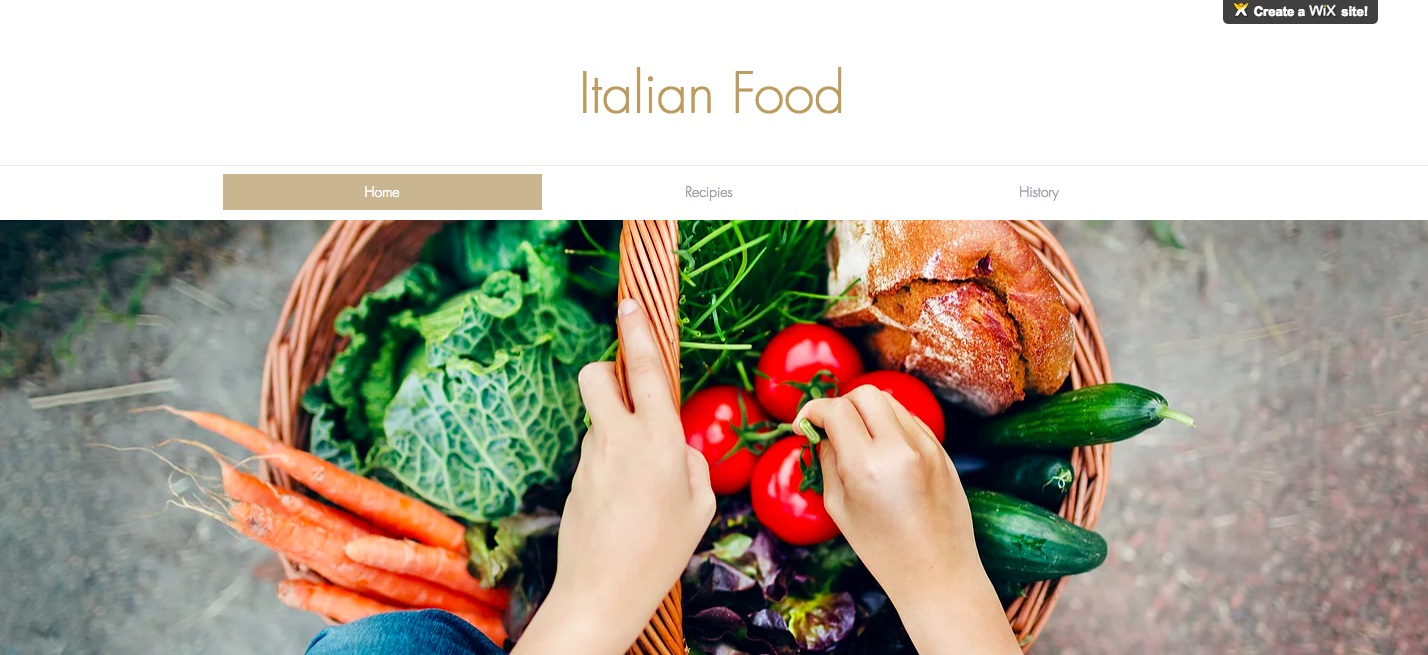
Due to my love of Italian food i decided to make a website based off of classic recipes you could find in Italy. I included dishes i felt best represented the culture, as well as provide the viewer with some in site as to how Italian food has changed and its great importance in the Italian culture.
My book called “East Side” focused on the businesses in the area, and gave a small look into what older and newer business are doing for the east side community. I wanted to inform the reader on some of the places they could expect to see if they visited the neighborhood. The book gives a feel for the environment and through the experiences of people it should help the reader understand what these businesses may or may not be doing for the community.
These gifs are an expression of what i saw happening currently in the East Side. There were a few gentlemen i met while exploring the neighborhood who inspired me to focus on the housing market of the area. Due to the gentrification happening in the area, housing prices and the cost of living are sky rocketing. This is pushing out the history and culture of the neighborhood and these gifs help represent that.
My idea for the Fulbright Conference Booklet was too fit the loads of information given into as little space as possible, but to make sure it was still legible and popped with color. I liked the idea of playing around with how the text would move through the page and tried to make rhythm with in the book to create more of an interest.
Before this class I knew about type and how to use it, but I think this class really helped me understand more the way type plays into design. Since all of the projects we did were heavily based on type I had to really push myself to create different ways in using it. I didn’t want my work to be repetitive, so it I tried to try different ideas on each of the project. The LATCH concept was one of the main things that helped with all of the assignment and it made me see the many different ways that I could use type.
The thing that I loved about this semester was all the new things I learned with the adobe programs. I feel like it was a love hate relationship because it was frustrating when I didn’t understand the program, but I think the skills I have gained are really going to help me in my career. Although I don’t feel 100% confident with InDesign and After Effects the skills I did learn is motivation to keep putting in practice time in order to learn more.
I think I am seeing “it”. If by “it” you mean what design really consists of. I feel like this class showed me more of a variety of things that designers can do. I also, realized how well al the projects we did fit together and it gave me a better understanding of what the point in our assignments are. I feel like I asked questions when necessary, but I don’t know if there are ever enough questions. The more I ask the more I learn, so for the time being I think that I asked enough for the projects we did. But in order to learn more I feel like there could have been questions I could have asked.
I think that I have been putting in less practice time then I did at the beginning of the semester since I have had to focus more on other classes. I want to use my summer to try and make up for lost practice time and to put in more expert hours. I think that I did get enough feedback on the projects. I think that I was part of class crits and desk crits. I only missed one class crit but I tried to be involved, and make comments on other peoples work to try and give them feedback. As well as take the opportunity to get feedback on my work.
I think that right now my life is in order. I had a hard time in the middle of the semester finding motivation, but I feel like I am now back on track and am getting all of my schoolwork and personal life together.
I like the class environment and how it’s a most of the time it’s a lecture and then you can work all class and you are available for questions. The style of the class I think helps with not feeling super pressured but I am always reinforced to make good work.
I think that I have grown a lot in skill and in time management since the beginning of the semester. I never realize how much I have learned until the end of the semester, but I am happy with all the things I have learned in such a short period of time.
For my Fulbright Booklet I decided that I wanted to use bright colors and also the concept of text blocking to show when a different kind of information is presented. I chose to color the pages based on the information that was on the page, so all of the information that went together would be colored with the same color page. My color palette embraces strong colors in order to enforce the ideas of World Challenges and their importance. I also came up with some symbols that represent the different challenges and labeled the events that corresponded with it.
I still am not completely happy with my cover I think that its plain, but I couldn’t find a way to incorporate the text blocking idea on my cover in a cohesive way. The problems I faced were that at first I wanted to layout every page individually, but I realized that I needed to first put down all the information in the booklet and then worry about designing. The timeline I felt was long enough but that I just had to work out what was most important and work on those things first so that I would have the book done on time. Overall I liked the ideas that I chose to follow, but I wish that I could have used a different size booklet and more pages so that the book could have more breathing room.
The weather report project required for you to use the idea of LATCH to bring forth information on the four cities you chose. I decided to use location, hierarchy, and category as my LATCH principles. My focus was to make sure the animation was clean looking and that the information was easily readable. I think that my project turned out well, but I think that I could have pushed myself in creativity to make it more interesting. I wanted the theme of my animation to be about going on an adventure now that flying cars are invented, so I used those elements in the opening slide as well as in some of my audio.
My neighborhood was Clarksville. I see Clarksville as a hip and very fun colorful neighborhood. I wanted to incorprate playfulness and represent the color i associated with the neighborhood. I used three pictures that could be recognized, since they are well known places in the neighborhood. I also, included a couple images i found on my own to show how i saw the neighborhood. I like the outcome, and how the borders give the pictures playfulness.
For my zine I wanted my book to be focused on nature and growth, so that it would go with my truism. I first thought about just including photos of flowers, plants etc, but I then decided that I wanted to do close up of those thing to make the work more abstract and give the zine more interest. I chose a hand lettered typeface, so that I could make it my own. I painted the saying on a paper with black ink so that it would be striking, and although I liked the background the focus was on the saying itself.
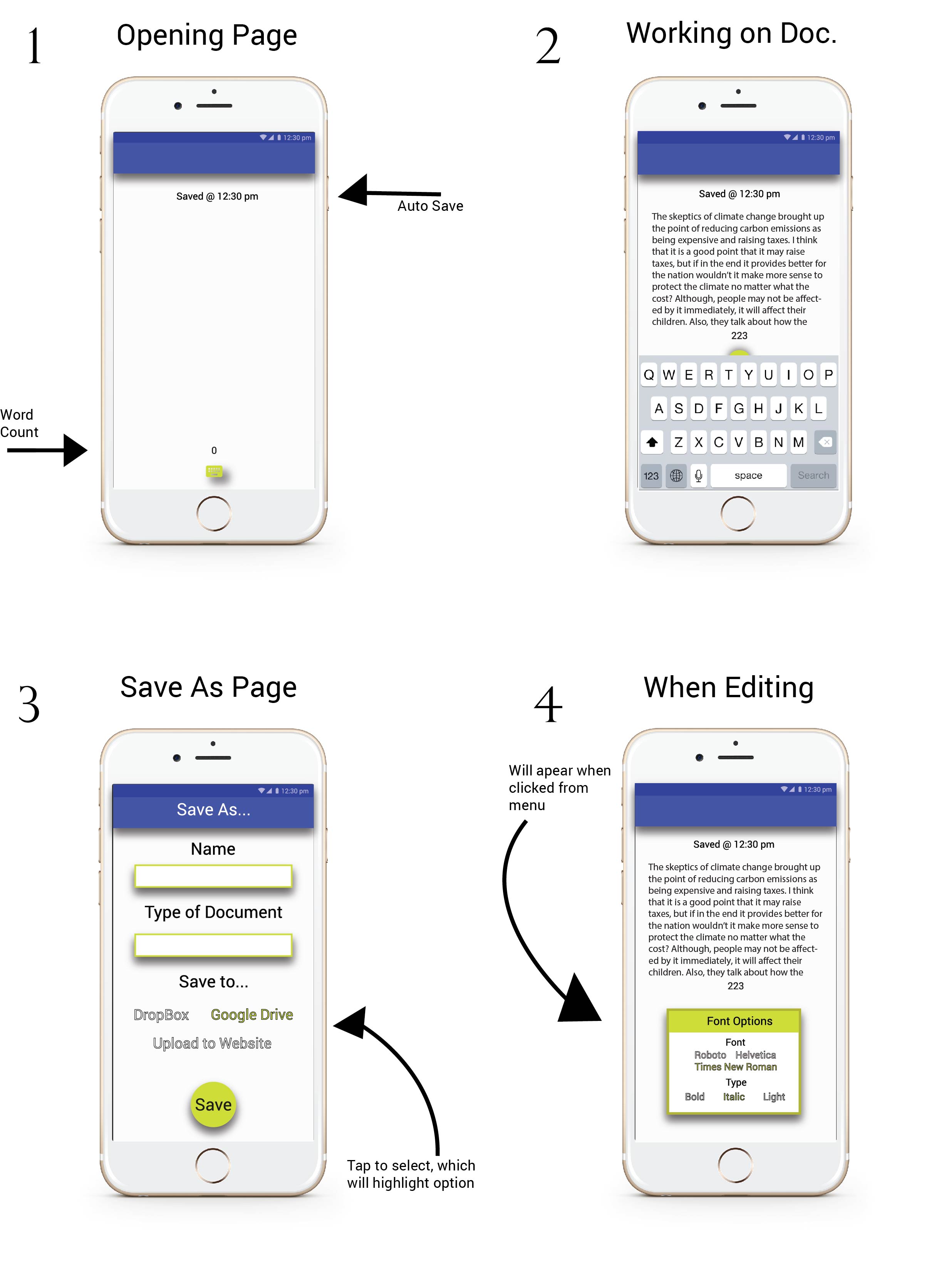
The app mockup that I made was supposed to have the same features as Microsoft Word, but for a specific audience. I decided that I wanted my audience to be people that were bloggers or writers. I wanted the app to look simple and I wanted it to be easy to navigate. Since, I wanted my app to look this way I made the home screen and the other aspects of the app look “clean” and not overwhelming so that the writers would be more focused on their writing rather than the app itself. I also, included ideas from material design to give the app a professional and modern feel.