VISU 1311: Book Project 1st Pass

For my book, I want to take pictures of the Driskill Hotel on 6th Street. The hotel is the oldest building in Austin, built in 1886 and the architecture of the hotel is stunning. I will develop a book that follows a journey through the hotel, starting with the doors, going through the lobby, in the cafe, up the stairs, into the bars and the ballrooms, and back down the stairs. When I was there, I saw a lot of potential images that would use perspective and repetition, and there are so many long ceilings and hallways I would like to capture, so I would like to keep my book taller than it is wide. I want to use some quotes about the rooms the book shows, like the ballroom and the cafe, and align the text into shapes that connote objects that would be found in the room. I plan to use a cutout to open the door to the hotel which will peek into the lobby, and then when the page is flipped, will open back to a shot of 6th street. I would like to shoot in the evening, I think the muted colors and elements will photograph best in that light and it will make the hotel seem older, and warmer. I may have to call the manager of the hotel and ask to get access to the ballroom, when I went there I wasn’t allowed in because of a private party. Overall, I’m hoping to capture the elegance and excitement of staying at the oldest hotel in Austin.

img_1278 img_1279 img_1283 img_1284 img_1287 img_1288 img_1295 img_1296 img_1297 img_1300 img_1301 img_1302 img_1304 img_1307 img_1312 img_1315 img_1319 img_1320

VISU 1100: Blog Post #8

If I could travel abroad, I would want to go to Russia, specifically St. Petersburg. I think this would be an interesting place to study abroad because of all of the history and architecture. As a creative, I am fascinated with old architecture and I love looking at pictures of cathedrals and palaces in Russia and I would love a chance to see them in person. I would love to become immersed in a culture that is very vibrant and social yet so different from the country I live in, and experience all of the art, history, and liveliness the country has to offer.

I am a member of CABRA magazine’s graphic design team, the university’s improv troupe, Box of Chocolates, and part of the theatre service fraternity, Alpha Phi Omega. I enjoy being a part of these groups because I am able to be creative with likeminded and motivated people who share similar interests to me, and it is very enjoyable to be able to bounce ideas off each other and have an environment for those ideas to thrive. I don’t think that I personally would add any student groups because I am very satisfied with the diversity and strength of a wide majority of the groups on campus and feel confident that I have begun to build new relationships and communities within them.

VISU 1311: Sequence 2.5 Response-Run Lola Run

I think the movie Run Lola Run has a very distinct method for sequence, and this unique characteristic of abrupt cuts, fades, and recurring themes helps to guide the film’s nonlinear sequence of events and make it understandable for the viewer. One of my favorite uses of this creative sequencing in the film is the repetition of motifs and shots that stay consistent throughout Lola’s three runs. For instance, each run begins with the spiral cartoon sequence, signaling to the audience that the plot line is restarting, but the subtle differences in each, as she learns of the boy’s presence on the stairwell and accommodates, helps to show what each run will signify as Lola finds the right way to go about her 20 minutes. Each run sequence runs approximately the same amount of time, and has the same elements and characters that recur each time, it is the plot only that changes. The sequences go in roughly the same order each time, which show the viewer exactly how the plot subtly changes, and makes the film have the flashback-like construction that makes it successful in conveying the storyline.

Another more detailed aspect of the sequencing in Run Lola Run is in the mise-en-scene of the actual parts of the run themselves-the repeated motifs throughout the film. The cartoon at the beginning brings the viewer out of the reality and heightened tension of the conclusion of the previous run and acts to wipe the slate and cue as to the outcome of the next run. This splits up the longer shots at the end of each run, but does not seem out of place as it is repeated each time and creates a sort of motif of itself. The image of the ticking clock not only appears in the cartoon sequence and the beginning credits, but also throughout the film as a split screen. This collage of shots reminds the viewer, much like Lola and Manni, that time is running out and helps to create common ground between each of the run sequences. As Lola passes a number of people on the street during her travel, many of them are brushed by, and this fast pacing between elements keeps the action-based meter going and allows the viewer to feel along for the ride. Another element of sequencing involving the people on the street is the many polaroid cuts, which show a number of images flipped in front of the camera that portray the lives of these citizens in under 30 seconds. This sequence mirrors the pace of the rest of the film, showing a lot of life in a short amount of time, and helps break up long shots of running.

Overall, Run Lola Run uses sequencing to keep themes intact throughout the ever-changing plot line, unite the three separate sections of the film, and break up long instances of film to remind the viewer that the clock is ticking.

VISU SEMINAR 1100: Blog Post #7

I enjoyed hearing the alumni presentations, especially since they were all from the Graphic Design department. This presentation really gave me an insight as to what my next four years will look like, but also what I can do with my degree and how useful and versatile it can be after I graduate. I was very impressed with Camille’s presentation and seeing all of the different outlets she had engaged with that weren’t solely graphic design to complete her final project, her Lucine box. I liked how she made everything in her box mostly herself and only outsourced a few of the jobs, I thought that made her project very personal, as it was a very real concern to her, and very well-rounded and creative. I also enjoyed seeing her triptych primordial designs, because it made me realize how versatile the degree is and how it can be applied to help just about any discipline, even prehistoric biology.  Though it was hard to hear, I also enjoyed Abbas’s presentation and looking at his work on his website after class. His work was very interesting to me because he is a recent college graduate working for many big corporations and doing lots of ad campaigns for them, another good way to use the graphic design degree. Overall, this presentation convinced me that a graphic design degree has a lot of options to explore, it all depends on what you’re interested in.

VISU 1311: Midterm Essay

In this class, I put lots of effort into my assignments and try my best even though the skills I am earning are new to me and I sometimes have trouble executing my vision through new mediums. But, I am always willing to work hard to come up with something I am happy with. For instance, the photo project at first was difficult for me, because I had never had any formal training on how to take pictures. I was happy with my first set of pictures, but soon found that there was a lot of details and technique I was missing, and the next week, I worked very hard to incorporate them and took my time to make sure I followed the rules, and I was very successful with my next rounds of pictures. I always take time to plan out my projects and think about what I want the final product to look like, and work hard to execute it.

I feel my work has met the criteria of the projects, and with each weekly update, I feel my work grows stronger from critique and sheer practice. On my first attempts, I meet all of the listed criteria, and over time, my work grows stronger conceptually and meets the criteria for the project and my own personal criteria. On the collage pieces, I worked to make sure I had the exact number of cuts for each piece, and using my feedback I received in class, worked and practiced, looking for inspiration online and thinking about concepts thoroughly before I executed the project. I worked hard to make my collages to be abstract and harmonious as well as meet the criteria for the project, and over time, I think I have succeeded.

I enjoyed receiving feedback and I was able to incorporate it into my projects. Because collage and photography are skills I haven’t worked with a lot or been trained in in the past, I needed a bit of critique to help shape my vision and focus it, and to find new and better ways to create the pieces. I took criticism well and not personally, because though I had thought some of my work was good and didn’t like hearing it, I realize it only made me stronger and helped me to practice and finesse my skills. In my photo project, I received a bit of positive and critical feedback on my first set, even though I was pleased with it at first. But, getting this critique that it needed more than just the color aspect helped me to grow as a photographer and work to capture my vision and make my sets cohesive. This experience has helped me and makes me want to practice more to get a handle on the skills I am learning.

I work very hard on my projects and never slack on them, even though I may find them hard. I know that this class is an important one to gain a foundation in my major and my career, and I treat it as such. In the collage project especially, I worked hard and spent many hours performing trial and error to create something I could turn in that I was happy with for a first draft to receive critique since I was unclear at first, and this process helped me to gain insight as to new ways to collage and why it is a unique and important art form. I devote lots of time to learning the new skills and I don’t give up when a task proves more challenging than I thought it would be. The projects are challenging for me, but I power through to become better.

I have been hired recently by Campus Ministry as a member of their graphic design team and have done numerous assignments for them in my time working with them. I enjoy working in this professional and fast-paced environment and I feel that it is helping to develop my professional skills as well as my graphic design skills. In addition, I also still work for the screen printing company I worked with back in my hometown and do designs for their clients and act as a sales rep for his company out here in Austin. This job is also going well and I am finding lots of potential clients.

Having left my home town and home state, I feel that I am adjusting well to living in a completely new environment and to college life. I have been able to find friends who are as devoted as I am to their success in school and who have introduced me to my new community and made me feel at home. I am able to work through the challenge of being far away from home and being with a completely new set of people and to a new situation. I haven’t gotten into any trouble and I don’t have plans to. I am enjoying my time here now that I am fully situated and am finding it very easy to get my work done and thrive in a new community.

I think I contribute well to the class discussions and environment, because I always defend my art work well and know why I made a certain choice in my pieces, and am willing to accept critique from my classmates. I always come to class and am prepared to work, and I try new things and make art I am proud of.

TYPO I: Midterm Essay

I spend a lot of time on the projects and assignments, even outside of class workdays to make sure that the project is something I am proud of. For instance, my most recent project, the quote-to-font type specimen project, took me about 11 hours to complete, including in-class time. It was a lot of work and my shoulder is worse for it, but I feel that doing this amount of extensive work helped me to create something I am very pleased with and showed me how far I can go. Now having done this, I think, with practice, I will be able to get faster as I learn the programs I am using and develop a creative reflex as I learn my style to make better, faster. I always make time to do the projects ahead of the due date and I enjoy doing the projects, so it isn’t a chore for me to carve out time to complete them.

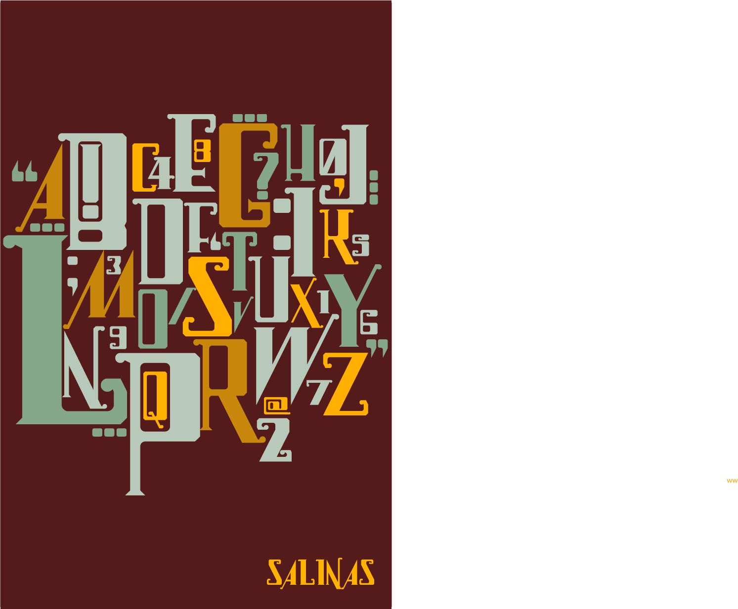
I feel my work has met and sometimes exceeded the criteria of the rubrics and assignment specifications, I always do exactly what is asked of the project and since hard work and quality are both things I value, I try to incorporate them into each piece that I do. For instance, in the typeface project, I worked hard to try and come up with a piece that I was happy with and visually pleased with, which meant a lot of trial and error, as I made about 10 sketches and rough drafts on the font program that weren’t working until I could find the right feel. In the end my font is one that I am proud to show off to my friends, and I think I challenged the font making system by creating an old-looking and intricate typeface despite its modular makeup. With this project and many of my others, I feel that my set is cohesive and conveys the message of olden days well, and is visually and technically strong.

I think I handled the feedback I received well, because I was able to see critically if and how the suggestions I received from instructors and peers would make my work all the better. I was still able to keep my vision of my work intact and didn’t compromise that, however I did take criticism on my technical construction of pieces into consideration when revising or looking back on my work. I didn’t take this criticism personally, and accepted it as part of the learning process. Overall, I feel the feedback I have received in class has helped me to develop my artistic vision and see what I think expresses the views or ideas I want it to, and what could help strengthen my projects visually and make them stronger. For instance, in my type specimen project I was able to defend how I thought some fonts would be categorized as a certain category of font when some of my classmates disagreed, but I was also able to learn how to better categorize fonts through their critique, and I am better at this because of it.

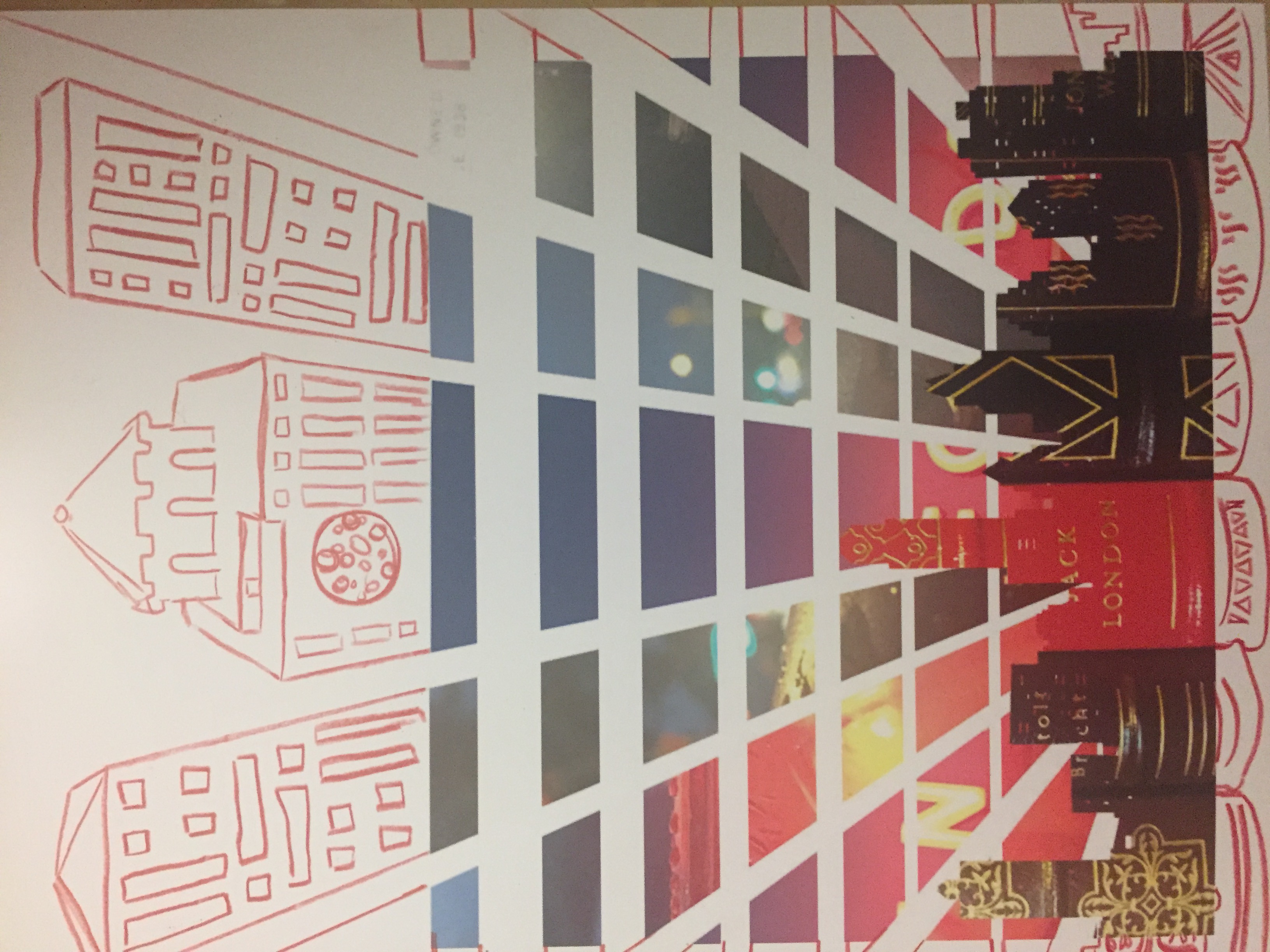
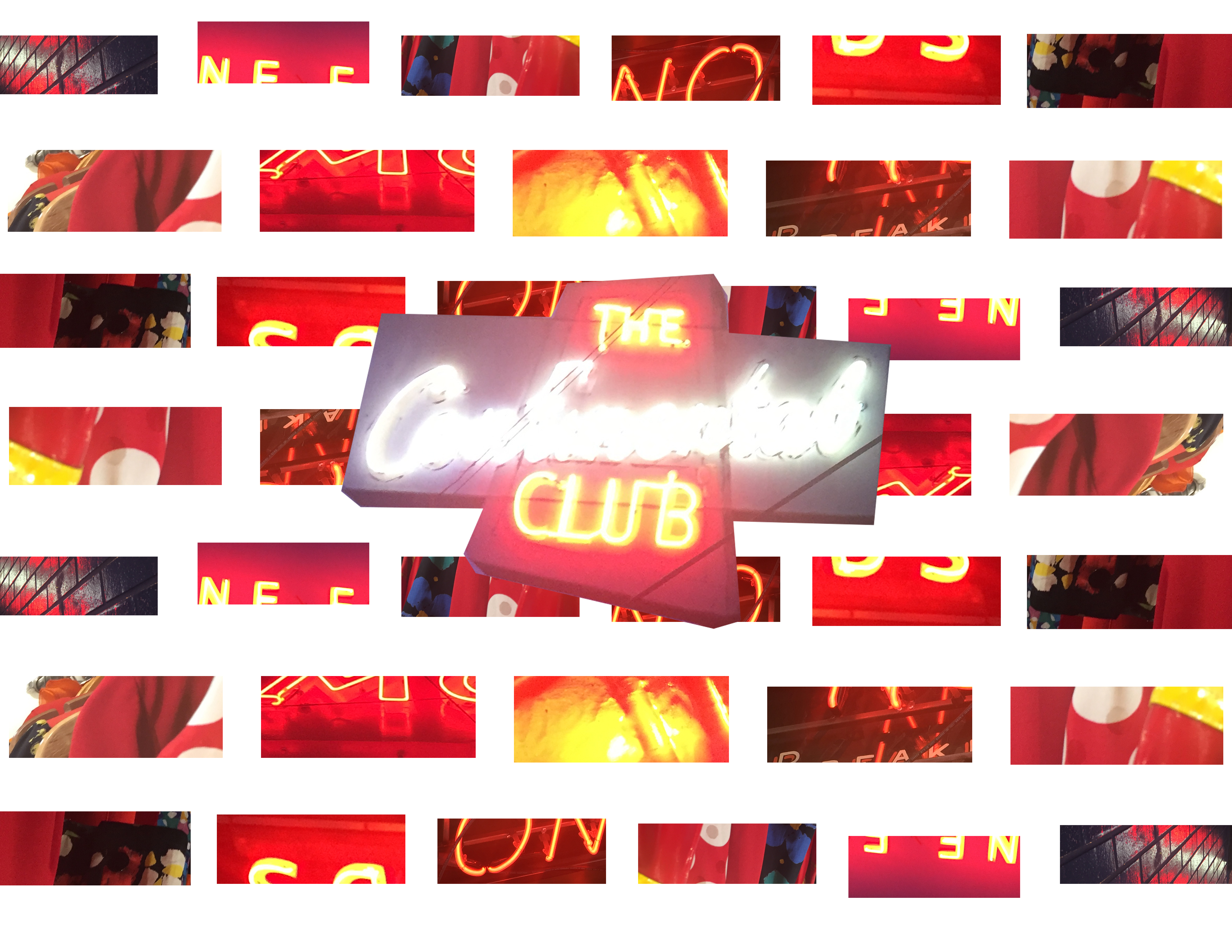
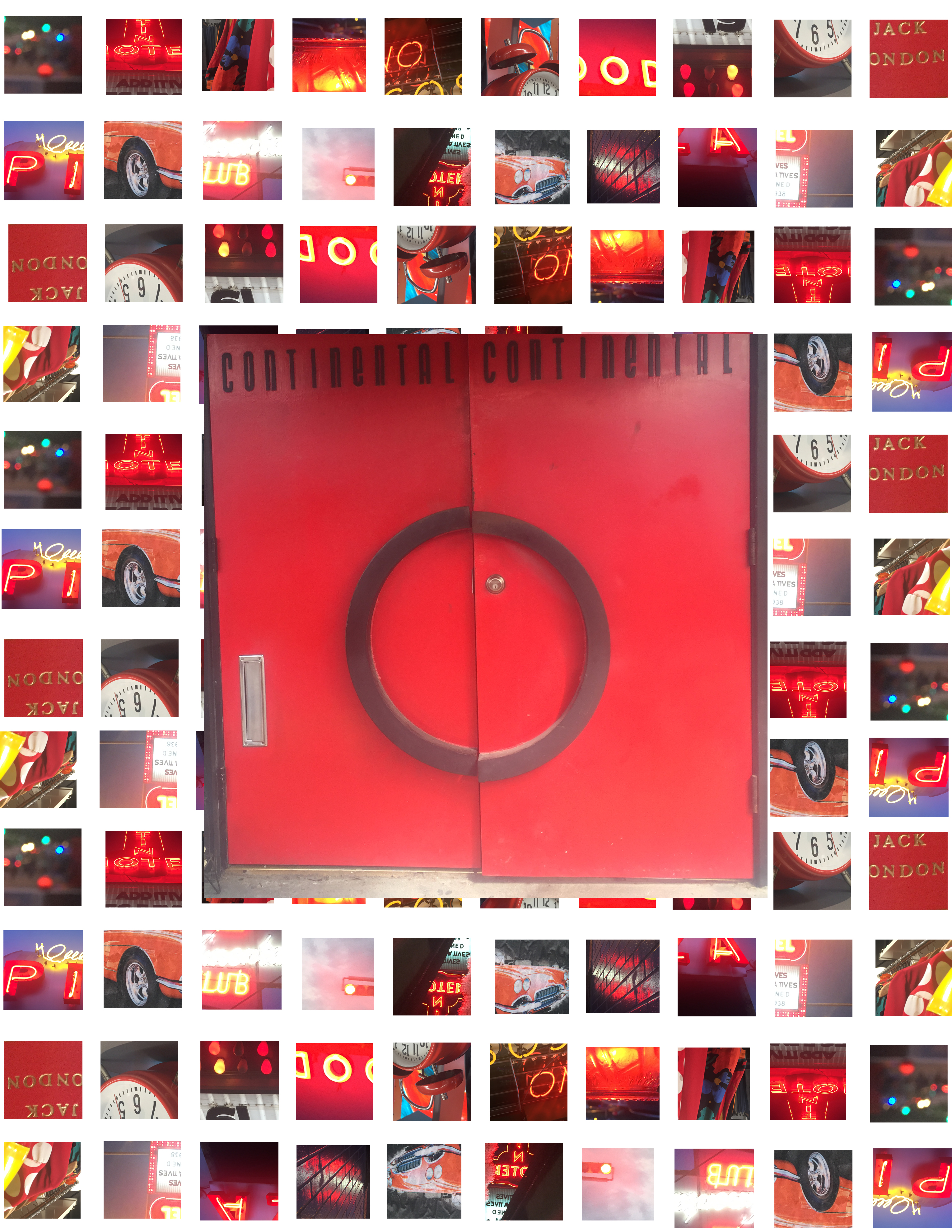
As I have mentioned, I work very hard on the projects I am assigned and do not give up on them or turn in something I am not happy with. When I have a vision, I stick to it and if I don’t quite yet, I keep trying until I find it. With the monogram project especially, this was true. I found it very hard to make the curve of the letter G with the pieces I was given and then make other letters that matched it, and I tried many different ways and looked up a lot of different font books before I finally could come up with a design. The project in and of itself was challenging, and this added roadblock did not make it any easier, though in the end I was able to complete the assignment thoroughly and it is a piece I can look back on with pride.

I have been hired recently by Campus Ministry as a member of their graphic design team and have done numerous assignments for them in my time working with them. I enjoy working in this professional and fast-paced environment and I feel that it is helping to develop my professional skills as well as my graphic design skills. In addition, I also still work for the screen printing company I worked with back in my hometown and do designs for their clients and act as a sales rep for his company out here in Austin. This job is also going well and I am finding lots of potential clients.

Having left my home town and home state, I feel that I am adjusting well to living in a completely new environment and to college life. I have been able to find friends who are as devoted as I am to their success in school and who have introduced me to my new community and made me feel at home. I am able to work through the challenge of being far away from home and being with a completely new set of people and to a new situation. I haven’t gotten into any trouble and I don’t have plans to. I am enjoying my time here now that I am fully situated and am finding it very easy to get my work done and thrive in a new community.

I think I contribute well to the class discussions and environment, because I always put my best work forward, I contribute to discussions and share any knowledge I have to answer questions, and give helpful and constructive critiques. I feel that I enjoy giving critiques because I can always find one positive and negative aspect about a project and I think it also helps me as an artist because I can apply my critiques to my own work. I always come to class and am always present and focused in class, and I enjoy being in class so my positive energy hopefully shows.

VISU 1311: Hybrid Collages

img_1093img_1094

For my final hybrid collages, I tried to work off of the digital collages I had done last week, using similar geometric shapes in patterns, to create depth and an abstract field. I started with the skyline piece, which started first as a simple skyline cut from a vector found online on a background of books I had liked, and then thought about what would make an appropriate background to highlight the idea I was trying to capture-that Austin was a vibrant and bustling city, and much like a collage itself-a mashing up of many different cultures and ideas that blend harmoniously together. I took a cut of beams shooting up diagonally from the center and inserted it into five photographs all which strongly featured light, making it look like the beams of light so commonly seen in cities. Then I started on the monkey piece,and went through my pictures looking for something interesting and captivating, which led me to that picture. I selected it, and decided to place it off-kilter in the middle and had the idea to draw in the rest of the outline in hand drawn, sketch-like pencil. I added the lips, another favorite of mine, and made bubbles of red clippings coming out of the pipe to keep with the lightheartedness. When I went back to the first after completing the second piece I realized the shapes were too continuous and needed to be broken up in order to integrate with the large white space at the top, so I deleted horizontal sections getting smaller and farther apart as they reached the bottom to do this. Then, it gave the appearance that these beams were traveling downward, not upward, and I decided to use the same technique of adding in pencil lines to complete the beams as skyscrapers of their own.

VISU 1100: Blog Post #6

SKILLS INVENTORY

For each class ask yourself the following:

  1. My greatest strengths in Visual Studies I include: I complete my assignments on time, I practice with the computer programs to gain better knowledge of how they work, and I am learning to adapt my artistic style to fit the necessary projects.
  2. For greater success in this course, I need to: focus more on mastering Photoshop so I can complete my tasks faster, and become more well-rounded in my artistic style.
  1. My greatest strengths in Printed Page and Silver Screen include: I contribute to the discussions, and I use office hours wisely.
  2. For greater success in this course, I need to: read the texts required more in advance so I won’t have to rush reading through them the night before or the day of.
  1. My greatest strengths in Visual Studies Seminar include: I always come to class and complete blog post assignments on time.
  2. For greater success in this course, I need to: focus more on how the lectures can apply to my discipline to make the most use out of them.
  1. My greatest strengths in Typography I include: I am good at seeing uniformity in typefaces and designing a coherent type set, and I always put my whole effort into completing the assignments.
  2. For greater success in this course, I need to: practice working with InDesign to get the hang of it and make it easier to do the projects.
  1. My greatest strengths in Rhetoric and Composition II include: I have a good writing voice and I am able to clearly express my opinions in my papers.
  2. For greater success in this course, I need to: go to office hours more to clarify assignments and work on incorporating the reading to my papers.
  1. My greatest strengths in Honors Seminar include: I am always in attendance and I turn my essays in on time.
  2. For greater success in this course, I need to: take more notes related to what I will be writing papers on to help me write them more efficiently.

Computer skills:

  1. My computer skills include: I am highly skilled on Adobe Illustrator, I know how to send emails to professors using a professional tone, I am learning and getting better at Photoshop and InDesign, I keep my desktop and files organized.
  2. I still need to learn: Photoshop advanced skills and how to maneuver around InDesign to help with my studio classes.

Research & writing skills:

  1. My greatest strengths as a researcher/writer include: I have a controlled and distinct writer’s voice and I am able to convey a message through my writing.
  2. I need to work on these aspects of research and writing: I need to include more evidence in my papers and work on integrating the texts I am researching into my paper.
  3. I learn best & accomplish most when: I enjoy the subject I am writing about and I use a time schedule to be efficient.

ACTION PLAN

Choose one class that you are struggling with or are not doing as well as you could.
Now make a list of 10 ways you could improve your performance in this class.

Rhetoric and Composition II:

  1. Ask more questions
  2. Bring water to class to help me focus
  3. Spread out my writing so I don’t have to do a lot at a time
  4. Go to office hours regularly
  5. Form a study group with my peers
  6. Mute notifications from my computer so I’m not distracted
  7. Annotate more thoroughly
  8. Research the readings if I don’t understand them
  9. Use library resources to help me do my research papers.
  10. Clarify assignments if I am confused

VISU 1311: Digital Collages

clock-collage continental-collage door-collage

For this week’s collages, I tried to take the feedback I received in class to make my work more abstract and have a systematic flow of elements into consideration, along with keeping my concept of the color red in play. I worked on the collage project for a very long time and originally tried to model the sample, but I found that it wasn’t working the way I planned and it wasn’t highlighting the best and my favorite features of my images. So, I decided to try a more grid-like background of close-up clippings of red objects from my pictures with one central object that modeled the same shape as the small background cutouts were. I found this technique worked well for me and gave me a sense of control, while still keeping the images abstract. I feel that these images all work together as a set, and l like the way they display my color theme. I also tried to clip images that reflected the central object, for instance in the square set, most of the clippings feature a circular or round object, just like the red doors do. Overall, I think I am making progress into abstract art, as it is something I have never done before and have no experience in.

VISU SEM 1100: Blog Post #5

Part 1: Upload 2 images of current classwork: a project(s) you are currently working on or have completed from one of your studio/visual studies courses.

TYPO Projectjumble-text

  1. The goal of this project is to create type specimen posters for a typeface we created ourselves, which was based on a quote assigned to us.
  2. Since my quote was from John Steinbeck’s Of Mice and Men, I tried to make the font, which was made on a website that makes modular typefaces, look as olden and hand-carved as I could to reflect the craftsman style of California where the book is set, and highlight the book’s themes of labor and hard work.

Collage Projectclock-collage

  1. The purpose of this project was to take pictures that we had previously taken of South       Congress Avenue and create an abstract collage out of them that represents a common theme we had when taking the pictures.
  2. My theme was the color red, so I decided for this collage to use the red hues and objects I found in my pictures and cut very small pieces of them into shapes that were similar to the one big central cut-out, in this case, the clock, to make the collage have order but still be abstract and require the viewer to look deeper at the pictures to figure out what they are.

Part 2: Self-Critique: On your blog, answer the following questions about one project you are currently working on or have completed from one of your studio/visual studies courses (see Part 1 of Blog post #3).

  1. I think the strongest aspect of my typography project is that all of the letters are very uniform and flow together as a set. I especially like this specimen of the set because of how the characters all fit together like a puzzle, and it looks like a jumble of the same character until you look more closely and see the differences and the characteristics of each of the characters.
  2. The weakest aspect of my project is that the numbers are too short. I designed them originally to be this way so they would not overcrowd the letters, but now in doing this project I realize it would have been better to keep them the same height.
  3. Conceptually this project could be strengthened by making the numbers match the letters, and I might like to change the color palette to give the poster a different feel.
  4. I would like to make the letters in a different way so that they could have more curves and give the typeface a smoother look that isn’t so edgy and harsh, although the modular typeface system prevents this. If I were to do this project again in a different application, this is something I would want to change.
  5. I love this project and I have had a lot of fun working to create something totally original, and I think it is a good first step into typography, and it has united all of the skills I have learned.