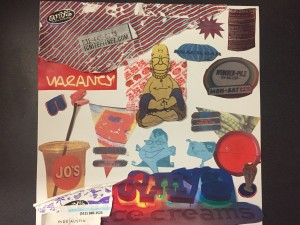
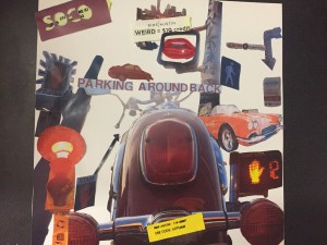
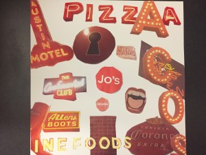
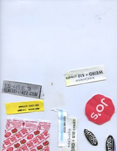
My first round of collage-making proved to be challenging, as I was very out of practice with an X-acto knife. But, I was able to categorize my images into three different piles-those that dealt with traffic, signage, and Austin culture, three things I found very prevalent in my photos. I used some of the ride take-me flyers as inspiration, as well as my many encounters with speeding cars on South Congress for my spark behind my traffic themed collage, and gathered many of the streetlamps and road signs that were often in the back of my photos to create the collage. I tried to use the idea of perspective to organize my clippings, putting the larger objects in the foreground and the smaller cars and fliers towards the back, like the view is from South Congress. For the signage collage, I tried to use lines already created in the photos-because many of the signs were cut off by the frame-to position my images on the paper and to decide where they would go, a technique which proved effective in organizing the space and keeping a sense of uniformity. I centered the clipping from a Jo’s coffee cup, as the circular shape and instantly recognizable logo made it a standout among many other quirky and harder to find logos. In the final one, I used many of the stranger things I had found on my walk-a Dum-Dum wrapper (which I did NOT pull out of the garbage, it was on the sidewalk and it was clean), an united telephone number, and an Amy’s ice cream cup which came with an odd look from the Amy’s 11:00 shift worker to develop a final theme. I then looked through my pictures to see what elements would help to capture and accentuate the culture and weirdness of Austin, from a Homer Simpson Budda and a dinosaur head, and I used these elements to play off of each other, hence the overlapping and dimension to the collage.
Monthly Archives: October 2016
VISU 1100-Blog Post 4
Part 1:
I really enjoyed seeing the upperclassmen’s presentations, and I felt like it has helped me to plan out my career as a Visual Arts student at St. Edward’s and get excited for the opportunities that await me.
I liked seeing Faith’s work, especially her photos from Thailand. I thought this really encapsulated what it means to be a student at St. Edward’s and how to use the resources provided to students to fully pursue careers and passions. I also thought that what she had to say about being a full-time employee of the college system was an important takeaway from the presentation, especially in the visual arts field. I feel that her advice is great to hear from an upperclassman and I will surely remember it as I go forward in my studies.
Mary’s presentation was very interesting to me, as graphic design is my major. I was able to gain a lot of insight as to how my schedule will look in the next few years. I liked seeing her work and hearing how she used her classes and resources from the school to create them, and her idea about finding a method to make her art have a purpose and meaning.
I thought that Diana’s presentation was very informative and had a lot of good information and advice to visual artists. I thought that she had a very interesting perspective on life at St. Edward’s because of her transfer and later return to the university, and liked how she worked all of these factors in to a thoughtful speech. Through her presentation, I was able to realize how important it is to stay on top of my coursework and scheduling, and to not be discouraged by setbacks.
John and Omar’s presentation was very interesting to me, especially because I do not know much about the game design world. I enjoyed hearing what they had to say about developing a portfolio and learning about a relatively new field of study, and liked how they were able to relate their experiences to other art majors, as they mentioned that their work is also time consuming and takes a lot of trial and error to get it right.
Part 2:
http://www.vasava.es I like this website because of the layout of the different designs posted, it makes them the main focus, a quality I like especially with designs like these. It makes you want to find out more information and doesn’t overload the viewer with text, keeping the webpage simple and clean, yet still highlighting a variety of work.
http://madebyfieldwork.com I love the use of animation and simplicity of the layout. The design company’s philosophy of making things is beautifully integrated in every part of the website layout, helping to keep the page cohesive.
http://lucianomarx.ch This designer incorporates physical photos and digital work very well, I enjoy the calm color palette that ties a variety of work together the bold yet simple use of typography.
http://truthlabs.com This website has a bit simpler animation, but it still captures the viewer’s attention. I love the use of the color red throughout the design and how each carefully chosen word takes you to another portal of the website, which still all go cohesively with one another. The designs are once again the center of attention and it is overall very visually pleasing.


