I found making the prototype to be very useful to my process, as seeing and holding a physical book has helped me to make decisions about image placement and text so the book follows a definite sequence for the viewer, rather than on screen. Though I had many many issues printing and sizing the book, I am happy with the way my prototype turned out. The colors are a bit darker than I would like, but this can be fixed with inkjet. Also, some of my type was cut off, this is good for me to know. Overall, I liked being able to see a first draft of my book on paper. 
VISU 1100: Blog Post #10
I was really impressed with the video game designers from Spacetime Studios, as I didn’t know that video game development required so much preplanning, mathematics, and overall detail to make a successful game. I knew that animation was a difficult process, but until their presentation I did not know the level of spreadsheets and the amount of steps required to do something as simple as throw a fireball. The whole presentation opened my eyes to something I know so little about. I had a vague idea of the industry and I was excited to see and hear what my peers are learning about, and how this industry truly encompasses a wide discipline of careers, from engineers to accountants to designers. I liked the chance to hear from the different aspects of video game production because it showed me how complicated and nuanced the process is and I got an insight to a very collaborative and detail-oriented industry.
One question that I have for professors is: When did you star
VISU 1311: Thumbnail Spreads
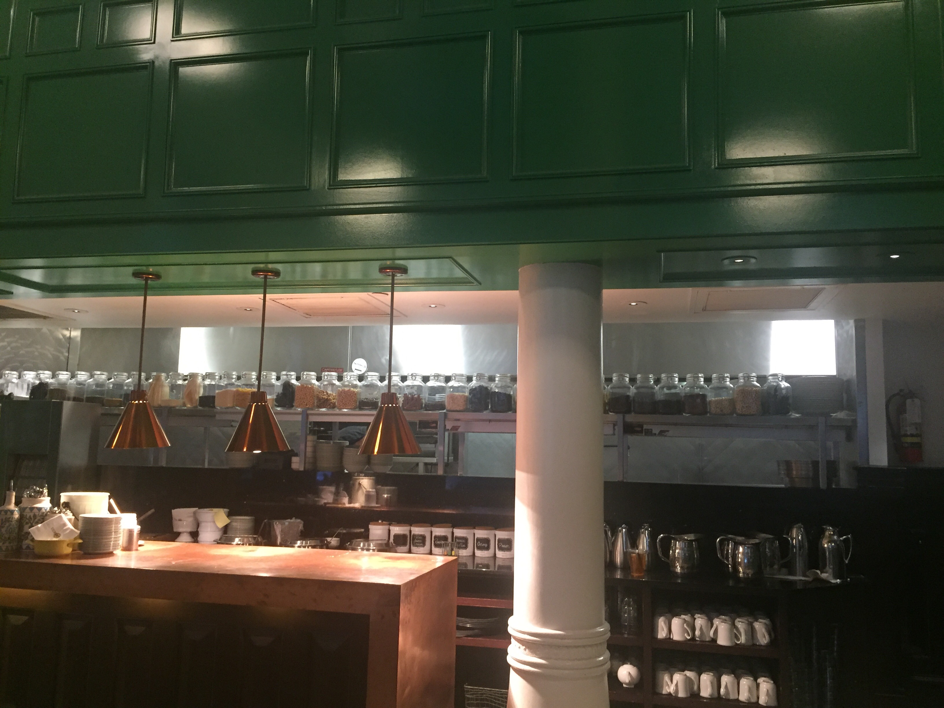
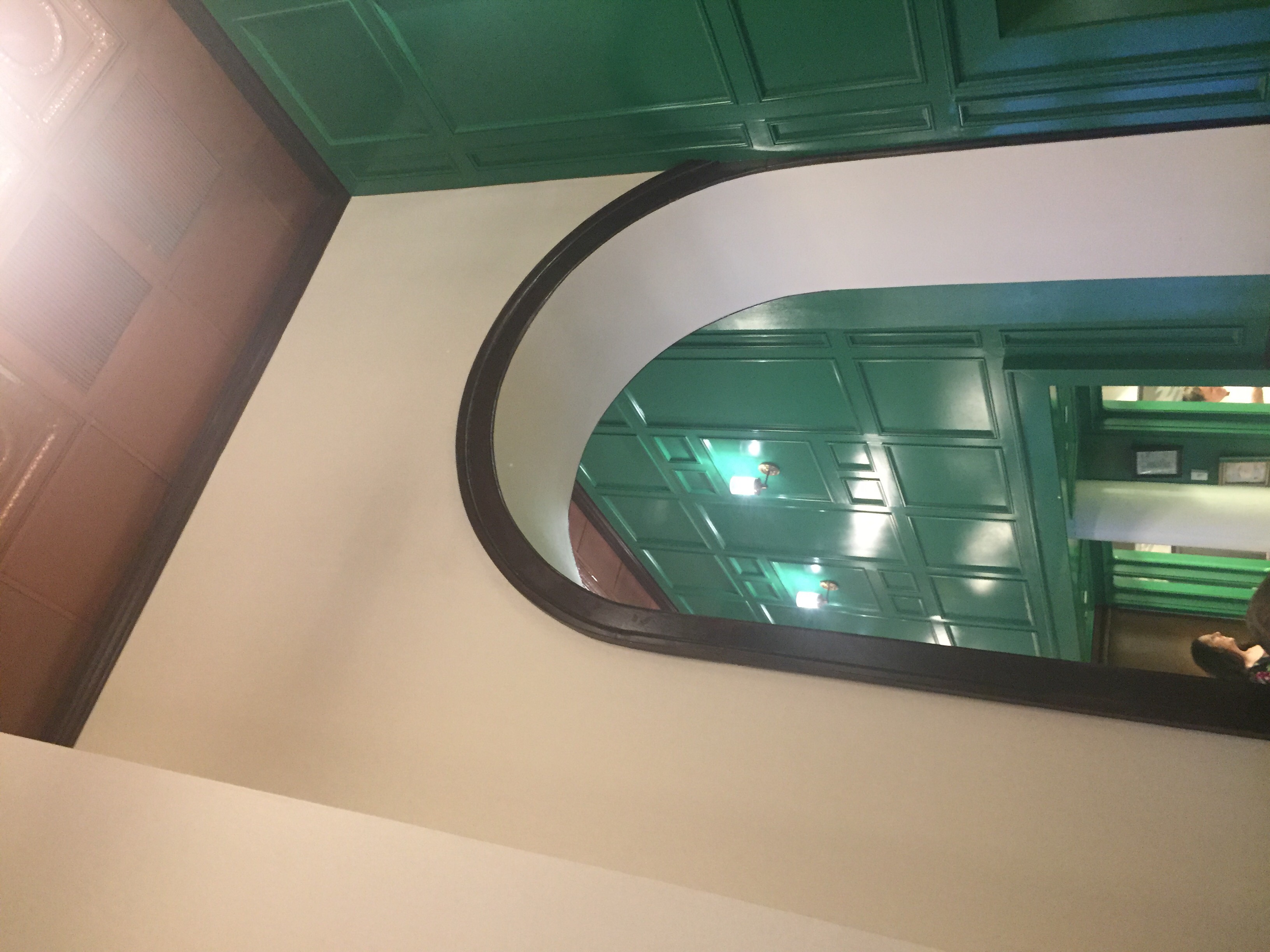
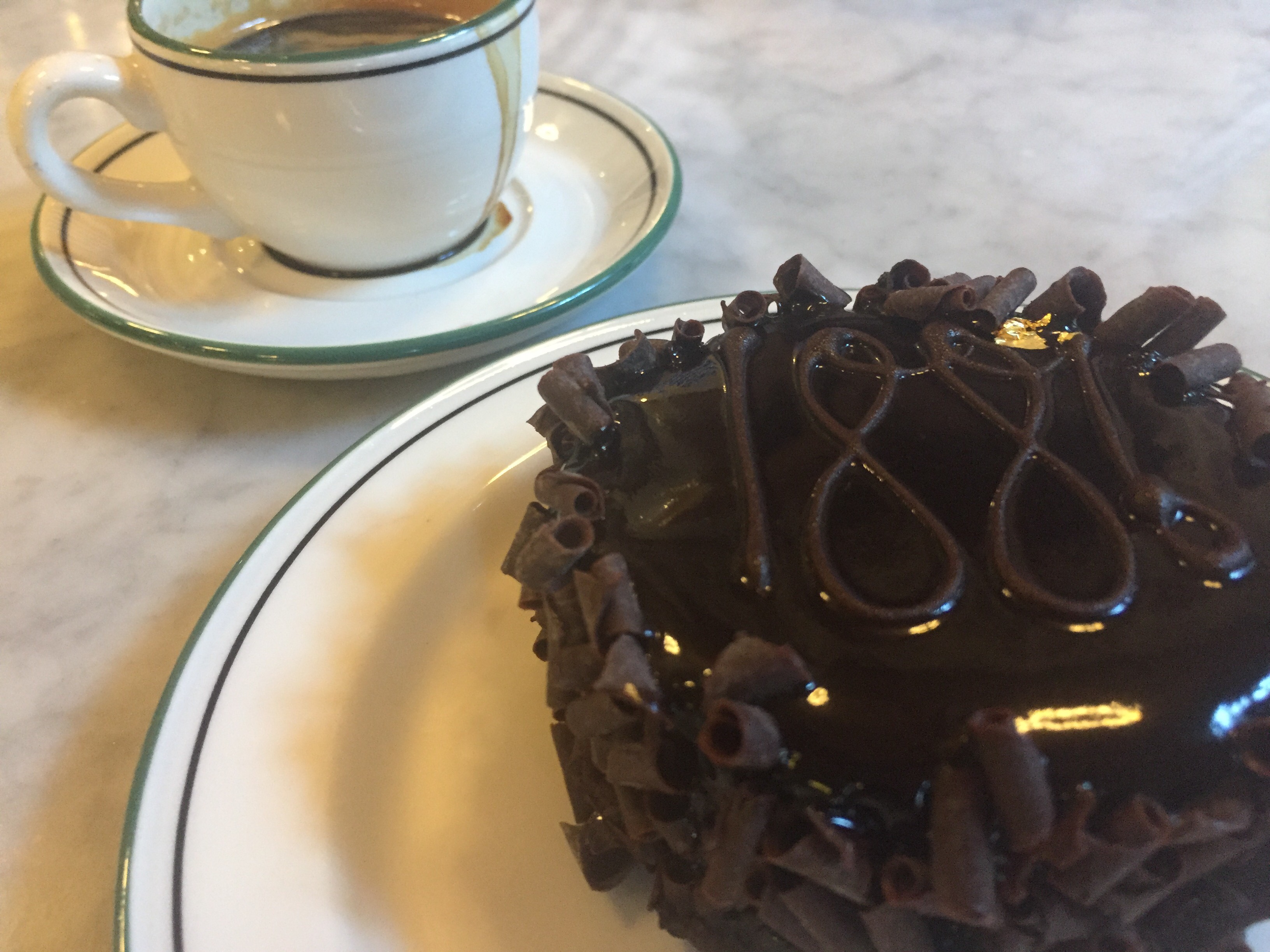
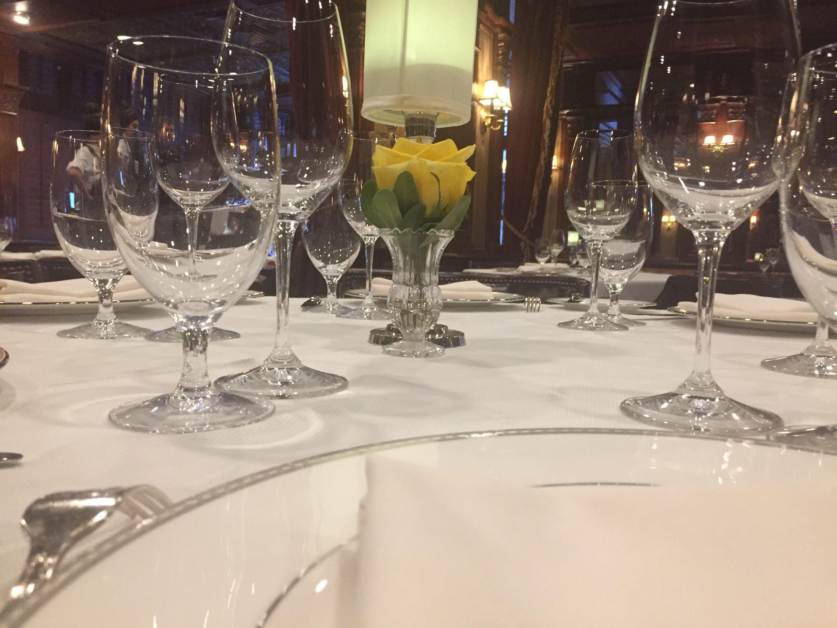
As I put my pictures into spreads, I tried to organize them with a flow and grouped certain images by common theme and location. I compiled the book starting with pictures from the outside, moving into the lobby, then into the cafe, then to the bar, and finally through some ballrooms before coming back down to the lobby again and out the doors. I grouped some images based on their use of dramatic lighting, and lone objects being the focal point of some images. I noticed as I was putting images through Camera Raw that many of them were dark because they were taken inside and in low light, so I decided to use it to my advantage and reduce the exposure on all of the inside photos to make it moody and give it mystery. This will add a new layer to my book, as when I visited there they informed me the hotel is indeed one of the most haunted places in Austin, so the lack of people and dark shadows will really contribute to this. I am still experimenting with layout and text, and I am not sure if I like it or if I want all photos. I think the book has a definite color palette that I am very happy about.


VISU 1311: Contact Sheets/Type


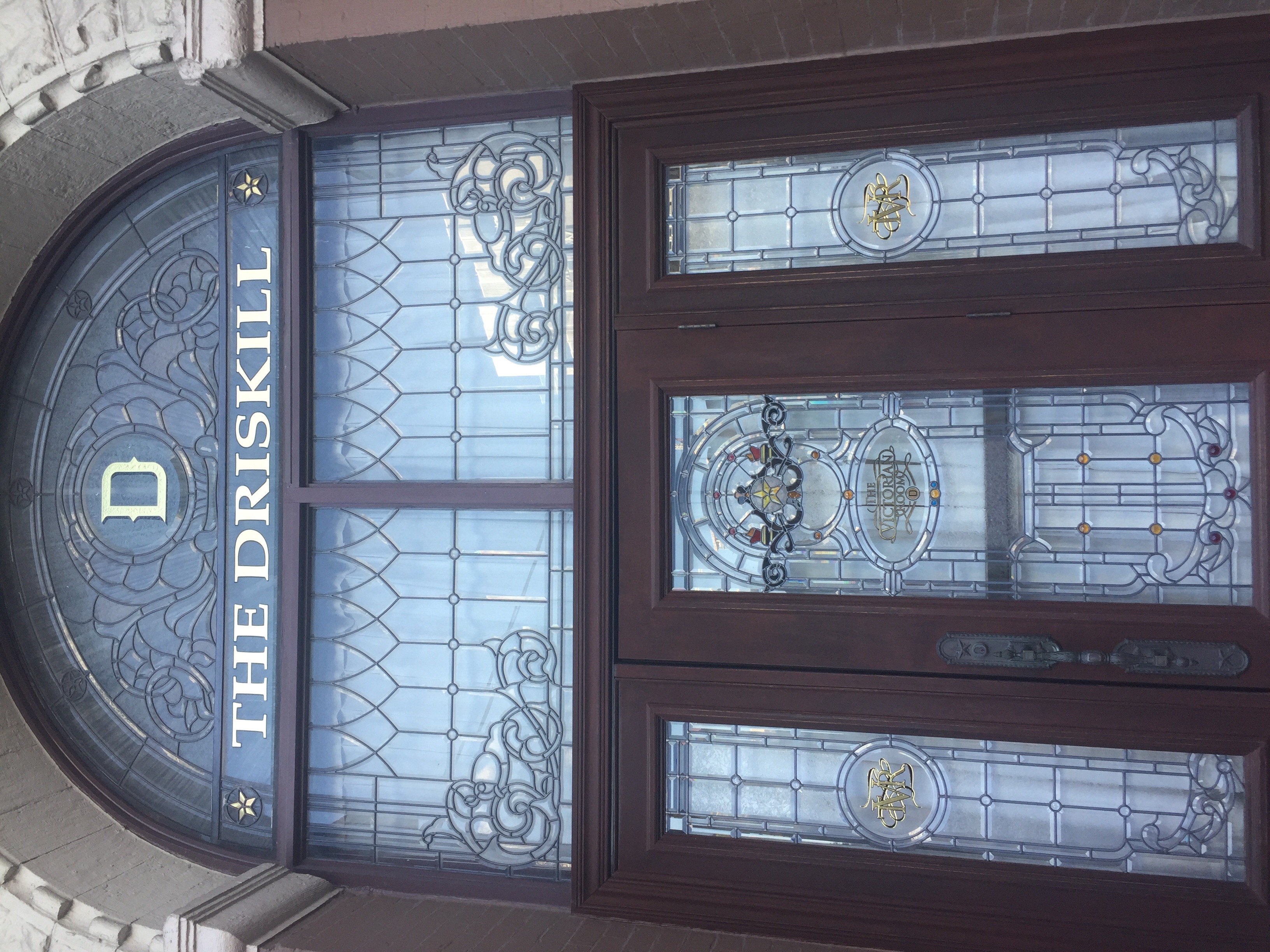
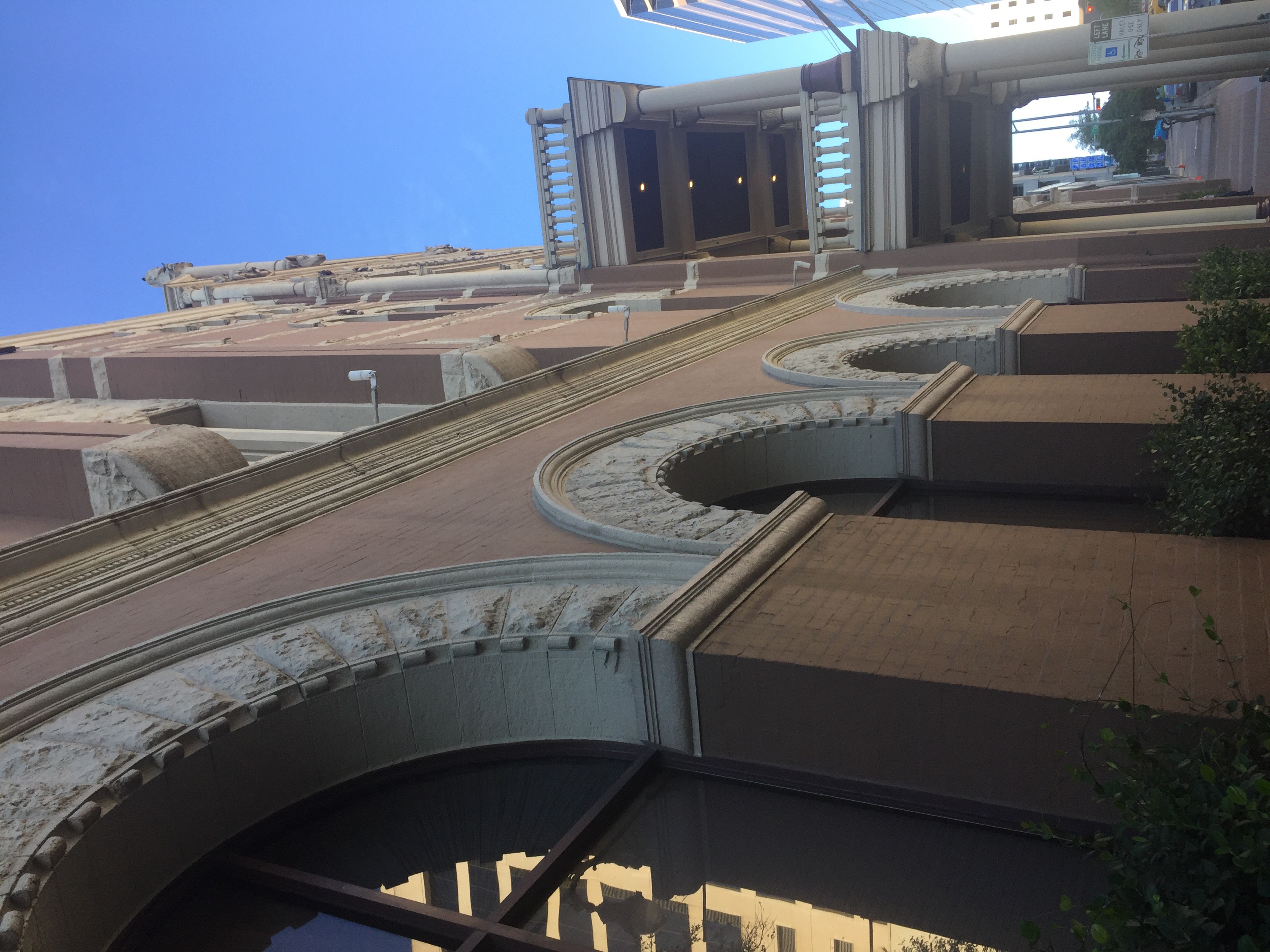
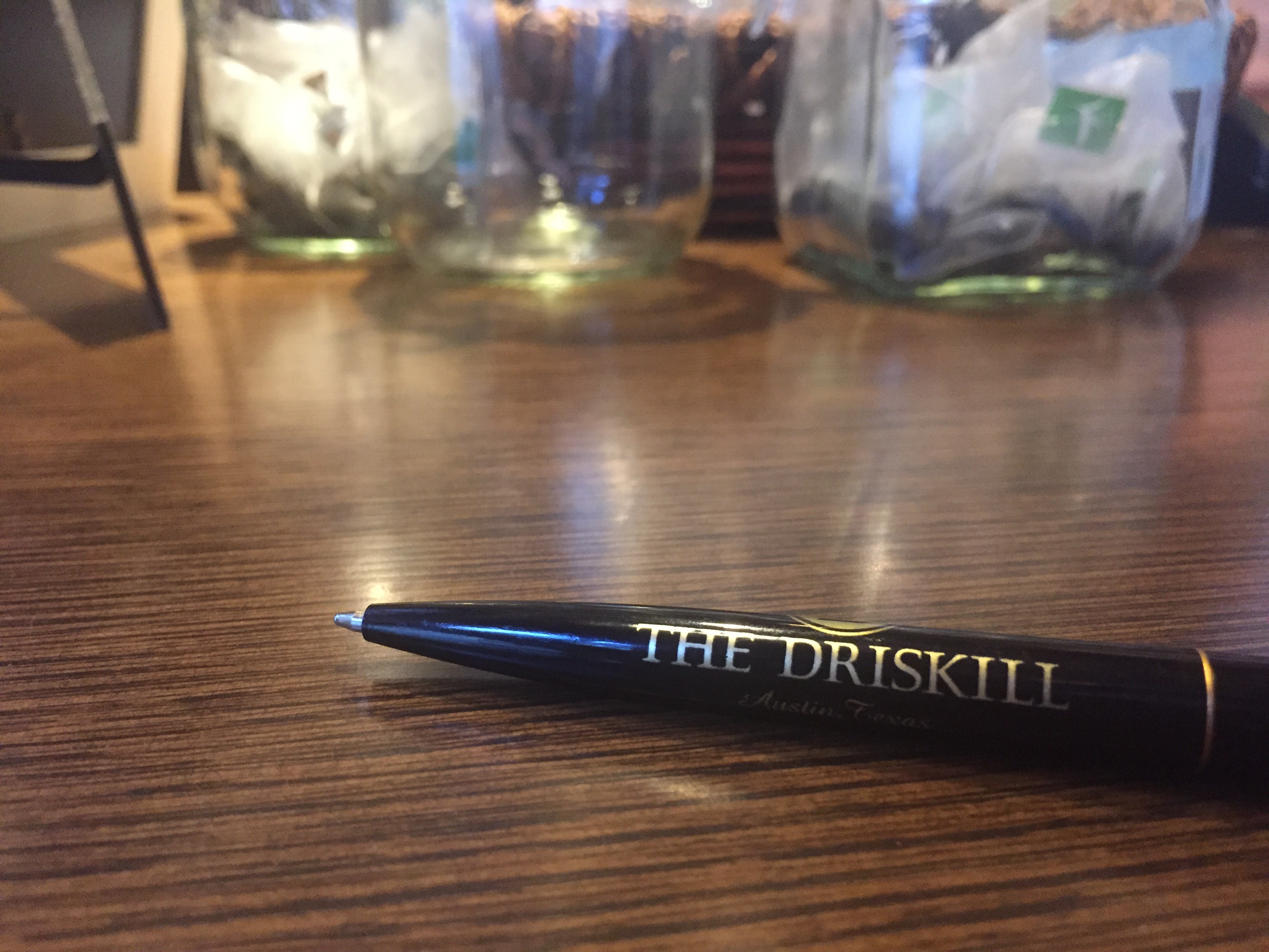
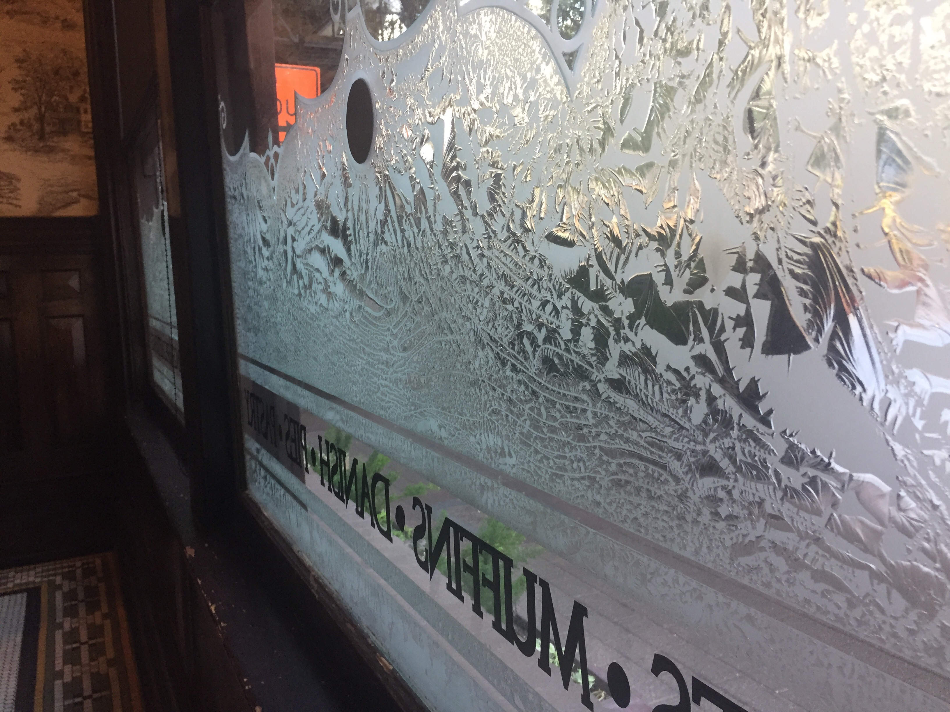
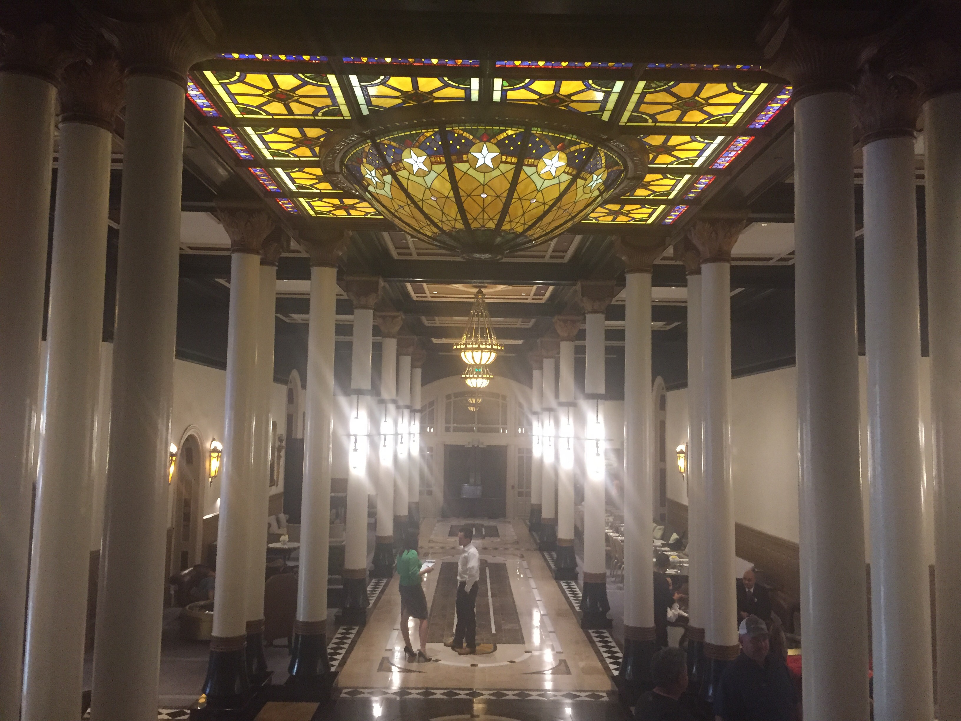
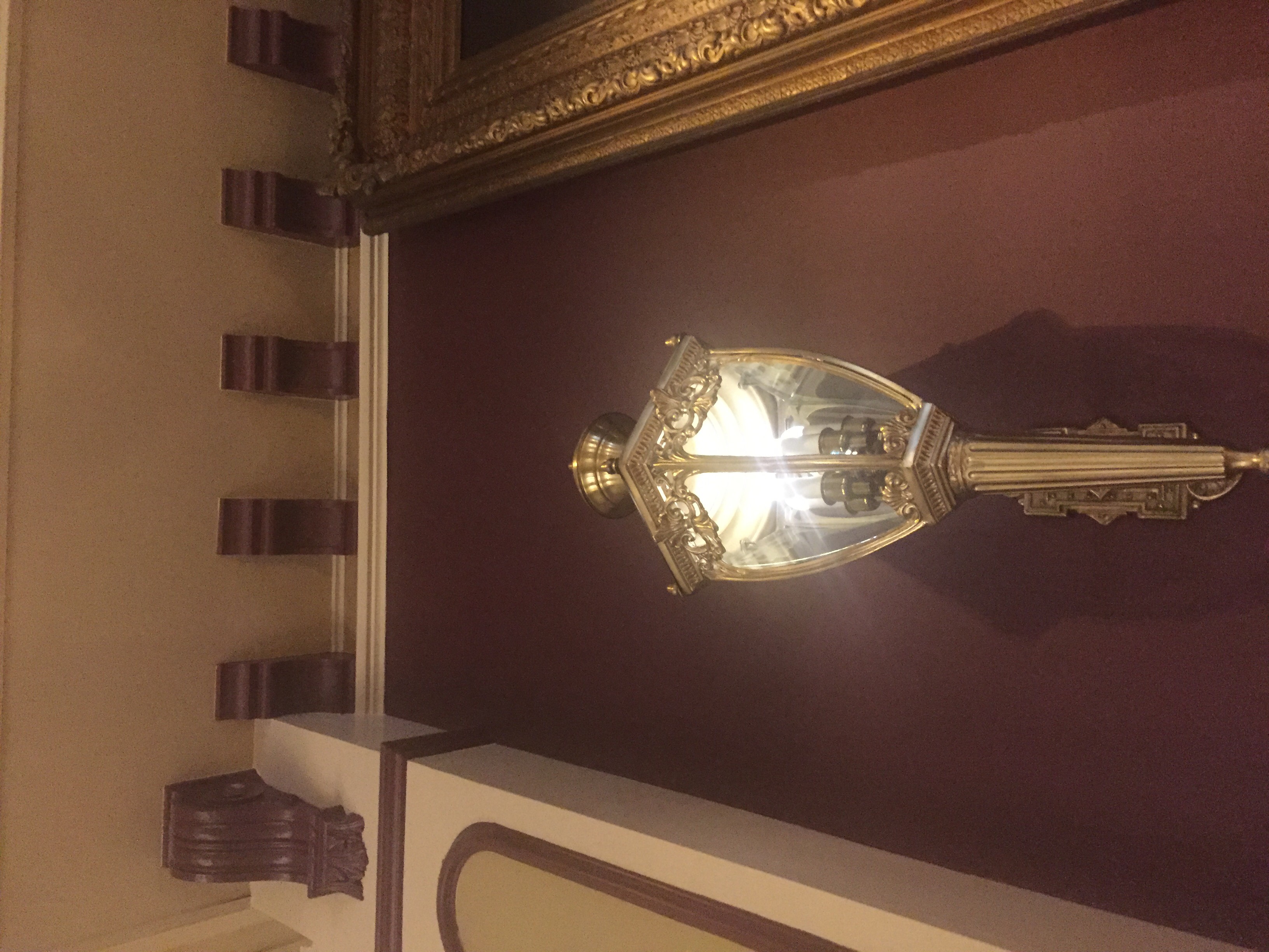
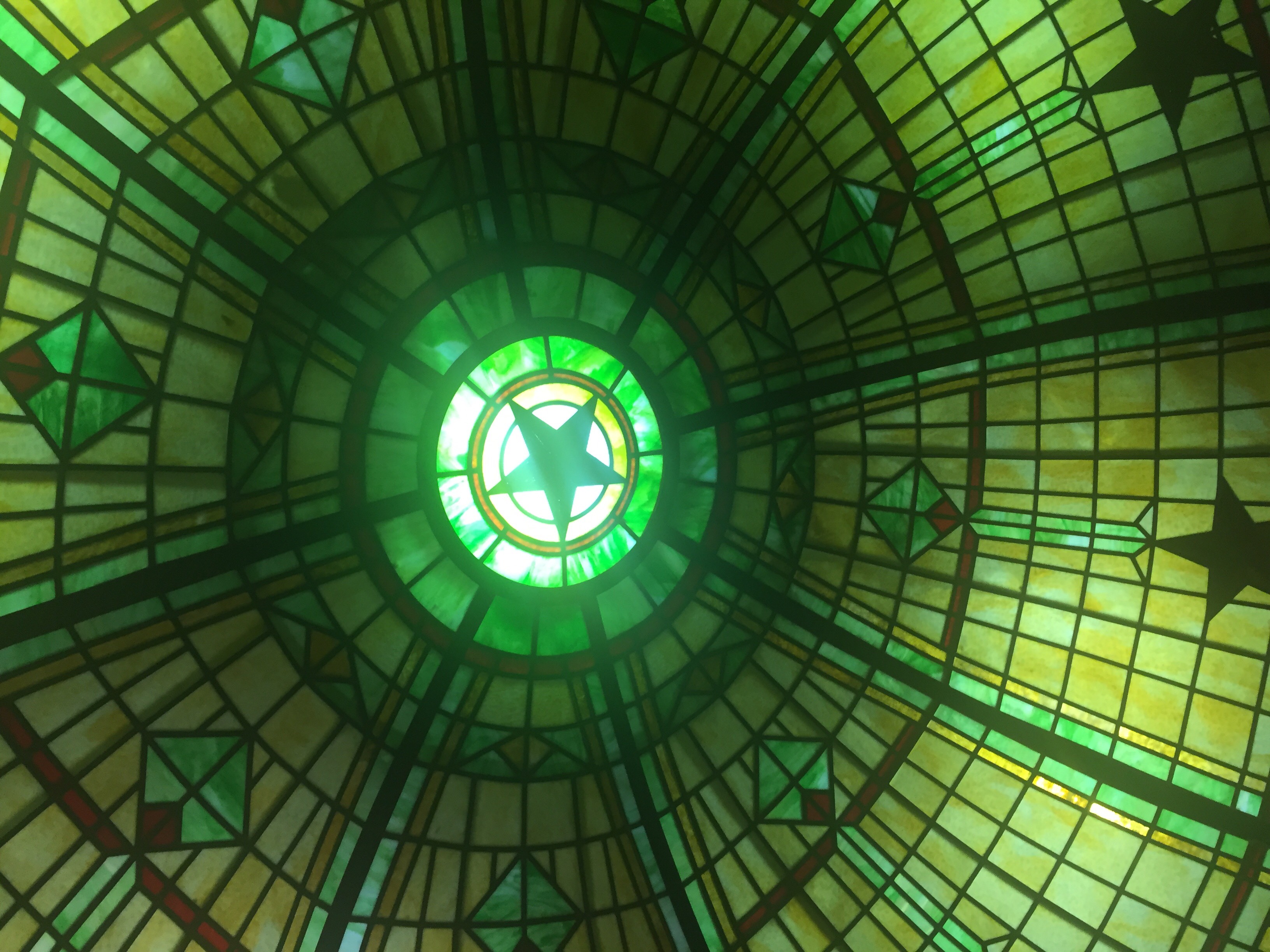
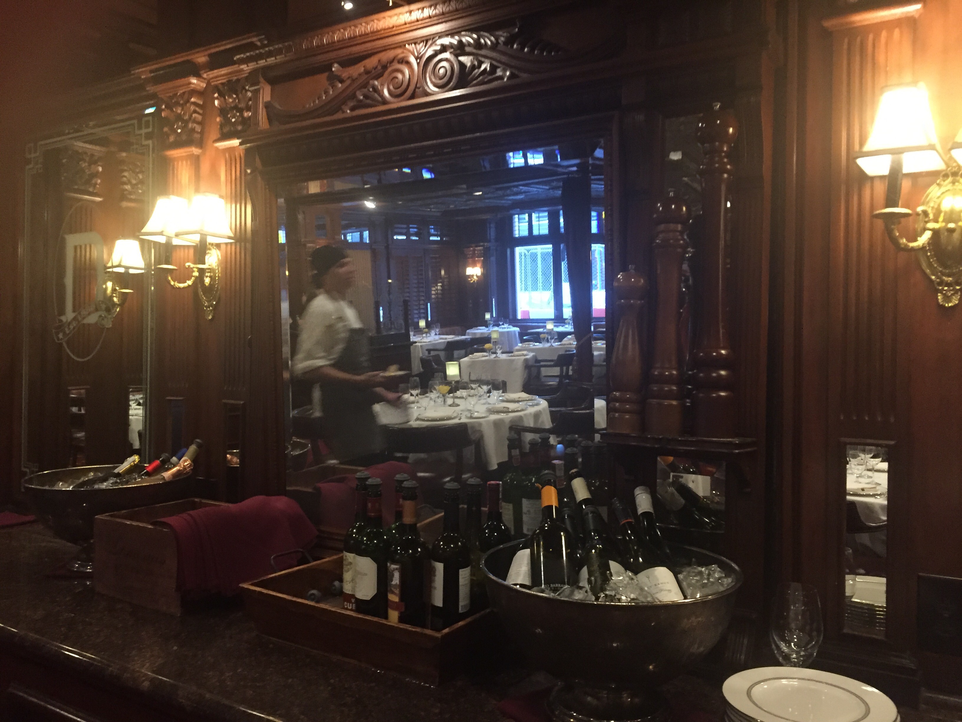
I went back to the Driskill with a Nikon camera I purchased off of E-bay (it was inexpensive and a professional photographer relative of mine recommended it to me, and I had been wanting one anyway) with an included CF card that turned out to only take 16 pictures before running out of memory. So, when I can get a new one I will return to the Driskill and take shots like the above with that camera. But for now, I took these with a camera phone, and have no RAW files to show at the moment, but I am trying to return and get those as soon as next weekend. I tried to capture obscure angles to enlarge certain elements of the architecture and design that I was trying to highlight, be it from doorways or Tiffany lamps in the lobby. I think this makes the images not so plain and straight on, giving them a bit of obscurity, while still keeping with my theme of a normal person’s journey through a hotel. Through these pictures, I have come up with a concrete color palette of yellows, greens, and rich browns which show up and are prevalent in every picture. I plan to pull these colors and use them in elements like text, page numbering, and in editing the photos themselves. The lighting in a majority of the photos is very dramatic and many of the pictures feature a light source, so that may work into a sub-theme too.
Unfortunately, I was and will only be able to shoot the public areas of the hotel: the cafe, lobby, and bar. They won’t let me into any private areas without paying a large fee, which will change mms sequencing plans. I will now be focusing heavily on minute aspects of these three areas. (I may be able to use my photos from the ballroom if they turn out well enough- I snuck in to take those pictures and I don’t think I’ll be able to get there again)
Here are the fonts I will be using throughout my book, for headings, accent, and body text in that order. The type specimen sheets I made on InDesign won’t upload here.
http://www.dafont.com/show-boat.font
http://www.fontspace.com/reference-type-foundry/aspire
http://www.fontspace.com/the-fontry/fha-condensed-french
VISU 1100: Blog Post #9
I thought that Mark’s presentation was very interesting and I was excited to see a successful alumni who was doing a variety of work both for pay and out of passion. I immediately recognized some of his photos from places around Austin, specifically, I had seen a trio of them in Hopdoddy Burgers the week before and I had distinctly remembered them because I liked their subjects, so I was excited to see the photographer behind them. I thought his stories about the film Boyhood were very interesting, as I remember hearing about the extreme production process and wondering what it would be like to stick with a project for that long. His experiences showed me what kind of passion you have to have to be a successful and happy visual artist. I also liked how he was still in touch with Prof. Kennedy, and it made me feel even stronger about my education and the connections I will be able to build here.
http://www.indeed.com/cmp/Two-Anchors/jobs/Paid-Graphic-Design-Intern-or-Junior-Level-Designer-2c20f6eb8d864154?q=Graphic+Design+Intern
http://www.indeed.com/cmp/USDM/jobs/Visual-Designer-b6370defb46bf1fc?q=Graphic+Design+Intern
I would like working at any of these internships, I think their design work on their websites is something I would enjoy contributing to and I would like to be able to get experience designing for a variety of different purposes.
VISU 1311: Book Project 1st Pass
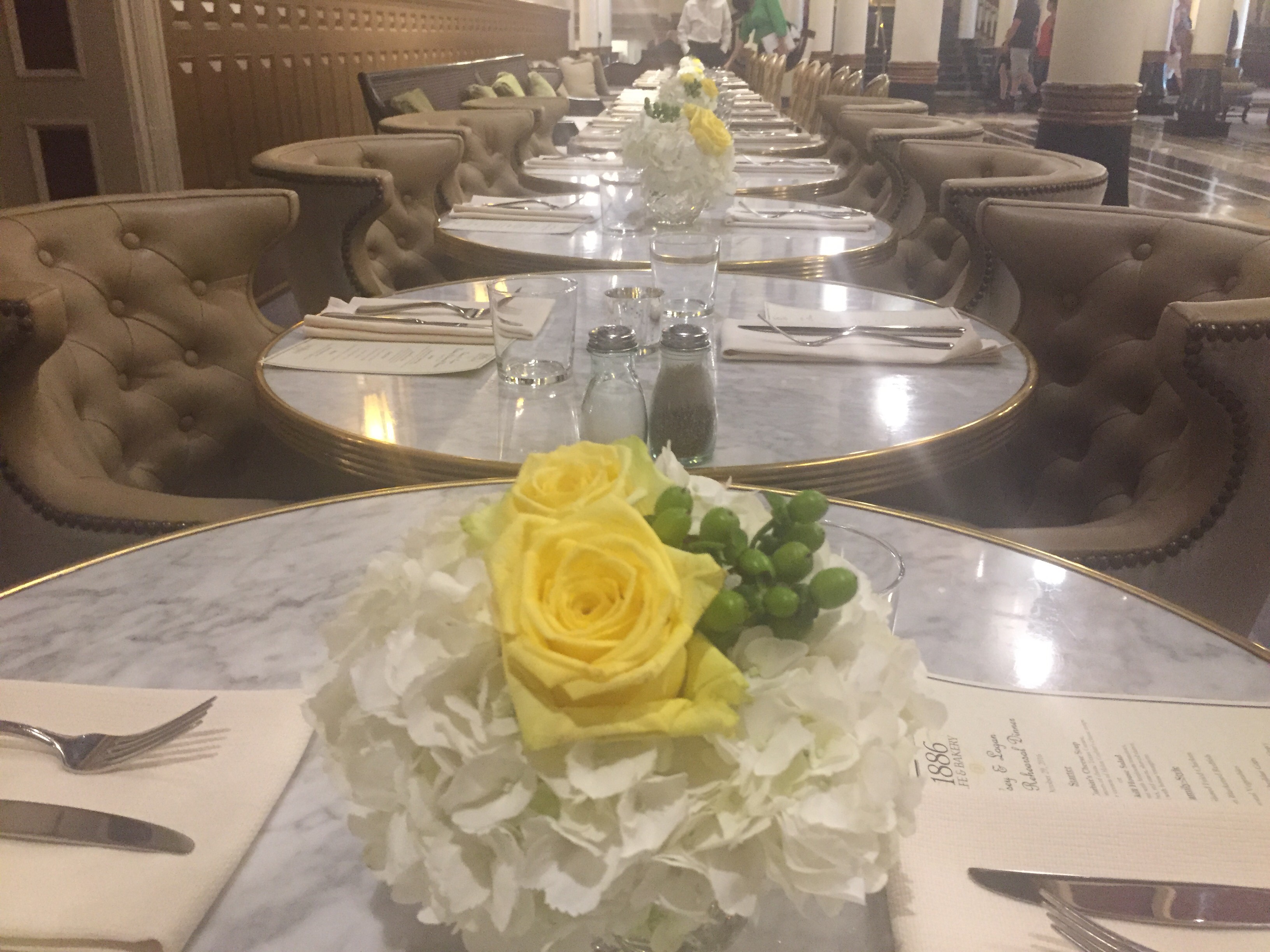
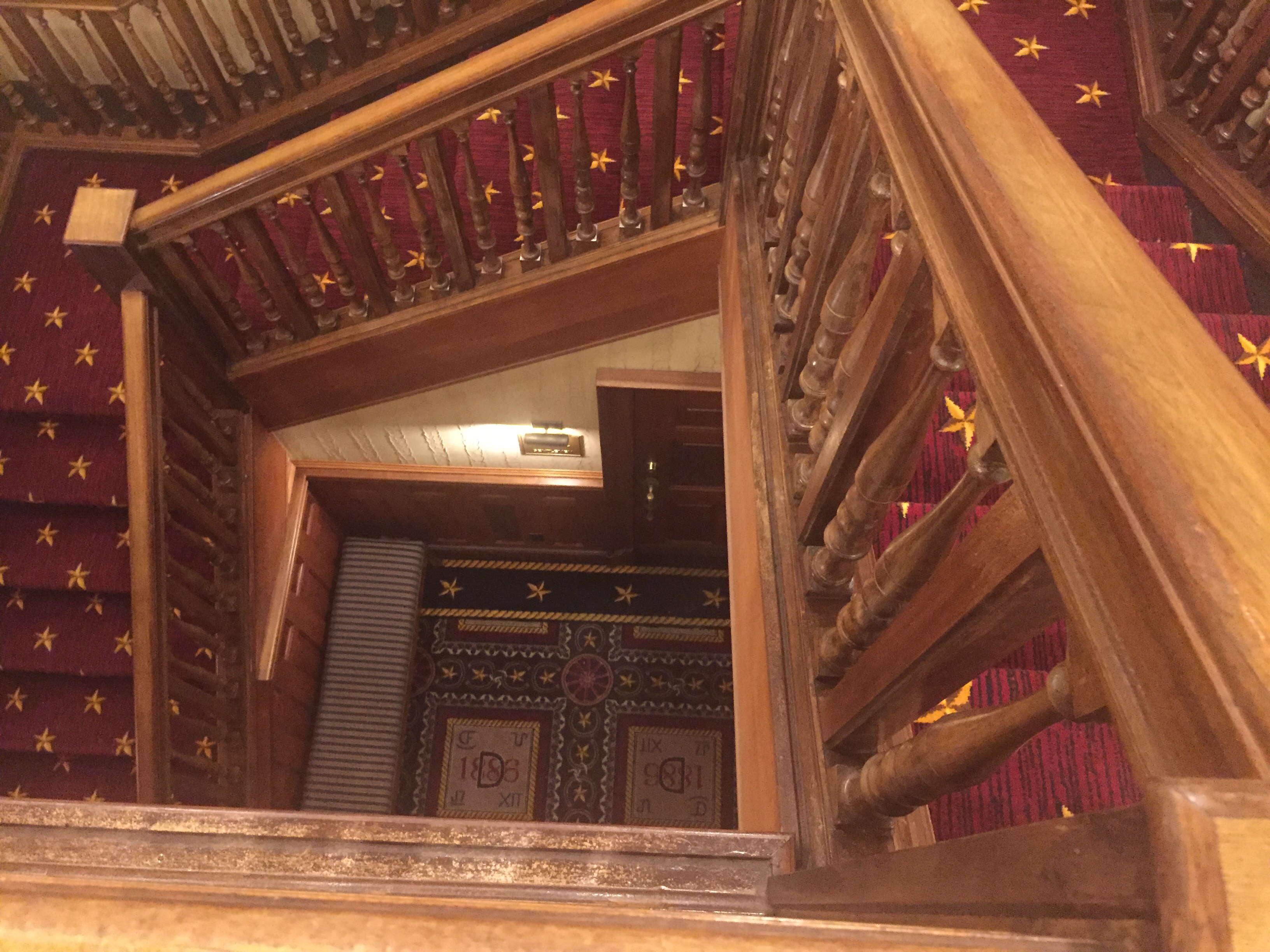
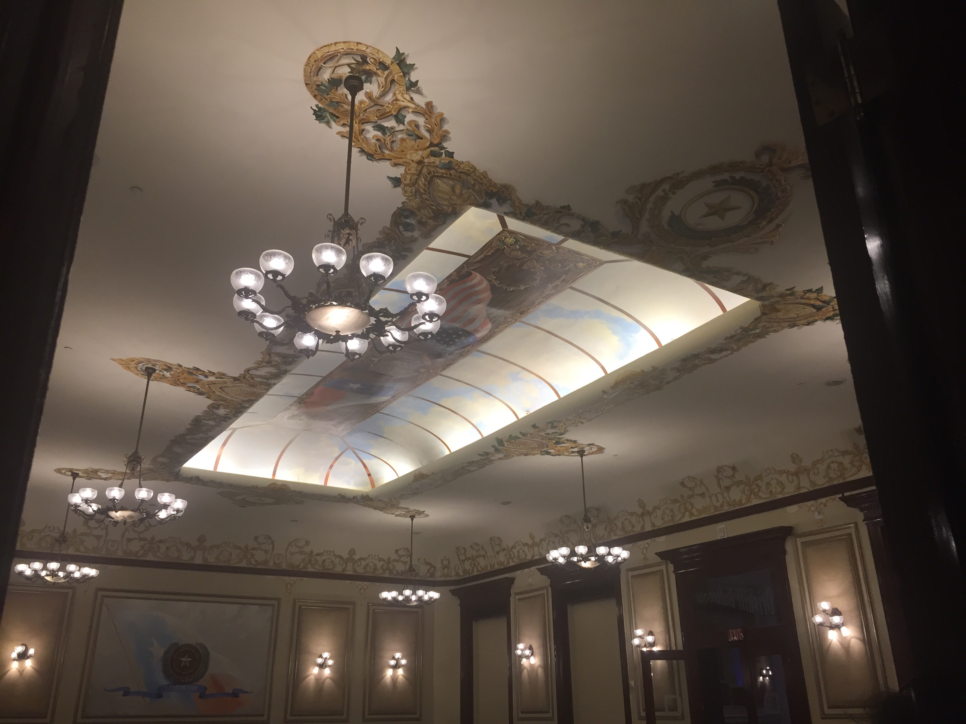
For my book, I want to take pictures of the Driskill Hotel on 6th Street. The hotel is the oldest building in Austin, built in 1886 and the architecture of the hotel is stunning. I will develop a book that follows a journey through the hotel, starting with the doors, going through the lobby, in the cafe, up the stairs, into the bars and the ballrooms, and back down the stairs. When I was there, I saw a lot of potential images that would use perspective and repetition, and there are so many long ceilings and hallways I would like to capture, so I would like to keep my book taller than it is wide. I want to use some quotes about the rooms the book shows, like the ballroom and the cafe, and align the text into shapes that connote objects that would be found in the room. I plan to use a cutout to open the door to the hotel which will peek into the lobby, and then when the page is flipped, will open back to a shot of 6th street. I would like to shoot in the evening, I think the muted colors and elements will photograph best in that light and it will make the hotel seem older, and warmer. I may have to call the manager of the hotel and ask to get access to the ballroom, when I went there I wasn’t allowed in because of a private party. Overall, I’m hoping to capture the elegance and excitement of staying at the oldest hotel in Austin.


VISU 1100: Blog Post #8
If I could travel abroad, I would want to go to Russia, specifically St. Petersburg. I think this would be an interesting place to study abroad because of all of the history and architecture. As a creative, I am fascinated with old architecture and I love looking at pictures of cathedrals and palaces in Russia and I would love a chance to see them in person. I would love to become immersed in a culture that is very vibrant and social yet so different from the country I live in, and experience all of the art, history, and liveliness the country has to offer.
I am a member of CABRA magazine’s graphic design team, the university’s improv troupe, Box of Chocolates, and part of the theatre service fraternity, Alpha Phi Omega. I enjoy being a part of these groups because I am able to be creative with likeminded and motivated people who share similar interests to me, and it is very enjoyable to be able to bounce ideas off each other and have an environment for those ideas to thrive. I don’t think that I personally would add any student groups because I am very satisfied with the diversity and strength of a wide majority of the groups on campus and feel confident that I have begun to build new relationships and communities within them.
VISU 1311: Sequence 2.5 Response-Run Lola Run
I think the movie Run Lola Run has a very distinct method for sequence, and this unique characteristic of abrupt cuts, fades, and recurring themes helps to guide the film’s nonlinear sequence of events and make it understandable for the viewer. One of my favorite uses of this creative sequencing in the film is the repetition of motifs and shots that stay consistent throughout Lola’s three runs. For instance, each run begins with the spiral cartoon sequence, signaling to the audience that the plot line is restarting, but the subtle differences in each, as she learns of the boy’s presence on the stairwell and accommodates, helps to show what each run will signify as Lola finds the right way to go about her 20 minutes. Each run sequence runs approximately the same amount of time, and has the same elements and characters that recur each time, it is the plot only that changes. The sequences go in roughly the same order each time, which show the viewer exactly how the plot subtly changes, and makes the film have the flashback-like construction that makes it successful in conveying the storyline.
Another more detailed aspect of the sequencing in Run Lola Run is in the mise-en-scene of the actual parts of the run themselves-the repeated motifs throughout the film. The cartoon at the beginning brings the viewer out of the reality and heightened tension of the conclusion of the previous run and acts to wipe the slate and cue as to the outcome of the next run. This splits up the longer shots at the end of each run, but does not seem out of place as it is repeated each time and creates a sort of motif of itself. The image of the ticking clock not only appears in the cartoon sequence and the beginning credits, but also throughout the film as a split screen. This collage of shots reminds the viewer, much like Lola and Manni, that time is running out and helps to create common ground between each of the run sequences. As Lola passes a number of people on the street during her travel, many of them are brushed by, and this fast pacing between elements keeps the action-based meter going and allows the viewer to feel along for the ride. Another element of sequencing involving the people on the street is the many polaroid cuts, which show a number of images flipped in front of the camera that portray the lives of these citizens in under 30 seconds. This sequence mirrors the pace of the rest of the film, showing a lot of life in a short amount of time, and helps break up long shots of running.
Overall, Run Lola Run uses sequencing to keep themes intact throughout the ever-changing plot line, unite the three separate sections of the film, and break up long instances of film to remind the viewer that the clock is ticking.
VISU SEMINAR 1100: Blog Post #7
I enjoyed hearing the alumni presentations, especially since they were all from the Graphic Design department. This presentation really gave me an insight as to what my next four years will look like, but also what I can do with my degree and how useful and versatile it can be after I graduate. I was very impressed with Camille’s presentation and seeing all of the different outlets she had engaged with that weren’t solely graphic design to complete her final project, her Lucine box. I liked how she made everything in her box mostly herself and only outsourced a few of the jobs, I thought that made her project very personal, as it was a very real concern to her, and very well-rounded and creative. I also enjoyed seeing her triptych primordial designs, because it made me realize how versatile the degree is and how it can be applied to help just about any discipline, even prehistoric biology. Though it was hard to hear, I also enjoyed Abbas’s presentation and looking at his work on his website after class. His work was very interesting to me because he is a recent college graduate working for many big corporations and doing lots of ad campaigns for them, another good way to use the graphic design degree. Overall, this presentation convinced me that a graphic design degree has a lot of options to explore, it all depends on what you’re interested in.
VISU 1311: Midterm Essay
In this class, I put lots of effort into my assignments and try my best even though the skills I am earning are new to me and I sometimes have trouble executing my vision through new mediums. But, I am always willing to work hard to come up with something I am happy with. For instance, the photo project at first was difficult for me, because I had never had any formal training on how to take pictures. I was happy with my first set of pictures, but soon found that there was a lot of details and technique I was missing, and the next week, I worked very hard to incorporate them and took my time to make sure I followed the rules, and I was very successful with my next rounds of pictures. I always take time to plan out my projects and think about what I want the final product to look like, and work hard to execute it.
I feel my work has met the criteria of the projects, and with each weekly update, I feel my work grows stronger from critique and sheer practice. On my first attempts, I meet all of the listed criteria, and over time, my work grows stronger conceptually and meets the criteria for the project and my own personal criteria. On the collage pieces, I worked to make sure I had the exact number of cuts for each piece, and using my feedback I received in class, worked and practiced, looking for inspiration online and thinking about concepts thoroughly before I executed the project. I worked hard to make my collages to be abstract and harmonious as well as meet the criteria for the project, and over time, I think I have succeeded.
I enjoyed receiving feedback and I was able to incorporate it into my projects. Because collage and photography are skills I haven’t worked with a lot or been trained in in the past, I needed a bit of critique to help shape my vision and focus it, and to find new and better ways to create the pieces. I took criticism well and not personally, because though I had thought some of my work was good and didn’t like hearing it, I realize it only made me stronger and helped me to practice and finesse my skills. In my photo project, I received a bit of positive and critical feedback on my first set, even though I was pleased with it at first. But, getting this critique that it needed more than just the color aspect helped me to grow as a photographer and work to capture my vision and make my sets cohesive. This experience has helped me and makes me want to practice more to get a handle on the skills I am learning.
I work very hard on my projects and never slack on them, even though I may find them hard. I know that this class is an important one to gain a foundation in my major and my career, and I treat it as such. In the collage project especially, I worked hard and spent many hours performing trial and error to create something I could turn in that I was happy with for a first draft to receive critique since I was unclear at first, and this process helped me to gain insight as to new ways to collage and why it is a unique and important art form. I devote lots of time to learning the new skills and I don’t give up when a task proves more challenging than I thought it would be. The projects are challenging for me, but I power through to become better.
I have been hired recently by Campus Ministry as a member of their graphic design team and have done numerous assignments for them in my time working with them. I enjoy working in this professional and fast-paced environment and I feel that it is helping to develop my professional skills as well as my graphic design skills. In addition, I also still work for the screen printing company I worked with back in my hometown and do designs for their clients and act as a sales rep for his company out here in Austin. This job is also going well and I am finding lots of potential clients.
Having left my home town and home state, I feel that I am adjusting well to living in a completely new environment and to college life. I have been able to find friends who are as devoted as I am to their success in school and who have introduced me to my new community and made me feel at home. I am able to work through the challenge of being far away from home and being with a completely new set of people and to a new situation. I haven’t gotten into any trouble and I don’t have plans to. I am enjoying my time here now that I am fully situated and am finding it very easy to get my work done and thrive in a new community.
I think I contribute well to the class discussions and environment, because I always defend my art work well and know why I made a certain choice in my pieces, and am willing to accept critique from my classmates. I always come to class and am prepared to work, and I try new things and make art I am proud of.