Critical Assessment


link to individual Matchbook post
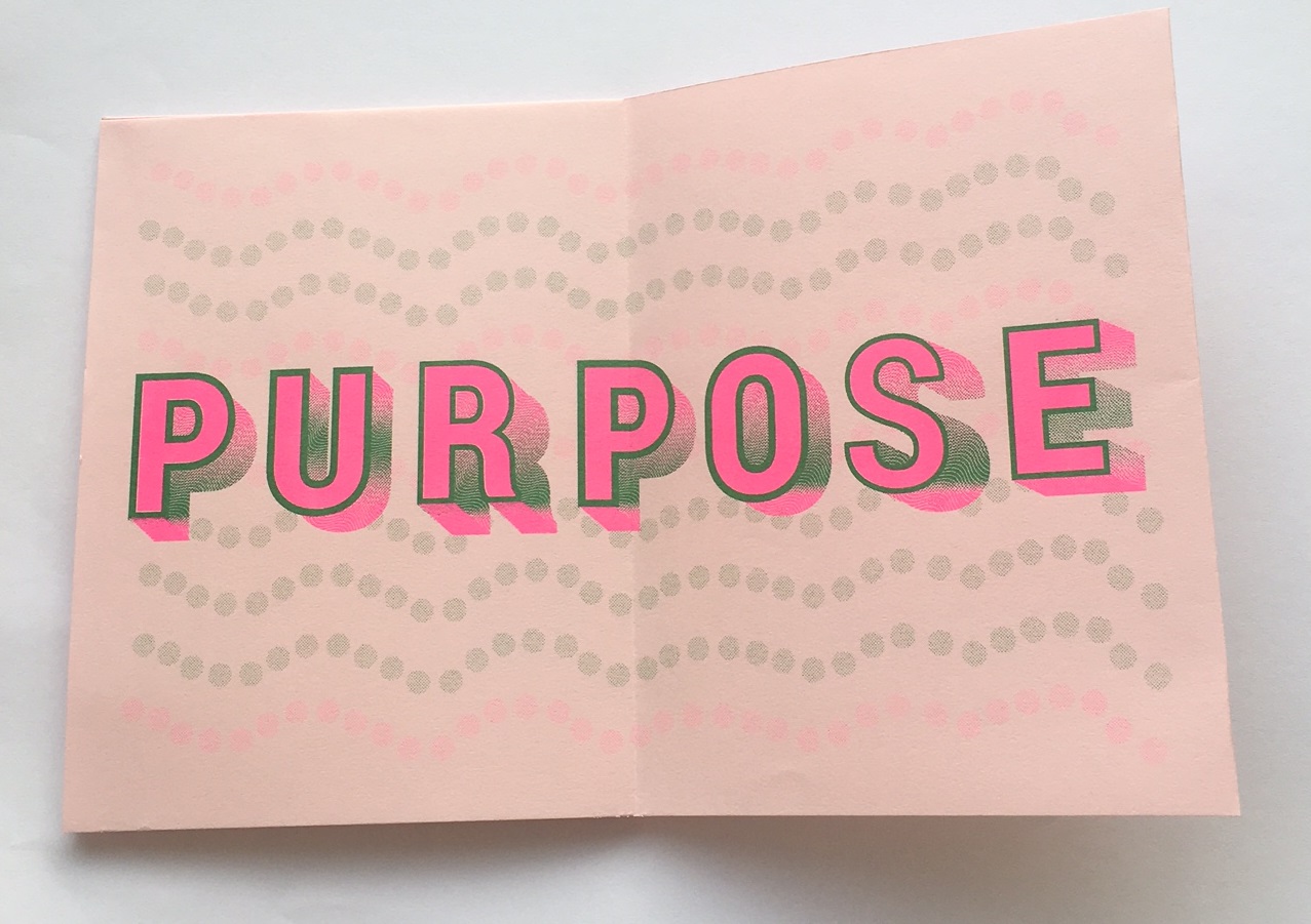
Before coming to St. Edward’s I took a intro to graphic design course at Austin Community College. The class mainly focused on using Adobe Illustrator, a tool that I had never used before. Once starting St. Edward’s I was familiar with Illustrator which helped when starting the first projects in Typography 1, like the monogram. Looking back I feel that I definitely know a lot more with not just Illustrator but also with Photoshop, InDesign, and After Effects. One of the projects that I learned a lot from was the Zine one in Image Methodology. We started off by working with type, and implementing different layers to it, which was new to me as well as the swatch colors and printing them from the Risograph Lab. I feel like it is not noticeable when looking at the finished product, in this case the Zines but there was a lot of tedious work that went into making it. I included some close up images of the type, I had to choose a design to go into it, I chose wavy lines and then used the pathfinder tool to make the white areas negative space. I also made pink rectangles at the bottom of the type to try to give it more depth but it didn’t seem to come across when printed. I feel that doing the gradient was one of the most successful parts of the design, I enjoyed working with green and fuchsia. The way the type is laid out across page to page gives it a sort of structure, as well as the size of the type. I do think that improvements could be made, to the outer stroke of the type because some letters are thicker then others. Going back to freshman year I would not have known how to design a type like this, or set it up to be printed off as a zine. I think that one of my strengths is working with design that is printed out. Not only does it make me feel good when something I created through a computer is brought to life, but I feel that it ends up being some of my best work as also seen in the creation of the matchbooks.
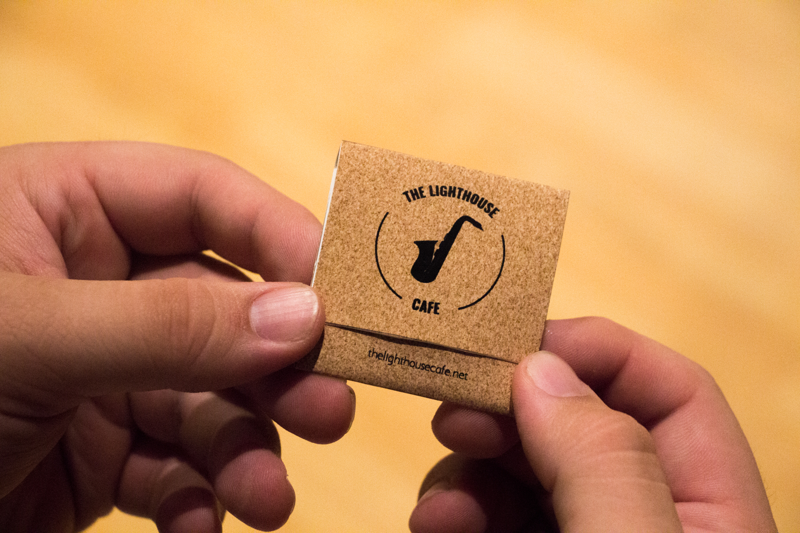
I had to create a design that would act as a prop for the movie La La Land, I chose the Lighthouse Cafe which is a jazz bar in the movie. I wanted the look to be simple and not busy, because I feel that matchbooks in general can be quite minimal and just show a little bit of information. For the front cover of the matchbook I chose a bold upper case font, when doing a mood board for this project I came across a lot of bold fonts, and some script that were used to represent jazz. I used semi circle outlines as a way to connect “The Lighthouse” to “Cafe”. Looking at it now I would go back and make the font bigger, so it is easier to read. I also created the saxophone icon to represent jazz, again I wanted it to have a minimal look so I made it one solid black color. I wanted most of the Cafe’s information like website and address, to be suttle which is why the point size is a lot smaller. I think that the most successful part was the inside cover and the type of font along with what the cafe has to offer. It all came together well to represent a jazz bar, especially with the cardboard cover texture, because in the movie the majority of the scenes are in the jazz players apartment which was very dull. I was also happy with the craftsmanship of the matches, it was very neat and clean.
Throughout the course of my work I feel that I have progressed and continue to progress as I continue to learn different skills. I have come to learn that one of the most important factors in creating a well design is time, and putting in time into the work. There were some projects that I felt were most successful then others because of the time that was put into them. There are other works that something ended up coming up so I did not work on them as much as I should have. I look forward to continue learning more about graphic design and implementing the skills that I learn into my work, and finding a way to dedicate the right amount of time that needs to be put into graphic design.
Links to all projects!
Mapping Project: Cognitive Map