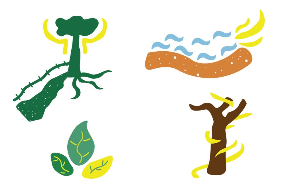
From the process research that we did, we then needed to create a mark to represent our site. The Hike and Bike Trail is 10 miles long and has different areas with benches where people can just sit and reflect, I knew this is what I wanted my identity to be, a place where people can heal and grow. Based on this I decided to create a system to represent some of the different areas from the trail. An area where there was a fence between the trail and grass, where the lake met the trail, and where there were trees without any leaves. I made yellow a recurring color across the marks because that is what represents healing. I also picked colors that one would mostly see while there, brown and green. The marks have an organic and free form feel, almost as if they were hand drawn to represent the calm aspect of the trail.
