
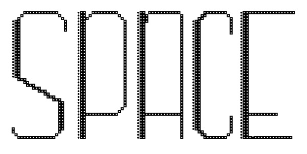
For this assignment we were tasked with designing our own font using the website Font Struct, which uses a proportional grid with individual shapes as a way to create a font. I used squares with a circle inside them as the base for my font, I liked the way they looked like signs that you would see in Times Square New York, with light bulbs inside them. I then wanted to make one side of the letter look heavier, and accomplished that by adding another layer of black squares along with only circles to the left side. I wanted the font to look vertically long as well and did that by having the horizontal line in letters like P,A and E closer to the bottom rather then being centered. I fulfilled the project requirements by creating the letters A-Z, along with numbers, semicolons, commas, and slashes and made it a downloadable font.