I have not taken Advanced Typography thus far.
Author Archives: msipko
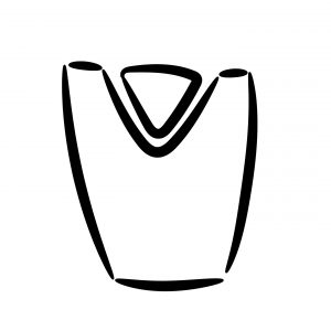
Graphic Design II – Visual Identity: Mark
Reflection
As I explored and researched my location, I discovered the Golden-Cheeked Warbler. I decided to incorporate it into my design and I feel it’s an integral part of all Austin wilderness. As for the rest of the design, I started off with a design to reflect some of the more tradition park logos. Since my concept was “escape,” I then thought about how I could “escape” the generic design. I decided to do so by having the Warbler literally breaking out of the design, showing my concept of breaking away from modernity and escaping to the wilderness. Even where the bird isn’t literally breaking out of the circle, its wings and tail escape the boundaries of the design. I feel this added energy to the design and really encouraged my concept.
Graphic Design II – Process Work/Research
Method 4: Writing
If we ever figure out teleportation, I imagine it’ll feel something like this. The transition from the busy intersection of Mopac and Loop 360 to the Greenbelt is almost instantaneous. The moment my foot leaves the pavement of the office building parking lot and makes a crunch on the dirt path, it’s like stepping into a bubble. Suddenly, it’s as if the land belongs to itself again. Its trees haven’t been uprooted to make room for more suburban housing, the creek hasn’t been dammed up into a reservoir. This place belongs to nature; we’re only visitors.
I never realized how rural the small town in Pennsylvania where I grew up was until coming to Austin. Though I could do without the frigid winters and wet summers, I do miss the feeling of driving down wooded roads on summer nights, windows down to let the sound of crickets and cicadas accent the music playing on the radio. I miss cutting through the forest to get to the baseball fields, having a backyard bordered by woods instead of more houses. Being on the Greenbelt takes me back.
The sun has finally broken through the storm clouds of the weekend, and the glow that bursts through the trees is heavenly. Hannah and I make our way down the path towards the creek. In one hand, I hold the camera I’ve borrowed from the library, snapping pictures of every branch and leaf and spider web, though I can’t quite figure out how to zoom in on the tiny spiders that move gracefully along their silken traps.
In the other hand, Baron tugs on his leash, joyful to be free of the confines of the house. I try to hold him long enough to get a shot of a small red flower, but I know the Australian shepherd could easily win this tug of war if he was brave enough to venture more than twenty feet away from someone who can rub his belly.
The water is still out of sight, but we can hear a few other people and their dogs. Is it possible to be more than a few yards away from a dog anywhere within Austin’s city limits? I wonder to myself as we pass a woman and her Labrador. Hannah holds Mingo close to her; it’s funny how she gets so protective of Baron. Though she’s bigger than most of the dogs we come across, she’s still at least thirty pounds smaller than Baron, who can definitely protect himself if he needs to. I wonder if she’s just jealous; worried that someone might try to steal her man. Do dogs get jealous?
We find an opening in the wooden fence that runs along the path and go through. Baron decides—as usual—to take the most complicated route: under one of the slats in the fence, wrapping his leash around of the poles and knocking the vertical slat off its perch. I groan as I try to guide him back through the fence without dropping the camera. He expertly manages to make it worse, so I let go of the leash and let him figure it out on his own. Finally, he wiggles free and I grab the leash before he can run off.
We can hear the creek trickling and in just a few short strides it’s finally in view. The dogs immediately plunge into the crystal clear water. If I didn’t know any better, I’d say it looked good enough to drink right out of the palms of my hands.
Across the stream there’s a sheer cliff with an overhang, cactuses populating the top of it. A group is setting up ropes and harnesses to make the climb, and I admire their skillful work. The path continues on the other side, and we look for a shallow part of the creek to cross. I slip off my boots and socks, tying them together to hang around my neck. I pull on the straps of my backpack so it doesn’t hang too low and wet all of my belongings.
The first few steps in the water are jarring; it’s chilly and my bare legs are covered in goosebumps. But my body quickly adjusts and I trudge on, the water reaching just above my knees. As we pass the halfway point, the water doesn’t seem to be getting shallower. It only looks about knee deep, but as the water passes my hips we realize that we’ve made a terrible mistake. Mingo doesn’t seem to have a problem; she swims to the rocky bank and shakes the water out of her fur, patiently waiting for us to reach her. Baron, on the other hand, has planted himself firmly in the middle of the creek where the water just reaches his chin. I try to coax him towards me but he just starts whining. What a big baby.
Hannah is already out of the water, trying to squeeze it out of her shirt and pants. I’m still waist-deep, holding my bag above my head so none of my electronics get waterlogged. I plant my feet on the rocks, pull the leash over my shoulder and start towards the bank. Baron gives a little, but I still need to make a big lunge before he finally gives up and starts swimming over. I reach the opposite bank and set my bag down before pulling myself out of the water. Baron jumps out and promptly douses us with all the water trapped in his coat.
Hannah and I both groan, but give into laughter at the true hilarity of the situation in retrospect. We rid ourselves of as much water as possible before slipping our shoes back on and moving forward on the path.
Reflection
I chose to highlight my work for our writing method in research and process of our design. As a Writing major, I feel it’s important to merge my disciplines and see how I can use one to enhance the other. Though there isn’t a lot of visual design here, I feel this piece shows one of the steps I took to create the concept of my final design (the mark). I was able to explore the feeling of my location, using imagery and figurative language to paint the emotions of being at the creek. By focusing on the transition from modernity to nature, I was able to discover my concept: escape.
Image Methodology
I have not taken Image Methodology thus far.
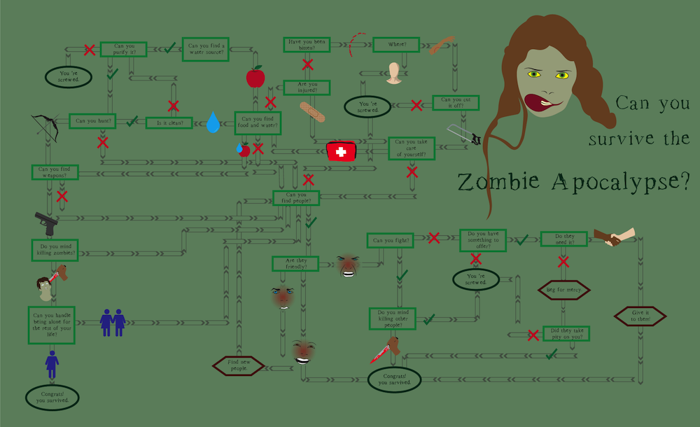
Graphic Design I – Cognitive Map
Reflection
For this piece, I focused more on the design. I narrowed down the content by replacing the options at each decision with icons. I also focused on the flow of the design, using the arrows to direct the viewers’ eyes to each step. Since the basic concept of the design was to present the questions and decisions, I focused on making those as clear as possible. I used different shapes and colors to denote the different types of text: questions, commands, and results. Decisions either got an icon or a check/x. I feel though I used color and images to evoke the feeling of a zombie apocalypse, I could have gone further and used texture as well to create a gritty mood. I feel I followed this idea with my font choice, option for something readable but visibly “destroyed.”
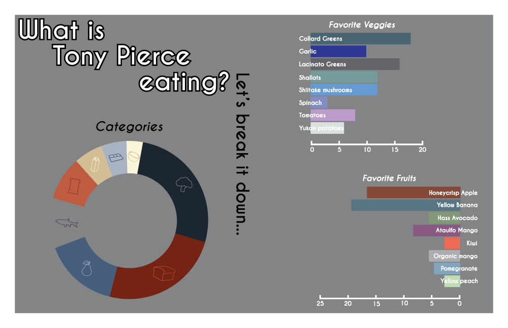
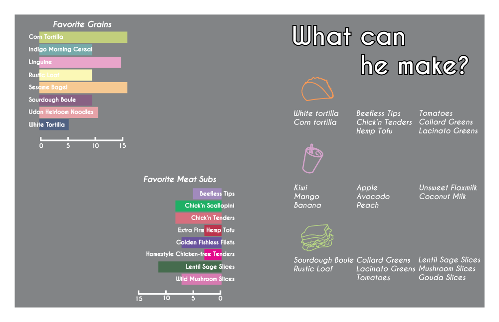
Graphic Design I – Information Map
Reflection
Since this concept was about tracking information, I wanted a design that showed the process I took to reach my conclusions and final design. I showed how I broke down the receipts we were given, albeit a much more condensed version of my thought-process. Since this design was rather content heavy, I wanted muted colors that caught the readers eye but didn’t distract them long enough to keep them from moving onto the next part. Because the ultimate goal was to present information, I did include basic charts, but I expanded on the labeling. I eliminated the y-axis on the bar graphs and opted to put the labels right on top of the information. I also focused on using as little words as possible to make the information communicate through symbol instead, such as in the pie graph.
Graphic Design I – Artifact Map
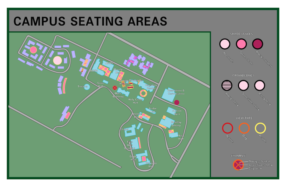
Reflection
For this map, I wanted a design that was simple and communicated its message. I came up with a simple legend that worked on multiple levels to communicate the different qualities of the seating areas around campus. I chose muted colors for the background and buildings and bright ones for the seating areas so they would stand out more, as they’re the most important piece of information. I definitely found scale to be challenging, and I feel that limited the amount I could communicate in my design. For instance, it’s difficult to see the stripes on the seating area around Jo’s. If I had the chance to move forward with the design, I would focus on how I could work with the scale to make the concept communicate better.
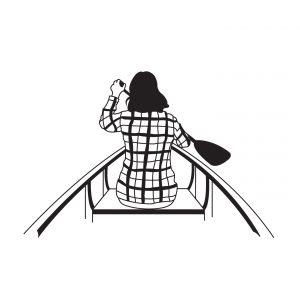
Graphic Design I – Symbol Matrix Methodology
Traced Images


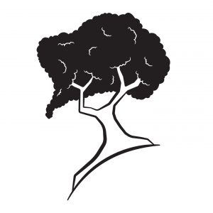
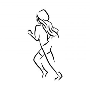
Stylized Images

Non-Objective Images

Combination Images


Reflection
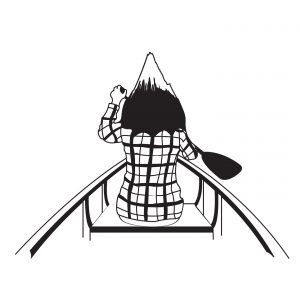
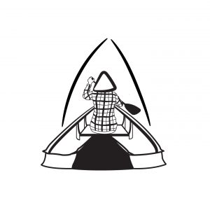
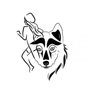
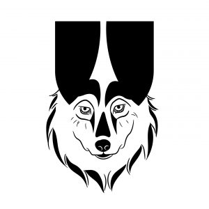
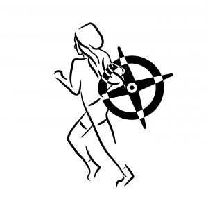
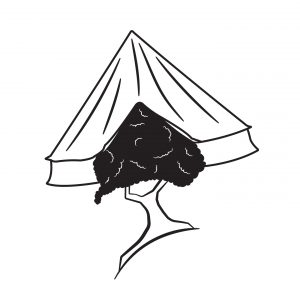
My concept for these symbols was “Adventure.” I wanted to develop icons that could possibly be used by a company that sends people on non-traditional vacations, like hiking through the mountains or camping in the desert. I wanted my icons to reflect things like challenges or some things that are already associate with adventurous spirits. I went in this direction for the traced images, choosing symbols that could easily be associated with some of the activities my “company” would suggest (mountain-climbing, canoeing, camping). For my stylized images, I wanted them to be more broadly interpreted. Though these images were literally a wolf, a tree, and a girl running, I wanted them to echo the adventurous spirit (wildness of the wolf, strength and determination of trees, the girl is full of energy). As for the non-objective images, I wanted to focus on first creating a design that was seemingly meaningless and then assigning it meaning. The meanings I gave them were primal, fire, and exploration. Even though alone the symbols had no meaning, they became meaningful when they were part of the group. As I combined the icons, I went with the approach of designing first and then seeing what meaning emerged as I designed. As the physical designs merged, so did the concepts behind them.
Typography I – Wikipedia Reader

Full PDF
Reflection
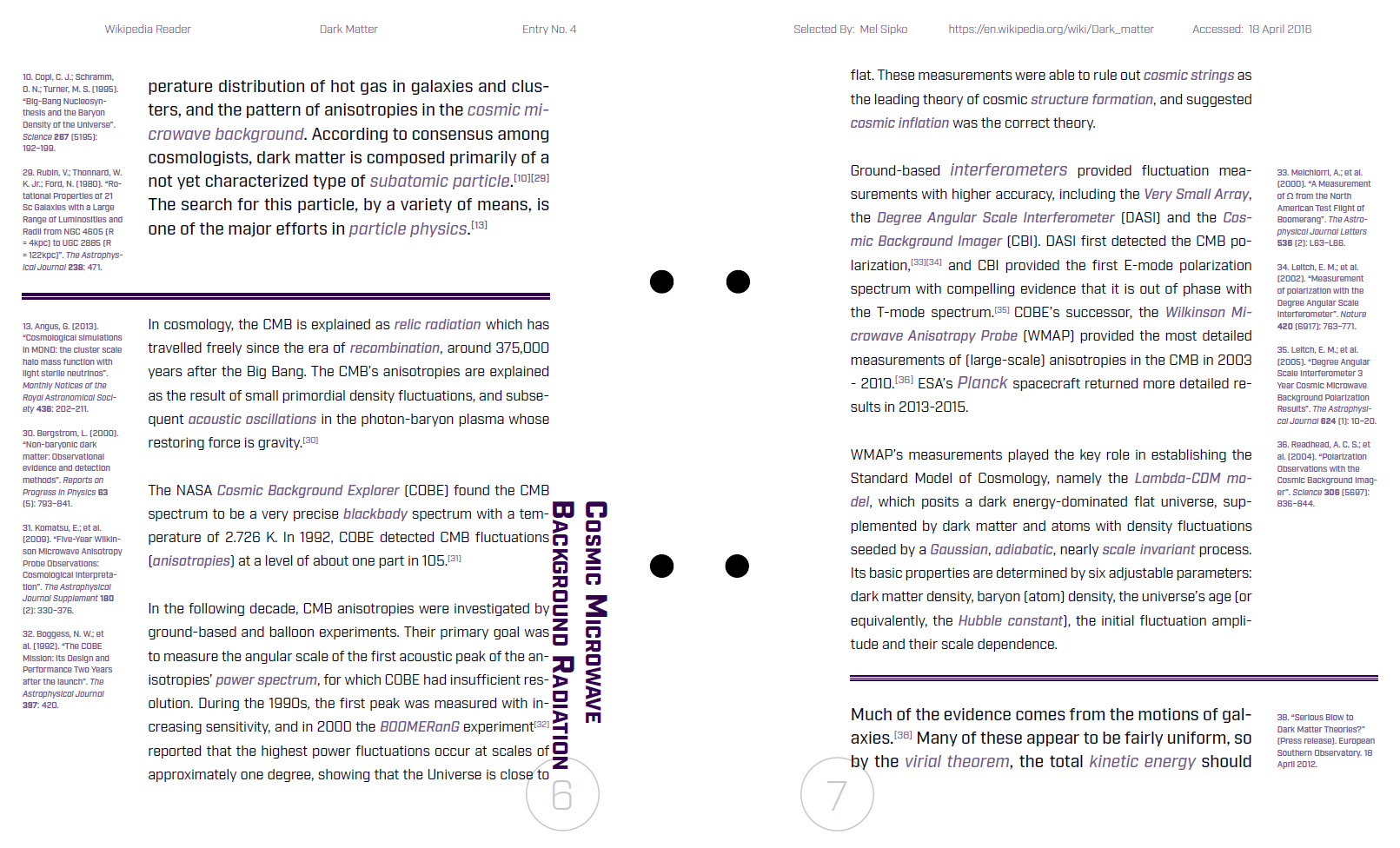
I wanted this design to focus on the content, since it is, after all, a reader. I had to ask myself how to make the booklet readable but also interesting to look at. Since dark matter is such a strange and not well-understood topic, I wanted to break some rules the same way dark matter does while also remaining subtle. This inspired be to have the section headers alight vertically alongside their content, instead of the way the Wikipedia page has them. Granted, this presented some challenges when the sections were rather short, and I’ll admit the design became rather distracting at those points. But I pushed through and focused on other subtle ways of breaking the “rules.” Though I had two separate columns for content and footnotes, I let the divider lines cross over the column boundaries. I also decided to add some color, keeping the tones subdued so as to add that moment of interest without distracting from the content, such as in the headers and keywords throughout the content, as well as to set the footnotes aside from the content.
Typography I – Proportional Grid Booklet


Full PDF
Reflection
For this project, I wanted to see how I could put the speaker into the design. Michelle Obama is one of, if not the most educated and well-spoken First Ladies in US history, so I chose a design that was neat and simple, and also strong and sturdy. I showed her sophistication in my font choice: the neat and measured strokes, a strong foundation in the serifs. I also felt justifying the paragraphs would echo that sense of strength and determination that resonates is Mrs. Obama’s words. Like the specimen sheet, I wanted the content to be the focus of the piece, not the design. Because of this, I opted not to make the pull quotes too flashy. I chose to highlight them in blue since it’s a soothing color and doesn’t draw too much attention.