Reflection
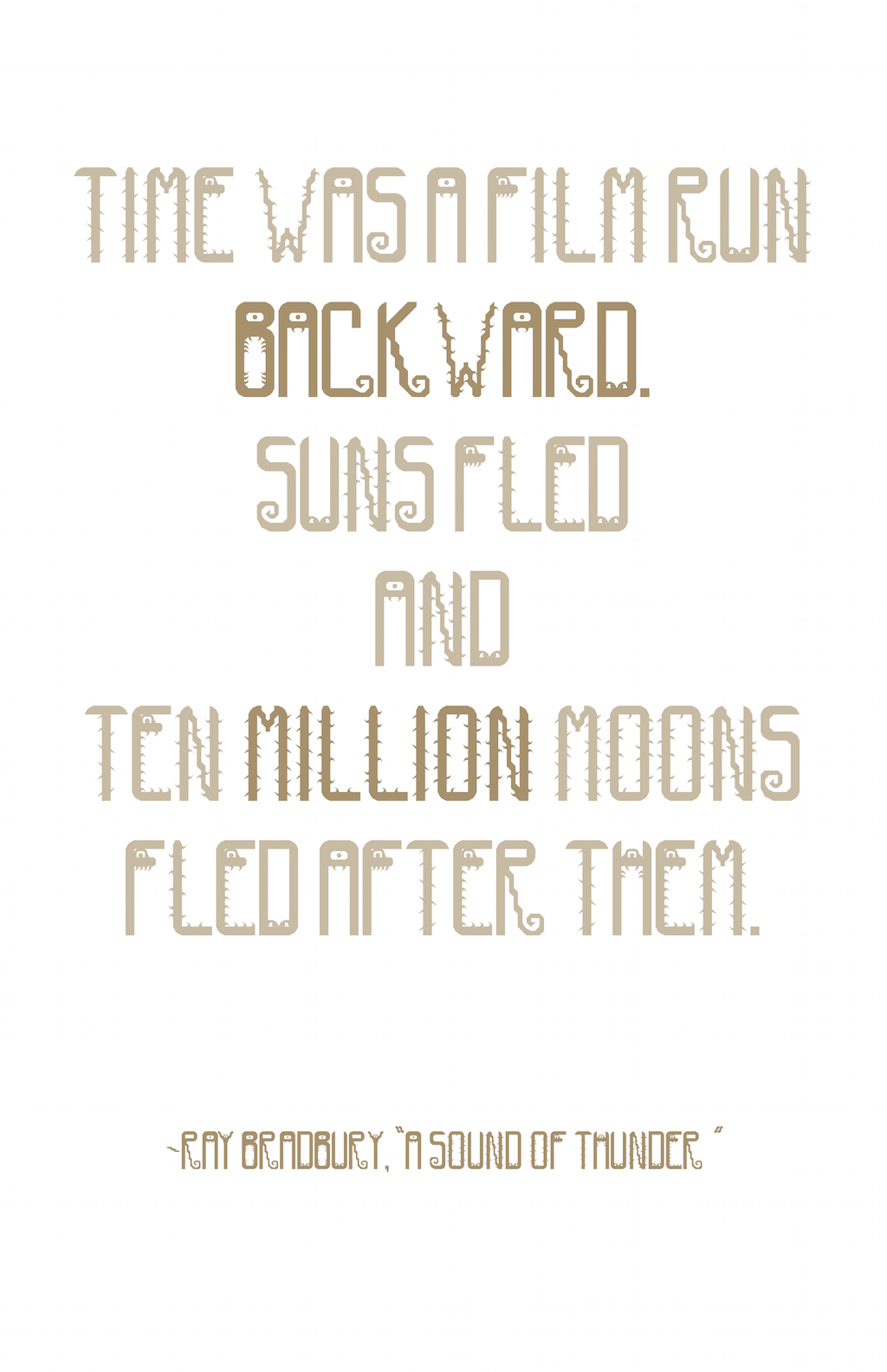
This was one of the most exciting projects for me to make. Jimmy gave us each a quote from butdoesitfloat.com. Mine was from Jeff VanderMeer’s “Annihilation,” and I named my font after the first part of the quote: “I leaned in closer.” I looked into the book for inspiration, and when I learned it was about exploring the jungle, I immediately got the idea of a creepy-crawly font. I wanted to capture the spirit of the jungle, of the danger the characters face and the feeling of being watched in the eyes of the A’s, E’s, etc. For the posters, I wanted to mix the content-centered design of the specimen sheet we’d produced earlier with the wildness of the font. I chose the simple, centered design to present the font, like in the second and third designs. I then considered how I could add some chaos. For the first design, it was by tilting the orientation of the design and adding a different colored drop-shadow. With the second poster, it was playing around with the risograph’s opacity features. In the third design, I added one big letter I wanted to show off to off-set the neat and compact specimen. For the final poster, I wanted to push the boundaries of disorder. I wanted to capture that jungle spirit–the danger and the wildness–while still remaining concise and readable.


