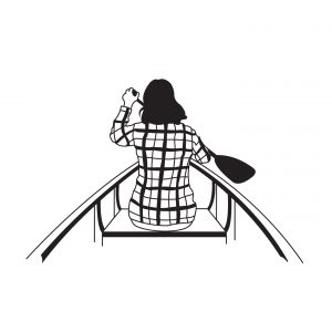
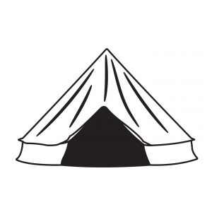
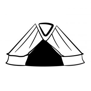
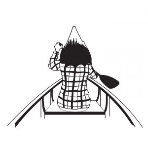
Traced Images

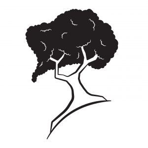
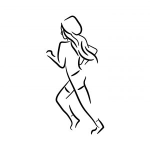
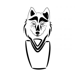
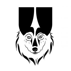
Stylized Images

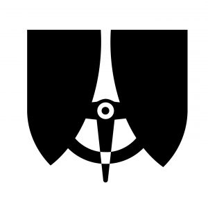
Non-Objective Images
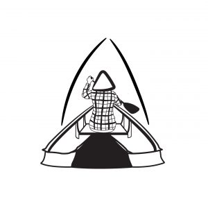
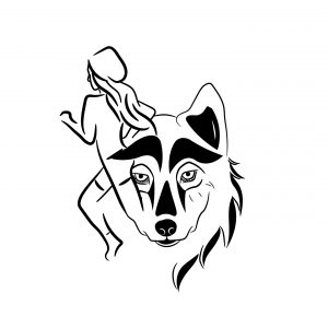
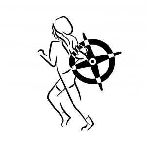
Combination Images

Reflection
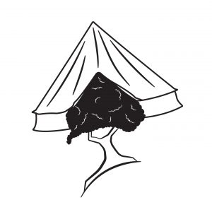
My concept for these symbols was “Adventure.” I wanted to develop icons that could possibly be used by a company that sends people on non-traditional vacations, like hiking through the mountains or camping in the desert. I wanted my icons to reflect things like challenges or some things that are already associate with adventurous spirits. I went in this direction for the traced images, choosing symbols that could easily be associated with some of the activities my “company” would suggest (mountain-climbing, canoeing, camping). For my stylized images, I wanted them to be more broadly interpreted. Though these images were literally a wolf, a tree, and a girl running, I wanted them to echo the adventurous spirit (wildness of the wolf, strength and determination of trees, the girl is full of energy). As for the non-objective images, I wanted to focus on first creating a design that was seemingly meaningless and then assigning it meaning. The meanings I gave them were primal, fire, and exploration. Even though alone the symbols had no meaning, they became meaningful when they were part of the group. As I combined the icons, I went with the approach of designing first and then seeing what meaning emerged as I designed. As the physical designs merged, so did the concepts behind them.