Full PDF
Reflection
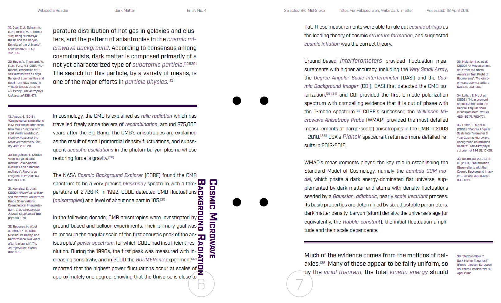
I wanted this design to focus on the content, since it is, after all, a reader. I had to ask myself how to make the booklet readable but also interesting to look at. Since dark matter is such a strange and not well-understood topic, I wanted to break some rules the same way dark matter does while also remaining subtle. This inspired be to have the section headers alight vertically alongside their content, instead of the way the Wikipedia page has them. Granted, this presented some challenges when the sections were rather short, and I’ll admit the design became rather distracting at those points. But I pushed through and focused on other subtle ways of breaking the “rules.” Though I had two separate columns for content and footnotes, I let the divider lines cross over the column boundaries. I also decided to add some color, keeping the tones subdued so as to add that moment of interest without distracting from the content, such as in the headers and keywords throughout the content, as well as to set the footnotes aside from the content.

