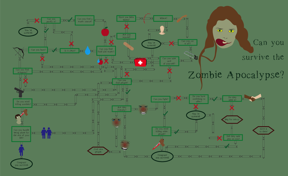
Reflection
For this piece, I focused more on the design. I narrowed down the content by replacing the options at each decision with icons. I also focused on the flow of the design, using the arrows to direct the viewers’ eyes to each step. Since the basic concept of the design was to present the questions and decisions, I focused on making those as clear as possible. I used different shapes and colors to denote the different types of text: questions, commands, and results. Decisions either got an icon or a check/x. I feel though I used color and images to evoke the feeling of a zombie apocalypse, I could have gone further and used texture as well to create a gritty mood. I feel I followed this idea with my font choice, option for something readable but visibly “destroyed.”