I saw the Style Lesson project as a way to gain an understanding on the various audiences and views around us. Each style has its unique characteristics and its own set of “rules” I had to follow. My partner and I did research on each style to know what is appropriate to use. With this project I learned how a style can be adapted or changed, depending on who your audience is. I will use this for when I design posters, making sure I use the appropriate “rules” for the audience/environment I am designing for.
My matchbook design was based on the movie Snowpiercer. The design structure and color scheme are based on the post-apocalyptic theme of the movie. I wanted to use aspects from the movie, such as the tone, color scheme and environment. I used the dark blue green as a representation of the post-apocalyptic era of the movie. I took the “W” from the Wilford Machinery that was used in the movie, it represents the power it holds. Lastly, the square pattern on the inside as a representation of the tracks, but this is something I would try to improve. Maybe by adding actual train tracks, or the gears of the train.
This map was designed to show the flow of a person’s decision process. I went with three choices that a person studying for a test would think through. I designed icons to represent studying, a test and time. Something I can improve on the poster is thickening the stroke weight of each icon, that way they will not fade into the background. I need to also add more icons to represent other parts of the decision process. One more thing I would change is the typeface I chose for the title, it looks out of place due to it being too narrow.
Decision Map PDF
This map is design as a visual representation of data obtain from “Tony Pierce’s” income spending. I represented 3 different ideas with 3 different graphs. The pie chart for monthly spending, the line graph for weekly spending and the bar graph for gas each week. I would improve this by adding more visuals to each of the graphs to represent what each graph is talking about.
Graph PDF
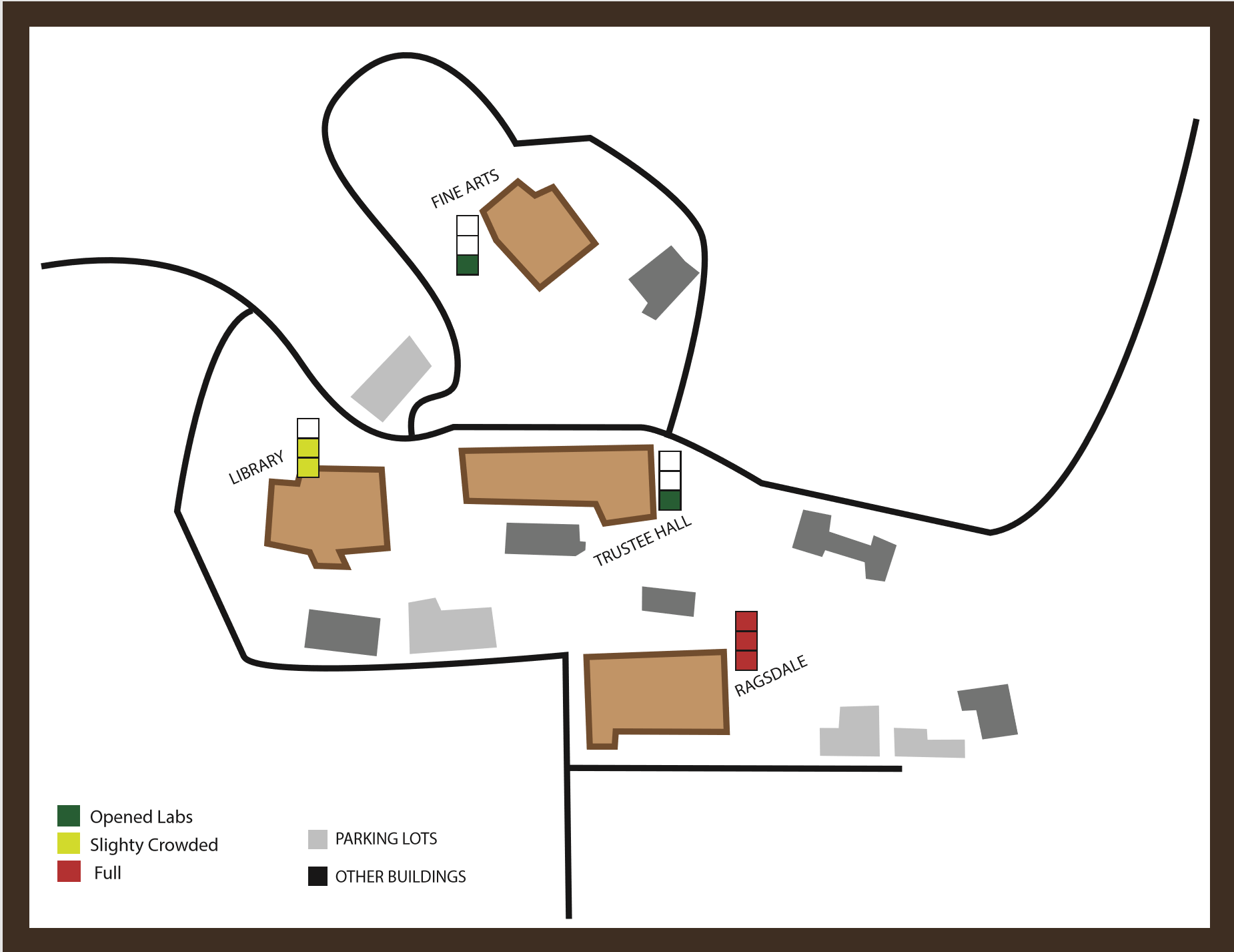
This map was designed to show how crowded the computer labs in St. Edward’s were on a specific day and time. I chose to map how full a lab was because I wanted to be in the know of what day time was easiest for a person to get access to a computer. I used the stop light colors to show when a computer lab had open spaces and when it didn’t. Green was a go, yellow was slightly crowded and red meant it was full. I design the map of the University because there are multiple labs around campus. I used color to emphasize the buildings that had a lab inside. I included the streets the surround the areas, so a person won’t get lost. What I should’ve added to the design is the name of the streets and the surrounding buildings to make it easier for another’s eye.
Map PDF
I wanted my symbol to be a representation of Hunger and Homelessness. I decided to create hybrids that represented the idea of what homelessness means. My design incorporates a house, hands asking for help, and torn clothing. I created hybrids that emphasized the theme of being homeless. The first one is a merge of a tattered shirt and the asking hands. This was a design based on what someone sees physically when that come across a person who is homeless. It represents the torn-up clothing people experiencing homeless can afford and the gesture of asking form help. The second design represented isolation. People who are homeless get isolated and branded as something completely different than “normal” people. Lastly, the hybrid including the asking hands merging with a house and earth. This represented giving a home to people around the world who need it.
Vinyl PDF
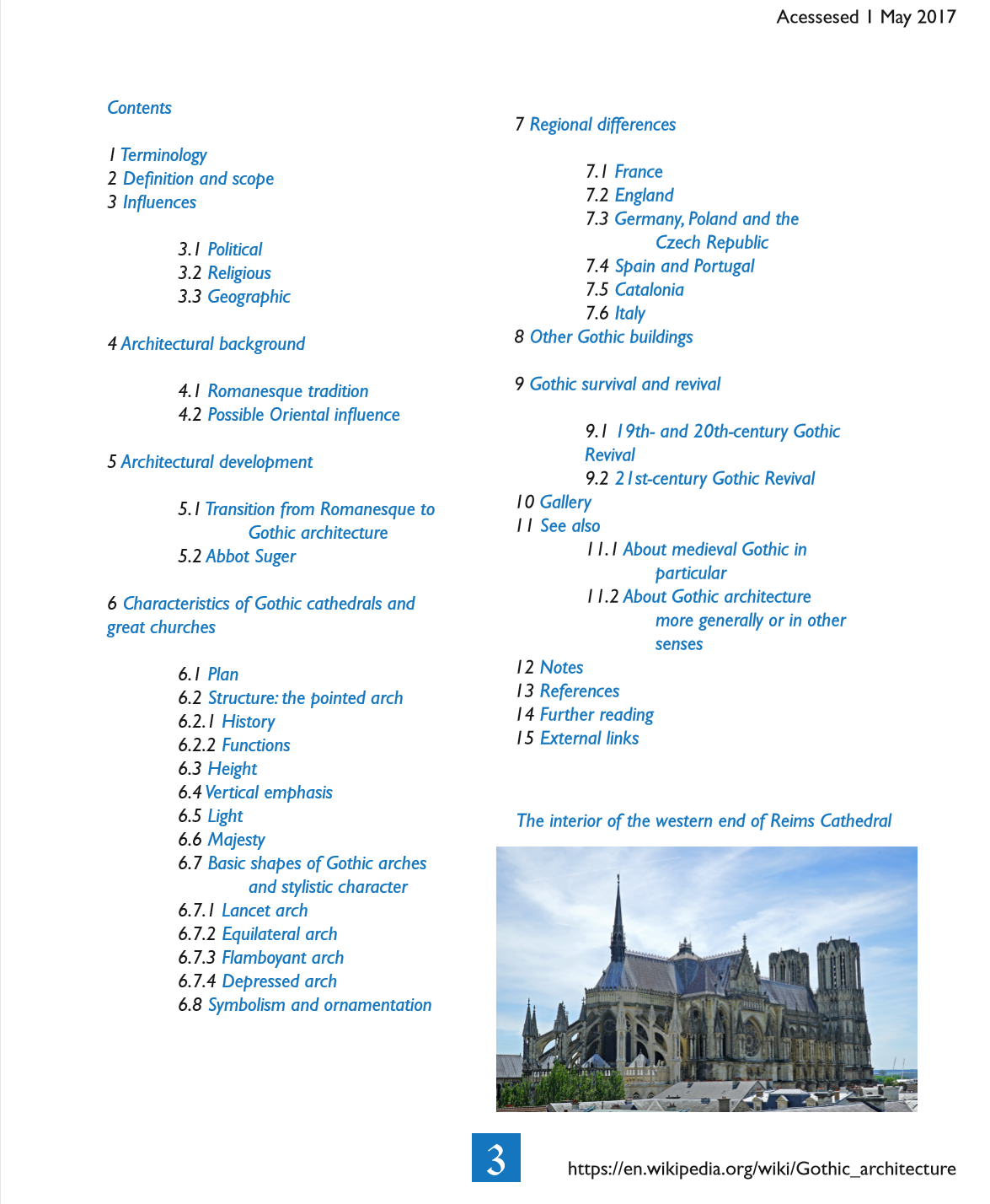
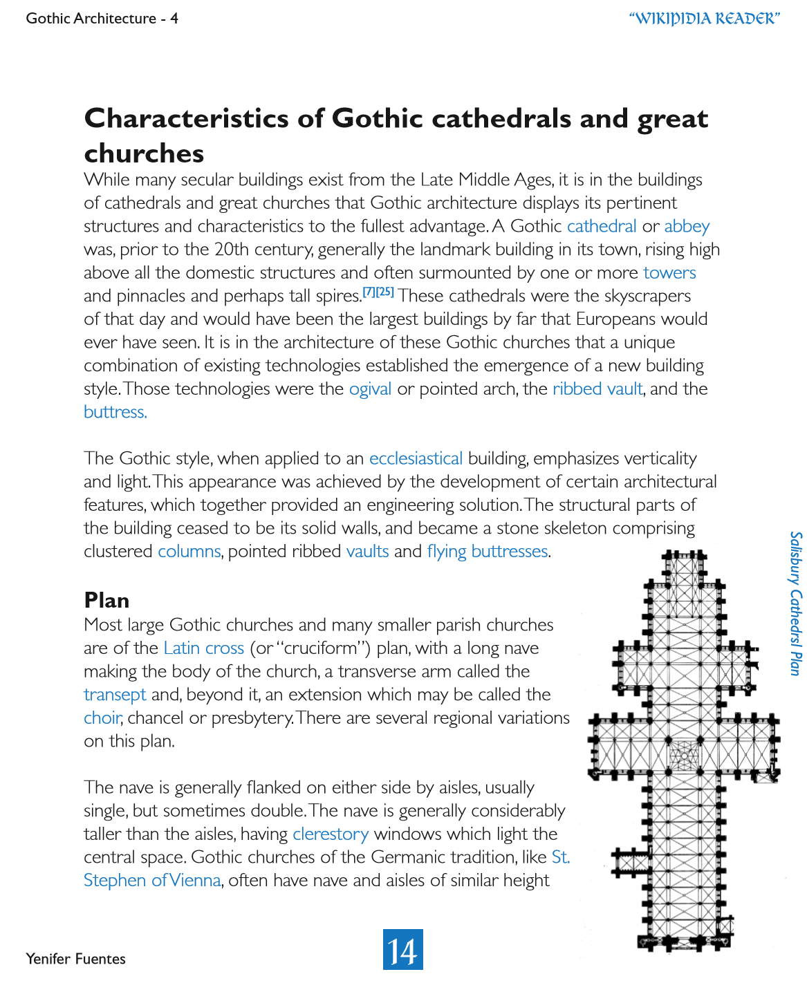
For this design, I use a colored font for the table of contents and to highlight the words that were going to be described in the index. I decided to go with blue because many of the photos included the blue sky and the cathedral windows had many assortments of blue on them. I included photos for the cathedrals that were mentioned in the text context or to have a visual example of the many things a cathedral has. Something I would change is the font of “Wikipedia Reader” on the right corner, the font is hard to understand and it has to much going on.
Wiki Reader PDF
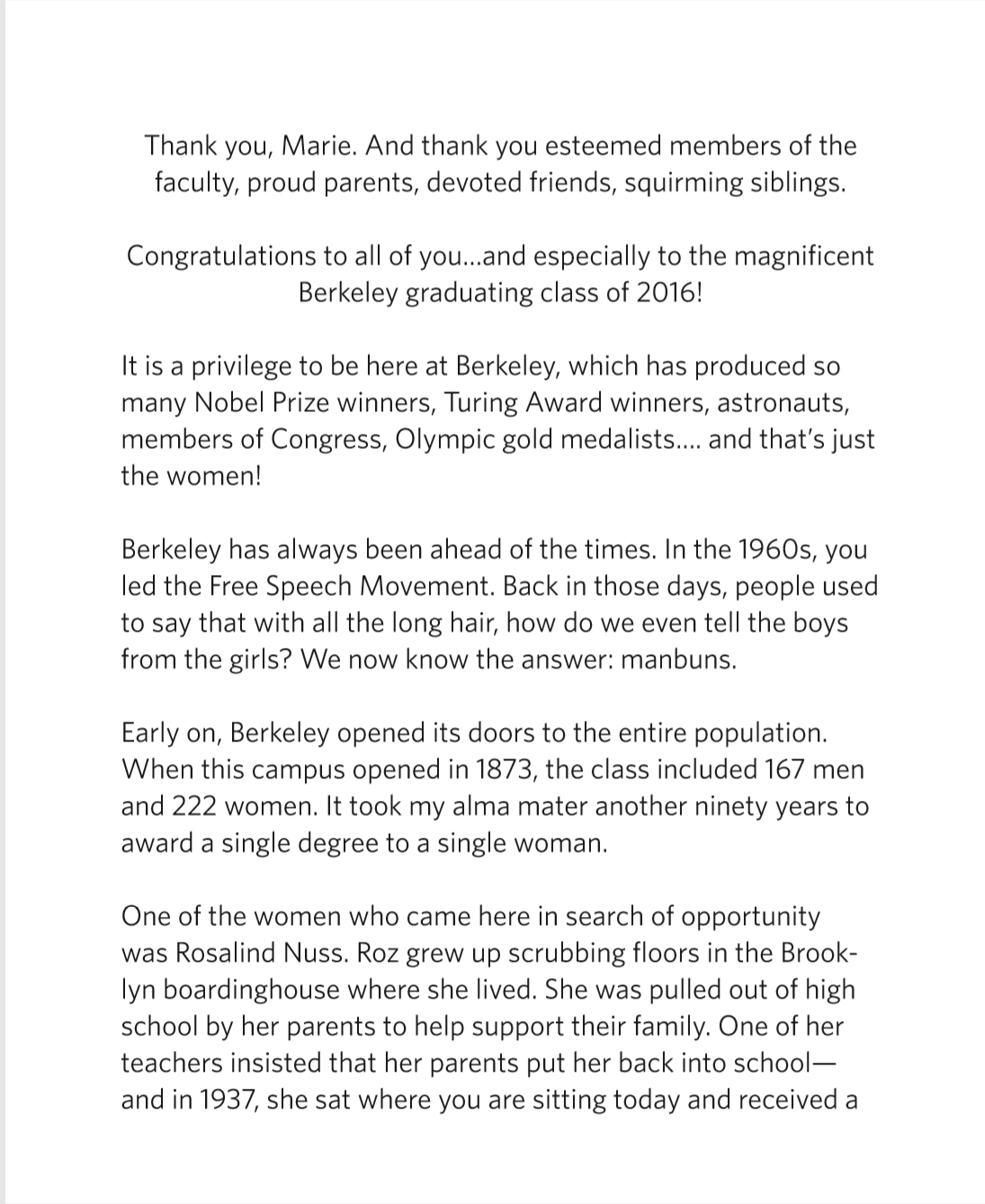
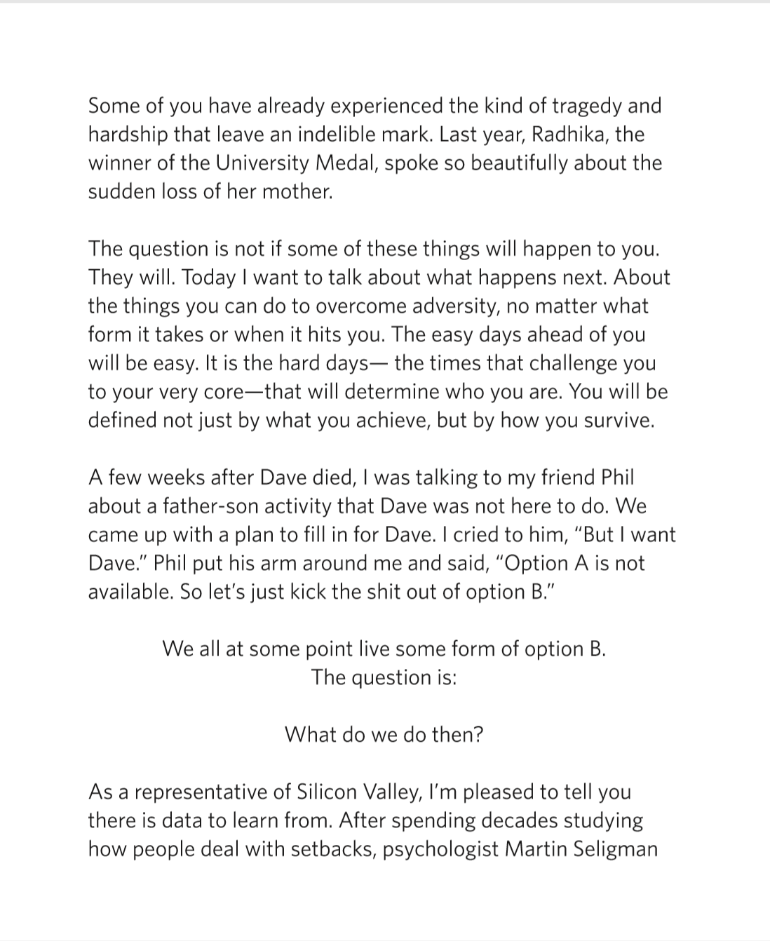
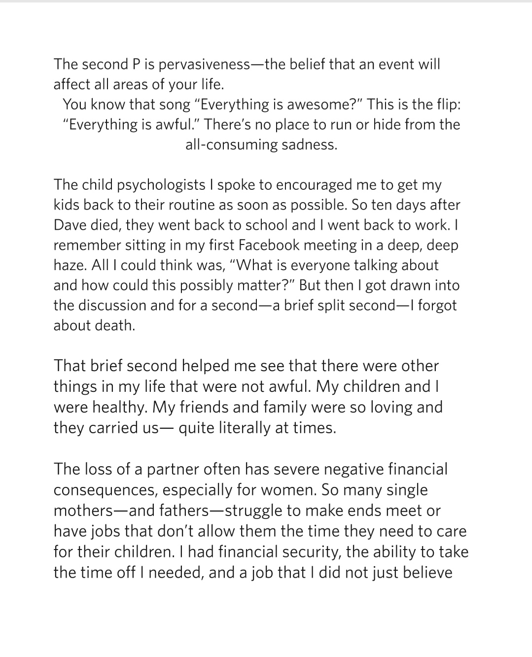
The front and back cover of the booklet display my typeface, Let It Evolve. I used it for the title and for the paragraph at the end. Inside the booklet, I wanted to emphasize the paragraphs that seemed important by centering them, but I soon realized that I could’ve done something different with that. the alignment of the paragraphs should be the same because by centering certain parts, it made the layout awkward. There was no connection at all with what was going on. I learned that if I wanted to highlight important parts, I could have pulled out the text or quote rather then centering it .By pulling out the text I can easily make that fit the design and not disrupt the smoothness of the layout.
Graduation Grid Booklet PDF
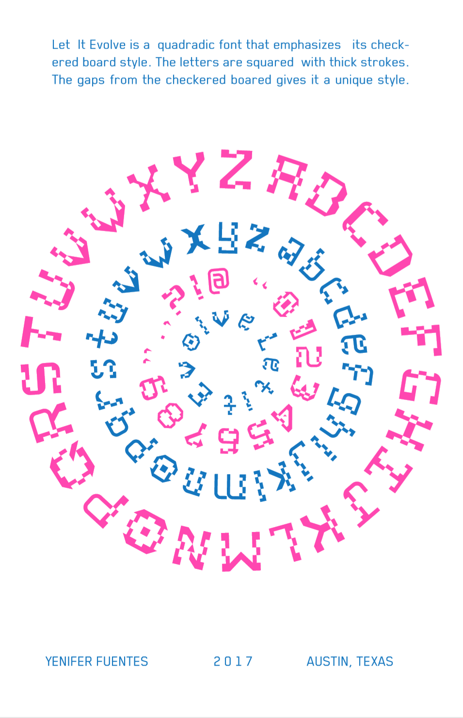
The specimen posters were used to display my typeface, Let It Evolve. For the first poster, I used the circle within a circle to emphasize the letters A-Z, both in upper case and lower case form. The shape of the circle help maintained the fact that my typeface is a quadratic font. It highlights the checkered patterns and the thick strokes. The second poster has only the numbers and the name of the typeface. Each number can be seen clearly, and it gives attention to the detail of each number. How every one of them shows off the same checkered pattern as the letters in their unique way.
Specimen PDF
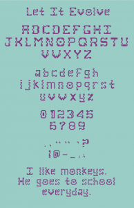
The displayed typeface is called Let It Evolve. I wanted to create a geometric kind of typeface that uses thick strokes and patterns. I decided to use straight lines and a checkered pattern. This helped me emphasize the quadratic aspect of each of the letters. The checkered pattern gives the type face a unique style, but sometimes it makes the eye loose focus because of the many gaps. From this project I learned that I need to use less gaps for the checkered pattern, but have more spacing in between each letter. The words in the sentences are a little too close to each other and they need more room to make out where one word finishes and where the other starts.
Type Display PDF
