03
Apr
2018
Apr
2018
Wikipedia Reader
categories: Uncategorized
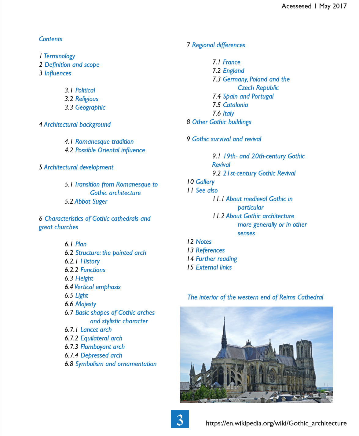
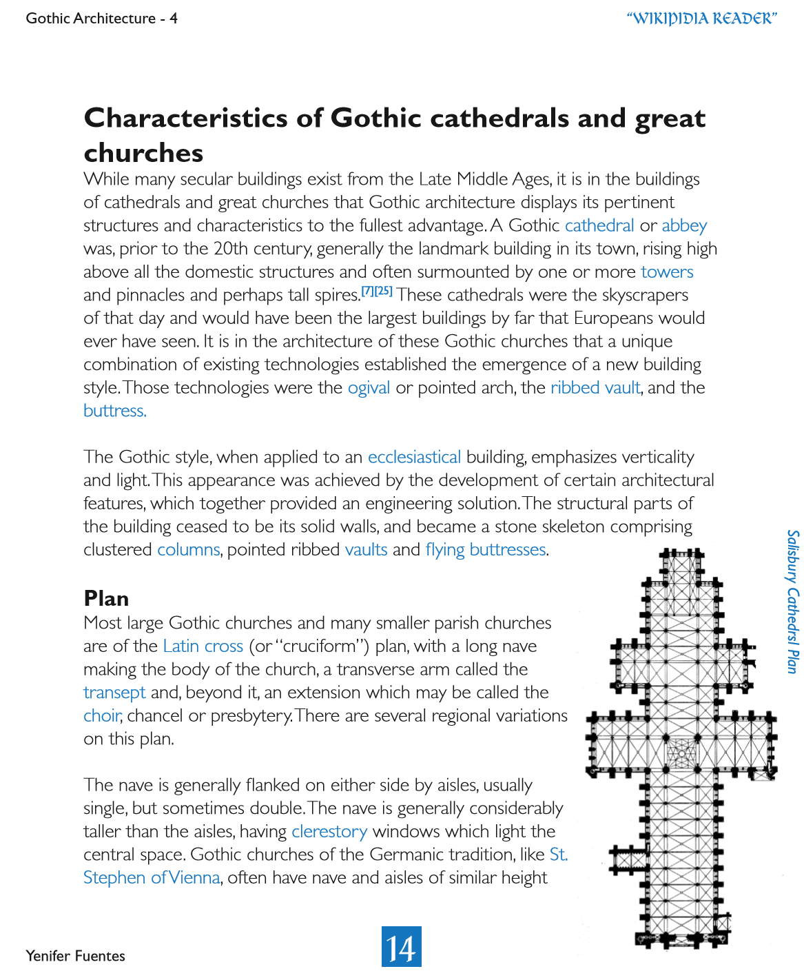
For this design, I use a colored font for the table of contents and to highlight the words that were going to be described in the index. I decided to go with blue because many of the photos included the blue sky and the cathedral windows had many assortments of blue on them. I included photos for the cathedrals that were mentioned in the text context or to have a visual example of the many things a cathedral has. Something I would change is the font of “Wikipedia Reader” on the right corner, the font is hard to understand and it has to much going on.


