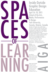
 For this project my main challenge was dealing with a predetermined space. I knew I wanted the name of the conference, “Spaces of Learning” to convey meaning within itself. I also initially struggled with determining how small of a point size I could go with the type. I wanted the various sizes of the type to be completely readable while standing from one point. I didn’t want a person reading this to have to move forward and backwards in order to read this poster. For this project I came up with a functional design that created multiple visual lines with type. The clusters of type in this posters fit in with each other. I learned how to deal with space in this poster. I also learned to further examine the relationship of type size and and the space it takes up.