For this project I was tasked with making my own weather report. I completely underestimated the amount of work it would take to complete this project. I did, however, enjoy its massiveness. This project helped me organize various systems in place. Making the icons and objects used in the video was its own monster. Applying a similar design aesthetic to the complete project before importing it into after effects was interesting. I don’t like the way the video ends. I should have done more in order to make the video look finished. This project helped me relay various types of data in a relevant format.
Monthly Archives: March 2016
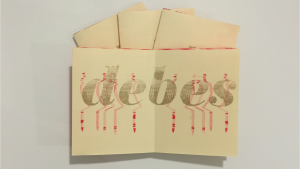
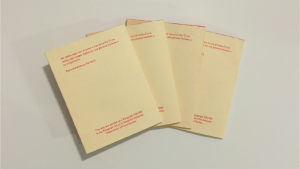
Zine
Interface
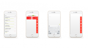 The challenge of this project was to relay a set design aesthetic into a phone screen. Issues that came with this project were to completely apply a set of numerous rules. It was a bit difficult to try and apply preexisting rules without forgetting one. This project was helpful for projects where we have to interpret the ideas of others.
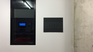
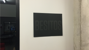
Plotter Poster
Mapping Project: Cognitive Map
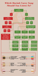 This project challenged me and helped me understand the scale of a concept. If we had an initial idea too big or wide our map would be too long, complicated, and have unnecessary structure. The unnecessary structure makes a map a mess and is not visually pleasing. If our idea was too small there would really be no distance to be travelled within the map. Through this project I was able to understand that an Idea needs content in order to make it flow. I was also able to rationalize data in a conceptual manor.
Mapping Project: Information Map
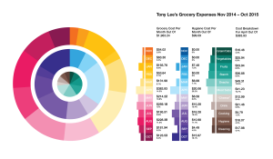 The objective of this map was to relay given information in a useable way. This map has extreme contrast from the left and right side and has vivid colors. I felt it important to condense the pie charts into a single body. I felt that by uniting them they would make a system that spoke higher to the information they relayed. The information on the right is the same data revealed in a different way. Through color I was able to link my designs without overbearing and unnecessary text.
Mapping Project: Artifact Map
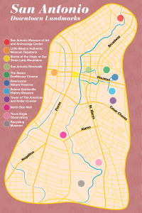 This project helped me understand proximity and scale. The layers on this map helped me easily categorize data. Because clutter can happen so easily with this map I wanted to make it look as smooth as possible. I felt that adding too many symbols and shapes would have made it an illegible map. I purposely tried to use the slightest shift in colors and line weights in order to avoid a mess.
Symbol Methodology
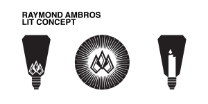 For this project we were tasked with developing various symbols for a single concept. Trough this project I was taught how to master symbolism. Abstract symbolism was the hardest to harness at first, I now feel comfortable with it. The fusing of symbols was introduced in this project. I feel that learning this was the most profound part. I mixed literal and abstract symbols and then reworked final products.
Type Specimen Book
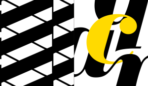
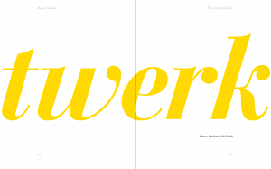
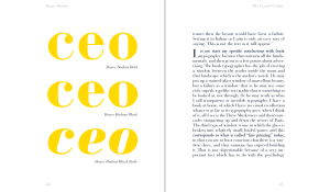 The objective of this project was to display a type family in action. I compared various weights of the type family. I observed the extreme contrast of this type family and certain faces while also drawing attention to letter forms. Through this project I was able to learn the very basics of book design and understand how easy it is for a book to grow in size. Because this book was saddle stitched various factors came into place. There was over hang, and I wanted to make my book so that it wouldn’t be so obvious. Attention to detail was key in this project. The inner pages of my book align perfectly throughout.
Typographic Poster
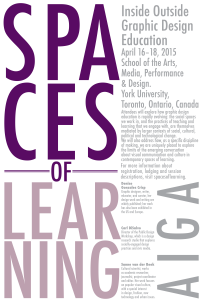 For this project my main challenge was dealing with a predetermined space. I knew I wanted the name of the conference, “Spaces of Learning” to convey meaning within itself. I also initially struggled with determining how small of a point size I could go with the type. I wanted the various sizes of the type to be completely readable while standing from one point. I didn’t want a person reading this to have to move forward and backwards in order to read this poster. For this project I came up with a functional design that created multiple visual lines with type. The clusters of type in this posters fit in with each other. I learned how to deal with space in this poster. I also learned to further examine the relationship of type size and and the space it takes up.
