Blog Post #3 : Anna Dittmann
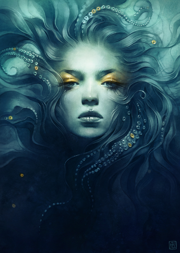
One of my favorite artists is Anna Dittmann, a freelance illustrator known for her usually monochromatic portraits. While her monochromatic color schemes are not usually something that I would pursue in my own work, her interpretations of organic elements and textures as well as the anatomy of her works are something that is to be envied.
Her interview states her process as well, with her explaining how she has a vague concept and just plans it along as she paints. She also uses references and textures on different layers in order to achieve the desired effect. She also explains the reason for her color palettes, and how they are inspired by natural elements. The chalky textures of her brushes, given how her medium of preference is digital art, is something that I want to imitate. However, an important thing to note is that she was mostly self taught up until she enrolled in SCAD, a motivational thing to hear given her works are not because of talent, but because she has been practicing art for years.
Overall, her pieces of women and organic natural elements with limited colors and gold accents show a relationship between human and nature that blurs the lines between the two. Her chalky textures emphasize this blur and allow the works of art to have a form of mysticism to them.
Her official site is here.