While researching Ken Garland to create this catalogue, I was drawn to two distinct works. First, I fell in love with Garland’s design work for Galt Toys, both his identity system and the toys and games themselves. I found myself wishing that games could be as simple and beautiful now as they were in the 1970s when Ken Garland and his associates were designing them. I made an attempt to model the look and feel of this catalogue after Garland’s simple and elegant, and playful designs. I did wonder what made a graphic designer want to design toys. The identity work, while incredible, fit neatly into what I considered graphic design. Creating games, especially in the time when Garland was working, didn’t seem to fit the job description of graphic design. I searched for the switch from just designing the branding for Galt Toys over to designing games too. I found my answer in the “First Things First” Manifesto. This manifesto, first published by Garland in 1964 gave me answers about why Garland would choose to make functional games and toys. Tired with advertising, Garland needed to make something that mattered. He needed to make something interesting and new. He was tired of selling things with his design, and so he started making something he enjoyed and it just so happened kids did too. The manifesto was published in 1964, right as Ken Garland took his first steps into the world of game design.


It was incredibly interesting to delve into the world of AR and into the history of St. Edward’s University. Going out and standing where this original photo was taking made me feel like I was a part of the history where the photo happened. By adding my own photo, I was about to take part in the on going history of the space. While the limitations of Aurasma were frustrating, it is still really interesting to be able to hold my phone in front of a printed photo and see history appear.

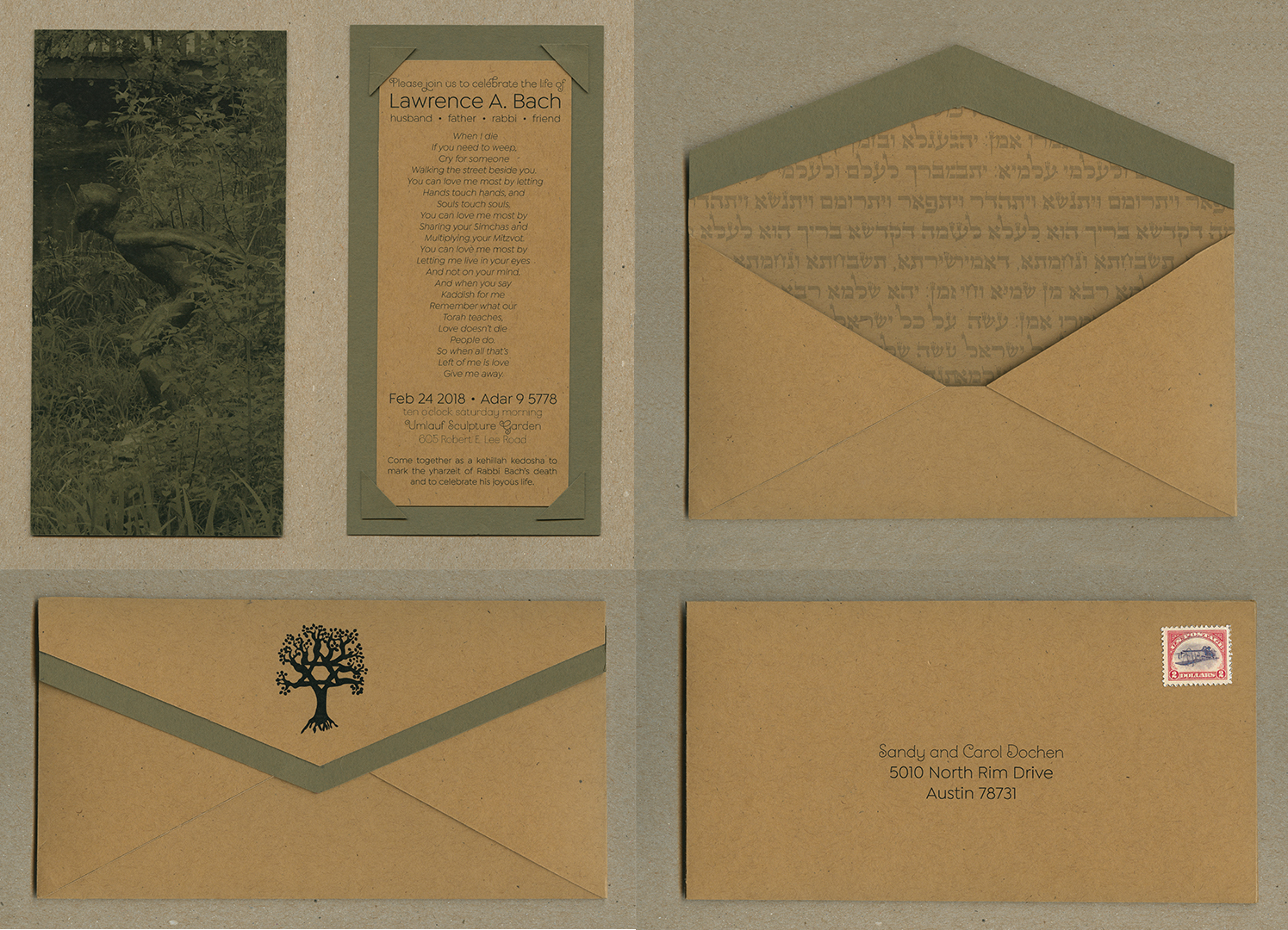
The invitation for the life celebration of Lawrence A. Bach encompasses the both the atmosphere of the setting–Umlauf Sculpture Garden and Museum–and the life of the man who is being celebrated. All of my design choices, from the featured sculpture, to the postage stamp were intentional, working towards the end goal of a meaningful invitation. The sculpture featured on the from of my invitation is called Diver, made by Umlauf in 1956. One of the few male figures in the sculpture garden, this sculpture of Umlauf’s son is representative of youth and freedom.


In creating this website, my ultimate goal was to create a usable index of material found in Alice Ogden Bellis’ book, Helpmates. Harlots and Heroes: Women’s Stories in the Hebrew Bible. I focused mainly on accessing the information in two different ways, by the scholar that is writing and by the biblical woman that is being written about. I provided multiple paths for my reader to access the interpretations. I made design decisions that evoke feelings of ancient Israel while still creating a clean and for the most part, flat interface that would not draw too much attention away from the content of the website.


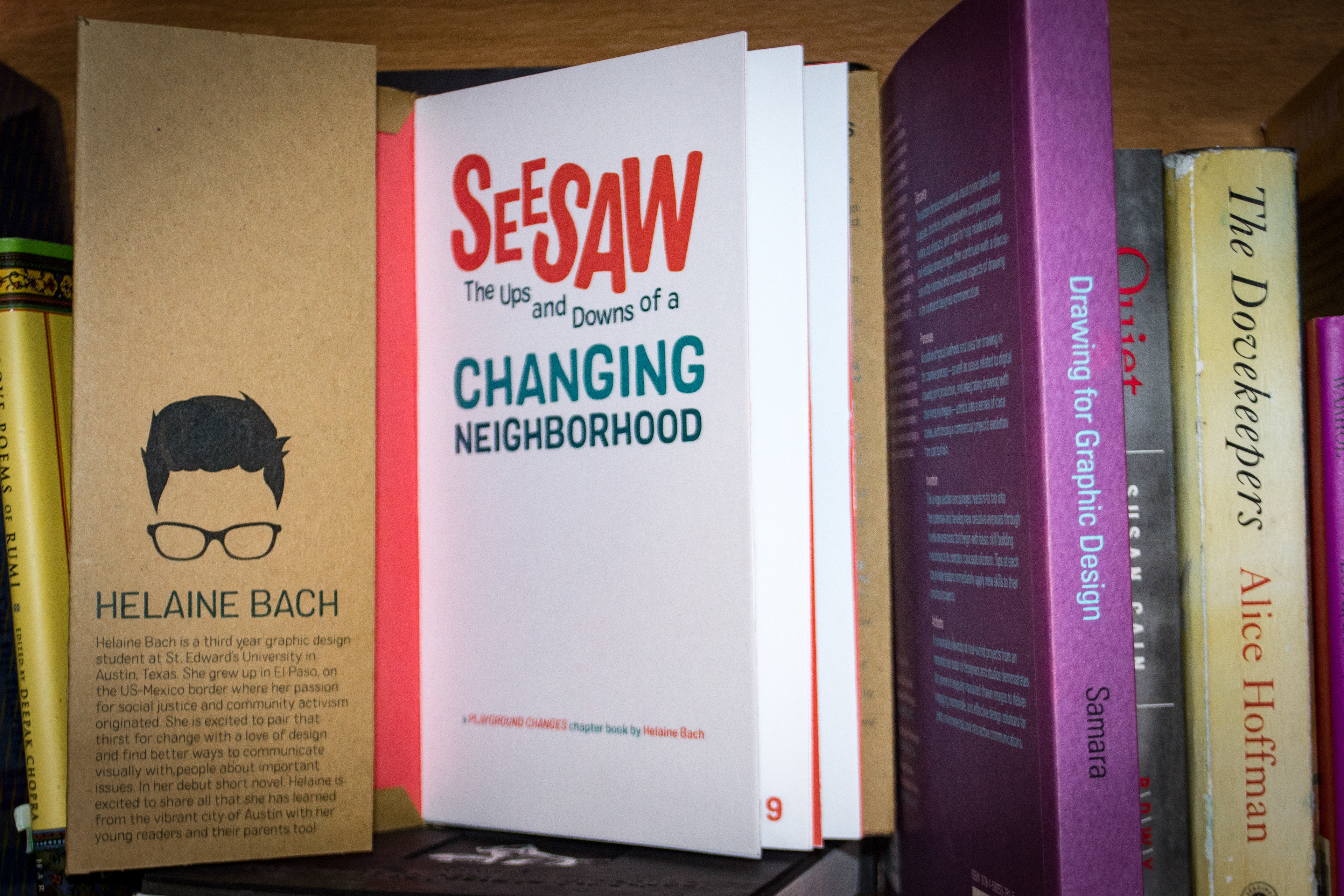
Through making this “my first chapter book” about the affects living in a gentrifying neighborhood has on a child, I refined two important skills. First, I was able to practice synthesizing complex information gathered from academic journals into a form my audience could more easily digest. Secondly, I experimented with various craft methods and pushed myself in the realm of illustration. The visual language of this book speaks alongside the narrative I crafted to tell the story of two boys growing up in a changing neighborhood.
These GIFs were a form of visual sketching. I experimented with various elements of the research I did on East Cesar Chavez, both out in the neighborhood myself and from in depth academic research. It was here that I first started the process of looking at the East Cesar Chavez neighborhood through the eyes of children, and thinking about the affects gentrification would have on them psychologically. While the visual style of each of these GIFs is very different, the concepts that run through can be seen in my final product, a “my first chapter book” about the neighborhood.
This video showcases the identity I crafted for Zilker Park. My goal was to show viewers that Zilker is a place where you can be happy in many different ways. I was able to utilize my brand system throughout the video, including brand colors and marks that I created. Overall, the visual elements provide an exuberant and playful identity for the park.
Now more than ever. This statement evokes feelings of movement, both forwards and upwards. I used the symbolism of stairs and steps throughout the conference program in order to evoke this inspiring forward and upward movement. I chose a strong, bold typeface for headings and altered that typeface to form the conference word mark so as to look like steps. The interlocking word forms are both visually intriguing and thought provoking in the sense that they invite the viewer to take a closer look at the way that letterform interacts in the same way Fulbright Conference goers take a close look at the interaction communities around the world. The cool yet bright color palette is meant to inspire feelings of freshness and wholeness, now more than ever.
I spent a great deal of time thinking about the way a user would want to interact with this weather report, using myself as an example. I planned the sequences in a way that I would want to view information when picking a city to go for the weekend. Another one of my goals for the project was to show unity throughout the animation to present the whole experience as cohesive, rather than separate actions. I did this through the use of dashed lines and a repeated use of sliding motion throughout the animation.

In creating this mark, my goal was to create a system which reflects the identity I have assigned to Zilker Park, that it is a place where different types of people, doing different things can come together in the same space and make that space happy. My color choice reflects this happy nature. I also made my system versatile to reflect the possibility for user input into the process of being happy at Zilker Park.


