Since I missed last Monday’s faculty presentation, here’s research (like BP3) on an artist I like, Daniel Aristizbal. I found his work on Instagram recently, @darias88, and have been enjoying his use of space and depth along with vivid color and iconic images. I like the way he creates symbols and uses lots of negative space, though his images are thoroughly enriched with color. I also enjoy how simple the objects he creates are, it is almost cartoonish but the realness and depth adds a new level to this comic-book feel. His creative process, described at https://www.format.com/magazine/features/illustration/daniel-aristizabal, is also very interesting as he relies on a sketchbook to decide how to compose 3D images, and sees his projects essentially as sketches coming to life.
For a 5-year plan, I would like to continue to hone my skills in college, work freelance as I have been, and work the summers at the print shop in my home town to gain experience in silk screening and know how to handle real-world customers. When i graduate, I will probably plan on looking for a job in a city, whether it be Austin or in California where I am from. I would hope to start as an apprentice or a junior designer for a marketing firm or design compan
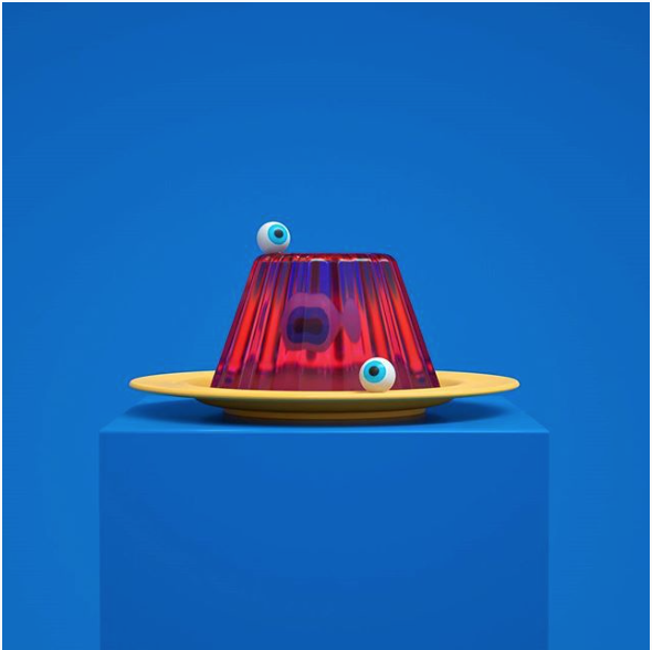
From Instagram, captioned “Trick or treat, happy halloween!”. I like the textures showcased, the matte of the background with the shine of the plate and the transparency and jelly of the Jell-O.

From Instagram, I love the way he keeps the pencils and their respective parts looking like their actual components, the wood looks like wood, the metal has shine, and the eraser is rubbery, yet he bends them in ways the mind knows is not possible.
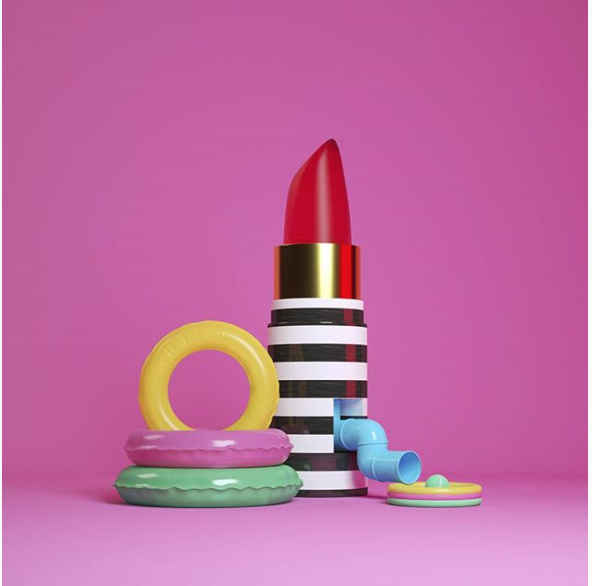
“The D, a water surreal candy lipstick park, non sense but i like it.” I also like it, I like how it takes a minute to conceive the “water park” and how each piece works together to convey this image. I also love the shine on each piece that looks like the plastic of a slide, and the color combo that screams summer.
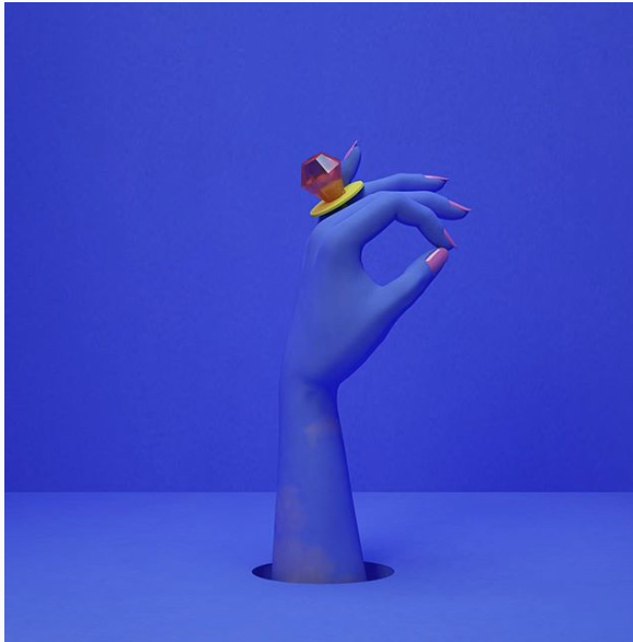
“I’m married to the game”, the royal blues and rich background contrast with the candy ring pop so well, and the hand as the same color as the background makes the shadows key to the composition, almost like a shading exercise.