
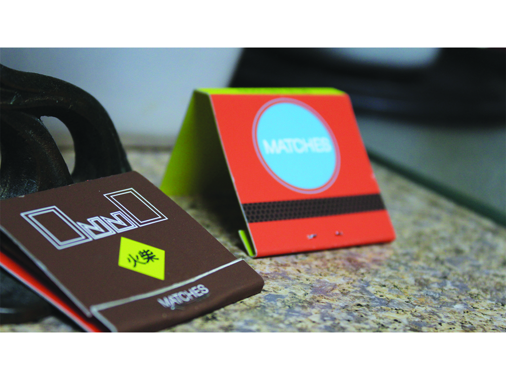
For the matchbook project, I needed to create a design for a matchbook that would exist within the set or world of the Spike Jonze film Her. Upon watching the film, I noticed that a lot of the movie’s interfaces and design work is related to very simple shapes such as circles, squares, and triangles. I also did a little research and found information from an interview with the lead designer for the film about how the interior design and interface design was carried out. Using that information, I stuck with their 70’s color palate, created a logo for a fictional matchbook company, Onno, and included the word “matches” in both Chinese and English, as those two languages were featured in almost every form of signage in the movie. From there, I used the color palate and simple shapes to set the composition and created two separate versions that have all the same information with different color schemes and shapes. Both matchbooks were printed on premium matte inkjet paper and were folded using a bone folder to ensure that crease lines were straight and solid. The design of both matchbooks combines the best elements of the film’s design work and combines them in a single artifact, truly encapsulating the essence of the film’s look and feel.