The word “collage” has never really meant anything to me before. I had no experience making collages, no interest in them, and ultimately no sense in what the point of a collage was. In the two days I have spent making these three collages, I have realized two things; (1) Cutting triangles for hours will make you insane and (2) the creativity of collages reveals itself when you let go of the reigns a bit.
For the first collage, I took a very calculated, measured out approach to the whole process. I confined everything to a form, and relied solely on contrast and shape to create my image. It is the most complete frame, but has the least amount of creativity. Yes, every shape is unique and has it’s own special part in the grand scheme, but it is all cold and calculated; there is no freedom, no space to breathe within the image. While the colors are contrasted and the lines are clear, the overall image seems too void of life. At first, I thought that the clustered and chaotic nature of the image represented the cluttered hustle-and-bustle of South Congress, and therefore did it justice, but there was room for improvement, and I did so with the next two images.

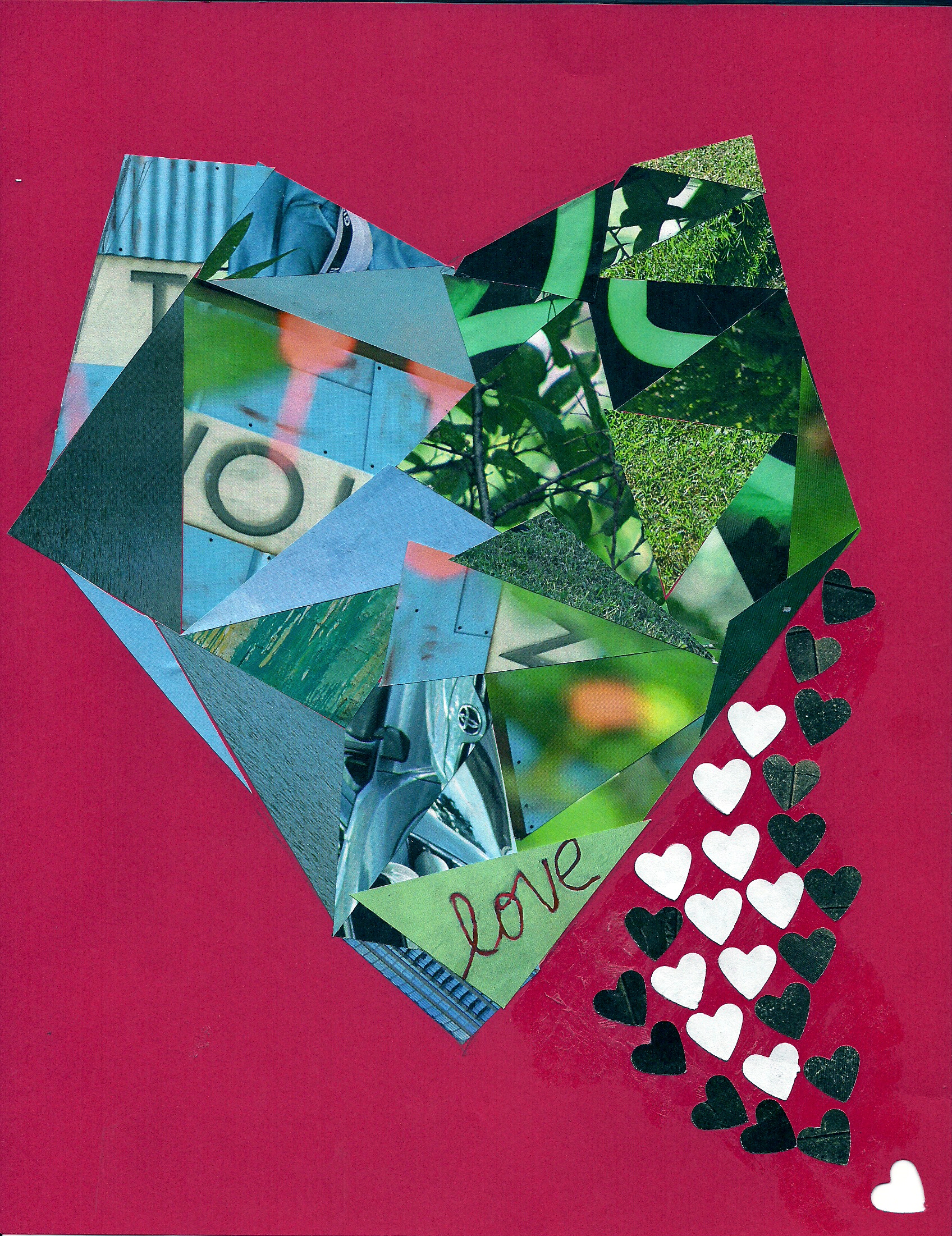
The second collage was that of a heart comprised of blue and green triangles, a rather sharp, chaotic mess, with a flowing wave of hearts almost pouring out of the larger shape. Intentionally, the last heart shape on the corner is cut out from the actual base paper, which, for me, seemed to serve as a metaphor along the lines of the heart being left somewhere, presumably in Austin; it was a quirky feature, so I left it in. The overall composition is sharp, but I actually cut the shapes out before they were even placed, so the line that divides the green and blue was completely formed as the project was created, and the shape formed itself from there onward. The famous “I love you so much” graffiti makes an appearance, and in that sense was a love note to Austin and South Congress, in its own right.
The final image was the most creative and the most aligned to the purpose of the assignment. I took circles of various size and color, placed them down on top of liquid glue, and simply saw what appeared. I followed a curve, and ended up with something that resembles a twister. Upon examination, there is some depth in the image, like the fact that the white circles within the top half’s negative space are small, while those near the bottom are large, making the image seem closer. I think the dynamic shape of the curve started as bubbles and progressed into something of sizeable power, and I was quickly overpowered by it. Ultimately, the curve itself and the background color of the paper made for an entirely different image than I had intended to create.

The design principles I focused on were mostly harmony and color, and I think I managed to craft interesting pieces with those principles, yet I think there’s definitely room for improvement, and exploration is the key to that expertise. I think if I’m a little less controlling in how the image will be processed, I’ll get something interesting. Perhaps this project has preyed on my fear of blindly stumbling into big projects without a plan, but often it seems that things turn out better when you take those risks and cut the image a little slack.