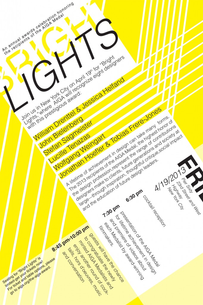
The assignment was to take a page of information for the AIGA Awards and design an event poster containing all the information given to us. The initial text layout was the first part to determine. We created several sketches of different text layouts by arranging hand cut clippings of the printed text. Then we started sketching on the computer on InDesign. Once we had a layout decided on we began to use one font and played with the use of color and shapes. I chose Helvetica as the typeface and a bright yellow, white and black color scheme with line elements. Since the title was “Bright Lights” I thought it was fitting to chose a bright yellow color along with solid and transparent lines to represent light beams or spotlights similar to those that you might see at a special event. By using these elements, one is more visually interested to read this poster because it is eye catching from the color and eye-lines but also because of the criss crossed axis and hierarchy of text layout. Overall by completing this project I was able to design my first large scale typography poster. Along with gaining experience using a larger scale printer and how to design content to scale.

