All posts by mcavall
Desire
Advanced type assessment
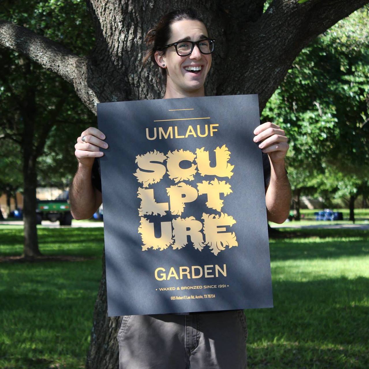
My Fulbright book is still a work in progress. The cover needs to be redone and have a better flow from the front to the back, as well as merging the title into the design more cohesively. The headers need to be rearranged, and the typeface and placement of the page numbers needs to be addressed. There are no running graphic design elements anywhere within the book, which need to be done. A color palette needs to be selected as well, the absence of which is leaving the book looking pretty bland. The maps section needs to be rearranged/redesigned with whatever the color palette eventually becomes, and the ads need to be rearranged/repositioned as well to help with the flow of the book. The majority of the hierarchy created through the type family choices works to some extent, but some minor changes are still needed. As it is now, this book would fall into the category of mediocre.
Weather Report
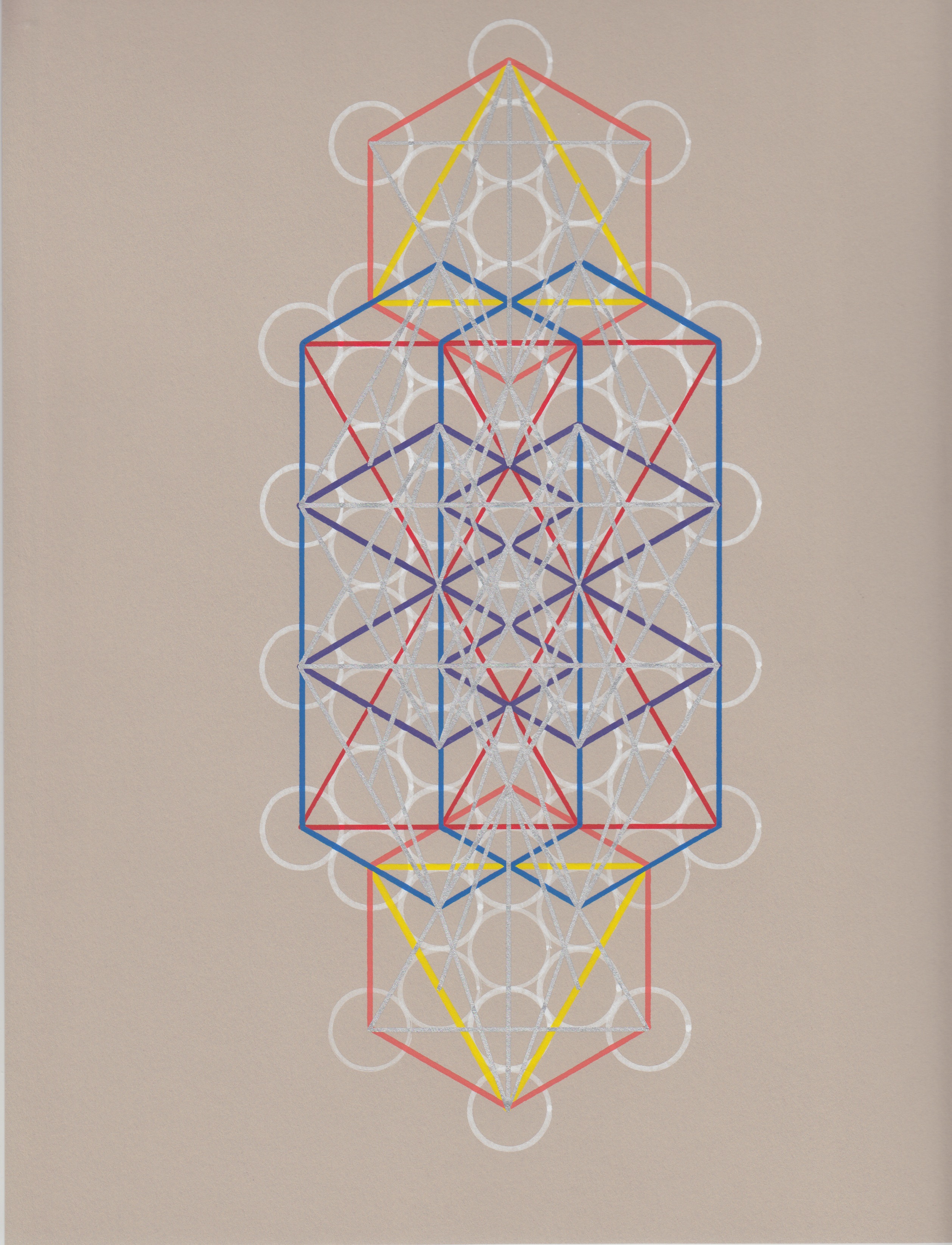
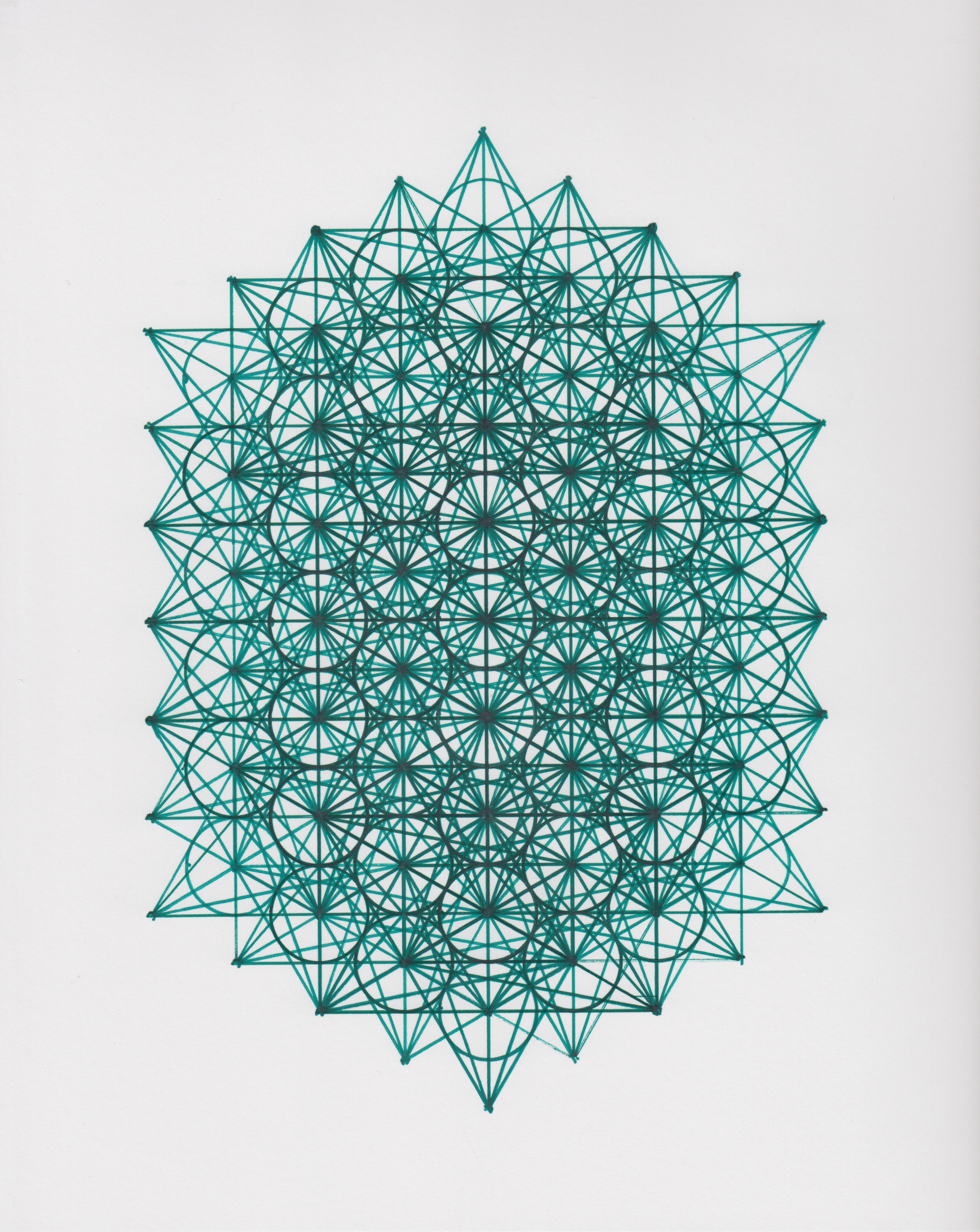
The weather report project required the use of the LATCH system to organize the 40 points of data in report. LATCH stands for Location, Alphabet, Time, Category, and Hierarchy; and the 40 points of data refer to the city names, days of the week, hi and low temperatures, and weather symbols. The project is set in the future which is why I used the typeface, Facet Ultra, for the city names. Initially I had wanted the city names to unfold from one triangle of each letter, like reversing origami paper from the final form back to the original paper. I also designed the symbols based off of the triangles that make up the Facet Ultra typeface, which have a geometric theme that I am partial to. These sharp angles that make up the typeface and symbols are contrasted by the circles and rounded rectangles within the first latch of Time, in which the data set is organized by the days of the week. Code Light and Bauhaus STD, are the other two sans serif typefaces I utilized in the following latches for labeling. I chose these two typefaces in order to continue to integrate rounded elements into the composition to balance the sharp angles of the symbols.
Rules
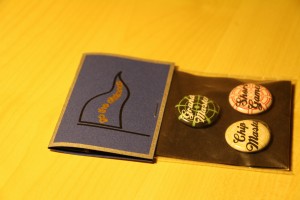
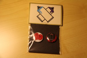
The Rules project first required us to decide on two locations within the city limits that we were unfamiliar with, and write a set of instructions that create a unique experience, and evoke a certain emotion when followed. After that we designed symbols in Adobe Illustrator that developed into buttons that served as mementos for the experience created by the instructions. There was an aspect of product merchandizing to this project in designing the packaging and tags to contain the mementos. I used the vinyl cutter with a pen attachment to do my tag design and instructions. I did this to give more of a handmade feel to the composition. The blue textured paper I used for the Top Golf label was chosen for its relation to the dimples on the surface of golf balls. The off white color paper used for the Hope Outdoor Gallery tags was chosen for its resemblance to concrete/blank canvas. I had to choose a typeface that had enough space within the letterforms to be plotted by a pen with the vinyl cutter, which is why I chose Bauhaus STD, a sans serif typeface with minimal clutter.
Advanced type assesment
My social/emotional development is pretty much at boss status. I have had a lot of extremely stressful, emotionally draining, time consuming situations on my plate outside of school which I have balanced quite excellently the past couple months. I would rate the sophistication of my work as high in comparison to my previous work. I have continued to push my limits as a designer this semester. I tested the performance envelope as far as after effects is concerned while working on the weather report project. I am working on being able to utilize feedback on my work to produce more cohesive designs. I would classify this as a meaningful use of feedback. I am challenging myself on an intense level this semester, I have taken on learning a whole new medium to work in, and I look forward to revealing some finished pieces sooner than later. I do my best to be attentive and responsive in class, and during critiques, which falls under a warm contribution to climate. My use of practice time has been consistent this semester, which can be attributed to the three-hour gap I have between my classes everyday. I took a laser engraving class earlier in the semester as far as expert experiences go, and look forward to working with, and learning more about that technology. I have accumulated 233 expert hours so far this semester, which is almost as many expert hours I had completed in the entire last semester. Altogether I have completed 526.5 expert hours between last semester and the current semester. I have completed more expert hours than this but these are what I have recorded. I think that I should have an A in the class so far.
Cutter Plotter


This project was left greatly up to our own interpretation, and was coined the “random” project. This assignment encouraged us to find an alternative medium to attach to the vinyl cutter via the pen attachment tool to create a design. I created different geometric patterns in illustrator to produce these pieces with the vinyl cutter. I used acrylic paint pens and tweaked the force, speed, and the pen placement to make this project happen. There was a lot of trial and error in the process of learning and working with the vinyl cutter. I really enjoyed the experience as a whole, and look forward to working more with this medium in the future. I started with a base design and pulled different shapes out of the main form to create varying geometric shapes which were then designated by layer and color. You really have to think backward in the layering process because the top layer is the one that the vinyl cutter replicates first. The color choices and layer sequence was a big obstacle that I faced.
Photoshop
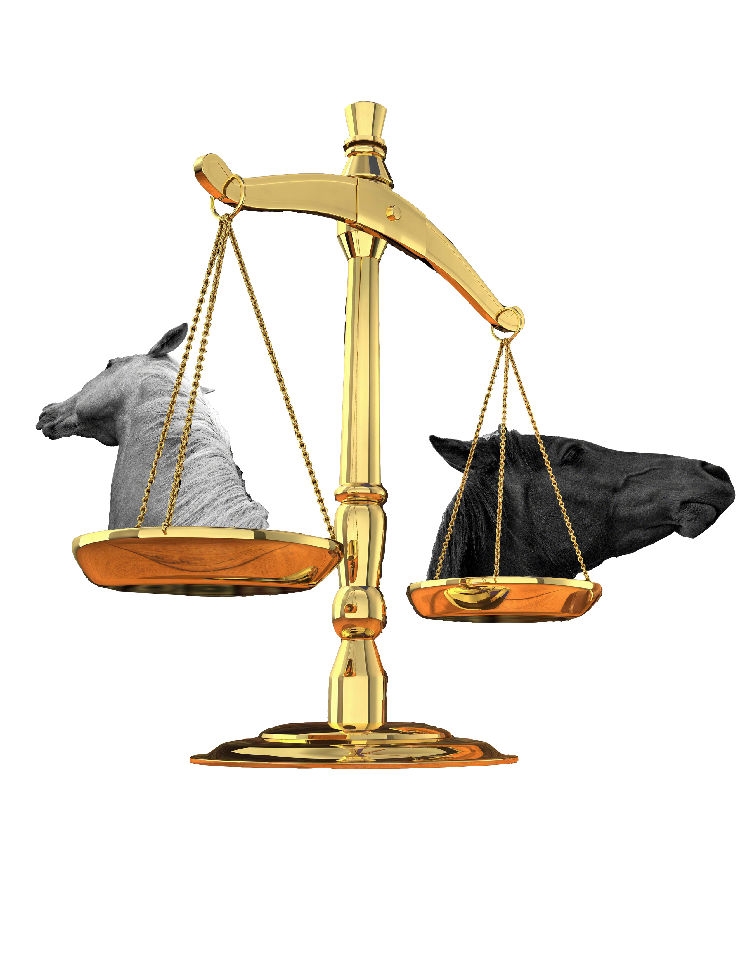

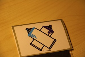
This photoshop project required us to make a collage of our eastern and western signs. My birthday makes me a libra for my western zodiac, and the horse is my eastern sign. This project was one of the first times I had used photoshop. The picture on the left was my first attempt to collage the two signs, which resulted in a fairly literal interpretation. I used black and white horse heads to represent my eastern sign, and scales, which is the symbol most associated with libras for my western sign. The picture on the right is a second iteration of the same project. In this version I tried to learn and play with different tools within photoshop and explore more of the information and traits associated with the different signs.
Video Camera
The video project introduced Adobe Premiere and After Effects and made me become acquainted with using a video camera. I cut and layered multiple scenes and points of view of a bird feeder and foliage in this project. Using Premiere, I was able to alter the opacity of the different layers and position them on the timeline to transition to the music. I chose to use Wayward Bob by Bonobo as the soundtrack because the beat of the music captures the sounds of the birds.
SLR Camera part 2


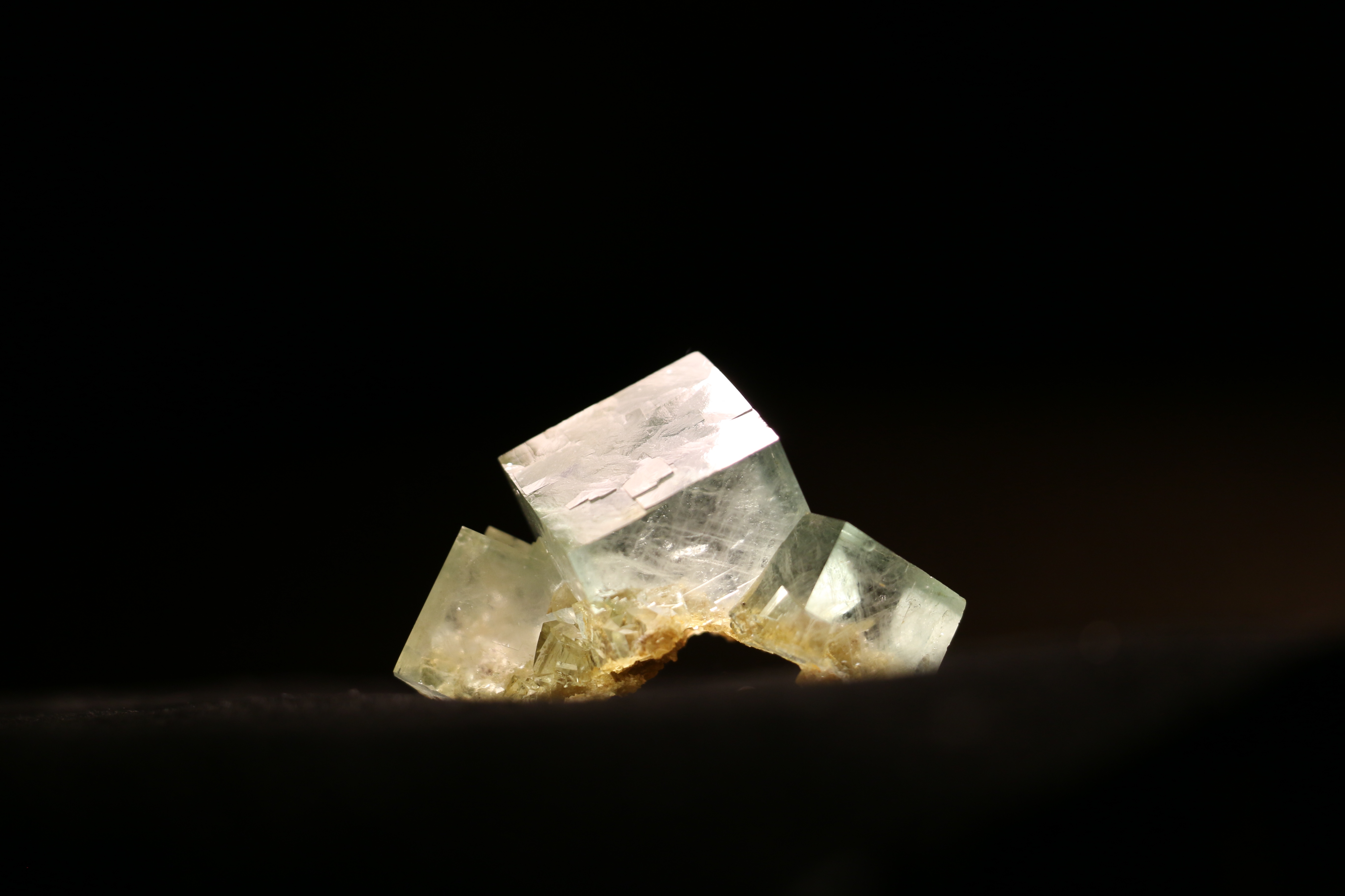
These three photos emphasize the lighting aspect of the SLR assignment. I manipulated the lighting in the room and used a lamp to play with lighting the minerals from different sides and angles.