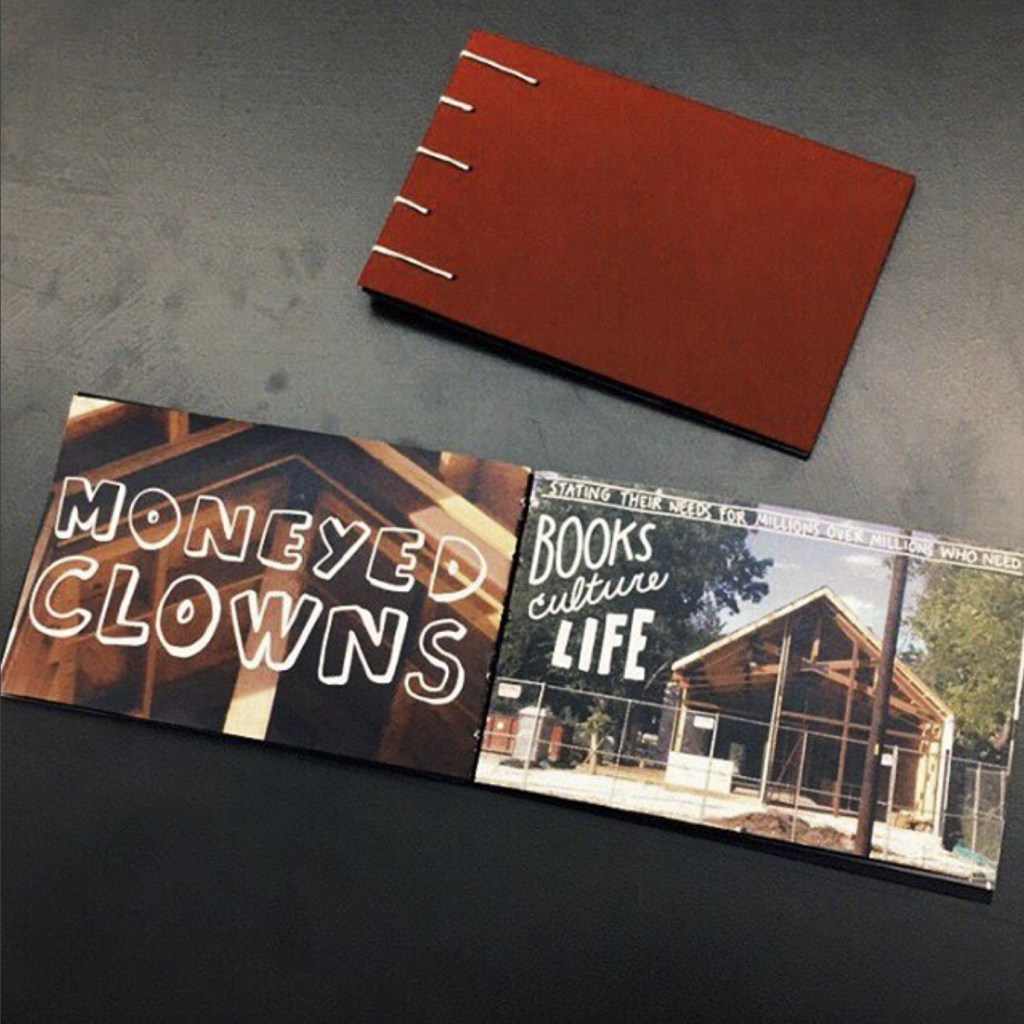
 East Austin, TX is currently being subjected to gentrification. For this project we had to research this process and the neighborhood’s history in depth. We made a lot of small designs based on our feelings about the neighborhood. Mine all focused on the gentrification and loss of culture occurring in the neighborhood. In my opinion the neighborhood was “losing its colors”, this later became the focus for my book.


My book was a compilation of photographs with a hand lettered poem about gentrification. The poem itself went through the process of a neighborhood being gentrified. The photos slowly faded to black and white as the book continued. I made the book small and pocket sized. I did this because the topic is such a big, heavy topic and I thought making it small the way I did made it more approachable.
Portfolio
Fullbright Program
 “Fulbright is a program of competitive, merit-based grants for international educational exchange for students, scholars, teachers, professionals, scientists and artists, founded by United States Senator J. William Fulbright in 1946.”
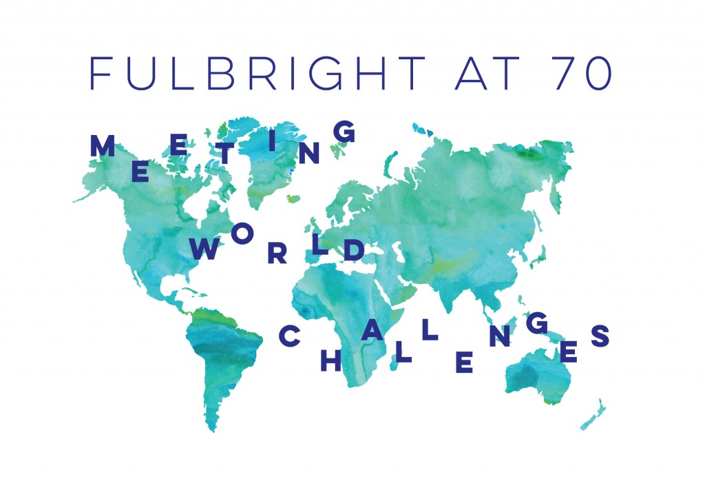
Fulbright has a conference every year. This year it turned 70 and students at my school were challenged to make the program for this event. We were given a “mystery file” with a massive text document and a ton of random images. Initially we had to figure out what we were making and whom we were making it for. Then during the design process we had to figure out what all the images were for, how to organize the information, etc. The theme for this conference is “Meeting World Challenges”. The theme of my program had three pillars:
- “Bright” because Fulbright is about opportunities and bright futures.
- “Natural” because Fulbright allows people to travel the world.
- “Fresh” because the conference will enable Fulbrighters to bring new and fresh ideas to world problems.
The watercolor map on the cover I think embodies these pillars the most. The watercolor feels natural but the colors of it are bright and fresh. The letters “Meeting World Challenges” are jumbled so they look like a challenge to read.
Clarksville Neighborhood Branding
Clarksville is a neighborhood just west of downtown Austin, Texas. The neighborhood is known for its old architecture and unique sense of community. Because of its proximity to downtown it has a pretty young population and lots of trendy businesses. I researched the history of the neighborhood for three months while creating a brand that communicated the identity of Clarksville. The brand includes a logo, wordmark and marketing materials. The goal was to make Clarksville not just a “place to go” but a place people will want to live. All of my research and products were put into a branding guidelines book.


Weather Report
This is a video of a futuristic home computer interface. The owner of the home computer is giving voice commands to the computer and the computer is responding accordingly. The first command is “I’m thinking about going on a trip, show me the weather in these four cities”. Then “arrange them by day” and “arrange them by category. This assignment was my first experience with After Effects. This challenged me to think about my designs in whole new dimensions. Using After Effects added depth, movement and choreography that my designs couldn’t achieve before. Creating this video gave me a new respect for animation.
Zine // Ignorance is the Virus
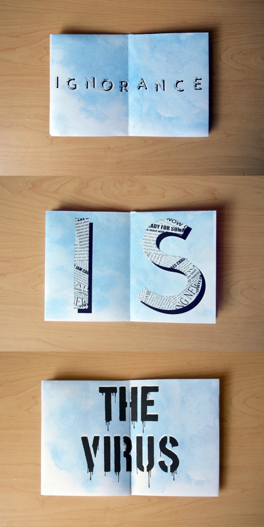
A truism is a statement that is obviously true or that is often presented as true. For this assignment we had to write a truism and put it in a zine (small booklet). I wrote the truism “ignorance is the virus” because it reminded me of growing up with my Father teaching me to be open-minded. My Father always encouraged me to seek out information whenever possible. As I grow older this curiosity and open-mindedness has shapes the way I look at the world, especially in the realm of politics. This project challenged me to represent not just the words of my truism but also the meaning they hold within me. The type on the first two spreads are made of a newspaper pattern to represent the media and news. The last spread that says “the virus” has type that was edited to have a toxic waste feel to it. In classic zine fashion, this zine was printed with a risograph using blue and black ink.
Interface // Final Word Mobile Application
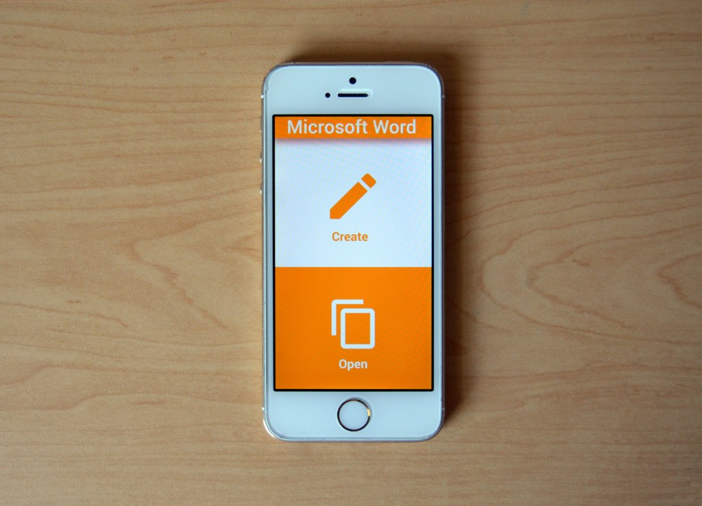
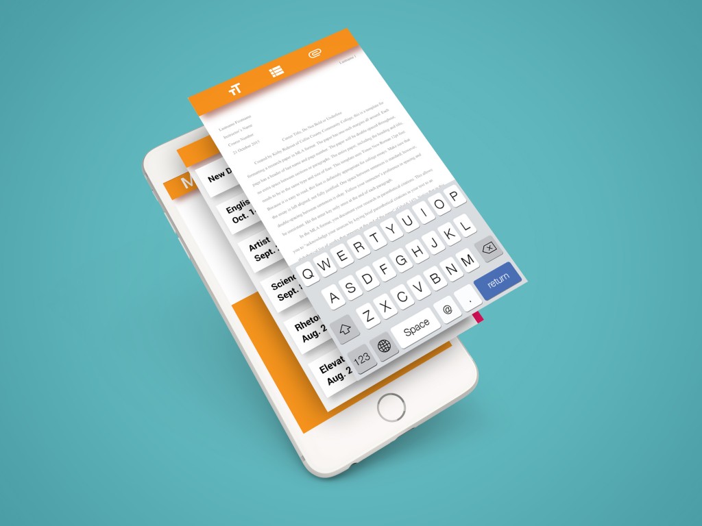
I have not been able to find a text editing mobile app that I liked enough to use regularly, so I designed an interface for one. I designed a mobile word processor made for users who need to create professional-looking final drafts on the go. I named the application Final Word. There are template options available for things like a MLA format documents, cover sheets, business proposals and more. I really narrowed down the elements that I thought were important. This assignment required that we use the Google Style Guide. This challenged me to create a look of my own while also remaining true to the rules. I wanted my interface to be unique but still cohesive with Google’s other products. I learned a lot about UX and UI design while working on this interface. I made paper prototypes and tested them on my friends to see how they responded to what I had designed. This project made me really consider pursuing a job in UX or UI design after I graduate college.
Plotter Poster // Spooky
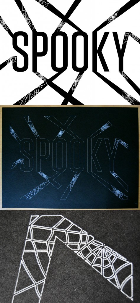
For this assignment I was given a set of instructions on how to distort a specific font. I was instructed to extend the letterforms with beams that radiated from the letters and to add a certain number of spider webs. I chose to use the word “spooky” for my project because I wanted to create a feeling of walking through a spooky attic or dark cave. The beams I made are meant to add depth as if the text is sinking into a dark room. This is also why I chose to plot this design on black paper, so it would look like cob webs in a dark space.
Decision Map // What Should You Watch on Netflix?
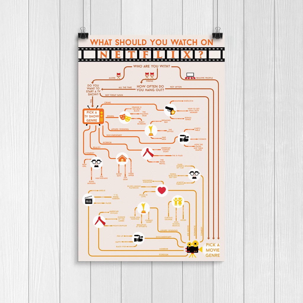 This is a decision making map for indecisive Netflix watchers. I chose to make a flowchart for this because this is a decision I’m faced with often. I sorted it first by who is watching, then by TV shows vs. films, then genres and finally sub-genres. I made icons for each of these divisions besides sub-genres. When deciding what style to make this, I knew I wanted to either make it look exactly like the Netflix interface or make it look vintage. I chose to make it look vintage to contrast the modernness of Netflix. I chose a neutral, vintage-looking color palette and the icons I made are all inspired by old film and TV. The font I used for the title of the poster is called Trajan, and was used non-stop in the 90s on American movie posters. I put the title in a strip of film as yet another reference to old film.
Information Map // Tony Lee’s Grocery List
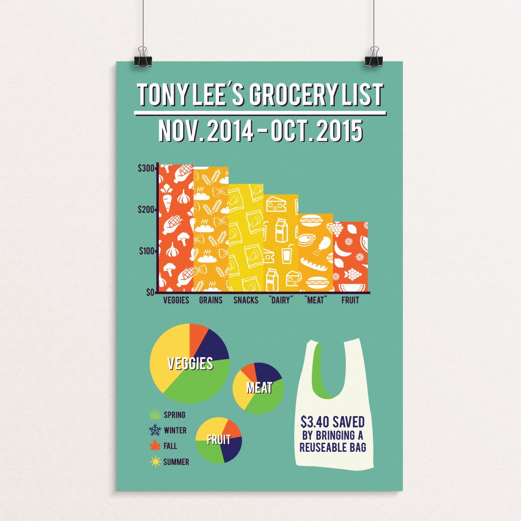 For this assignment we were given an excel spreadsheet of every grocery store transaction that “Tony Lee” made in 12 months. We were allowed to present whatever findings we had from the information. Based on the purchases made by this person I assumed that this person was following a vegan diet. Because of this I decided to display how much money was spent on different food groups in an entire year. I also displayed how much money was spent in these food groups per season. Lastly I displayed how much money was saved by bringing reusable bags to the grocery store. This project taught me a lot about sorting data and organizing information.
Personal Geography // The Bathrooms of St. Edward’s
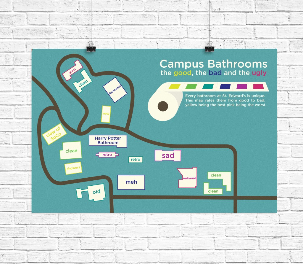 Every building at St. Edward’s has a personality and reputation of it’s own, and same goes for their respective bathrooms. This assignment I decided to make a map of the best and worst bathrooms on campus with a rating system and brief descriptions. Although this map looks very simple it took me a very long time to gather the information for this map and present it in a simple and concise fashion. This map may look simple but it required a lot of research, investigation and polling. This map is meant to be for anyone new to campus, so I used the opinions of my fellow classmates when rating the bathrooms.
