VISU 1100: Blog Post #8

The presentations done by the counselors and student advisers were informative about my options concerning studying abroad. I learned that if I want to study abroad, I must begin planning it out as soon as possible. The counselor also showed the class how to look at our scheduling options for the next semester, as well as any other information regarding our major.

My future is quite flexible, as I’m unsure about my major and ultimate career path. I have been considering becoming a Graphics Design major after hearing of my friends experience in her class. However, for the most part I have options regarding to how I want my life to go.

VISU 1100: Blog Post #7

Camille Dollins, an alumni of St. Edward’s, came to speak to during our previous class. She graduated with a Bachelor of Fine Arts in Graphic Design in 2016. While studying here, she began working at student life as a designer and became interested in the career. She began an internship with the Dime Club and Nano Global, working to create ads, logos and brand development. She also presented her senior exhibition which featured a self-care subscription box, Lucine. She now works as a marketing specialist at Cratejoy.

The thing that stuck with me the most about her presentation was a piece of advice she offered– ‘Clients don’t need to be in the creative process’. This is often not told to artists, but is certainly important if you are trying to make a living from your art.

The other guys’ microphone kept cutting out and I couldn’t understand him. Every time he tried to talk I got a headache because the noise was so choppy.

VISU 1100: Blog Post #6


  1. My greatest strengths in Ceramics include: My creativity, ingenuity, originality, as well as my ability to meet deadlines and exceed project expectations.
  2. For greater success in this course, I need to: Spend more time outside of class practicing ceramic techniques, as well as researching other artists who have made a name for themselves in this field.

Computer skills:

  1. My computer skills include: Word, Excel, PowerPoint, and various other computer applications.
  2. I still need to learn: How to use Digital Art programs.

Research & writing skills:

  1. My greatest strengths as a researcher/writer include: Being able to organize my thoughts neatly, arranging my thesis to flow throughout my writing, and my ability to use literary devices appropriately to support my thesis.
  2. I need to work on these aspects of research and writing: Citing sources, MLA format, and reaching a deeper level of writing.
  3. I learn best & accomplish most when: I am inspired.

ACTION PLAN

Choose one class that you are struggling with or are not doing as well as you could.
Now make a list of 10 ways you could improve your performance in this class.

  1. Dedicate more time to studying.
  2. Work on my assignments as soon as they’re assigned.
  3. Get more rest at night.
  4. Eat healthier (healthy food= healthy brain)
  5. Come in outside of class to work.
  6. Research topics discussed in class outside of class.
  7. Organize my study process.
  8. Get feedback from my peers on my work before turning in.
  9. Practice what I’ve learned.
  10. Study notes I’ve taken after the class is over.

VISU 1100: Blog Post #5

  1. What was the goal of the assignment? Or what was the question posed by this assignment?
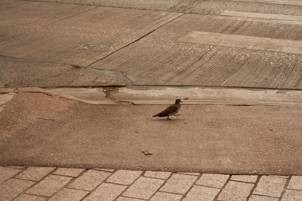
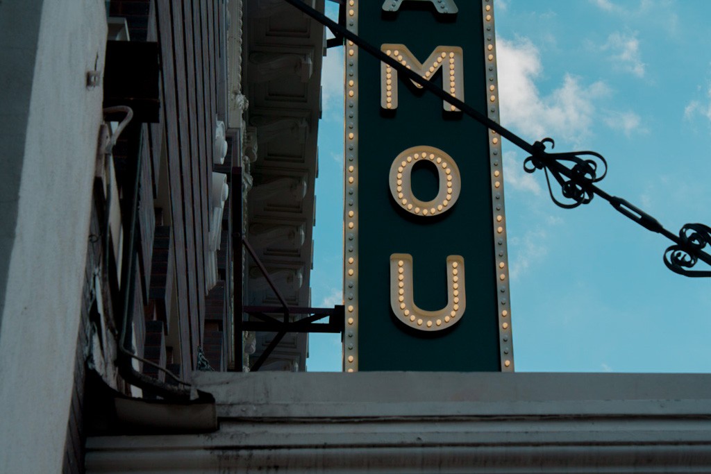
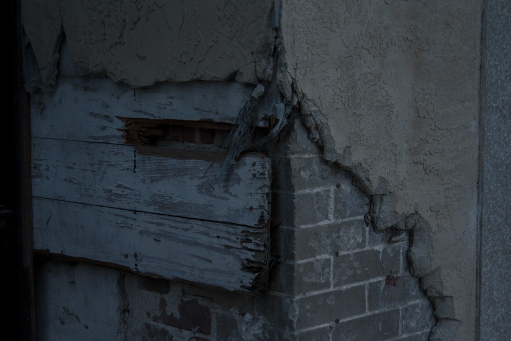
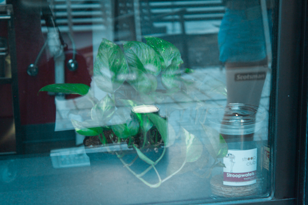
    • The goal of the assignment was to successfully capture Gestalt principles and apply them to our images by restraining ourselves to only photographing on South Congress, as well as to become familiarized with various photo-editing software and camera settings.
  2. How did you go about reaching this goal or answering this question?
    • I followed the assignment guidelines and went out and took pictures on South Congress. I limited myself to a certain color palette and only allowed myself to take up to 80 photos each time I went out.

~

  1. What is the strongest aspect of this work?
    • The ‘cold’ color palette and undefined imagery which creates an eerie tone.
  2. What is the weakest aspect?
    • Other than the palette, the images don’t relate together without some sort of explanation.
  3. How can the project be strengthened conceptually?
    • If the guidelines had allowed me to include other media on my images.
  4. How can the project be strengthened technically?
    • Better editing, some of images looked ‘over-edited’.
  5. Additional notes.
    • Overall, the project was enjoyable and I have learned how to utilize Bridge and Lightroom which will certainly help me as an artist when I am older.

VI$U 1311 Project #1: Jomana Al-Abed

Screenshot

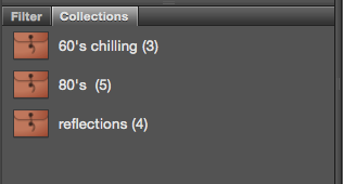
I was interested in relationships between colors and the time periods we associate them with in photographs. I chose to photograph images that challenges the difference between reality and perception– whatever I present to the viewer will be accepted as truth, even though SoCo is easily recognizable. Keeping this in mind, I explored places in South Congress that appeared to be timeless to me. I also explored the tones of each era; the warm, inviting and ‘rebellious’ content of the 80’s compared to the empty and unsettling vibes of the 60’s.

VISU 1100: Blog Post #4

Having the upperclassmen come into class and present their work was very eye-opening. Seeing their professional websites, how they lay out their content, and especially how they chose to present it to us made me realize that in order to be a successful artist, I must have a portfolio that has the same qualities as theirs. These qualities include being easy to read, having enough information for the viewer and having it arranged in a way that is organized and clear, and having a neutral background.

Pip & Pop

Pip & Pop, also known as Tanya Schultz, is an Australian artist who creates rather large installations using candy, bright colors, and found objects. I chose her website because of the simpleness of the layout which still maintains her colorful artistic theme. The white background doesn’t take away from the content of her images and the information of each image is provided directly below it, making it easy to find. The task-bar is also placed next to header of her website, making it easier to navigate.

Laura Callaghan

Laura Callaghan is an Irish artist who is known for her pop art styled portraits which depict women being ‘unconventional’. I chose her website because of her organization of her images in collections. She has sorted them all into specific tabs which indicates how each image in the collection is related to each other (i.e. if the group of images were all in the same exhibition). I also enjoy the readability of the layout and how the navigation is always in the top left corner.

Tenderfoot Studio

Tenderfoot studio is a tattoo parlor owned by artist Pony Reinhardt in Oregon. I chose her website because of the layout of information- I liked how she had a photo with the header and a small description underneath, as well as a link on the bottom inviting the viewer to explore the page. It is very user-friendly and I also enjoy the neutral color palette, as well as the links in the top right corner to help direct the viewer to other pages.

Logic

Logic, also kown as Young Sinatra, Bobby Tarantino, or Sir Robert Bryson Hall II, is a rapper from Maryland. I chose this fan-created website because I honestly thought it was his official website for the longest time. It is very professional and sleek- on the right side-bar are links to various updates from Logic, and upon scrolling down, you are able to see blog posts with pictures of his recent tour, new merchandise and opportunities to meet him. The website also maintains a dark color palette which doesn’t take away from the quality of the photos.
 

Skip to toolbar