Project Three: Typeface Match-up
categories: Typography I
Graphic Design Student c/o 2019


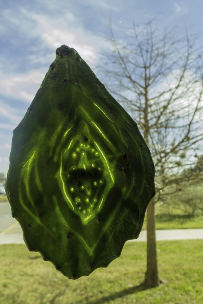
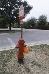
Having grown up in the southwest, I have a strong connection to the desert. I chose to make my mark on a cactus pad that I found on the streets of my new home, Austin. I found a really interesting phenomena when I placed my mark up to the window in my dorm. Light completely transforms my “maker’s mark.”


For my first line inventory, I did my best to explore all of the materials at my disposal. I wanted to know what it would feel like to make marks with a variety of materials, from charcoal to india ink. I explored different methods of mark making and got an idea of what kind of lines are visually pleasing and I enjoy making (which would be crucial for the scale of and time spent on the final step of this project).
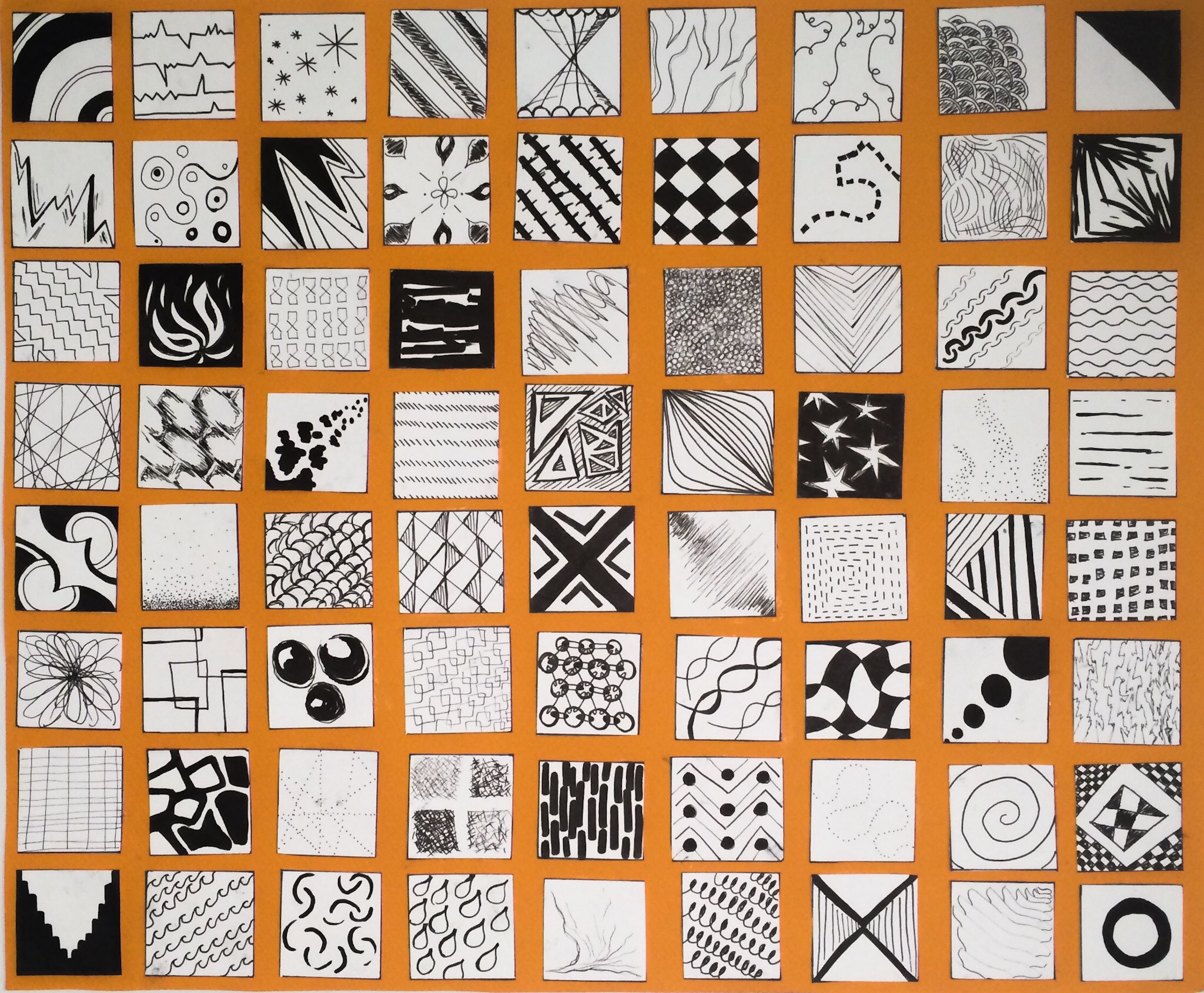
I was then given the instructions to “make it better.” After spending so much time on my first line inventory, I was a little distressed that i would have to do it all again, but also eager to learn from my first experience with the project. I chose the best lines from my first inventory and also gathered ideas from my classmates. I made an extra effort to perfect my craft for this second iteration on my line inventory and spent extra time cutting out each square and placing them on an orange substrate for a clean and professional look.

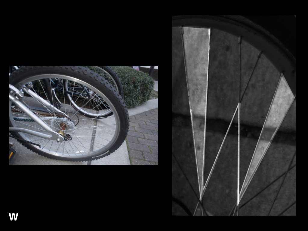
I’m used to sketching surfaces, rather than lines. I focus on the blocks of light and dark on an object, rather than the lines that make them up. This was a very interesting exercise for me and it got me thinking a lot about the way that line can suggest form and movement, even if it isn’t visually there on the subject.

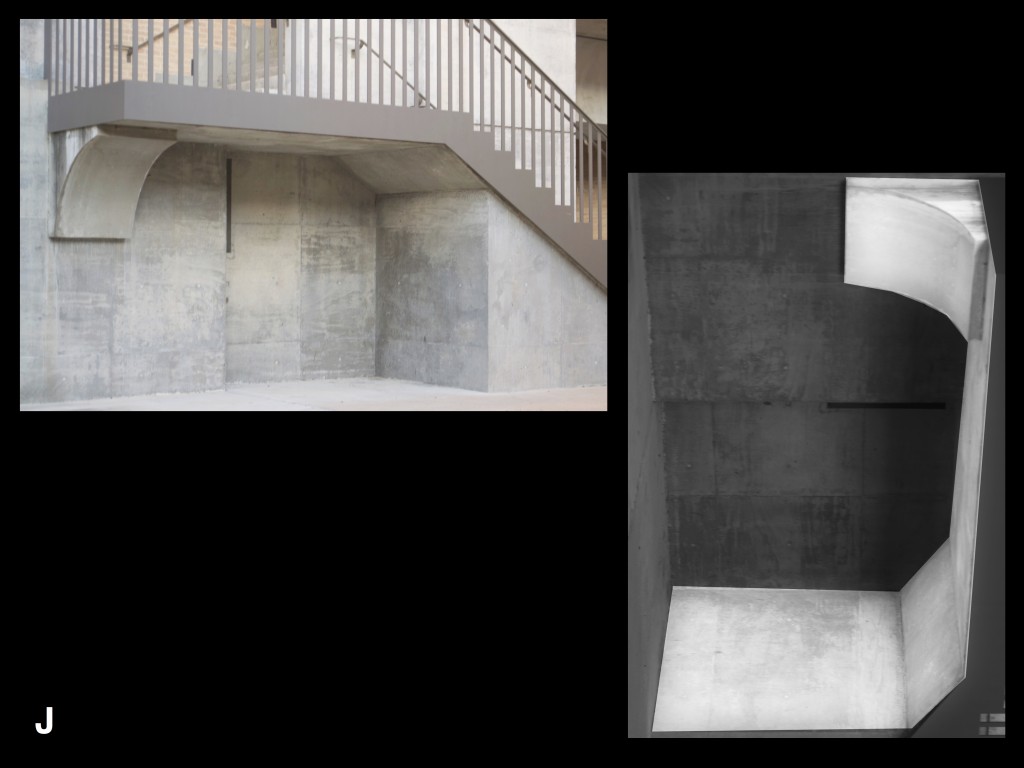
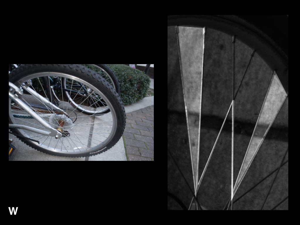
I don’t usually work with three dimensional art, so this was really fun. I tried to draw lines in a physical space with the wire I was using. I created a frame and then tried to capture the movement of fabric with the wire that I attached between the frames.

I made an intentional decision when starting this piece to concentrate the weight of my piece on the edges of the paper. I was able to create an intense focus on the white of the majority of the paper with an intricate framing of different line patterns. I was able to create a movement reminiscent of waves in water with the orientation of all the different lines. I’m very pleased with he outcome of this projects and was able to develop a stronger understanding of line through each step of this process.
I was extremely intrigued by Nelson’s views of design as ornamentation on functionality, rather than a substitution for it. As a graphic designer, I’ve thought of design as “more practical” than fine art. Graphic design is often describes as functional art. However, Nelson is making the case that functionality does not dictate whether or not something has been design well. Rather, a good design adds to the base functionality in ways that more functional, but poorly designed products are unable to. When describing my field of study to people outside of the world of visual arts, I often use the phrase “I make things pretty.” Nelson seems to agree with this notion that design is about aesthetics, rather than operational value.

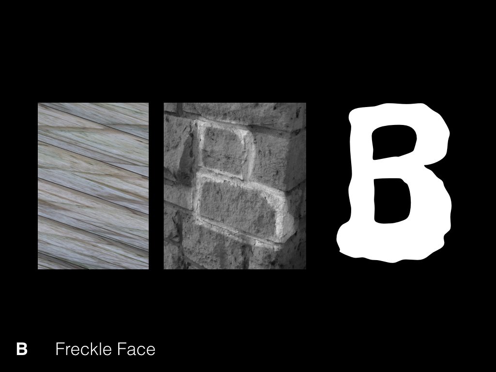


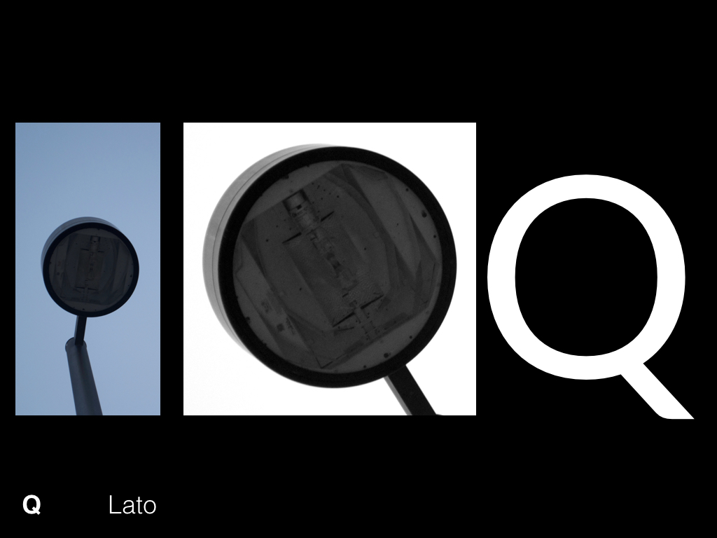
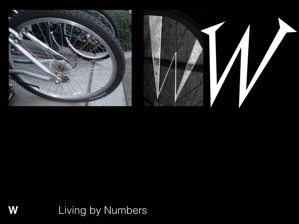

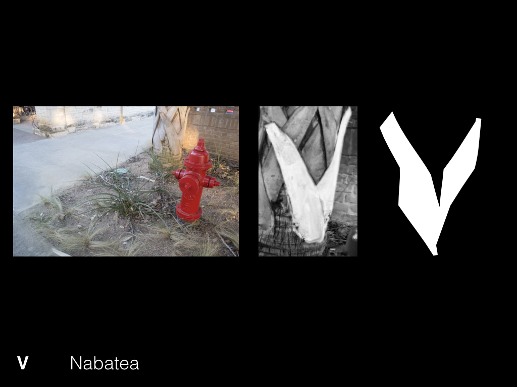

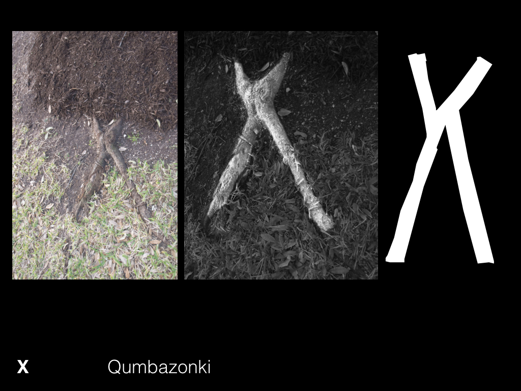


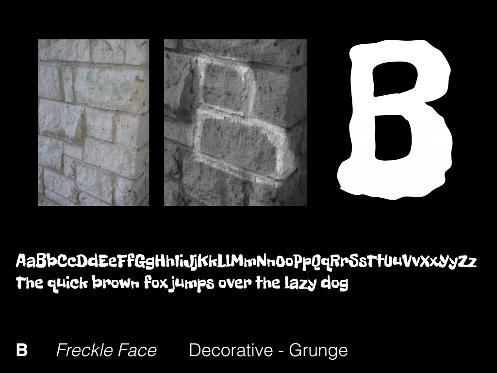
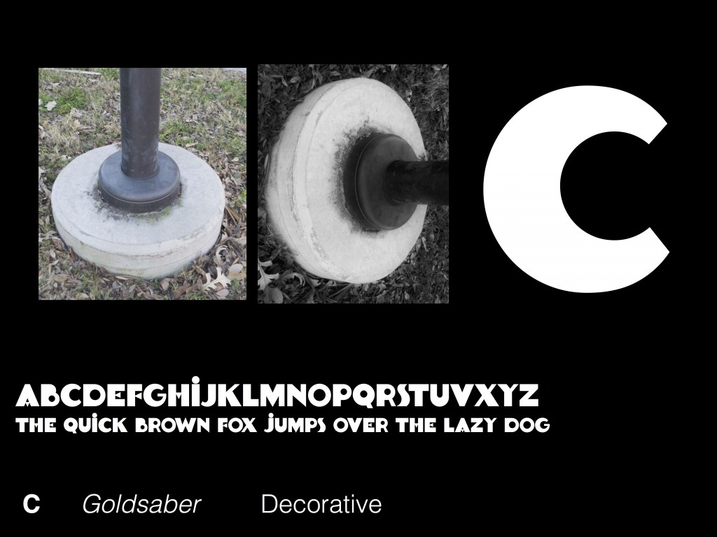
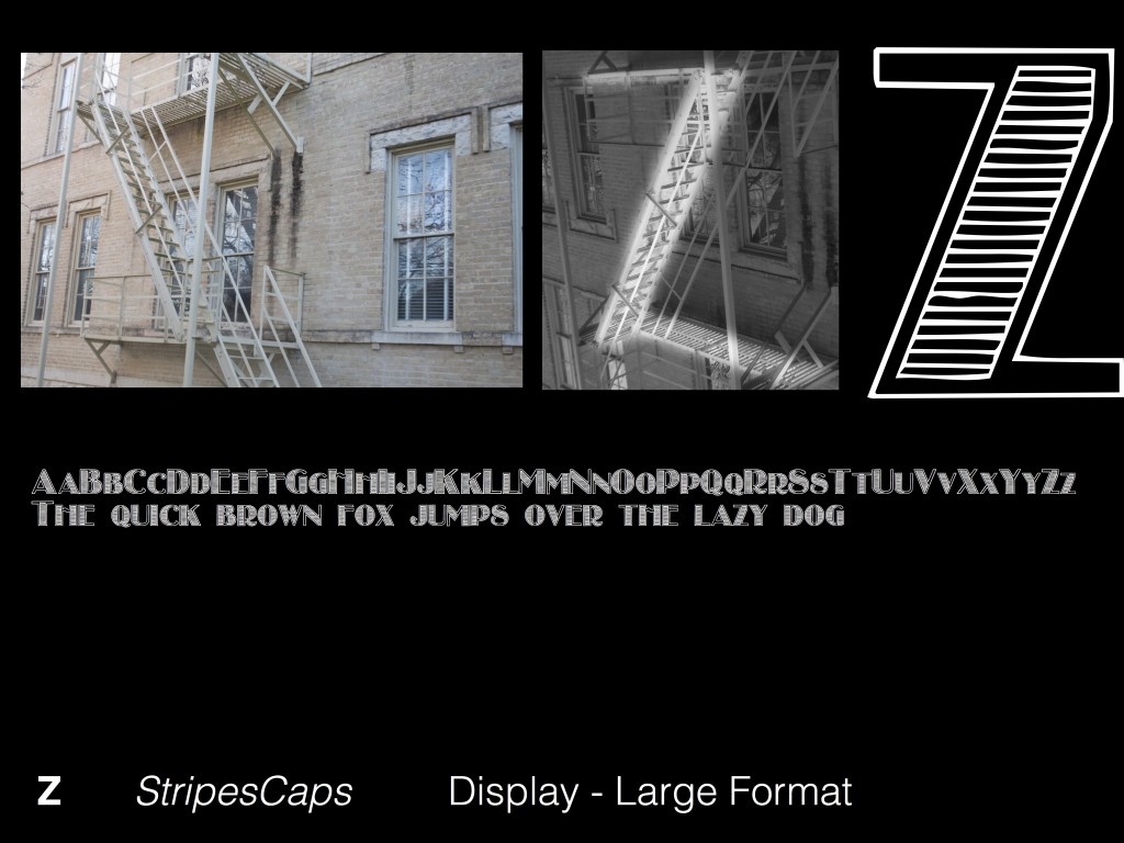
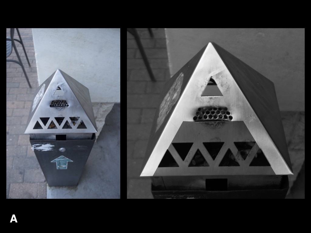
Through the process of matching existing typefaces to letterforms I found in my surroundings, I was pushed to understand the unique choices typeface designers make that distinguish their forms from other typefaces. I took extra care to identify the most distinguishing characteristic of each found letterform and go on to choose an existing typeface which possesses these same characteristics. I believe that this produced an effective match which showcases the essence of the found letterform in a way that wouldn’t have been possible if I simply chose a typeface where the single character matched exactly to the letterform from my surroundings.


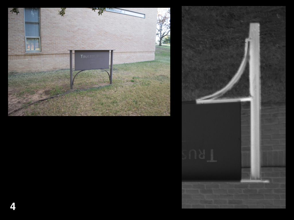


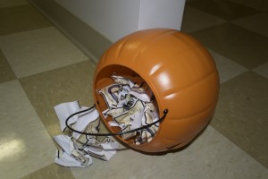
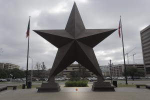
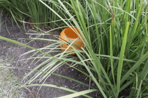
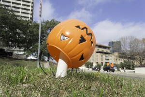
As a designer, it is essential to take inspiration from your surroundings. These letterforms found in my surroundings push the envelope on traditional letterform and invite the viewer to take a closer look at their own surroundings. As I wandered through campus, I made an effort to identify interesting and unconventional letterforms. I was particularly interested by letterforms formed by both natural and man made objects. The letterforms I was able to identify in my surroundings helped me to dissect letterform and focus on their formal properties, disregarding meaning associated with the characters.
Tammie’s work is very interesting. As a graphic designer, I hadn’t given much thought to 3-D work. However, after seeing Tammie’s interpretation of ceramics as sculptural, rather than functional, I am very intrigued. The idea of a chimera, something that it hoped or wished for but is actually illusionary, is really thought provoking. Her work reminds me of surrealism, but takes on a new life because of the medium. I am also very interested in how the places that Tammie has lived affect her artwork. I had never thought of interaction with nature as controlled or uncontrolled, but it makes perfect sense when you see her work and think about it in relation to Chicago and Seattle.
Kim worked as a designer for fourteen years before she became a professor. It really shows in the way she showed us her work on an app. It felt like she was pitching the idea to clients, which she has. In contrast, her passion project “Till the Clouds Roll By” was a completely different animal. Her work with her husband on this film felt more like fine art than any digital rendering I’ve seen before. I was starting to worry that the digital medium was simply meant for communication arts alone, but Kim has proved that digital can be just as beautiful as any traditional medium.
I was really interested that James’ topic has stayed pretty much consistent throughout his work. It makes sense, considering it’s such a broad and engaging idea. Things that happen “by accident” or without aesthetic intention are often the most beautiful. The challenge comes in being able to record that accident or recreate it artistically without making it seem staged.
I’ve really enjoyed my first semester in the visual studies program at St. Edward’s. I think that this class is a good way to frame the program for students just entering the program. I definitely have benefitted from spending time with art and photo comm students who I’m not sure I would have met otherwise. It’s also really cool to be taught by the professors who we’ll be learning from later in our St. Ed’s careers – a way to see where we are headed. There wasn’t a lot of structure to the course, but I enjoyed that. We were able to let the conversation guide what we learned and that was very insightful.
 It’s a Sunday night in October and I’m working in the lounge of my dorm because it’s the only room with enough table space to set up my assignment for Drawing I. I’m sketching out what seems like the millionth cube this semester when my phone buzzes. Happy for the distraction, I take a look and see a text from an old friend, asking for my help. Josh Halff wants to know if I can help the pledges of AEPi with their Halloween party. Of course I, a student at a different university, was the only person they could think of to help with their design work – “spec work.”
Spec work is when you do work for free that may or may not be used; and then the client own the rights to the design whether they end up using it or not. Spec work is the root of all evil, at least according to any respected graphic designer. I haven’t been in the field long, but almost every professional designer who I’ve heard speak about their work has warned against it. There’s an entire website devoted to discouraging designers from doing spec work. The American Institute for graphic arts has an official statement discouraging spec work. I have to admit, it does sound pretty crappy. However, I would like to argue the unpopular opinion that design students should do spec work. Controversial, I know. The argument against spec work is that as a designer, you’re selling yourself short. Working for nothing means that you’re saying that you’re worth nothing. Well I don’t think that you’re working for nothing in this case. As a young designer, you’re working for experience.
Getting a job after school depends on one thing – your portfolio. Your book is your life. A good book has to have more than just the work you’ve been assigned by professors. You’re not going to get hired by showing that you can follow directions. If students think the projects we do for school are boring, imagine what design firms think. Doing outside work is key. One route is to do a bunch of passion projects, designing for imaginary events or making art for yourself. School is the only time that you really have to do work for yourself. Explore what you like and dislike, set your own parameters and deadlines. The most important thing is to make work. Personal projects will definitely fill your portfolio, but I think there’s a lot to be learned from the experience of designing for other people. Graphic design is a client driven field and we don’t focus on that nearly enough in the classroom. I think that it’s up to design students to make our own client scenarios. This is where spec work comes in.
Suprise! College students are poor. They are not going to want to pay for design work, so you can bet that the ones you’re friends with are going to cash in on that friendship when they need a t-shirt design for their juggling club or a newsletter template for the “save the squirrels” organization they’re trying to start. When your friends come to you asking for help and can’t offer much in return, know that you are getting experience in the world of designer–client relations that you wouldn’t have otherwise. Pay attention to the process: figure out how you’re communicating and whether that works or not, notice how you present your designs, be mindful of how you’re interpreting their ideas and translating them into visual representations of the initial concept. Spec work gives you the opportunity to do all that while still in school. It’s a low stakes way of getting experience with the “people skills” aspect of graphic design that is often bypassed in formal design education. That’s why I said yes.
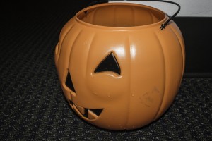
![]() So for the next two weeks I spent a great deal of my free time helping a bunch of nice Jewish boys put together their “Heaven and Hell” themed Halloween party. I was well on my way into research about client–designer relationships and excited to put what I’d learned into practiced. They already had an idea of what they wanted and some initial sketches, which made things easier, but at the same time was very limiting. I didn’t have to do as much leg work, but I also wasn’t free to do anything I wanted. When Josh told me the the theme for the party, I immediately turned to Pinterest and started my research. However, I was soon informed that everything had to be pre approved by the pledge trainers (fraternities are weird) and that pretty much everything was already designed – they just needed my help executing it. I was a little bummed at first, but still happy to help out. Who doesn’t like painting with a bunch of cute frat boys? When I arrived, I realized they would need me more than they thought they did. I was able to help make sense of their basic ideas and turn them into something that could actually be done in their time frame. For example, they were very into the idea of a “fireball wall.” I took their initial design (made in Microsoft Word, eek!) and brought it into Adobe Illustrator, cleaned it up, got it re-approved by the pledge master and then painted it. This is very similar to real work that a graphic designer has to do to help their client move a design within a company. I was also able to offer my own artistic skills because let’s face it, these boys couldn’t make fire look that good if they tried.
So for the next two weeks I spent a great deal of my free time helping a bunch of nice Jewish boys put together their “Heaven and Hell” themed Halloween party. I was well on my way into research about client–designer relationships and excited to put what I’d learned into practiced. They already had an idea of what they wanted and some initial sketches, which made things easier, but at the same time was very limiting. I didn’t have to do as much leg work, but I also wasn’t free to do anything I wanted. When Josh told me the the theme for the party, I immediately turned to Pinterest and started my research. However, I was soon informed that everything had to be pre approved by the pledge trainers (fraternities are weird) and that pretty much everything was already designed – they just needed my help executing it. I was a little bummed at first, but still happy to help out. Who doesn’t like painting with a bunch of cute frat boys? When I arrived, I realized they would need me more than they thought they did. I was able to help make sense of their basic ideas and turn them into something that could actually be done in their time frame. For example, they were very into the idea of a “fireball wall.” I took their initial design (made in Microsoft Word, eek!) and brought it into Adobe Illustrator, cleaned it up, got it re-approved by the pledge master and then painted it. This is very similar to real work that a graphic designer has to do to help their client move a design within a company. I was also able to offer my own artistic skills because let’s face it, these boys couldn’t make fire look that good if they tried.


All in all, it was a good experience. I got to put into practice the visual skills that I’ve been learning as a designer as well as practicing communicating within the relationship between designers (myself) and clients (Jewish frat boys). While most professional designers say no to spec work, I’ll be saying yes. As a student, the experience I gained by doing this work is more valuable than anything these pledges could have scraped together to try and compensate me for more work, not that they didn’t try…