Author Archive
Where are you in your hours that you declared earlier in the semester? Looking at your work now, are your current accumulated hours enough?
I committed to working about two and a half hours a day on course work for this class, accumulating 112 hours by midterms. I’m not sure if I have consistently worked two and a half hours every day, but I probably have averaged about as much, considering some days I went far more than 2 and a half hours and some days I was busy working on other things and didn’t have as much time to commit to this class. However, if I am looking at my overall time spent on furthering my design education, also known as expert hours, I feel like I have definitely been successful in this regard. Between actual assigned coursework, all of the information I’ve absorbed sitting in the lab during other classes as a lab assistant, and plenty of time spent reading and watching professional designers talk about their work, I’ve been racking up the expert hours. I think this time commitment shows in my work and that if anything, I have learned the lesson of spreading my hours of work out over more days, especially concerning animation. I hope I never again put myself in the situation where I have to spend six hours straight working in After Effects.
Has your definition of “sophisticated” work changed from last semester? If so, how so? What is sophisticated in your weather report?
A conversation that I had with Jimmy has strongly influenced my understanding of sophisticated work. We were talking about my grasp on “style,” which is a bit lacking. He asked about my habits of looking at other successful work and told me to pay close attention to how they create within the constraints they are given, in order to reach the goals of the project. I think that as I absorb content, I want to be more intentional about picking up what works and then rather then just copying, analyzing why it works and trying to follow a similar process to get there. I think my weather report is sophisticated in the sense that I really stepped into the shoes of the viewer and made choices based on how I as a viewer would like to see the information. I tried to apply a logic of progression that begins to elevate this project to the realm of sophistication.
Describe how the new things you’ve learned so far connect to what you already had coming into the semester.
I was a little worried coming into this semester that my experience in typography was lacking. I was in, what I perceived to be, a less vigorous section of Typography I and I was worried this meant I wasn’t prepared. I think I was right in the sense that most of my technical knowledge of type had to come from supplemental sources (I read a lot), but I had picked up on the overarching concept of hierarchy. I think that I have been able to draw from all of my foundational classes, even ones not classified as GDES, in order to put together successful compositions that draw the viewer to what I want them to, or at least I know the questions to ask to start me on my way there.
What are somethings you are still unsure about in this project that you would like to know more about?
I think the aspect of this project that I would like to explore further is the idea of transitioning between two configurations of information without reintroducing the information entirely. In technical respects, I had a lot of trouble with this in animating without clutter. I think I want to spend some time thinking and reading about different methods of emphasizing information and transitioning that emphasis more naturally. I’d like to expand beyond the more conventional ways of drawing attention to type (color, size, etc.) and think more critically about the ways that people see and then process information. I want to look into the psychology of reading and see how we as people are trained to perceive different choices that designers make.
Assign a level of value to this project. Identify two other projects in your creative life and place this weather report relative to them. How close or far are they from one another? What qualities did each project have that the other’s didn’t that would rate them higher/lower?
I am going to look at this project in comparison to the interaction lesson at the end of Image Methodology (where I used After Effects for the first time) and the final project in Typography I (where I was given an unformatted journal article and asked to format it). I think that these two projects serve as a good reference for my progress because they showcase my precious experience with the technical aspect of animation in After Effects, as well as the conceptual idea of taking pure unformatted information and applying design to it to change or enhance the meaning. I certainly have come a long way in respects to animation since the app mockup project at the end of last semester. I am not nearly as comfortable in After Effects as I am in Illustrator or Photoshop, but practice makes perfect. I think that if I were to go on and make more work in After Effects, it would be well informed by the process of creating this weather report. It’s true, the final outcome of the video is not as clean as I would like. However, I can pick out specific points and know how to fix them if time allowed that and I think that shows success in as far as the application of animation on this project. With respects to making design choices that give information more meaning, I don’t know if I have necessarily progressed. I think I had a pretty strong understanding of conventional ways to do that even a year ago, back in Typography I. The fact that I have not progressed beyond those conventional methods is what is pushing me to try different ways.
Break down the percentages of what entities are responsible for creating growth within the creative you. Am I part of it? Part of it is on you, right? Do you consider your classmates/friends as influencers on the course of your trajectory for success? At the end of the semester you will be evaluating me, but right now within your own pie piece, how much have you brought to the game? How did it end up that you brought that much?
I work my ass off. I put in hours of work on assignments and continue to make myself do design outside of assignments too. I give informed and constructive critique to my classmates. I absorb and apply outside influence to my work constantly. I put in the work. I think it’s starting to pay off. I think my weather report shows that.
I spent a great deal of time thinking about the way a user would want to interact with this weather report, using myself as an example. I planned the sequences in a way that I would want to view information when picking a city to go for the weekend. Another one of my goals for the project was to show unity throughout the animation to present the whole experience as cohesive, rather than separate actions. I did this through the use of dashed lines and a repeated use of sliding motion throughout the animation.

In creating this mark, my goal was to create a system which reflects the identity I have assigned to Zilker Park, that it is a place where different types of people, doing different things can come together in the same space and make that space happy. My color choice reflects this happy nature. I also made my system versatile to reflect the possibility for user input into the process of being happy at Zilker Park.
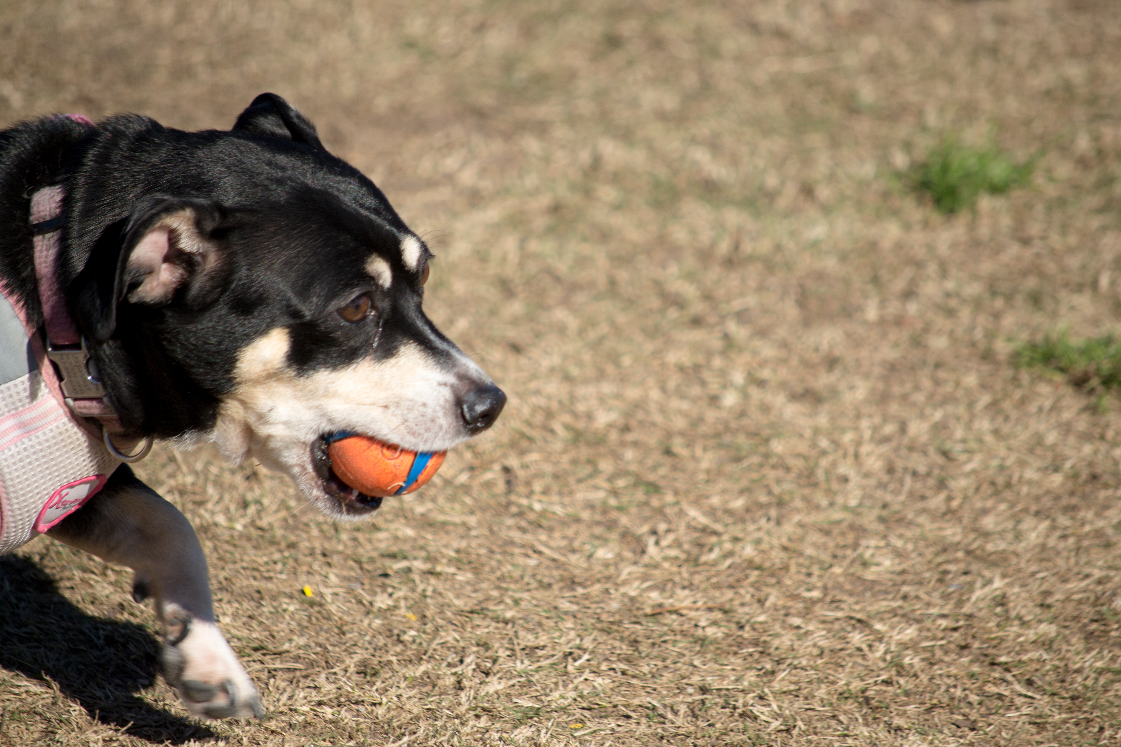
Small dogs like balls…
And big dogs like balls…
all dogs like balls, even people dogs!
The only useful advice I ever received from a substitute teacher in high school was this: “treat college like a 9 to 5 job, doesn’t matter if you don’t have classes that whole time, you’re working, whether that be working on assignments or studying or reading, you are on the clock eight hours a day.”
I also once heard that for every hour in class you should spend three hours working outside of class.
16+(16×3)=64
However, in order to get 64 hours in every week, working 8 hours a day, I’d need 8 days. Rather than bend the space time continuum, I think I’ll just exceed that substitute’s advice by one hour and make it a goal to work nine hours every day.
If I apply the math to this course…
4+(4×3)=16
…sixteen hours a week spent on work for this course seems doable. Broken down, this means about two and a half hours a day, which I feel like I can commit to.
If I stick to this, I will have completed 112 hours by midterms and 224 hours by finals.
Better get working!
Diving into research for a single location was a very interesting experience. By creating an anthology of Zilker Park, including visual, audio, and written accounts, I was able to create a solid foundation from which to move forward. When I moved forward in creating an identity for the place, I was interested to see which parts of my research moved forward with me in the process and which served as background information. As I solidified my identity for Zilker Park, I drew more and more from my original investigation into Zilker to find evidence of what I was proposing to be true.
In order to showcase my work in an app form, I had to consider the way that people interact with interfaces. I spent a lot of time thinking about the ways that people navigate through apps, drawing from my own experience in the touch screen digital world. Taking my existing work, and designing an interface for people to view it was a very interesting process because it allowed me to spend more time thinking about the ways a viewer could get the most out of my work. An example of this is my choice to showcase my plotter designs in a scrolling gallery, acknowledging their sequential nature and how they exist as a whole collection, rather than individual pieces.


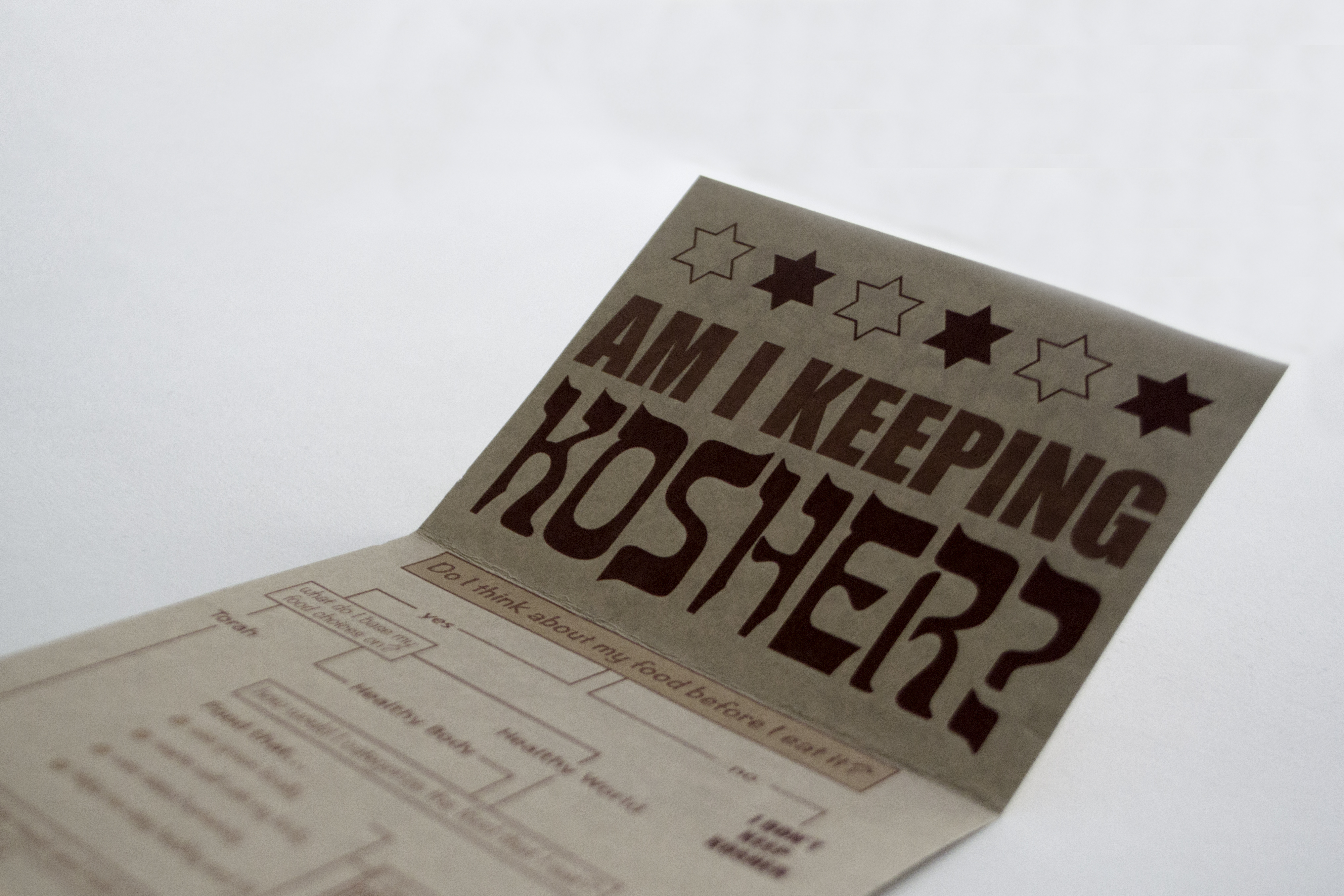
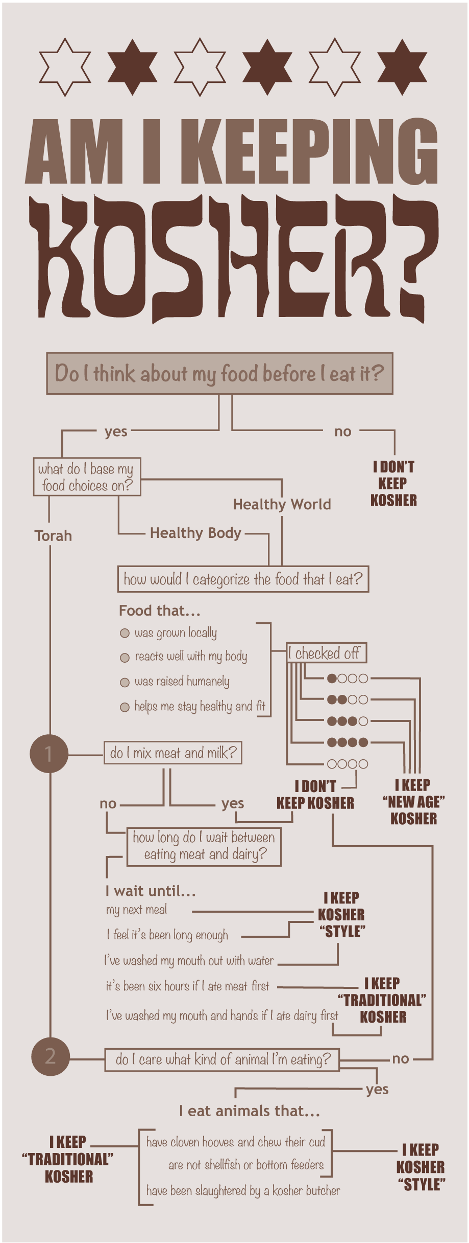
The design of this map is first and foremost about function. I want to be able to pull it out of my back pocket the next time someone asks if something is kosher and walk them through the steps that lead me to that conclusion ideologically. It’s hard to break down such a rich history into a simple infographic, but I did my best to allude to the nuances of Judaism through questions that start with “do I think about…” and “do I care…” The craft of the document, and my choice to print on textured tan paper reflect the styles of traditional Jewish literature.
 How many hours of practice time per week would you consider excessive? How many hours would not be enough to create sophisticated work? Where are you situated?
It’s hard to count my hours, mostly because I feel like I’m always working. Even when I’m not physically sitting in from of a computer with illustrator open or putting pencil to paper, my mind is filled with design. I look at menus and I see type, I look at interactive apps and I see the gestures. I feel like design thinking consumes me. Is that too much? Maybe, but I think it’s helped my work, so maybe that’s ok. I definitely recognize that I also need to take time to “turn off” my design mind occasionally so that I don’t burn out. I would also like to add that any time spent in the lab past five o’clock on a Friday would be considered excessive.
What is “sophisticated” work? What is sophisticated in the designs of your maps?
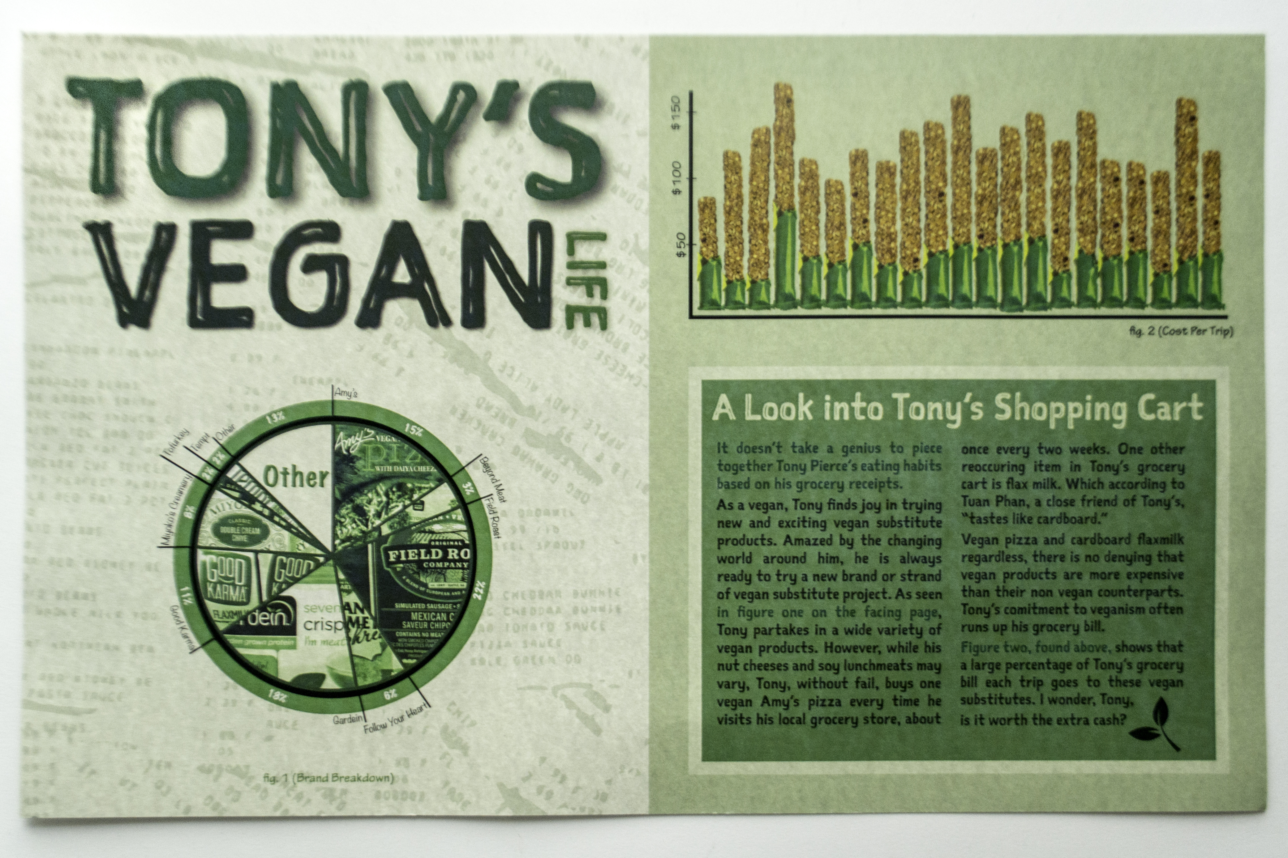
Sophisticated work involves an elevation beyond the “default.” This means there is a certain threshold of work that has to be done in order to consider the work to be sophisticated. I think often, this means taking whatever your original idea was and doing something more. In the case of my maps, this was most apparent in my visualizing information map. My initial bar graph was a standard stacked bar graph. It was composed of two solid colors and it wasn’t interesting. Eventually, I came up with the idea to create granola bars out of the bars in my graph. This added a whole new dimension to the graph and made it sophisticated. In addition to adding a sophistication to the project, I added a sophistication to my own level of expertise by learning new skills in photoshop.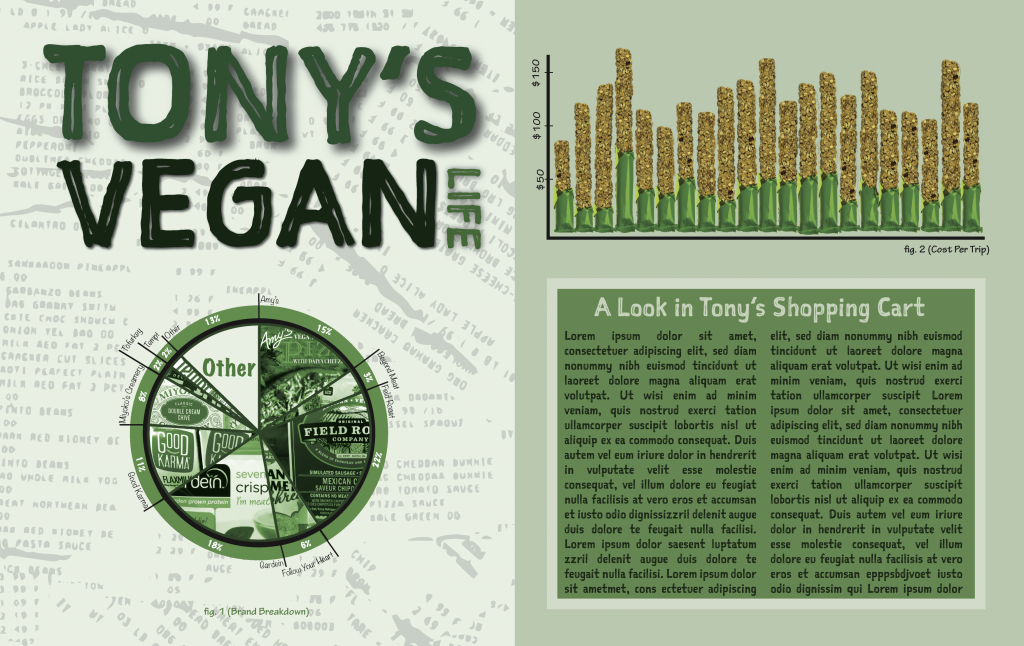
What was some meaningful feedback you received about the maps and what did you do with that feedback?
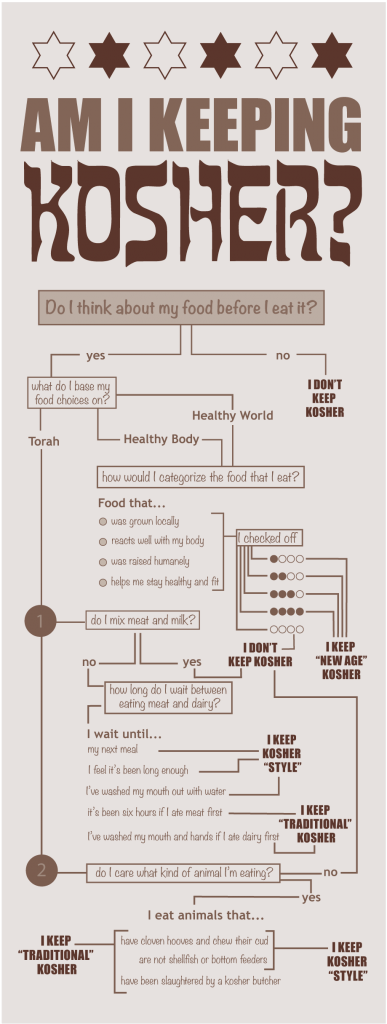 The most meaningful feedback I received was regarding my decision map. This was the only map that I had a lot of trouble starting on. I showed up to the critique where we were supposed to have a first draft and it was not up to my standards. I was frustrated that I couldn’t seem to come up with any thing decent, besides my main idea: kosher. I really liked the idea and was annoyed that I was probably going to have to change it. However, during our first critique, I was inspired by what Tuan (and others) had to say about the rationale behind decisions; the idea that our decisions, and the questions we ask in order to get there, have to refer to motives, not just the outcome. This helped me to redesign the way my map was structured and I was able to move forward with the rest of the design.
Describe what level of challenge you encountered in the creation of your maps. What was the hardest part / what was the easiest part? What was the most enjoyable part of the process?
I’ve found that in the design processes there are sometimes very distinct “aha” moments. All of a sudden, you have an idea that completely changes the way you’re thinking about a problem and it just works. That is the most enjoyable part of the process for me. I suppose the hardest part of the process is working through the time before your “aha” moment. I’ve learned this semester that there are calculated ways to work through that time. You can’t stop making just because you don’t feel inspired.
 Did you do anything else outside of class, extracurricular, related to art, design, or creativity?
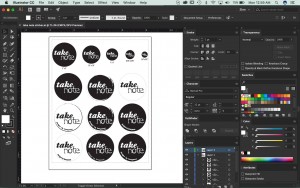
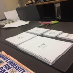
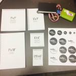
This semester I started making a lot of notebooks. And when I say a lot, I mean A LOT. After sitting in on Kim’s GDES III class during my shift as a lab monitor, I became a bit obsessed with bookbinding. I found myself staying in the lab late into the night making spiral bound notebooks. I came up with a whole business model to sell notebooks, determining ideal sizing and materials. I also made personalized notebooks for each of my family members as Chanukah presents, which was a really good exercise in reading people and thinking about how they will interact with an object.
Whether positively, negatively or neutrally, how has your life outside of school impacted your school work?
I have no life outside of school and that’s a problem. In the past, I’ve done a better job of balancing work and play. This semester, I’ve let work take over completely and I can feel the toll it has played on me. I’m trying to figure out whether or not this is just what life is nw, or if I really am working too much. I’m taking fewer hours next semester (still more than recommended) so hopefully that will help.
What does the most ideal classroom environment look/feel like to you? What does it mean to be part of a class? This semester, what was your part/role/contribution to this ideal vision?
I thrive in a design working environment. I’ve found myself spending more and more time in the lab, even when I’m working on assignments that aren’t design related or that I could be doing from home. I like being in a creative space to work. I think the most straightforward example of this was when I was working on my decisions map and I was in the lab and I turned to Alex to ask her to look at my work. Work cannot be done in a vacuum, we rely on each other (rightly so) for feedback. Our work should not be static and I am happy to be a part of an environment that allows for dynamic work to be created.

 T
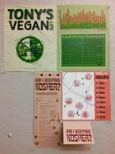
T ranslation of raw data into legible graphics is an extremely important skill for designers to have, in fact, I’d probably say it’s most important. It is our job to take information that one audience wouldn’t generally be able to process and make it accessible for them. In this case, I made financial information derived from a year’s worth of grocery receipts into a spread that the consumer can use to analyze his spending habits on vegan products.