Category Archives: Visual Studies I

We’re Closing In!!!

We’re Closing In!!!

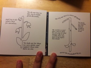
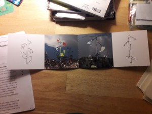
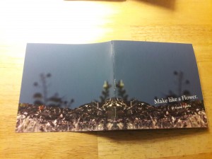
So, this time around I went through PRINTING HELL to get to the inkjet prototype. Honestly, gate folds are a gigantic pain in the butt, even if it turned out pretty awesome.

For the sake of not messing anything up, I made no cuts in the gate fold, but I may try it after Monday’s crit, just to see what it looks like.

20161204_02311220161204_02305920161204_02283220161204_022847

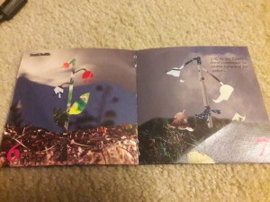
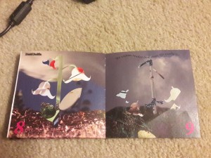
I think the sequence was a very deliberate and conscious effort on my part, so really swapping any two pages, even just misplacing the center spread, really changes the flow of things, creating a huge bump in the sequence. Honestly, changing two pages makes it a very awkward book. Now, if the pages are in the same spread, it might just give the book variety, as the overall narrative would remain intact.

the narrative itself is comparison-based. The whole story revolves around life, death, and the cycle between the two. In the case of the book, the flower is used as an example of the theme through juxtaposition; the live plant and the dying one represent the young and old, and it reveals the somewhat naive concept that nothing really dies; we’re all extensions of those before us.

Anyhow, in terms of the book itself, I’ve had to make a ton of small, minute changes in order for things to work properly. My changes have ranged from full-scale remakes to simply changing two numbers in the document setup tab. It’s been one heck of a rollercoaster ride, and I’m glad Tuan and my peers have been able to help me through it. My mom has also been a big help, reviewing my written content and letting me bounce my ideas off her. It’s somewhat mind-blowing to think that this whole book started with a single spark — a small idea — and turned into such and intricate and painstakingly crafted product. I’m pleased with how things have progressed, and I’m glad the gate fold and its many counterparts did not force me to pull my hair out.

The main changes were text placement, text formatting (i.e. hidden characters and spaces that shouldn’t be there/widows), image sizing, page sizing, print sizing, spread scaling (turning off “scale to fit” for the gate fold), and making the content flow better in terms of the written and visual content. The font choice on all pages was also deliberate and evolved over time.
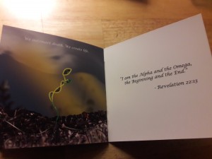
Book-Making TORTURE

Book-Making TORTURE

Book-making is an incredibly troubling process. There’s things to troubleshoot, and sometimes when you think you have it right, there’s still something wrong. I managed to scrape together a good mock-up, but I wasn’t able to include a gate fold like I planned. The gate fold took forever to get right, and when I did manage it, the double-sided print came out unaligned, so there was no way to really integrate it properly.

Aside from the technical difficulties, the overall form of the book came out incredibly well. I was very impressed by how the book turned out, and the pages/spreads work together a lot better than I had anticipated. With text accompanying the visuals, the sequence flowed better, and I think the overall message was also clearer. The book was pretty easy to make, and it fell into place the way I wanted it to, but that gate fold really was something else. I’m now at the point that I either try to narrow down the craft and execute, or simply do without it.

I have been trying to really nail down the central message, and I think creating the mock-up solidified what I was leaning towards, and I have made the flower into more of a metaphor for life than anything.

All in all, this was an interesting experience, one marked by a lack of staples and a wobbly set of pages. However, things are moving along smoothly.

Some samples of mark-up spreads:

20161121_002559 20161121_002621

Book Bonanza!

Book Bonanza!

This week was interesting.

After exploring the local park in my community, I decided that I’d end up making a book that follows the growth of a plant through the stitching together of various outdoor textures and the various textures of playground equipment.

img_20161102_071208550img_20161102_071248079img_20161102_071329386

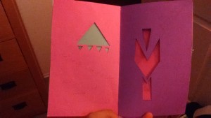
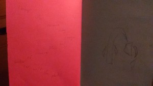
I had the idea when I began to cut through the book. It started with me cutting out a raindrop, which then evolved through further cuts into the idea of the moon, sunlight, a flower, a flower with leaves, then multiple flowers.

It’s obviously a work in progress, but it gave me a general idea of what I want to do. I think the important feature is going to be how i incorporate illustrations and collage into the area surrounding those cuts, and the mood those elements create. I want the end product to be meaningful, and while I couldn’t put in a gate fold, I was thinking that maybe a gate fold would allow for a more interesting image of a flower sprouting out from the spine of the book.

Regardless, it was a good opportunity to get my ideas down onto the page, and just exploring where and how to cut into each page was a very interesting and eye-opening experience. I did a lot of work with negative space, and it became difficult to work within those parameters and still communicate something abstract. However, it still managed to create a general example, and I’m sure it will only improve as I continue to expand my ideas along with my library of usable images.

Hopefully, the final product will represent what I envision. Even if it evolves, I think that the whole book making process has made my ideas a lot more open, at least in terms of organization and delivery.

Memento

Memento

Christopher Nolan’s Memento, is a film that relies on a unique storytelling element; its entire sequencing is backwards. Memento begins with Leonard, a man with short term memory loss and a need to avenge the murder of his wife, developing a photo of a dead man in reverse. From that scene onward, the film is presented in reverse order, with the individual scenes being shown normally rather than in reverse. This left me wondering what was going on, and while it was a little disorienting, it was interesting to try and piece together the actual events and decipher what was happening to Leonard.

The film itself is a very tangled web, the flow of the story changing around halfway through, proceeding in a chronological order to end at the big jaw-dropping conclusion, which ultimately reveals the truth about Leonard’s condition and his life. The details that are presented during Memento are extremely crucial to understanding the film’s plot, and the non-chronological flow of the film demands that the viewer pay attention to the events that take place. From my own perspective, the film was rather immersive, and drew me in with the uncertainty of what was real or fabricated by another character, especially with the introduction of Natalie, who turns out to play a major role by manipulating Leonard through the first half of the film (a fact not realized until the end of the film).

The style of Memento is unique, but the twists are a key feature in Nolan’s own style, given that Nolan also created the film Inception, which prides itself on its uncertainties. I think that I’m most interested in the fact that he used chronological order in the end, as well as flashbacks, to clear up all the loose ends. It was especially interesting how in certain areas of the film, there seems to be an overarching conversation between Leonard and someone on a telephone, as it adds to the mystery while providing information about Leonard.

When I look at Memento, it seems like a film that revolutionized the film industry. Honestly, I’ve never seen anything like it, and I believe that in art, sequence and presentation are the two most important methods of controlling how the viewer experiences someone’s creation. If Memento was shown in chronological order, it might’ve had a predictable outcome, or may have been less intriguing. By controlling the work and how others perceived its flow and sequence, Nolan created a whole new sense of uncertainty, and used it to blindside the audience.

Collage! – Wave 3

Collage! – Wave 3

As the third week of collaging ends, I’ve really gotten into the material. I’ve dared myself to try new things, and I’ve thrown caution to the wind a few times in an attempt to try new things. Overall, while it has been a struggle to break away from the formal and lean into the suggestive and abstract, I’ve worked diligently to try and capture those very concepts.

This time around, I managed to incorporate some items into my collages, as well as make some very interesting observations about my own style and creative mindset.

img_0004

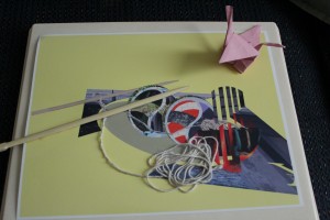
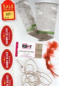
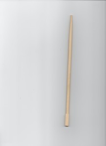
For the first collage, I was determined to create something that could represent something through suggestions and minimal context, yet remain a jumbled assortment of random images. That came out in the form of the above collage, and took root in an experience I had at the Lucky Robot. I decided to make a sushi plate, but I wanted concepts to remain collage-like and relatively abstract. While it is the most formal out of all of my collages, it also remains abstract through the mere suggestion of form, being that it still requires thought to even understand what is depicted. The way the digital balanced with the analog was interesting, and was harmonious both in composition and content. I used the chopstick and string to give the image a three-dimensional depth, and I must say it was quite effective. I really like the way it turned out, even if it does stand on the outskirts of abstractivity.

img_0002

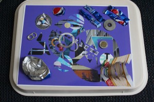
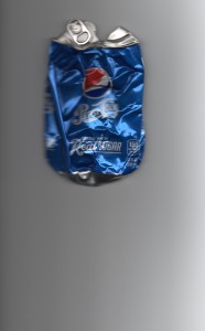
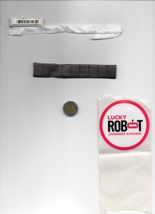
The second collage, to put it lightly, was quite messy. I like the way it turned out, as it’s definitely more abstract than the first one, but retains a unique composition, filled with not only circles but a variety of shapes and patterns. I think that this collage was the most difficult, as it mainly presented itself as I worked on it, while the other did the same, but at least started with a general concept/theme. This collage was definitely the most experimental, by far, and remains my least favorite of the two, only because I now see it as cluttered, even though it does have some redeeming qualities. I’ve incorporated several scans within the image, as well as a soda can and some random bits of metal/coin that I picked up off the street. Needless to say, it uses the items better, but looses something in it’s composition.

Overall, each collage has pros and cons, and I’m not completely content with either. Aesthetics aside, I think they are both interesting concepts and bring something new to the table, but they also each took a considerable amount of thought and effort to end up where they are. I think that that same effort is evident in the artwork, and that both pieces represent two distinct concepts within my own definition of collage; the first collage is clean and calculated, while the second is much more liberal.


My scavenged items:

img004 img005 img007 img011 img014 img017

Collage – Wave 2

Collage – Wave 2

The analog collages were pretty difficult, especially since I had no idea what I was doing. However, with some reassurance from our last critique, I figured I knew what I was doing, more or less, and I needed to explore things a bit further.

As far as the digital collages went, I feel there was definitely a better of the two. Both collages were centered around the principle of a sort of leading line or focal point within the image, and then expanded into the themes of color and shape, along with some interesting experimental features.

collage1

The first collage was mostly green/blue, and I tried to keep things as monochromatic as possible, even playing with the saturation of the images. I started with the circle cut out from one of my shots of the river around SoCo, then I just took samples of other textures and patterns and made the various elements conform to a general path, as all of the objects head towards the top-left and converge. I made a dotted line from one sample, and used it to divide multiple elements, which I figured was a creative way to go about creating some kind of vague symmetry. For the most part, I tried to keep everything as vague and abstract as possible; rather than leaving an object whole, I manipulated it, or cut it down further.

I think my favorite part about that collage was the hand and the typography element. At one point, I took a random hand off of the Mr. Rogers mural, and slapped it into the focal point. I think it gave the piece a new meaning, as everything seemed to stem from it. In addition, I took a letter A and cut it in half, then made a copy and inverted it, creating the layered/3D look that the letter has in the collage.

Overall, I think it kind of became a visual representation of life, moreso a breath of life than the act of living.

collage-2

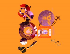
The second collage was not my favorite, and was a little disjointed, in my opinion. The overall theme was orange hues, and I played with the idea of a camera lens, so that’s sort of how I structured the circles in their groups, and why some are more focused than others. Even looking at it now, I still feel like it’s missing something, I’m just not sure what.

As an experiment, I cut out four diagonal lines from the entirety of the collage, suggesting lines that lead to a specific vanishing point. They’re faintly suggested, so it was just something I wanted to put it and see how it turned out.

I think both collages were pretty well-rounded, and I used some cool principles, but the second one needs work. I’m pretty sure that both collages managed to capture a pretty good amount of Austin’s “weird factor”, and I think they each served SoCo justice in their own unique and weird way. Overall, they are more abstract and a definite improvement from the analog collages.


Gestalt Stage 3!

Gestalt Stage 3!

Imagery is a big part of our lives. Everywhere we go, we see posters, skylines, and all sorts of interesting scenarios playing out before us. As human beings, we try to capture those moments and preserve them as long as we can; try to crystallize what we see, and let others see it, as well.

img_0291

I think that photography, while it may not be my major, is still a big part of myself and what I want to learn. I spent three years in high school working for the yearbook team, so I’ve always been taking photos. For me, this assignment brought something new to the process. While I’ve had a good eye in the past, and I’ve had some experience with Gestalt laws, this assignment allowed me to look at photography in a much less objective light. For the first time ever, photography was more about expression and creation than simple the recording of data.

img_0271

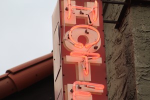
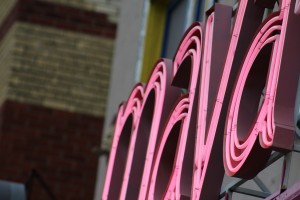
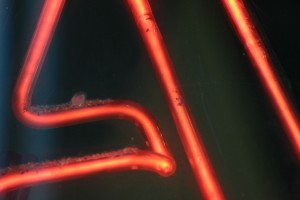
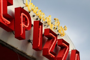
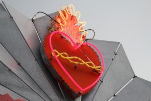
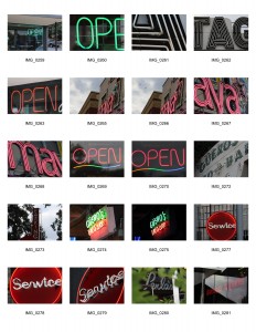
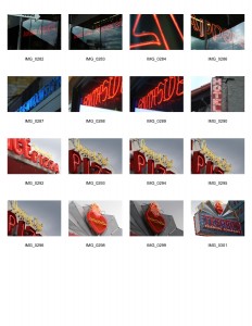
Overall, I think I learned a lot about composition. While I definitely favored a few laws over others, I did try to focus of my framing and the way I presented things within the realm of Closure. I wanted my images to have a texture; some kind of unique presentation that was ambiguous yet telling. I found that in neon signs. I specifically went for red neon signs, and tried to capture a wide variation of such images. I really wanted the color to unify them, not just their components. Altogether, I think my image choice for this set was rather thoughtful, and I think talking to my teachers helped me to understand what a proper image set was; it needs to be cohesive, but that doesn’t mean it can’t be meaningful.

img_0276

I think art is pretty subjective, but there’s still a basic theme you can convey to a viewer. With my set, I wanted the warmth of the red to give off a homey feeling, but I also wanted the signs to seem whimsical and inviting. I think the Maya sign was the one that had the most interesting perspective, being how condensed it was, yet can still be legible. It was definitely on of the images I picked that didn’t seem up to par until it was alongside the others.

img_0264

Another awesome shot was the close-up of the American Apparel neon sign. The “A” I took a photo of really stood out to me, and gave me all sorts of flash backs to the Stranger Things intro, which was honestly a big influence on my career path. I really liked that photo, and I think the overall aesthetic of it was quite impressive; it almost looked like lava.

img_0284

The photos I took all meant something to me, in this sense. Whether it be the pizza place I spent graduation at, or the heart sign that made me stop and think about what really matters to me in life. Altogether, these images represent me, and I really feel that this assignment got down to the heart of what any designer needs, which is a strong sense of composition. No matter what field you’re in, when it comes to all art, composition and aesthetics are important. If I learned anything from this project, it’s that good composition makes an image complex, and makes the work that much better.

img_0297img_0300


contact3-jpg-1 contact3-jpg-2


Stage 2 Gestalt Reflection

Stage 2 Gestalt Reflection

Gestalt is an amazing concept. Honestly, I thought it was pretty interesting how simple placement and suggestion could make an image completely different from just taking a full frame photo of the subject. In this set of photos, I really tried to go for signage, which is something that was a bit of an afterthought beforehand.

img_0219img_0240

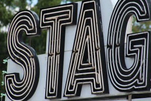
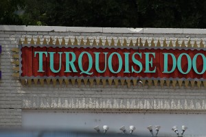
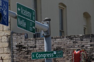
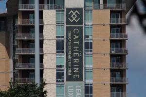
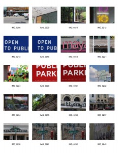
What I really wanted to play with this go around was the Law of Symmetry, the Law of Closure, and the Law of  Proximity. While there were many photos to choose from, I think the ones below serve as the best representation of those efforts. For instance, the grouping of the street signs was a good representation of the Law of Proximity, as they are all perceived as similar, even if they are only seen as an intersection. The Catherine logo was a good use of negative space, I think, with the logo sort of clustered in the center, away from the noise. I think the framing there was a good use of the Law of Containment.

img_0244img_0248

The other thing I would like to address is the law I really fell in love with; the Law of Closure.

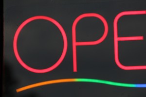
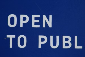
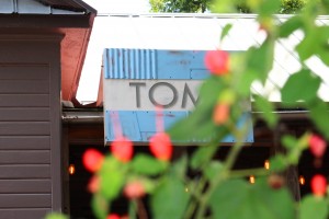
While the Law of Closure is all about suggestion and our ability to finish words and shapes based on our own knowledge, I find it incredibly fascinating how interesting it made my images. For example, the “Open to public” sign and “TOM” sign were both very interesting pieces, in my opinion. The TOM’S sign was really awesome with the fact that the plants managed to cover up the M, but it could still be understood as a complete word and idea. I experimented with this for the rest of my shots, and it was honestly a lot of fun.

img_0214img_0225

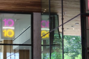
I found what I believed to be the Law of Symmetry in the 10/10 sign, which reflected across a window when I took the shot. I thought it was a pretty interesting composition, and it really caught my eye with the neon colors and the way it just happened to reflect that way. It was an unique experience to have the opportunity to capture that moment, as I really haven’t seen anything like it before.

img_0211

When it comes to Gestalt, I think that using the laws can create a very interesting image, no matter what the subject is. Almost anything can be aesthetically pleasing, but these laws simplified it down to a basic understanding of composition and frame use, which make a big difference in the long run. I feel like I’ve learned quite a bit about photography in just two weeks, and I honestly am very impressed with the way things turned out. My last set was a lot more random and out of focus, but this set was very clear to me. I knew where I was going, and that made all the difference. Honestly, I think the Gestalt principles really helped me create this set, and I wouldn’t have known where to start without them.

img_0220

sheet2-1 sheet2-2

My Introduction to Photography

My Introduction to Photography

On Drive, Creativity, and the Meaning of Design

On Drive, Creativity, and the Meaning of Design

What is design? That question is something I have never really thought about for the past two years. I took a graphic design class both my Junior and Senior year, but I never once questioned what I was doing, or why I was doing it. For me, design was something professional, yet oddly liberating. I considered graphic design to be fascinating, mostly because you can really create whatever you want with the tools you’re given. I guess what separated it from traditional “pen and paper” art was the extensive applications of the medium.

For instance, graphic design is often used for marketing, but also includes things like concept art and digital painting. Realistically speaking, it is incredibly hard to pin down a good definition of graphic design. Design, in general, is constantly changing and adapting with trends and new generations of thought. When design is rooted in what is around us, the changing environment can equate to a constant shift in aesthetics and what we believe design to be.

While it is hard to define design, it is equally difficult to explain creativity. Some individuals think that you cannot be a designer without some level of creativity. That is probably true, but when you think about where creativity comes from, it also becomes a difficult subject to handle. Amy Tan brought up the concept from different perspectives, touching on the genetic, psychological, and emotional roots of creativity. Personally, I think some people are born with creativity. How else to you explain the prodigies of decades’ past? However, I feel creativity can also be something latent within us that has to be sparked into existence. Like Tan said, perhaps creativity can start up after intense trauma, or perhaps an inspiring moment. After all, creativity allows you to be expressive through art; to let your emotions and ideas spill onto the canvas. I don’t think I was born with any sort of innate ability to create. No, I think it was something I was introduced to, maybe with Legos or building blocks, and I chose to explore it.

Doubling back now, I feel like design is what you make it. Yes, there are numerous fields such as graphic design, and they can be extremely corporate and cold, but they are only as dull as you make them. Graphic designers create aesthetics. They create the way we see things, and how we associate colors and shapes with our daily lives. Whether that comes in the form of branding, web design, or even just making the layout for a billboard, it still resonates with the public and shapes their own associations. That’s really what I want to do. I want to create things that people think are beautiful and aesthetically pleasing. I want to help design simple, elegant, streamlined web pages. I want to design book covers or even book illustrations. I want to work on company billboards and logos. I want to explore animation and someday create my own cartoon show, or maybe try my hand at making the first American-produced anime. I want to create the world around me, or at least have some kind of influence on it.
I think that is why people really end up becoming artists and designers. Like everyone else, we desire to leave a mark on this world. However, for artists, I think it is more than that. Artists have ideas and concepts they want to express, and they want the whole world to see what they see. As artists of any sort, we are all trying to make our own mark, and we are all trying to show this world what our own minds have to bring to the table.