Imagery is a big part of our lives. Everywhere we go, we see posters, skylines, and all sorts of interesting scenarios playing out before us. As human beings, we try to capture those moments and preserve them as long as we can; try to crystallize what we see, and let others see it, as well.
I think that photography, while it may not be my major, is still a big part of myself and what I want to learn. I spent three years in high school working for the yearbook team, so I’ve always been taking photos. For me, this assignment brought something new to the process. While I’ve had a good eye in the past, and I’ve had some experience with Gestalt laws, this assignment allowed me to look at photography in a much less objective light. For the first time ever, photography was more about expression and creation than simple the recording of data.
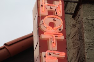
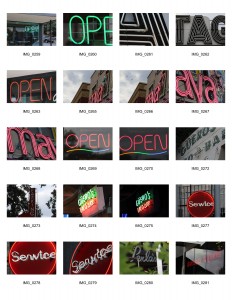
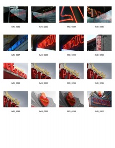
Overall, I think I learned a lot about composition. While I definitely favored a few laws over others, I did try to focus of my framing and the way I presented things within the realm of Closure. I wanted my images to have a texture; some kind of unique presentation that was ambiguous yet telling. I found that in neon signs. I specifically went for red neon signs, and tried to capture a wide variation of such images. I really wanted the color to unify them, not just their components. Altogether, I think my image choice for this set was rather thoughtful, and I think talking to my teachers helped me to understand what a proper image set was; it needs to be cohesive, but that doesn’t mean it can’t be meaningful.
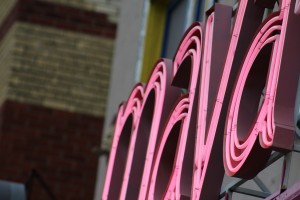
I think art is pretty subjective, but there’s still a basic theme you can convey to a viewer. With my set, I wanted the warmth of the red to give off a homey feeling, but I also wanted the signs to seem whimsical and inviting. I think the Maya sign was the one that had the most interesting perspective, being how condensed it was, yet can still be legible. It was definitely on of the images I picked that didn’t seem up to par until it was alongside the others.
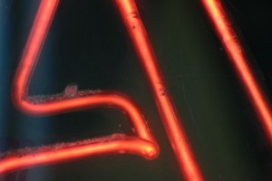
Another awesome shot was the close-up of the American Apparel neon sign. The “A” I took a photo of really stood out to me, and gave me all sorts of flash backs to the Stranger Things intro, which was honestly a big influence on my career path. I really liked that photo, and I think the overall aesthetic of it was quite impressive; it almost looked like lava.
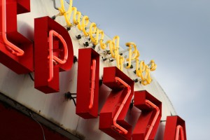
The photos I took all meant something to me, in this sense. Whether it be the pizza place I spent graduation at, or the heart sign that made me stop and think about what really matters to me in life. Altogether, these images represent me, and I really feel that this assignment got down to the heart of what any designer needs, which is a strong sense of composition. No matter what field you’re in, when it comes to all art, composition and aesthetics are important. If I learned anything from this project, it’s that good composition makes an image complex, and makes the work that much better.
