Img Meth: Zine

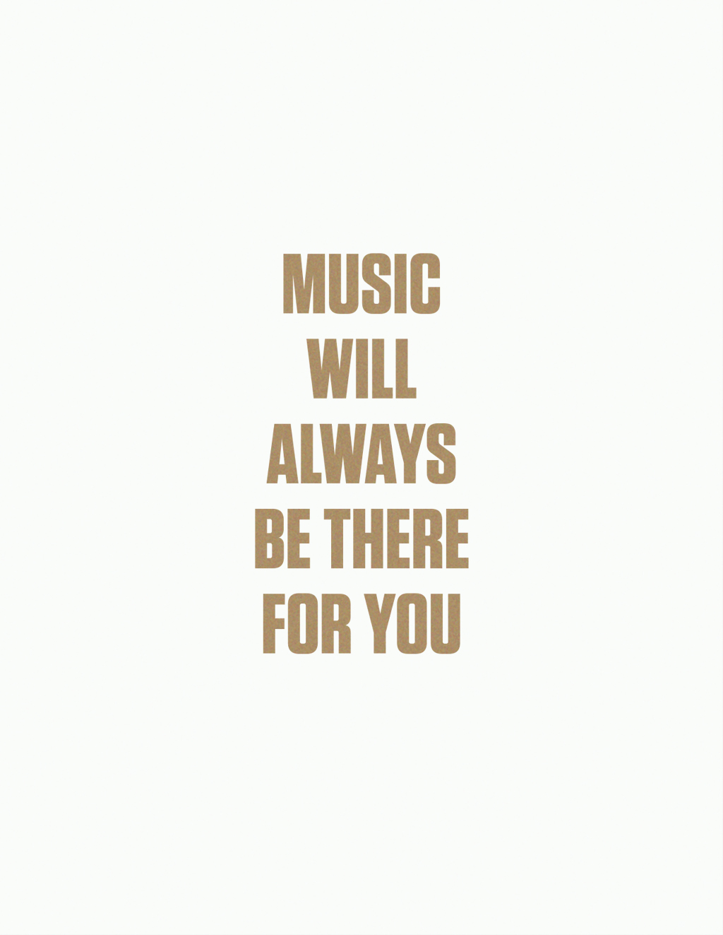
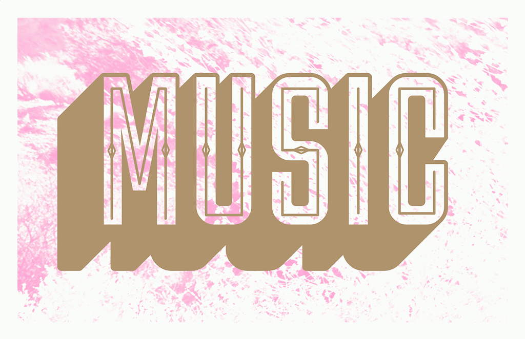
For the zine project, I focused on creating a truism about music. It’s something that I’m into and it’s always around. The colors of the design plays on the fact that I mainly listen to pop music. The pink and gold stands and pops out. While the project had us making chromatic type, I didn’t want to make mine seem too much of a standard chromatic wood type because the type style tends to turn into a vintage and almost western feel. The sans-serif font helped prevent that. The backgrounds provide a texture that helps visualize how there are various textures in music.

PDF: atruongnzine

Graphic Design I: Symbol Methodology

For this project, I created a hybrid of symbols that would arbitrarily fit together. I focused on independent film and tried to take an iconic item from each one. In drawing the individual symbols, I tried to keep each item as bare and simple as possible to make it easy on the eyes. For the final hybrids, the movies I ended up using were Perks of Being a Wallflower, The Spectacular Now, Whiplash, Nightcrawler, and Ex Machina. Despite being arbitrarily placed together, the hybridized films have things in common.

Img Meth: Style

The two styles that were replicated and hybridized were Beatnik and prep. Both of them are contrasting styles in which the Beatniks strayed from what was the norm and the preppy kids tried to fit in with an elite sense. The hybrids combined very different looks into something interesting and quite stylish.