As a designer, I have been able to recognize what looks good and what doesn’t. I focus a lot on the aesthetic I hope to achieve in whatever I’m creating or designing. I don’t have a lot of trouble translating my ideas onto the screen. Consistency is something that I think I’m good at. When I create something, the aesthetic has to make some sense in relation to the thing I’m making it for. My design process has definitely relied a little too heavily on visual appeal as opposed to concentrating on the reasoning. I think that as I progress as a designer, I should really starting thinking much more about process and be able to communicate more concrete ideas.
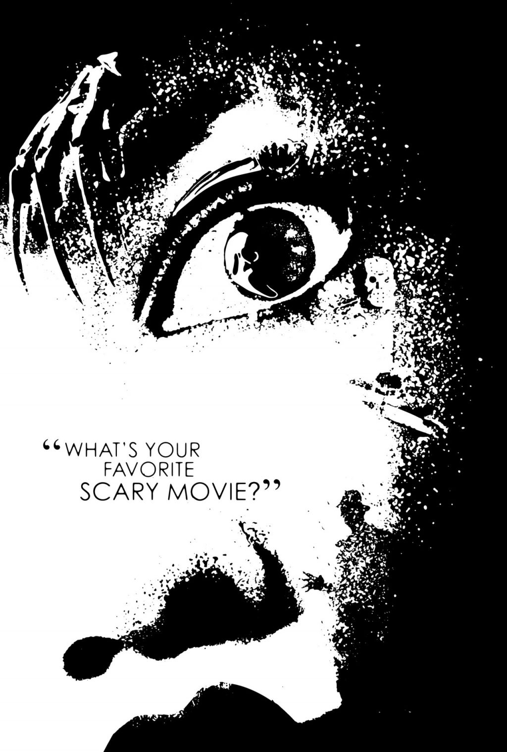
The first piece is a poster I created fall of freshman year for the Command G Halloween poster sale that unfortunately did not happen. I was eager to make something substantial and created this poster based on the film ‘Scream’ which is a quintessential movie to the horror genre. It was a perfect way to encompass Halloween with its references to several other iconic scary movies. I wanted to make the poster dramatic and almost tense. I used Drew Barrymore’s face as the basis and placed the slashers that ‘Scream’ references around her so that they “create” her face. The strength of this work is the way each object is placed throughout the poster. I tried to make sure that each thing fit well, constantly finding the right size for each object so that the overall image is visually striking and pleasing.
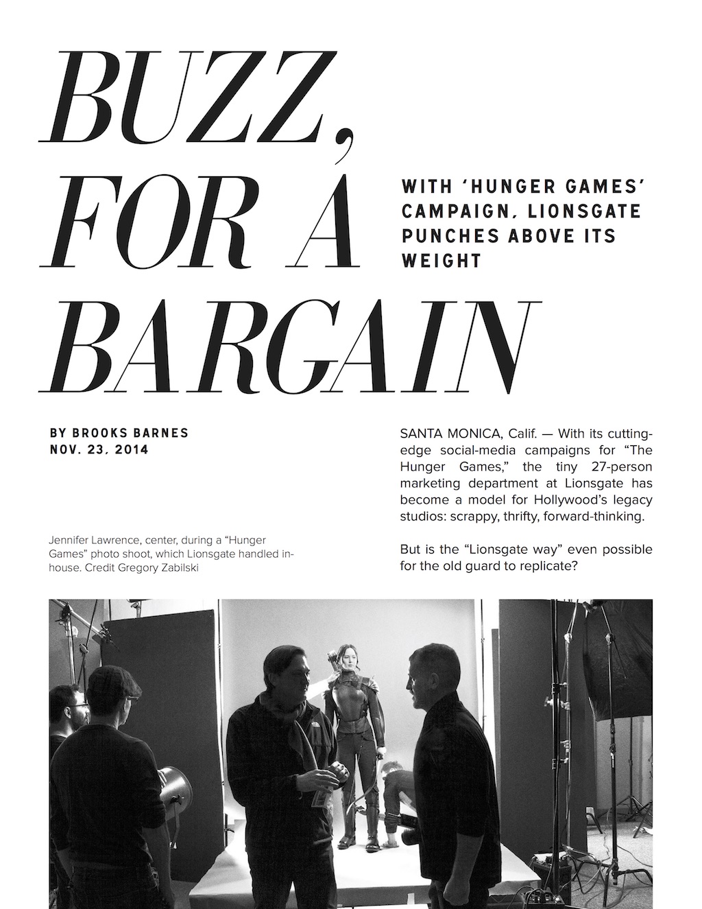
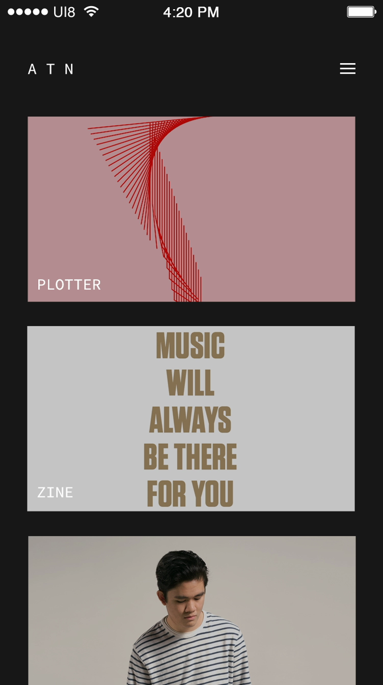
In my spread for Typography I, the grid I developed helped give a consistent layout throughout the entire article. This project allowed me to start thinking about grids and how text should be laid out instead of placing a bunch of text boxes where needed. I believe the strength of this work is the clarity that the spread gives for the article. The image choices, I think, also helped strengthen the spread as well. The typeface doesn’t distract from the content and the way the text is laid out isn’t confusing for readers. Spacing between words on some lines could be fixed, and the corners of text that wrap around the one image should be straightened out. For the portfolio app interface, I understood the need for the interface to be easy to view and navigate. I laid out the work on the homepage in a feed so that viewers can immediately see what I have. I didn’t want my app to be clunky or visually confusing. Having some prior knowledge of After Effects helped. I think there’s always room for improvement. I tend to leave a lot of work for the last minute, and I think that if I spread my work more evenly, I can fix a lot of the little details such as alignment and spacing that might be still need attention.