Course Analysis

Rhetoric and Composition II:

  1. My greatest strengths include my ability to relate various texts to one another and understand how they work together.
  2. For greater success in this course, I need to work on my ability to write down my thoughts and turn them into essays in a way that is easily understandable.

Visual Studies I:

  1. My greatest strengths include my passion for art that keeps me going, even if I’m frustrated by a project.
  2. For greater success in this course, I need to work on focusing the meaning and theme in my projects. My mind runs a mile a minute and it makes it hard for me to centralize a theme, leading to scattered pieces that don’t relate very well.

Schooling, Education, and Society:

  1. My greatest strengths include my genuine interest in the course material. I want to become a teacher, so everything in this class is interesting to me.
  2. For greater success in this course, I need to work on memorizing names and dates. There’s so much content with minute details, and I need to sit down and make flashcards or something to help burn them into my brain.

Visual Studies Seminar:

  1. My greatest strengths include my ability to pay attention and take detailed notes without losing track of the content.
  2. For greater success in this course, I need to work on putting more effort into my blog posts since they can become an indicator of my progress as a student and artist.

Social Justice LLC Seminar:

  1. My greatest strengths include my ability to take copious notes and relate the different categories of social justice to one another in a comprehensive way in order to better understand how everything connects.
  2. For greater success in this course, I need to work on being more attentive during the class since it’s in the morning and I’m usually really tired.

Math for Liberal Arts:

  1. My greatest strengths include my ability to work through a problem step-by-step and (for the most part) not be overwhelmed by it.
  2. For greater success in this course, I need to work on paying better attention during class. I often find my mind wandering, and then when I focus back on the class I’ve missed four lecture slides.

Computer skills:

  1. My computer skills include: Word, Powerpoint, (a little) Photoshop and Lightroom
  2. I still need to learn: how to master Lightroom and Photoshop, as well as Excel

Research & writing skills:

  1. My greatest strengths as a researcher/writer include: my ability to compile a lot of information using different sources
  2. I need to work on these aspects of research and writing: having a clear point of view, transitioning between different topics, and picking which information is vital to the paper
  3. I learn best & accomplish most when: I am in a quiet place, well-rested, and focused on the task at hand

Action plan:

I frequently find myself struggling in my Rhet and Comp II class. I’m used to writing argumentative essays, not theoretical analyses, so it’s hard to transition between the two genres.

  1. Ask more questions during class
  2. Email my professor whenever I’m having trouble
  3. Utilize the writing center on campus
  4. Have classmates read over my writing and critique it
  5. Read the assigned essays multiple times
  6. Take notes over the assigned essays to better understand the content
  7. Work on the homework right after class while the content is still fresh
  8. Take more notes during class
  9. Make more brain dumps when writing essays
  10. Treat homework like tests to make sure I do the best I can on it


Self-Critique

DOGGY


1. What was the goal of the assignment? Or what was the question posed by this assignment?

The purpose of this assignment was to create 2D collages using Photoshop or Lightroom (or some other computer-based design program) that express Harmony.

2. How did you go about reaching this goal or answering this question?

I was originally going to make two dog collages with contrasting color schemes, but I severely underestimated the amount of time it would take to make them. So for now I just have this dog collage, but there will definitely be another. In the previous collage project (part of which is pictured below) I created a diptic using the “HERE” phrase and contrasting color schemes to emulate different moods. For this project, I wanted to tie all of the collages together so I created this piece to mirror the 3D collage shown below. The other dog collage will have a color scheme similar to the other “HERE” collage, so that they work well together both as a whole and separately.

  • What is the strongest aspect of this work?

    I think that the strongest aspect of this collage is the color palette because it ties the image together

  • What is the weakest aspect?

    Probably the technical aspect and the purple outline of the dog/plants

  • How can the composition or form be improved?

    I could go in and clean the image up or choose components that maybe fit the image better

  • How can the project be strengthened conceptually?

    I could make the dog more of a focal point, because right now he’s just sort of chilling there

  • How can the project be strengthened technically?

    Since this was the first time I ever created a collage using Photoshop, I know there are a lot of technical issues that can be fixed due to my lack of experience

  • Additional notes.

    While I know this isn’t perfect, I’m still really proud of it. It took me what felt like forever to finish, and I think it’s interesting and fun. I love the plants, the colors, and the different pieces all coming together to create a sort of aura around the dog


HERE PURPLE


1. What was the goal of the assignment? Or what was the question posed by this assignment?

The purpose of this assignment was to create a 3D collage using images taken/found at SoCo. The images should have a sense of Harmony.

2. How did you go about reaching this goal or answering this question?

I didn’t include the second image of this diptic because, as I stated above, I don’t have the accompanying dog collage to go with it. That being said, this image is only half of the whole. The other “HERE” collage uses brighter, warmer colors. I wanted there to be harmony within the image itself, so I used a cohesive color palette. The letters in “HERE” were physically cut out of the other image and glued onto this one to create a relationship between the two of them.

Blog Post #4

Shelby Savage – Just based on appearances, I really liked her. She seemed sweet and put together, and I loved her outfit. Then she showed us her portfolio, and my initial impression was reaffirmed. She has a very feminine style, and her work was bright and attractive. I really loved the graphic chart of Wes Anderson movies, and I actually sent it to my brother-in-law (with proper credit!).

Paul Young – Even though his art is different from what I usually gravitate toward, I was drawn to it. I loved the concept he had for (I think it was) his senior project. Journaling dreams is something I’ve tried to do countless times but either forget about or don’t have time for, so his dedication was inspiring. I also really liked the posters he made for the music department and the logo for the writing class.

Crissy Smith – Crissy is the TA for my Visual Studies class, so I already knew a little bit about her. She seems really nice from the limited interactions I’ve had with her. Her photography, though, was amazing. The emotion and personality she managed to capture in her photographs of firefighters was so vivid that it felt like I already knew them. I also really loved the “Little Planets” series she did; I thought it was creative and fun.

Juliana Isabel – Once again I loved her outfit; to me she totally embodied the look of an artist. I thought her photography was very interesting. There was a lot to look at and admire in each piece, and I appreciated the amount of detail put into each one. The fact that she opened up a gallery with some friends was crazy inspiring to me. I’d love to go look at an exhibit or two if I get the chance.

—-

  • Weave Silk I love to go on here when I get really stressed. Making all these different designs, even if they’re too busy or don’t make sense, is therapeutic and mesmerizing.
  • Every Noise at Once I like to use this website to find music that fits the mood of whatever I’m creating. Or, if I’m feeling creative but don’t have any direction, I roam around on here until I find something that sparks my interest.
  • PostSecret My sister showed me this website when I was younger and I’ve been hooked ever since. I love looking through the secrets and making connections to each of them. Some are inspiring, some are saddening, and some are just totally off the wall, but I love each one.
  • crystaloceans This is my personal blog. I’ve had it for around five years and still update it (though not as regularly as I would like) with new images.

2D Harmony Collage

DOGGY

Photoshop is difficult. It’s time-consuming, finicky, meticulous, and takes forever for me to figure out. That being said, I really like using it. As much as it drove me crazy, I enjoyed creating all the layers and moving things around and making it all work together. Unfortunately, I underestimated the amount of time it would take me to make a single collage, so I only had time to make one. I had hoped to create a similar collage with a different dog, flowers/plants, and background images, that way they would be similar to the 3D collages I made. I wanted to tie it all together, and make the “Here” images relate to the dogs using similar color palettes. Before the next critique I’ll (try to) have the other dog collage done, that way the meaning and purpose translates better across both images.

3D Harmony Collages

HERE ORANGE

HERE PURPLE

This project was difficult for me, but in a good way. I used to make collages all the time when I was younger, but I didn’t want something that looked too “scrapbook-y” this time. I’m used to having paper bits all over my floor and magazines strewn about, but this was more precise cutting (with a box cutter) and careful gluing. Also, I wasn’t sure what would constitute as “scrapbook-y” so I played it safer than I probably should have. I really wanted to try making a diptic of some sort, so I used the “HERE” from the wall and moved it onto the wall with the purple plants. I tried to create harmony using similar color palettes for each image but make them contrast when compared to each other. Overall I’m happy with what I created but I think it’s too rigid for a collage.

Divisions (Final Project)

Proj_4-6

Proj_4-2

Proj_4-4

Proj_4-3

Proj_4-5

Proj_4-1


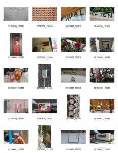
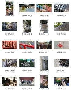
FINAL CONTACT SHEET-1FINAL CONTACT SHEET-2

This project was fairly difficult for me. I took a bus to SoCo feeling good about the whole thing, and even as I took pictures I thought to myself, “This is gonna be great.” Unfortunately, when I got back to my dorm I found that I wasn’t as excited as earlier. My pictures were okay, but editing them was frustrating so I scrapped my first idea. And the second. And the third. Finally I had to take a break because I was starting to panic, but when I came back to my computer I was calm and ready to go.

That’s when this series was created. I wanted to try something bold and bright, two things I usually shy away from in my art. I tried to choose pictures with similar color schemes, strong patterns, and lines that created shapes within the image (Gestalt law of containment?). They have an urban, almost gritty quality that I think works well. To be completely honest I’m not sure what the specific meaning is other than that I have a strong emotional connection to each one. Maybe that’s because I spent so much time on them, or maybe I was subconsciously drawn to them from the start. I don’t know, but I’m excited to figure it out. I really wanted to push myself with the project and try out things that weren’t necessarily in my comfort zone. To me, this series represents the bright world around me, and the daring options I should take more often.

Charmaine Olivia

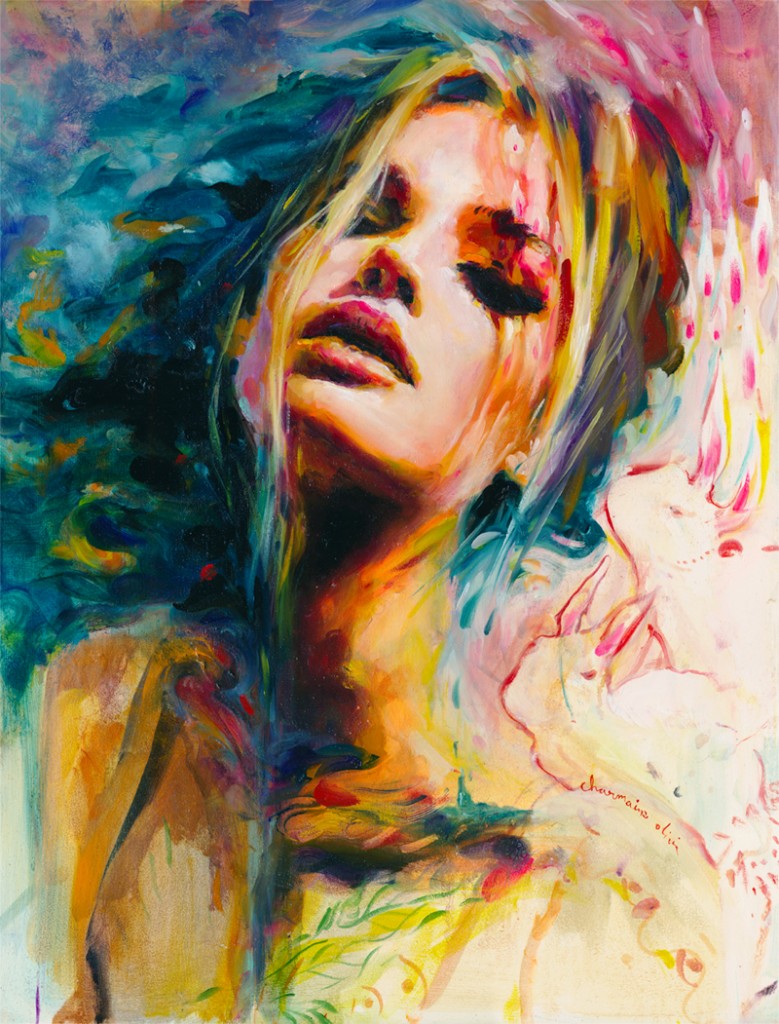
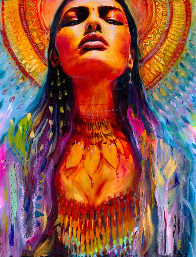
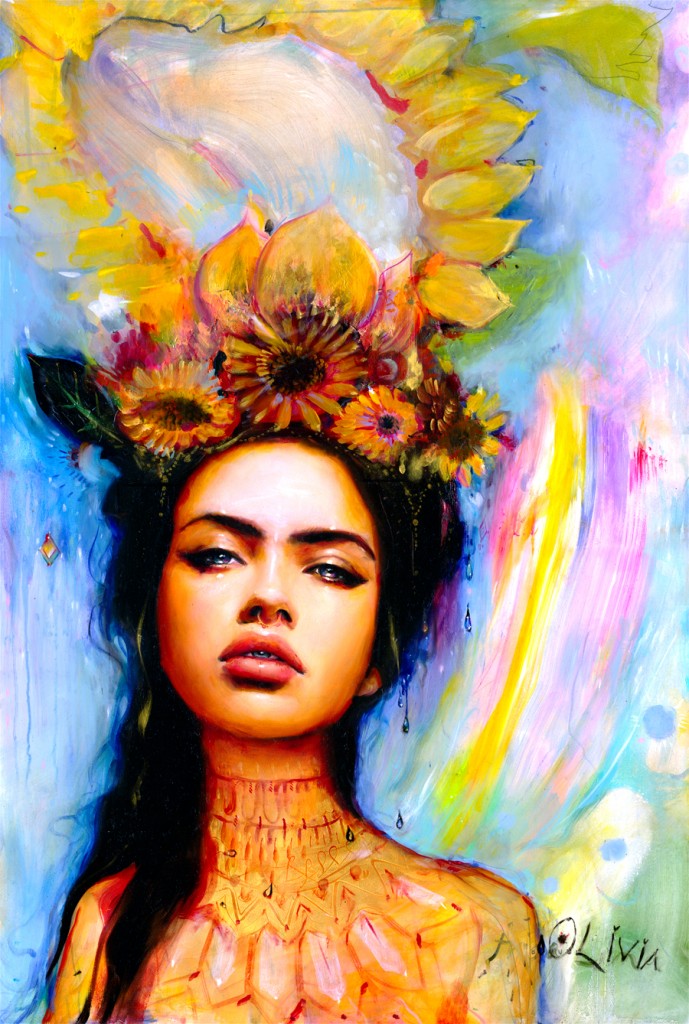
Charmaine Olivia is native Californian who uses primarily oil paints to create otherworldly paintings. She has several pieces and sketches using other mediums and has practiced using spray paint as well. Some of the people/groups she has worked with include Urban Outfitters, Society6, Lady Gaga, Nylon Magazine, and collaborations with Cirque du Soliel. She has a loose, playful, ethereal style and uses many colors to create beautiful portraits. I first found her in my third year of high school and loved her artwork immediately. I’m drawn to the expressive movement in her artwork and the many details that are hidden away. There are layers to her artwork that amazes me. Sometimes I just stare and wonder at how she did it. She also has an enthusiasm for creating art that I find inspiring. In an interview that can be found here, she talks about her creative process and how it’s changed. If she gets frustrated with a painting, she “walk[s] away” until she’s “chilled out and excited again.” Since I can get pretty stressed over my art, I thought this was a very interesting philosophy. From her ink drawings to oil portraits, there isn’t a piece by her that I don’t like.

Images from charmaineolivia.com

wallpaper charmaine olivia
Evelyn, oil on panel, 18″ x 24″, December 2012

wallpaper sundrenched
Sundrenched, oil on panel, 2014

dewdrop
Dewdrop, oil on panel, 2014

Blog Post #2

Tracking my activities for an entire week was more difficult than I first anticipated. I would frequently forget to write down hours or even days worth of events, and then had to wrack my brains to remember what happened.

Aside from those slip-ups, it was very insightful. I know I require a lot of sleep to function, but when laid out on paper my napping seems a bit excessive. I also noticed that around 8:00 pm – 9:00 pm every night I just sort of stop doing anything productive and relax for four hours or so. This might be a habit I haven’t yet kicked from high school, but seeing so much time “wasted” makes me think I need to work more.

Or, if I’m not working, I can be making art in my sketchbook. There was a severe lack of that on the time sheet, and if I want to become an art teacher I need to start creating art more regularly. Plus I had forgotten how soothing it is to paint or sketch for an hour. Overall I think it was a very good idea to fill out this time tracker, because it showed me what I need to work on in terms of time management.

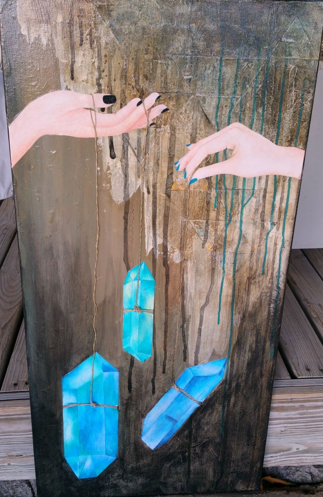
Blog Post 2 Past Art
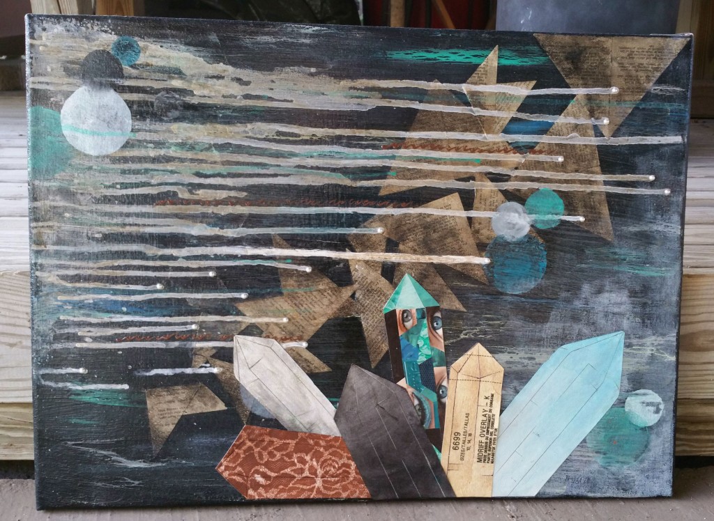
Awakening, mixed media on canvas,  40″ x 20″, 2014

Blog Post 2 Past Art 2
Rebirth, mixed media on canvas, 20″ x 24″, 2014

Blog Post 2 Past Art 3
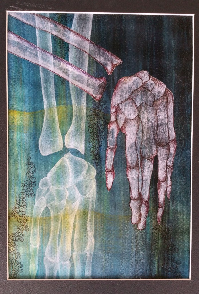
Haunted, mixed media on watercolor paper, 18″ x 12″, 2014

These three pieces of artwork were all created in the same school year. I frequently find myself working with blues, greens, black, white, and neutral color palettes as opposed to bright, warm colors. My artwork usually has several layers and I’m not afraid to paint over the entire thing if I’m not satisfied with it. I try to incorporate both abstract and realistic images in my pieces to create a sense of balance. I draw inspiration from many different places and tend to work on feelings rather than well laid out plans.

Blog Post #2

law of symmetry
Law of Symmetry

law of repetition
Law of Proximity

law of proximity
Law of Similarity

law of continuity
Law of Continuity

law of containment
Law of Containment

law of closure
Law of Closure


This project was definitely more challenging than the first. Gestalt theories are a bit difficult to understand, and I found myself constantly checking the definitions to make sure I was on the right track. Unfortunately, I was so focused on getting pictures of the different laws that I didn’t pay enough attention to the theme of the photos. The end result doesn’t flow together as well as I would have hoped, but I’m happy that I managed to find six different laws.

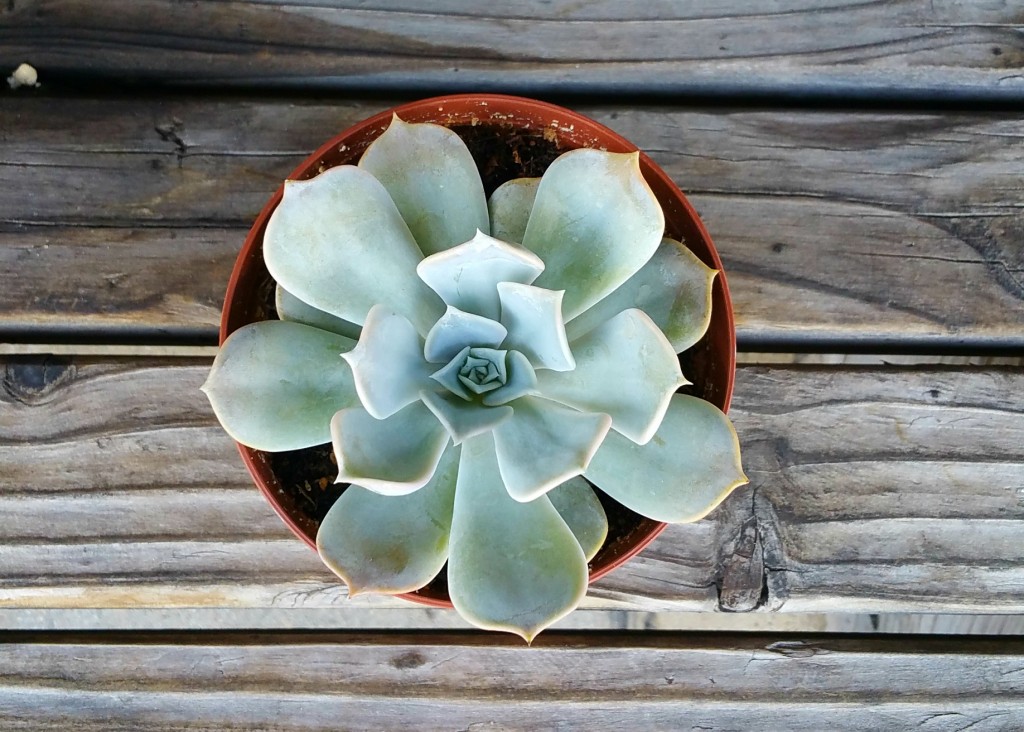
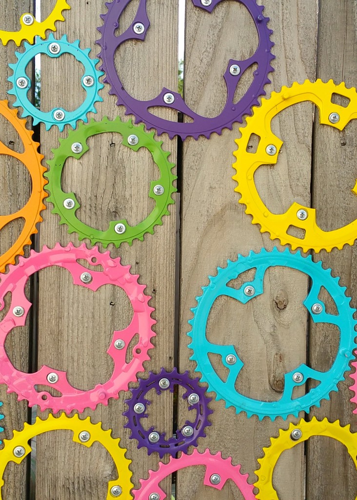
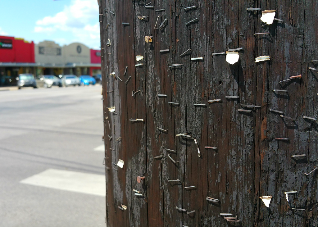
The potted cactus works for the law of symmetry because while it’s not exactly identical, the image looks very similar on both sides. Plants have a natural symmetry that worked well in the photo. The multi-colored cogs works for the law of proximity because although they aren’t the same size or color, the overall shape is the same. This grouping sets them apart as a unit. I chose the staples on the wooden pole for the law of similarity because they all have a similar shape and tend to naturally separate into groupings.

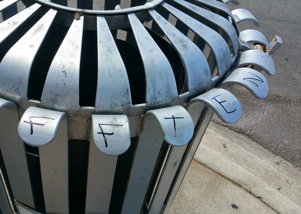
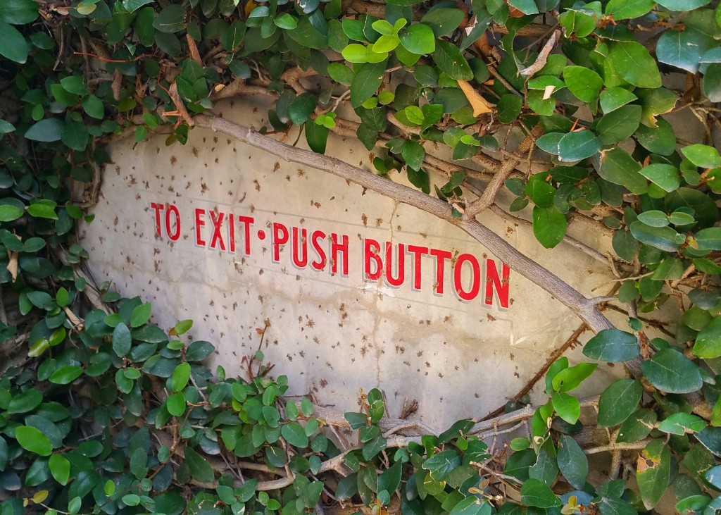
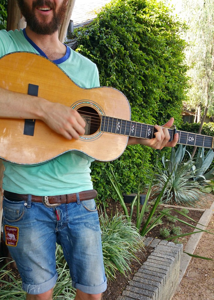
I chose the trashcan for the law of continuity because the curve of it flowed very nicely across the image. The different lines give it movement and draws the eye across the whole photo. I was a little unsure about the law of containment photo I used because it wasn’t a rectangular frame, but I think it still frames the words well. Hopefully I’m not off on that one! Finally, the guitarist I used in the law of closure photo works because although you can’t see the top of his face, your brain knows it’s still there.

Blog Post #1

final20150828_112110

final20150830_131415

final20150830_132540

final20150830_134846

final20150830_135905

final20150830_135930

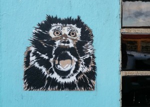
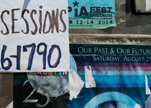
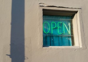
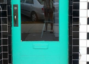
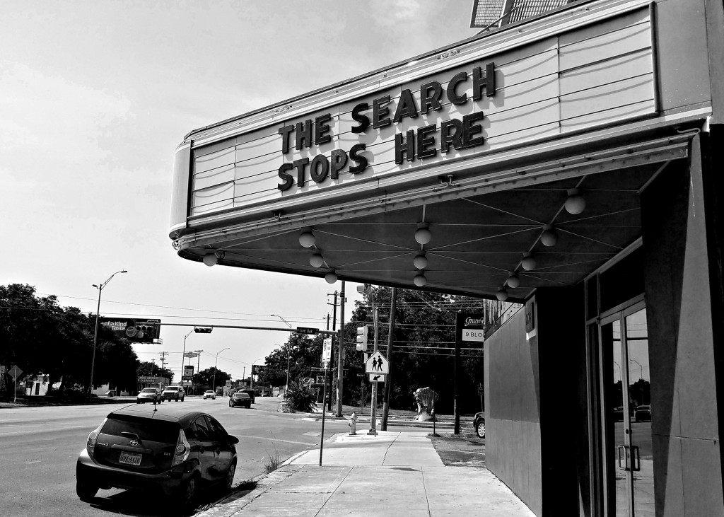
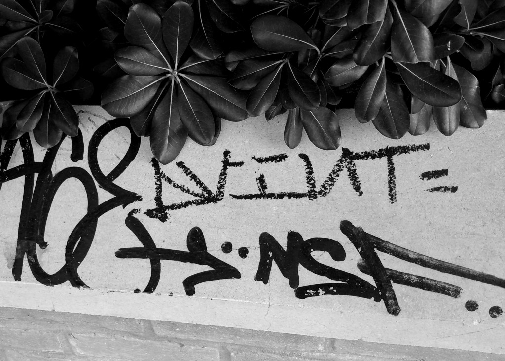
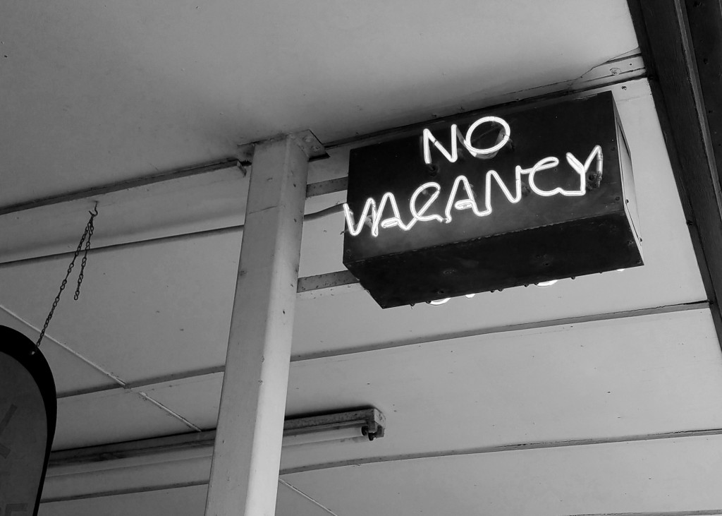
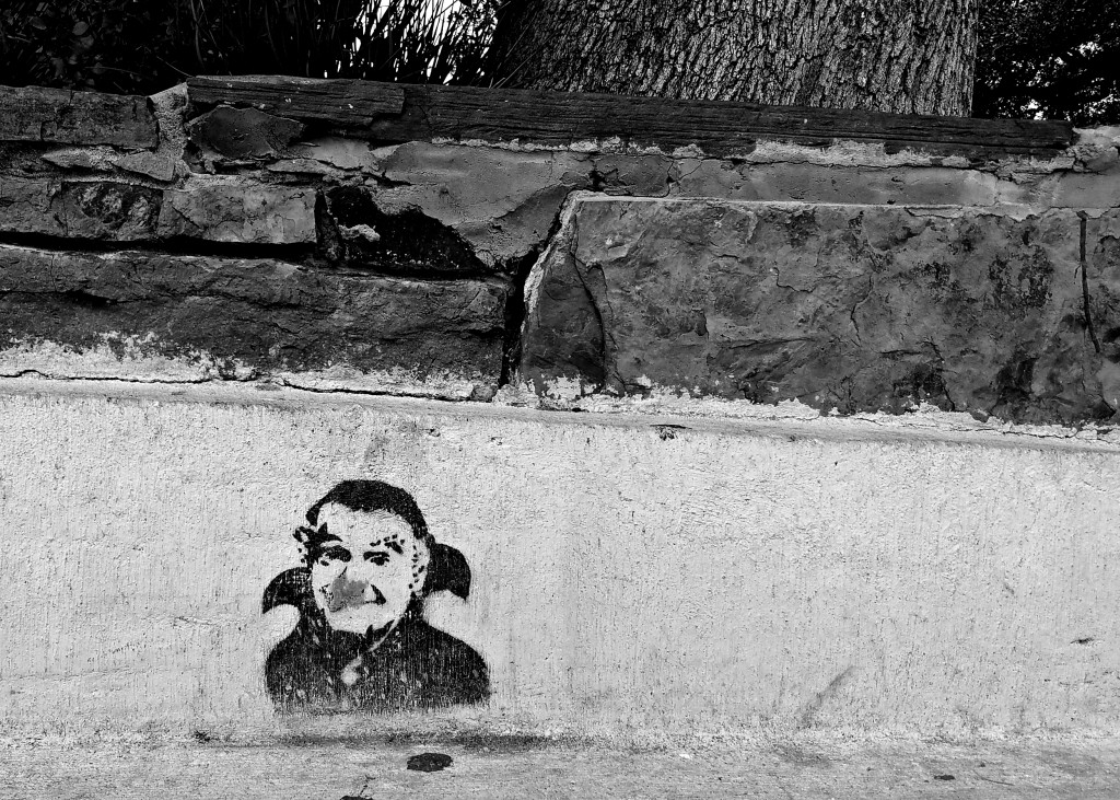
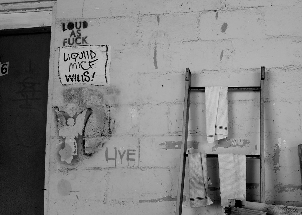
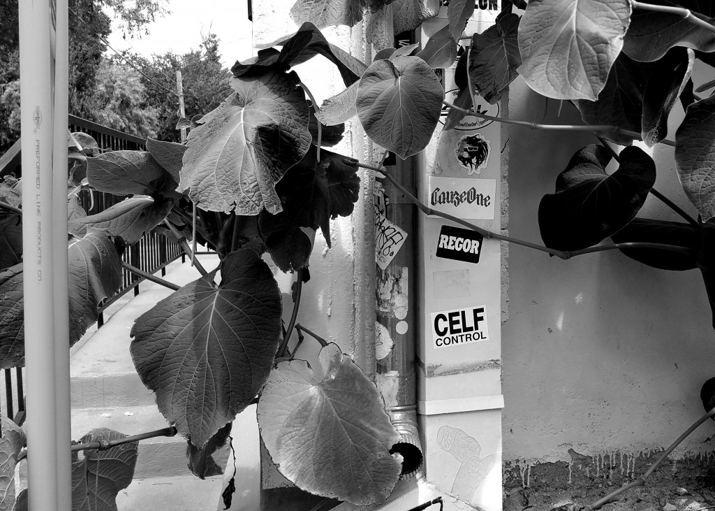
Exploring Austin for this project was both exhilarating and nerve-wracking. The bustle of traffic, constantly changing  sights and smells, and plethora of places to look at were, at times, overwhelming. I started off with no direction, knowing only that I needed to take some pictures. What happened, though, was that I began to see a trend develop. While taking a break at a food truck, I scrolled through my gallery and saw that many of the pictures I took were of signs, graffiti, and other markings. This was interesting because I hadn’t noticed any sort of pattern in my picture-taking up until that point.

The presence of so many murals, stickers, graffiti, stencils, and other such markings in Austin is intriguing to me. I even missed the green walking symbol once because I was too busy examining the posters and stickers on a light pole next to me. In suburban Katy, where I grew up, there was never much of it. If someone did see graffiti it wasn’t seen as artistic, it was simply a nuisance that someone had the unfortunate task of power washing away. The acceptance and even encouragement of such self-expression in Austin is a welcome change, and I think I was subconsciously drawn to it.

The photos I chose for this project held more of an emotional attachment than the rest. Each one stood out for one reason or another. Looking back on them I can see that my concept wasn’t as strong as it could have been, but I’m still proud knowing how much work I put into it. With time and more work I can surely tighten my view and centralize the theme, but for now I’m happy with what I’ve accomplished.