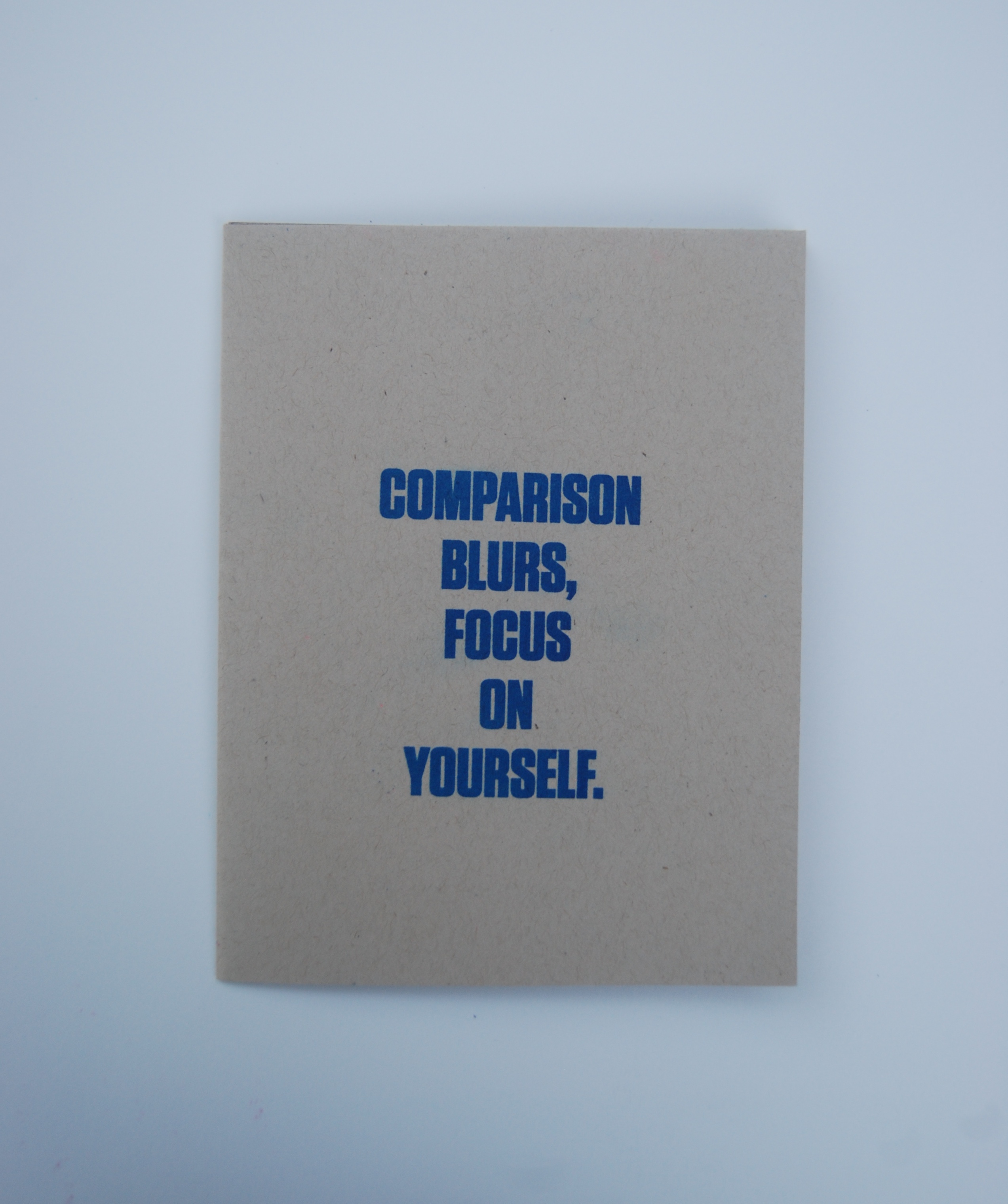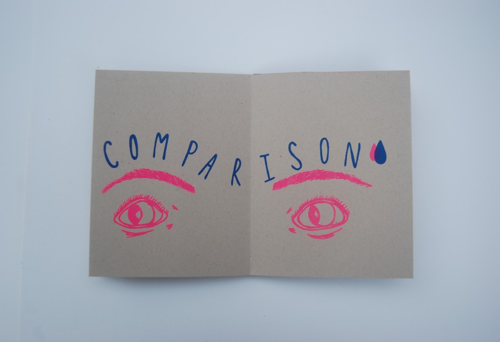
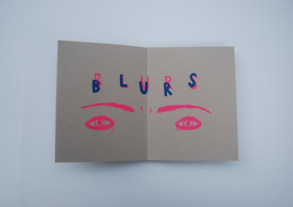
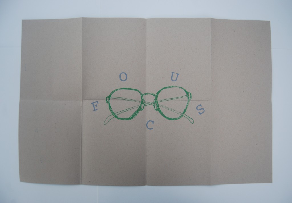
Abstract Form As Image combined zine culture with the idea of truisms. A zine is a small magazine that contain whatever you want it to and can be designed in your own liking because there are no rules or limitations when it comes to zine making. Having previous experience creating fun zines for myself and for friends, I was excited to take on this module. I wanted the design of my zine to be simple, consistent, and have a hand made feel. I achieved this by having both my images and text placed in the same area on each page in way where they interacted with each other to create a cohesive yet interesting feel. I enjoyed the process of writing a truism that related to a life experience of mine and then visually depicting that through sketches and hand lettering. The zine was designed to be printed on a Risograph, so I designed it with the intention of being printed using two colors, bright blue and pink, and then a third color, green, for the poster on the back when you unfold the entire zine. I think this module really portrays my artistic style and has helped me along the journey of establishing and developing an individual style.

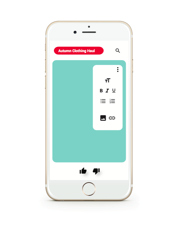

This project explored user interface design, UI and UX, through the design of a mobile app that reflected aspects of Google’s Material Design and the Microsoft Word software. My app designed is catered to Youtuber’s who are looking for a quick and easy way to compose ideas/notes for a video or blog post and keep all those drafts in one place. The inspiration behind my idea was drawn from the fact that Youtube has gained a lot of popularity and news in the past few years, so I wanted to design an app that would be relevant and current. The stills that I designed show how the app incorporates a fusion of visual elements from both Microsoft Word and Youtube to enhance the app’s identity and overall experience. Such elements include the paragraph and text tools (text size, bold, italic, underline) and the thumbs up/thumbs down for saving or deleting drafts. Through this module it was interesting to focus on the back end of the way an interface is designed to look on a phone screen or a desktop screen seeing as apps and interfaces are are things that I look at on a daily basis.
For Style As Image we combined photography and editorial design to create a “Preppy Magazine” that highlighted what it means to be a Prep style wise. In order to further investigate what it means to be preppy we read The Official Preppy Handbook and then implemented that type of style in an on campus photoshoot. These images were then organized and designed into a magazine using InDesign. The photoshoot process and the image processing part of this project taught me more about photo resolution, size, and .JPEG vs. .TIF compression.
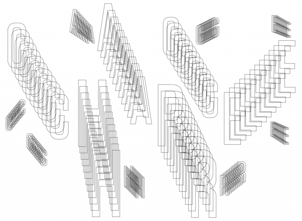
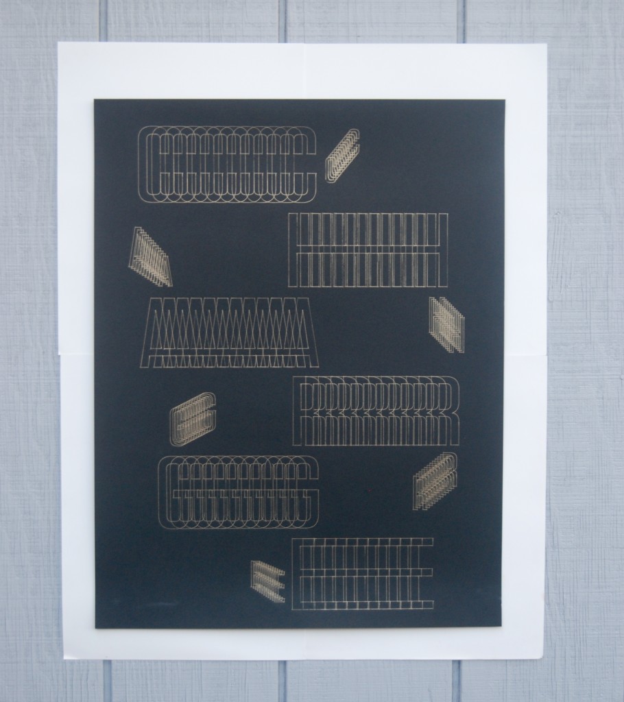
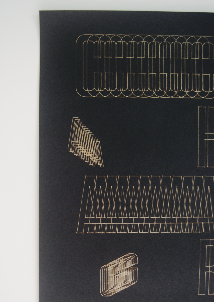
For Operation As Image we explored the abilities of the cutting plotter by plotting letterforms with a writing utensil. The purpose of this project was to modify a typeface based on a set of rules to show how the interpretation of rules can create a variety of results which would then be plotted using the cutting plotter. For my image I plotted the word CHARGE which I modified using the Blend tool in Illustrator. I designed the arrangement of the type so that the letterforms appear as though the words are moving due to an electric charge and then plotted using a gold gel pen on 24×17 black matte paper. This project allowed me to use an Illustrator tool that I had never used before and gave me experience with the cutting plotter.