Oct
2015
Interface: Google’s Material Design

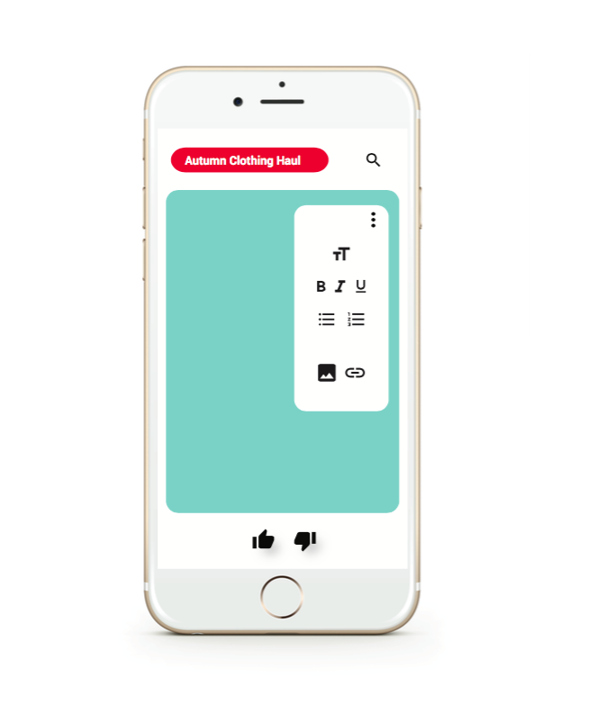

This project explored user interface design, UI and UX, through the design of a mobile app that reflected aspects of Google’s Material Design and the Microsoft Word software. My app designed is catered to Youtuber’s who are looking for a quick and easy way to compose ideas/notes for a video or blog post and keep all those drafts in one place. The inspiration behind my idea was drawn from the fact that Youtube has gained a lot of popularity and news in the past few years, so I wanted to design an app that would be relevant and current. The stills that I designed show how the app incorporates a fusion of visual elements from both Microsoft Word and Youtube to enhance the app’s identity and overall experience. Such elements include the paragraph and text tools (text size, bold, italic, underline) and the thumbs up/thumbs down for saving or deleting drafts. Through this module it was interesting to focus on the back end of the way an interface is designed to look on a phone screen or a desktop screen seeing as apps and interfaces are are things that I look at on a daily basis.