Alexa Weather Report from Alexa Bogran on Vimeo.
The purpose of the Weather Report project was to design a weekend weather report for 4 locations and to animate all the information in an organized format so that it is presented to the viewer in a seamless and creative manner. This was my first experience with After Effects which hindered my ability to use the program to its best abilities, but it also taught me how to quickly learn a new method of design in a short amount of time. The beginning of my experience with it was a bit rough and confusing because I didn’t know how to utilize the program and all its tools. I used my practice time, inside and outside of class, to get the basic hang of it and from there I was able to really dive into the project. I am proud of my final animation but there is definitely room for improvement in the transitions of my text/graphics so that the viewer easily understands the information presented. After Effects is a program that I would like to get more practice with and would enjoy using again in the future.
Goal Expert Hours:
(this including my job, and work done outside of class)
how much a week = minimum 8
what should be the mid-term total = 64
what should be the semester total = 128
(your current grand total = about 115 )
This second half of the semester I feel as though I have improved my use of practice time by managing my time amongst all of my classes better. Since the maps project was spread out over two months I really had to make sure that I was making good use of the work time given in class because I am also dedicated to all of my other classes (graphic design and general education) and my on campus design job. Since the mid semester I have improved my use of time in all these areas and still manage to make free time for myself. I put countless hours into each of my classes and have made sure that each are getting equal attention. Since I do not have the Adobe Creative Cloud system on my laptop I go to the digi lab to work in the afternoons about 3 times a week and usually on the weekends as well. Because I do not have the system on my laptop I cannot just easily leave a design until the last minute and work on it all night; I have to work within the hours that lab is open which forces me to make better use of my time and work with the lab hours schedule.
The sophistication of my work is constantly improving because with each critique I am learning more about myself and what I am producing. Through the maps project I feel as though I have gained a better view on what a “good design” looks like. Specifically each map has had a different agenda/purpose that has made me aware of how to convey a message in an organized and easily comprehensive way through the use of symbols, graphs, color, hierarchy, and labeling. I feel as though this project has trained my design eye to be more discerning and make good judgments as to how all those factors interact and how to apply them well to my designs.
I found feedback to be very useful especially during times where I felt I was having a creative block or trouble moving forward with my designs. I find class critiques to be very helpful because I get to hear multiple opinions on my work and I get to see where everybody else is and what direction they are taking. Having the chance to see everyone’s work and talking about it is really helpful because I can draw creative direction from my peers and professor. I never take feedback personally because I know that whatever good or bad comments others have will help me improve my work; I take feedback and use it to my advantage.
I would say that the level of challenge I gave myself was at the medium mark because while I do enjoy a challenge, I felt as though I was afraid sometimes to take on a new complex idea. I find that when I have a concept that looks easy to accomplish on paper but not so easy to execute on Illustrator I opt for the easier route because it takes less time. Finding the willingness to take on a new level of challenge is something that I need to work on, as well as making time in my schedule to create a design that may be more complex or time-consuming. For example, for Map 02 I had quite a bit of sketches that I thought would present the data in a creative and organized way, but when it came down to designing that on Illustrator I found that I was short on time so I opted for the less time consuming route, which isn’t always the best route. Although I am satisfied with my design for Map 02 I know that I can definitely do better because there is a lot of room for me to improve through challenging myself creatively.
I acquired many more expert hours this second half of the semester compared to the first half. In October I went to the Houston Zine Fest and the Chaotic Moon Studio tour with Command G. In November I attended another workshop with Jenn Hassin to complete her collaborative art piece with St. Ed’s. I also attended the East Austin Studio Tour one weekend and attended the Senior Graphic Design Presentations.
During the second half of this semester I have managed to keep my stress and emotions at an average level. Although I have left some American Dilemmas papers until the last minute I have still managed to deliver without stressing or freaking out. Aside from procrastination with papers I have not have any other major events in my life that have thrown my emotions in turmoil. There have been some small issues happening back at home but I have managed to not let that completely distract or disturb my school work. We all have bad days but I always try to find the best in a situation and look at the positives rather than the negatives.
As a class we are all learning together so I think it is important to contribute to the conversation and help each other learn and advance, whether that be through group discussion or one-on-one conversations. I feel as though I contribute to the warm class environment by keeping a positive attitude during critiques and feedback. I don’t think I would ever tell someone that their design is bad, instead I point out what can be done to improve it and execute the concept better. Savannah and I are always bouncing ideas off each other and asking for each other’s opinions which is really helpful on both ends. I trust her judgement and know that she will tell it to me straight. I try to do the same in return and give her ideas or help her make creative decisions. The same goes for anyone else that may ask my for my opinion or advice.
I would give myself an B+/A- for this end term assessment. I feel as though I have improved since the mid term and put more effort into each project, but I still need to improve my level of challenge in relationship to time management skills. I have definitely put in more expert hours and acquired more expert experiences which I plan to increase next semester with my next set of design classes.
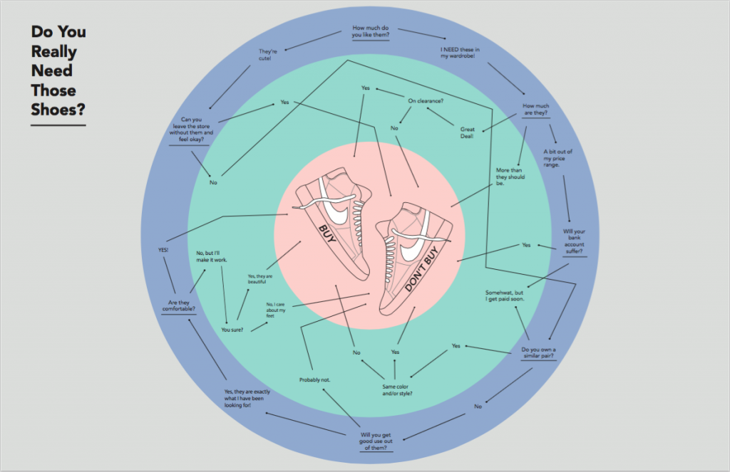
The purpose of this map was to design a functional flowchart that maps a decision. Ideally the series of questions should allow the reader to examine all sides, pros and cons, of the decision they are trying to make and then lead them to a final decision. I decided to map a flowchart for a situation where you are deciding whether to buy a pair of shoes or not. This map was difficult for me to design-wise because I ran into issues or organization and neatness. I had all my questions and answers planned out but when it came to designing it I felt as though my layout choices made the information look too crowded. I knew that I wanted to incorporate the shoe graphics in the middle and then have the rest of the information surround it in a circular shape but the execution was not 100 percent there. I think to improve I can go back add icons to main decision making questions and then experiment more with layout to make it more organized and easy for the reader to follow.

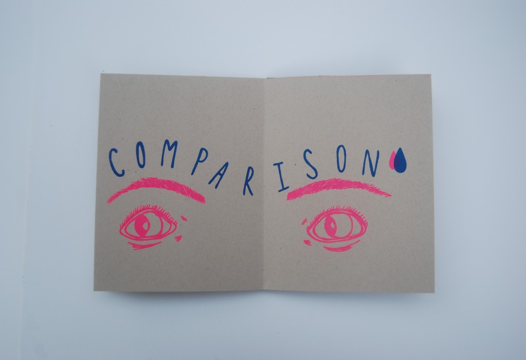
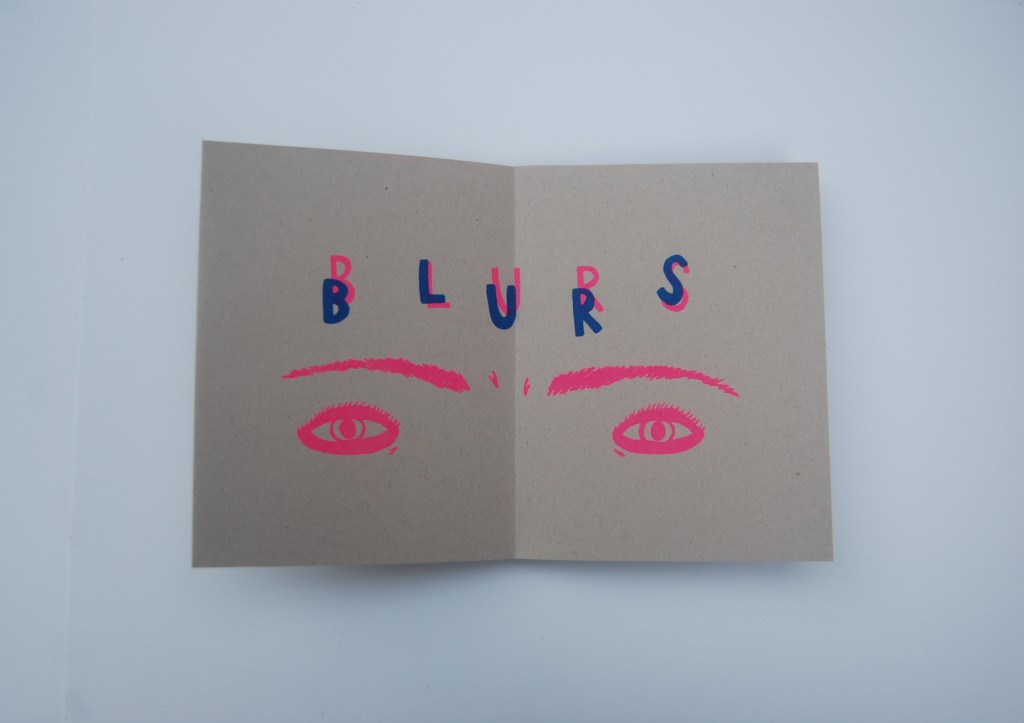
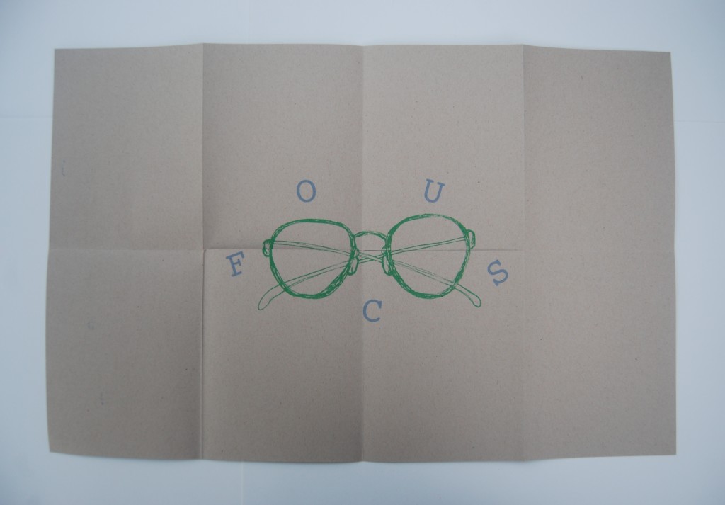
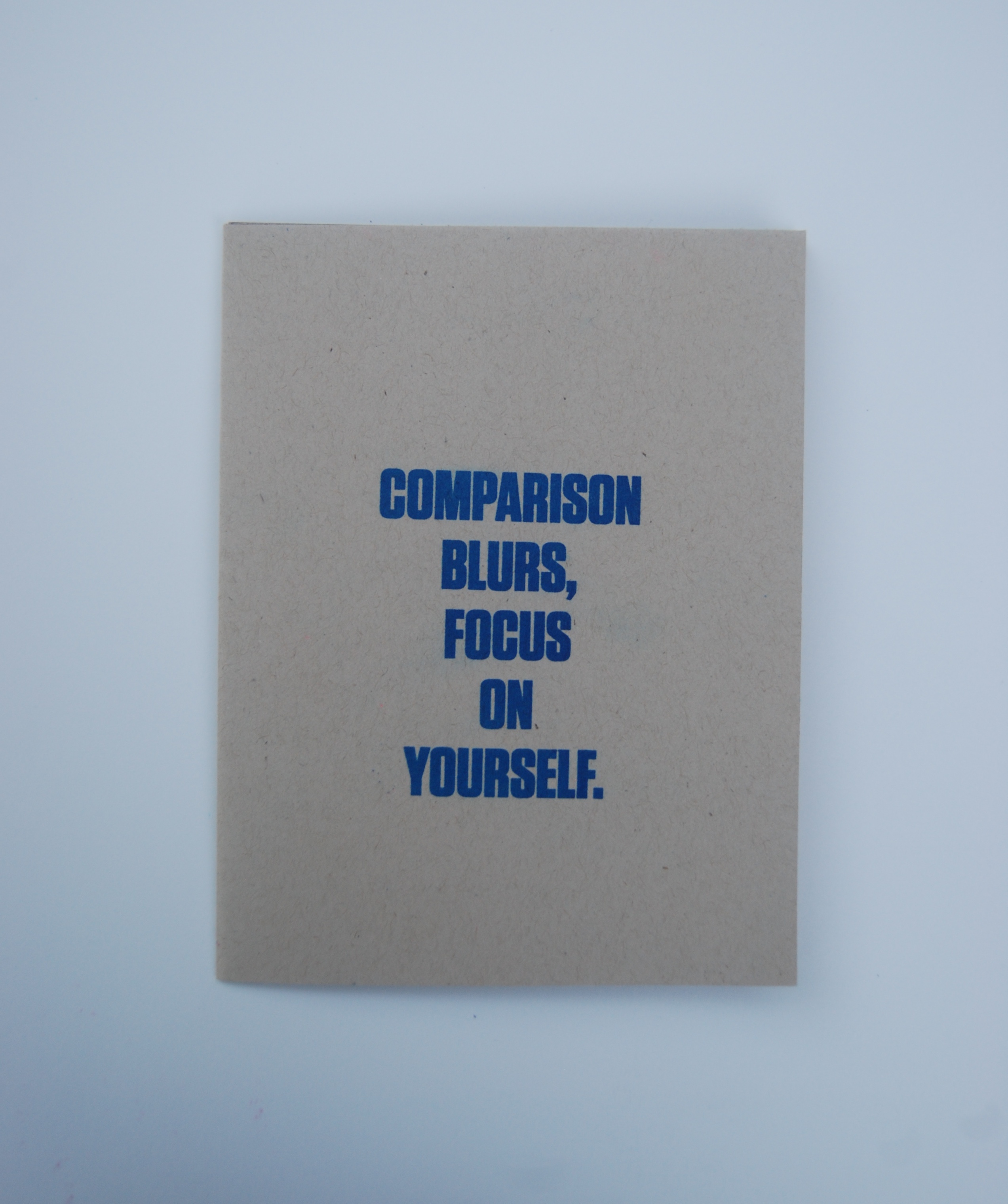
Abstract Form As Image combined zine culture with the idea of truisms. A zine is a small magazine that contain whatever you want it to and can be designed in your own liking because there are no rules or limitations when it comes to zine making. Having previous experience creating fun zines for myself and for friends, I was excited to take on this module. I wanted the design of my zine to be simple, consistent, and have a hand made feel. I achieved this by having both my images and text placed in the same area on each page in way where they interacted with each other to create a cohesive yet interesting feel. I enjoyed the process of writing a truism that related to a life experience of mine and then visually depicting that through sketches and hand lettering. The zine was designed to be printed on a Risograph, so I designed it with the intention of being printed using two colors, bright blue and pink, and then a third color, green, for the poster on the back when you unfold the entire zine. I think this module really portrays my artistic style and has helped me along the journey of establishing and developing an individual style.
Final:

1st Draft:
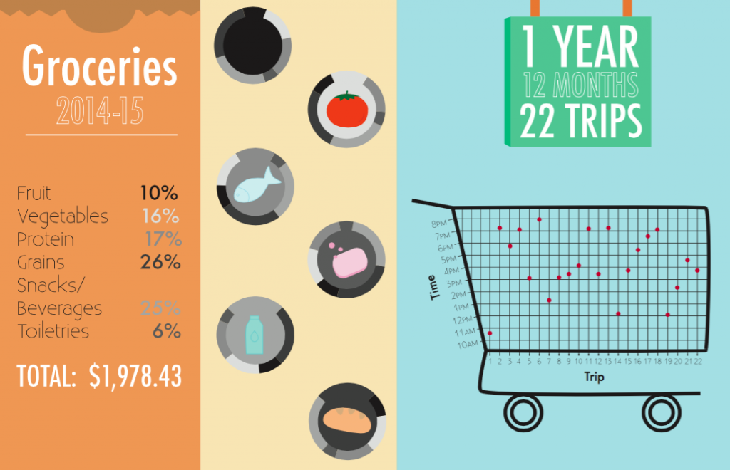
For this map we were provided with a spreadsheet containing a years worth of grocery receipt information/numbers which we had to then translate into a visual representation using icons, type, and charts/graphs. I decided to organize the information by food group and then map the percentage bought of each group in a pie chart. I also created a visual scatter plot chart of the the trip to the grocery store in relation to the time of day the trip took place. Issues I came across were organization of the information in a visually interesting yet coherent way. In my final draft I think I presented the information neatly, but my icons could use improvement. This map taught me about how to translate numbers and information into a visual format where placement of type and graphics is important as well as choosing the most efficient form of a chart/graph to use.

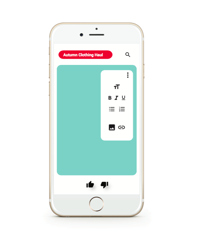

This project explored user interface design, UI and UX, through the design of a mobile app that reflected aspects of Google’s Material Design and the Microsoft Word software. My app designed is catered to Youtuber’s who are looking for a quick and easy way to compose ideas/notes for a video or blog post and keep all those drafts in one place. The inspiration behind my idea was drawn from the fact that Youtube has gained a lot of popularity and news in the past few years, so I wanted to design an app that would be relevant and current. The stills that I designed show how the app incorporates a fusion of visual elements from both Microsoft Word and Youtube to enhance the app’s identity and overall experience. Such elements include the paragraph and text tools (text size, bold, italic, underline) and the thumbs up/thumbs down for saving or deleting drafts. Through this module it was interesting to focus on the back end of the way an interface is designed to look on a phone screen or a desktop screen seeing as apps and interfaces are are things that I look at on a daily basis.
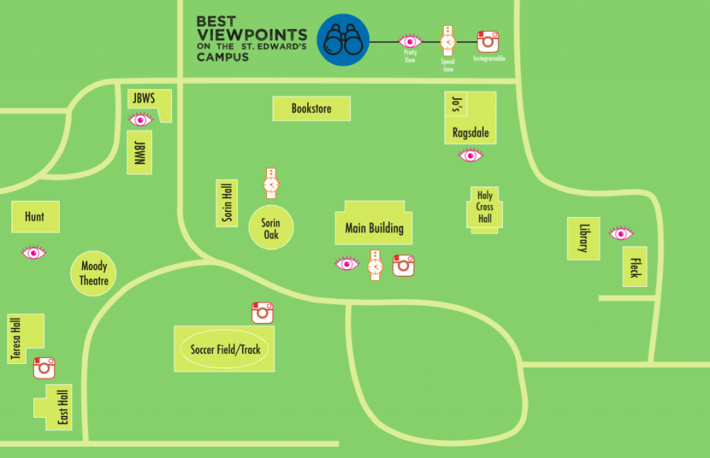
This personal geography map is map between home and school, which both happen to be on campus for me. For this map we were free to chose what exactly we were mapping between the two places along with what kind of agenda the map was portraying. I decided to map the best viewpoints on the St. Edward’s campus. Each viewpoint is categorized by one of three levels (Pretty view, Enjoyable to Spend Time There, and Instagram Worthy) with some fitting into more than one level. This map allowed me to learn more about the different components of a map and their individual importance – i.e. line weight, icons, networks, matrix, boundaries/divisions, scale, and political agenda.
For Style As Image we combined photography and editorial design to create a “Preppy Magazine” that highlighted what it means to be a Prep style wise. In order to further investigate what it means to be preppy we read The Official Preppy Handbook and then implemented that type of style in an on campus photoshoot. These images were then organized and designed into a magazine using InDesign. The photoshoot process and the image processing part of this project taught me more about photo resolution, size, and .JPEG vs. .TIF compression.
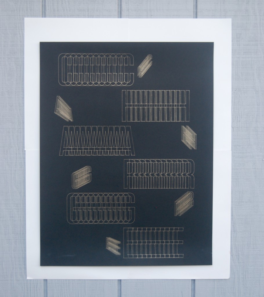
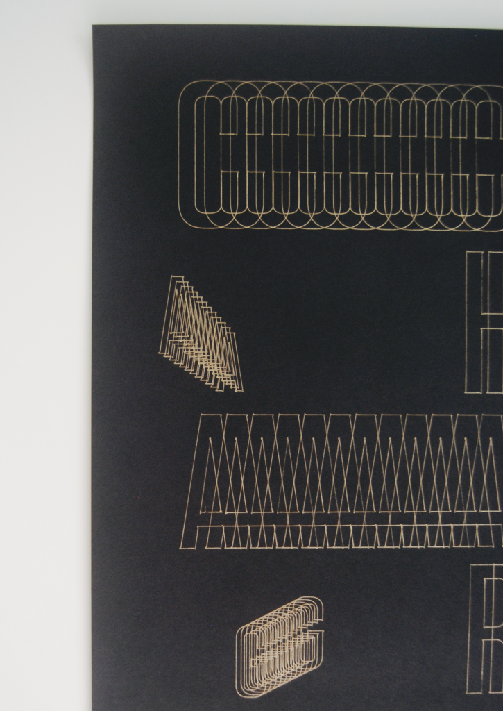
For Operation As Image we explored the abilities of the cutting plotter by plotting letterforms with a writing utensil. The purpose of this project was to modify a typeface based on a set of rules to show how the interpretation of rules can create a variety of results which would then be plotted using the cutting plotter. For my image I plotted the word CHARGE which I modified using the Blend tool in Illustrator. I designed the arrangement of the type so that the letterforms appear as though the words are moving due to an electric charge and then plotted using a gold gel pen on 24×17 black matte paper. This project allowed me to use an Illustrator tool that I had never used before and gave me experience with the cutting plotter.