My type specimen book presented the typeface Officina along with information about it’s history and who created it followed by the essay The Crystal Goblet by Beatrice Ward. The purpose of this project was to present a typeface in a way that demonstrates and advertises it’s range and quality. I chose Officina because it was a typeface that I was unaware of at the time and I admired the typewriter feel of it. At the time of this project I had very little experience designing in InDesign and now looking back on it I am pretty proud of the work I produced. This project was my first exposure to InDesign and book design. It taught me the basics about alignment, tracking, kerning, and margins and briefly about book making since we used the saddle stick method to bind the physical book.
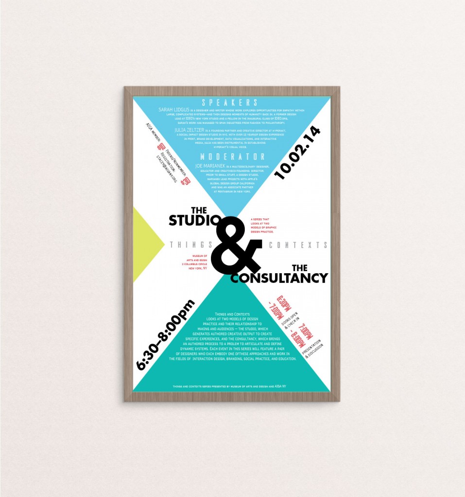
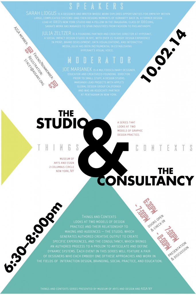
Type As Layout explored the ways in which a large amount of text and information can be arranged in an organized yet visually interesting layout. For this assignment we were given the raw text for an AIGIA event The Studio & Consultancy presented by Things & Contexts, and then asked to design a typographic poster from it. I created several layout variations before deciding on the final one which incorporated triangular shapes as the basis. This experimentation with typographic layout got me really interested in typography and taught me the importance of deciding on the right typefaces to use and figuring out which types of fonts interact best with each other.
23 September 2014

6 October 2014

These two exercises examined how type can be manipulated to convey a certain feeling, idea, or even sound. The idea for Type Is Space was to portray the meaning and essence of the word by altering the type. I did so by creating an interruption in the word interruption, arranging the letters in the word space at different alignments and scalings, and so forth. For Type Is Sound we had to choose an onamonapia and display the sound of that word using type. I experimented with elements of repetition and scale for my word Splash and tried to make the type look as though it was being scattered by a splash made in a body of water.

