Nov
2015
Maps Project: Information Map
Final:
1st Draft:
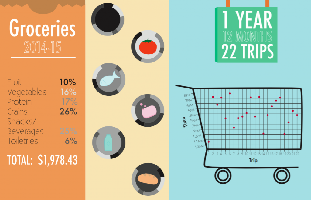
For this map we were provided with a spreadsheet containing a years worth of grocery receipt information/numbers which we had to then translate into a visual representation using icons, type, and charts/graphs. I decided to organize the information by food group and then map the percentage bought of each group in a pie chart. I also created a visual scatter plot chart of the the trip to the grocery store in relation to the time of day the trip took place. Issues I came across were organization of the information in a visually interesting yet coherent way. In my final draft I think I presented the information neatly, but my icons could use improvement. This map taught me about how to translate numbers and information into a visual format where placement of type and graphics is important as well as choosing the most efficient form of a chart/graph to use.

