Graphic Design I: Information Map

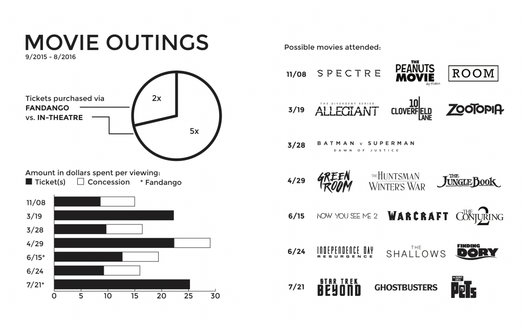
For this information map, a lot of data organization was required. Out of Tony Pierce’s bills, I decided to focus on the movie tickets that he purchased throughout the year. I had to figure the standard ticket prices in-theatre vs online and recognize the possibility of him buying food or drinks. Since this map is to be placed in a book, I laid everything out in a manner that would be easily read. I chose to keep the color all black, as I imagined it would simply be a very standard black and white information book. I managed to simplify the movie logos so that it would all be flat and one color, keeping up with a minimal feel to the map.

Graphic Design I: Geography Map

Further showing my interest in film, I made this map of local Austin theaters that I have been to. I thought it would be good to make a map of them because each theater is so different and provides something unique. The color scheme I chose is very neutral and not too bright and contrasted because I didn’t want to make the map too straining and busy. I wanted it to be clean and easy to understand. The header typeface gives a very humanistic quality to the map that I liked because it is a personal geography map.

Graphic Design I: Symbol Methodology

For this project, I created a hybrid of symbols that would arbitrarily fit together. I focused on independent film and tried to take an iconic item from each one. In drawing the individual symbols, I tried to keep each item as bare and simple as possible to make it easy on the eyes. For the final hybrids, the movies I ended up using were Perks of Being a Wallflower, The Spectacular Now, Whiplash, Nightcrawler, and Ex Machina. Despite being arbitrarily placed together, the hybridized films have things in common.