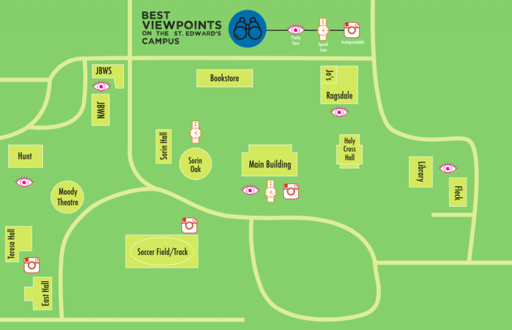
This personal geography map is map between home and school, which both happen to be on campus for me. For this map we were free to chose what exactly we were mapping between the two places along with what kind of agenda the map was portraying. I decided to map the best viewpoints on the St. Edward’s campus. Each viewpoint is categorized by one of three levels (Pretty view, Enjoyable to Spend Time There, and Instagram Worthy) with some fitting into more than one level. This map allowed me to learn more about the different components of a map and their individual importance – i.e. line weight, icons, networks, matrix, boundaries/divisions, scale, and political agenda.
For Style As Image we combined photography and editorial design to create a “Preppy Magazine” that highlighted what it means to be a Prep style wise. In order to further investigate what it means to be preppy we read The Official Preppy Handbook and then implemented that type of style in an on campus photoshoot. These images were then organized and designed into a magazine using InDesign. The photoshoot process and the image processing part of this project taught me more about photo resolution, size, and .JPEG vs. .TIF compression.
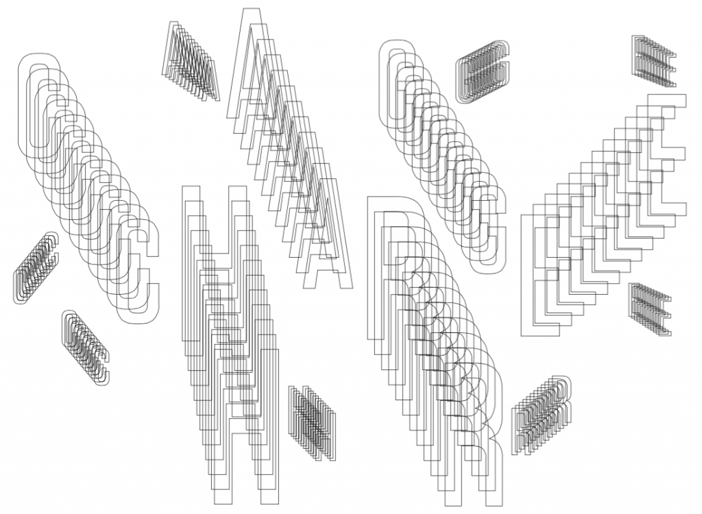
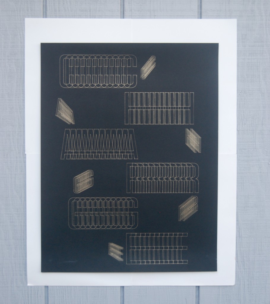
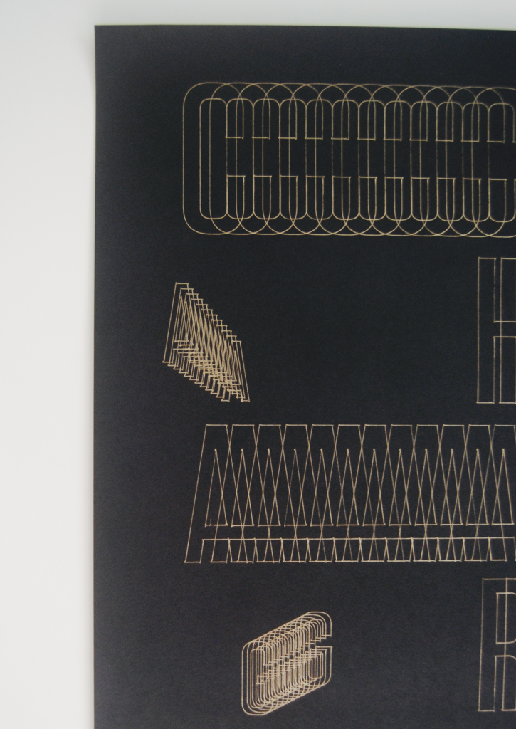
For Operation As Image we explored the abilities of the cutting plotter by plotting letterforms with a writing utensil. The purpose of this project was to modify a typeface based on a set of rules to show how the interpretation of rules can create a variety of results which would then be plotted using the cutting plotter. For my image I plotted the word CHARGE which I modified using the Blend tool in Illustrator. I designed the arrangement of the type so that the letterforms appear as though the words are moving due to an electric charge and then plotted using a gold gel pen on 24×17 black matte paper. This project allowed me to use an Illustrator tool that I had never used before and gave me experience with the cutting plotter.
Final Symbols:

Topic: Exercise
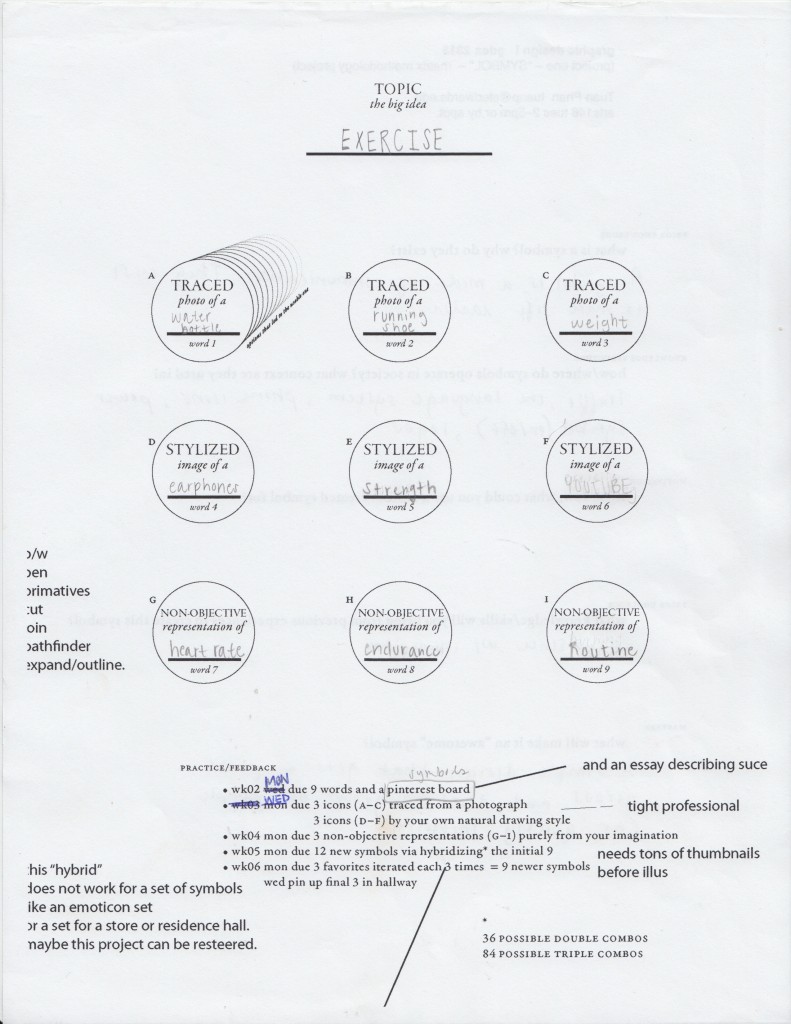
Traced Photos:
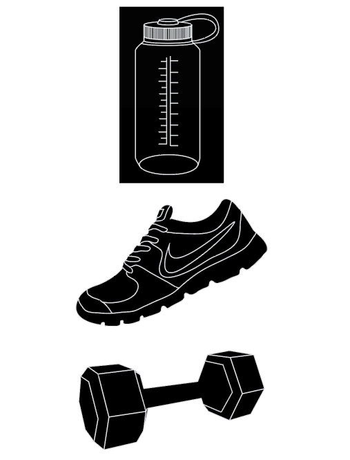
This basis of this project was symbol making which was explored through by the questions: What is a symbol? and Why do they exist? . The main Illustrator tool that was used for this project was the pen tool, which I had little experience with beforehand. After completing this project I feel very comfortable and efficient with the pen tool. The big idea for my set of symbols is Exercise. I began by brainstorming items/activities/feelings/and ideas related to exercise and from there I designed three traced symbols, three stylized symbols, and three non-objective symbols that each had multiple iterations before coming to my 3 final symbol group. My experience with this project taught me about the importance of iterations and experimentation with shapes, line weight, negative space, and simplicity vs detail. All of which effect the way in which a symbol is presented and interpreted.
28 August 2015
Currently I only have a few expert hours logged on my calendar. I have been pondering what exactly qualifies as “expert hours” and have come to the realization that a lot of my daily habits may qualify. Looking at design inspiration on social media (i.e. Tumblr, Instagram, Pinterest), looking at photography and design magazines, and noticing the way that design plays a role in my everyday life are things that occur all the time. Working on projects or readings for my other design classes are also things that I am constantly doing which will all go towards the hours that I invest in graphic design. Another consistent amount of hours that I will be logging each week are my hours that I will be working in Student Life as a member of the publicity team. Having a job on campus that relates to my major is the perfect way to get more hands on experience with Adobe programs (Illustrator, InDesign) and to learn how to work with design clients in a professional setting. I project that my expert hours may fluctuate from week to week depending on what projects I am working, how much homework I have for other general education classes, and what my priorities are for that week.
My type specimen book presented the typeface Officina along with information about it’s history and who created it followed by the essay The Crystal Goblet by Beatrice Ward. The purpose of this project was to present a typeface in a way that demonstrates and advertises it’s range and quality. I chose Officina because it was a typeface that I was unaware of at the time and I admired the typewriter feel of it. At the time of this project I had very little experience designing in InDesign and now looking back on it I am pretty proud of the work I produced. This project was my first exposure to InDesign and book design. It taught me the basics about alignment, tracking, kerning, and margins and briefly about book making since we used the saddle stick method to bind the physical book.
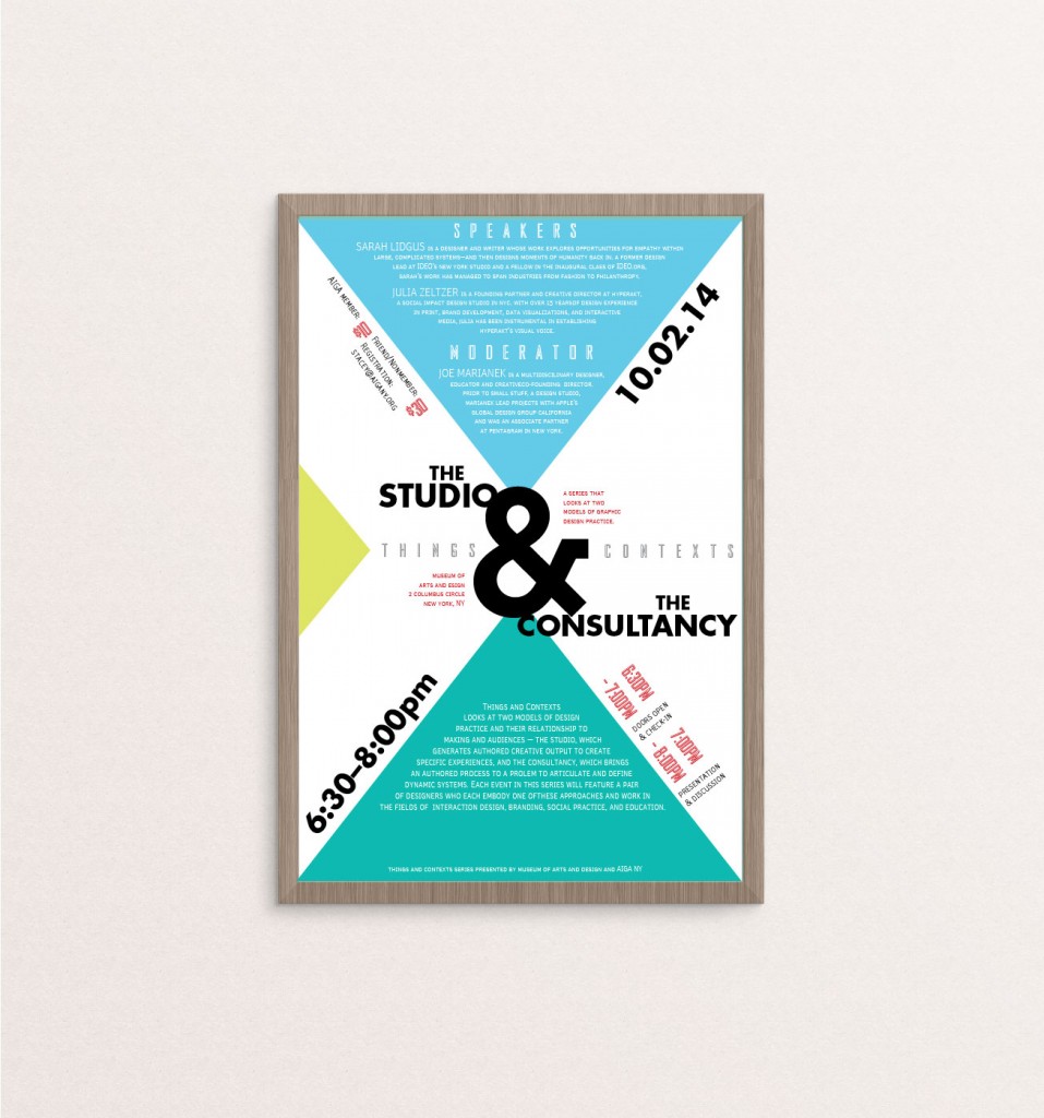
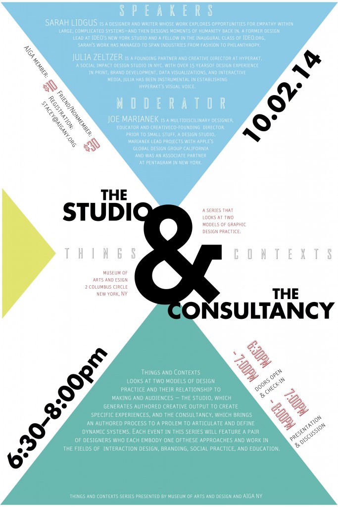
Type As Layout explored the ways in which a large amount of text and information can be arranged in an organized yet visually interesting layout. For this assignment we were given the raw text for an AIGIA event The Studio & Consultancy presented by Things & Contexts, and then asked to design a typographic poster from it. I created several layout variations before deciding on the final one which incorporated triangular shapes as the basis. This experimentation with typographic layout got me really interested in typography and taught me the importance of deciding on the right typefaces to use and figuring out which types of fonts interact best with each other.
23 September 2014

6 October 2014

These two exercises examined how type can be manipulated to convey a certain feeling, idea, or even sound. The idea for Type Is Space was to portray the meaning and essence of the word by altering the type. I did so by creating an interruption in the word interruption, arranging the letters in the word space at different alignments and scalings, and so forth. For Type Is Sound we had to choose an onamonapia and display the sound of that word using type. I experimented with elements of repetition and scale for my word Splash and tried to make the type look as though it was being scattered by a splash made in a body of water.