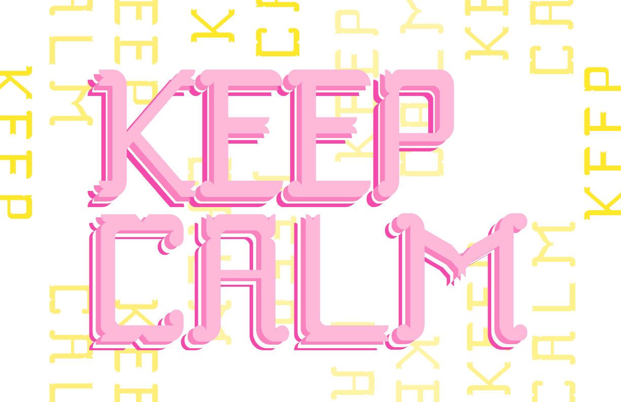
The type specimen posters I designed were made using the typeface I created for the display typeface assignment. The idea behind these posters was connected to my previous idea about the inspiration images looking almost like puzzles. This concept became a focal point for how these posters came to be. I played around with rotation and placement of the letters to make a more abstract looking shape. I layered letters over each other since these were going to be printed on the Risograph to create a more interesting and compelling color combinations. Some choices I had to make regarding these posters was the orientation of the posters to see which orientation would allow for the post canvas space as well for which way would be more interesting to the viewer. The design embodies my concept of a puzzle through the rotation of the “pieces” being the letters and how these letters fit next to each other, the selected letters were those who showed more potential to being fit with itself. My design enhanced the content in the way that the letters were sized very large to show its decorativeness and the color choices also made them pop against the paper color choice.
Type Specimen Posters