Author: Paula
FulBright Conference Book
Desire & Delight
Cambio: Locating Place: Book
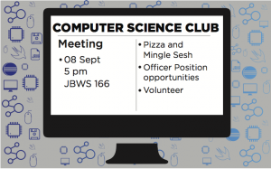
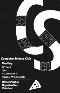
Club Posters
FulBright Conference Book
CutSheets
Santos Advanced Typography End of Semester Review
All the dimensions: Social/emotional development, sophistication of work, Use of feedback, Level of challenge, contribution to climate, and use of practice time were all touched on. There were other areas that were used during the production of the book such as the craft/production of the book, typography, and planning. 875 hrs total; 175 hrs since midsemester review.
This book has definitely challenged the use of typography, craft, planning, and sophistication of the book during the production of the book.
Typography
When using typography, you are not simply choosing different fonts and placing them onto a page. When designing the book, you have to think about the connotations the fonts add to the book, whether it may be sophisticated, fancy, casual etc. Which in this case, i wanted to make the program appear professional in a sophisticated manner. A consideration to take into account when choosing fonts is if the fonts have similar styles in terms of the same font foundry or if they are of the same type (serif/slab/sans serif ). All fonts i chose were serifs: Gotham, Knockout, and Whitney. They also come from the same type foundry, Hoefler & Co. These fonts all come with endless choice of different weights which is a major plus to create emphasis on certain texts in terms of the context.
Craft
There are many small considerations to take into account when thinking about craft. Craft can change your layout drastically also craft creates boundaries for the program if it is thought of first. For example, craft encompasses page bleed, creep, finger placement, and whether the book is wrinkled or not after production. All the different concerns described above mainly affect the margins of a book. Also they help as a guide to effectively produce a book. My program respected all these aspects because i made room for finger space.
Planning
When the assignment was first introduced, a week was spent dedicated to what information would be placed on what pages. Also different layout options were taken into account as well. The planning stage is there to become familiar with the information/text the client gives to you. It is hard to start making the book with out reference to a layout plan. It can be done- but it is not an effective way to start a book. For example, in the Fulbright program, it would not be effective to place the sponsors section in the middle of the book and the newsletter page at the very beginning versus placing sponsors at the beginning and newsletter towards the end. Levels of importance is what planning is about and i made sure to place each section in the places to create flow.
Sophistication of Work
How final and rich the project turned out is considered the sophistication of work. Also in the context of the program, i think utilizing the space and making the book still legible and have flow is also considered sophistication of work. When i was creating the book, i realized the book would end up being more than 32 pages (the limit) if i designed it with more space. Which is why picking a typeface is crucial to making the program legible because the point size will most likely be scaled down to 8 or even 7. I spent most of my time by fitting information neatly on a page and make it look appealing, for that i feel that my book is strong in that area.
Overall advanced type has definitely increased my view on the value of typography and how it can be used for all sorts of mediums in design. I am also much more aware of type around me and i have gained extensive knowledge on the topic. Also i can easily pick out a font for a certain projects. (i can now say i have a favorite font). Looking at the video and book, i can say i am happy with the final but there is definitely room for improvement. There always is! I think because i am aware of the knowledge i’ve gained from this class along with my progression, i would respectively give myself an A.
Weather Report
The weather report is a motion graphics video that allowed the user to view weather conditions of different places. The video was placed into a context of how viewing weather would change in the future. I focused giving the video a sophisticated and clean theme. The most important and challenging part of the video was transitioning seamlessly from one “LATCH” to the other. Also the transition has to make sense to the viewer to know what data is going to be shown next. Hierarchy, graphics (icons), and typography were the essential factors i focused on in the video. In the making and fixing of the video taught me how patient you must be with motion graphics. And i give animation much more value.
Rules
The button pins were created based off a place in Austin we haven’t visited before. I chose to visit a park called Red Bud Isle and the Lamar Pedestrian Bridge. When i visited Red Bud Isle i took photos of what looked interesting to me, i did the same with the bridge. After reviewing the photos i took, i drew ideas from the photos i took and make the pins related to theme. I took textures from the park like tree bark, leafs and footprints in the dirt. As for the bridge, i decided to take the light details from the skyscrapers of downtown austin since they were all viewed from the bridge at night. The most challenging part of the project was the final production and consistent style. But this was definitely a good learning experience.
Video Camera
https://www.youtube.com/watch?v=iG_tRDjuwHg
This video consisted of group effort and effective collaboration. Each person in the class and other class section has a job to contribute to the video. My job in the video was to help direct the video. It was interesting to see how so much planning and drafting created a seamless film production on the film day. Everyone cooperated and knew their place, it was definitely an experience.
After Effects/ Photoshop
https://www.youtube.com/watch?v=HO4unwbWnLU&feature=youtu.be
This assignment was an after effects project that dealt with graphic illustrations. This project’s theme is cosmos and constellations. My constellation was delphinus(dolphin constellation) and the images rotating in the back were microscopic scanned images. This video was accompanied with abstract sounds that were captured with a recording tool. This project benefitted me in learning the program and how to produce a video.
Cognitive Map
The cognitive map or decision map dealt with how to visually help the reader narrow down to a final decision by going through several condition to think about. I decided to make my decision map based on what kind of pet to get. This project went through many iterations in terms of transforming words into graphics/symbols. Eventually there were no words on the map besides the title and main questions. Finding the most suitable symbols to convey what i wanted to sat and properly placing the decision making sectors in the right spots was most challenging about this project. I chose minimal color and focused on graphics to create more cohesiveness.
Informative Map
The information map was an info graphic that visually represented information in 3 different ways: bar graph, line graph, and pie chart. The type of data i chose to represent was music preferences among college students. After i conducted a survey of 50 students who attended a college, i began to translate numbers to graphics. I created icons for the different music genres and aimed for minimal color to emphasize the topic and information related to the topic. This was one of my favorite projects because you had the ability to customize the data graphics in ways you’ve never seen them before.
SLR Camera
This project involved reading text to draw inspiration from to create an image. We read stories from the book called “Me Talk Pretty One Day” by David Sedaris. We paired off into groups were assigned different stories upon our liking. The tone of my story was a humorous one for it dealt with a grown man learning a new language. Metaphorically, i thought of a man jumping into the pool for the first time and does not know how to swim. I am satisfied with this image, for many iterations were done to find the most appropriate book cover/metaphor for the story.


