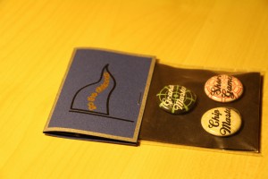
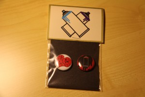
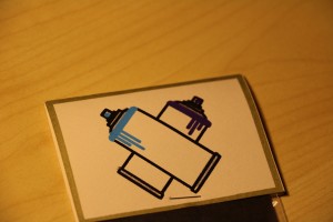
The Rules project first required us to decide on two locations within the city limits that we were unfamiliar with, and write a set of instructions that create a unique experience, and evoke a certain emotion when followed. After that we designed symbols in Adobe Illustrator that developed into buttons that served as mementos for the experience created by the instructions. There was an aspect of product merchandizing to this project in designing the packaging and tags to contain the mementos. I used the vinyl cutter with a pen attachment to do my tag design and instructions. I did this to give more of a handmade feel to the composition. The blue textured paper I used for the Top Golf label was chosen for its relation to the dimples on the surface of golf balls. The off white color paper used for the Hope Outdoor Gallery tags was chosen for its resemblance to concrete/blank canvas. I had to choose a typeface that had enough space within the letterforms to be plotted by a pen with the vinyl cutter, which is why I chose Bauhaus STD, a sans serif typeface with minimal clutter.