For this project, we were required to create three symbols that represented two or more things. When thinking of an umbrella topic to base my symbol project around, immediately I thought of designing a symbol that encompassed what made me who I am today. As cliche as that sounds, it was easy to find words that fell in to the category and they were all things I was passionate about.
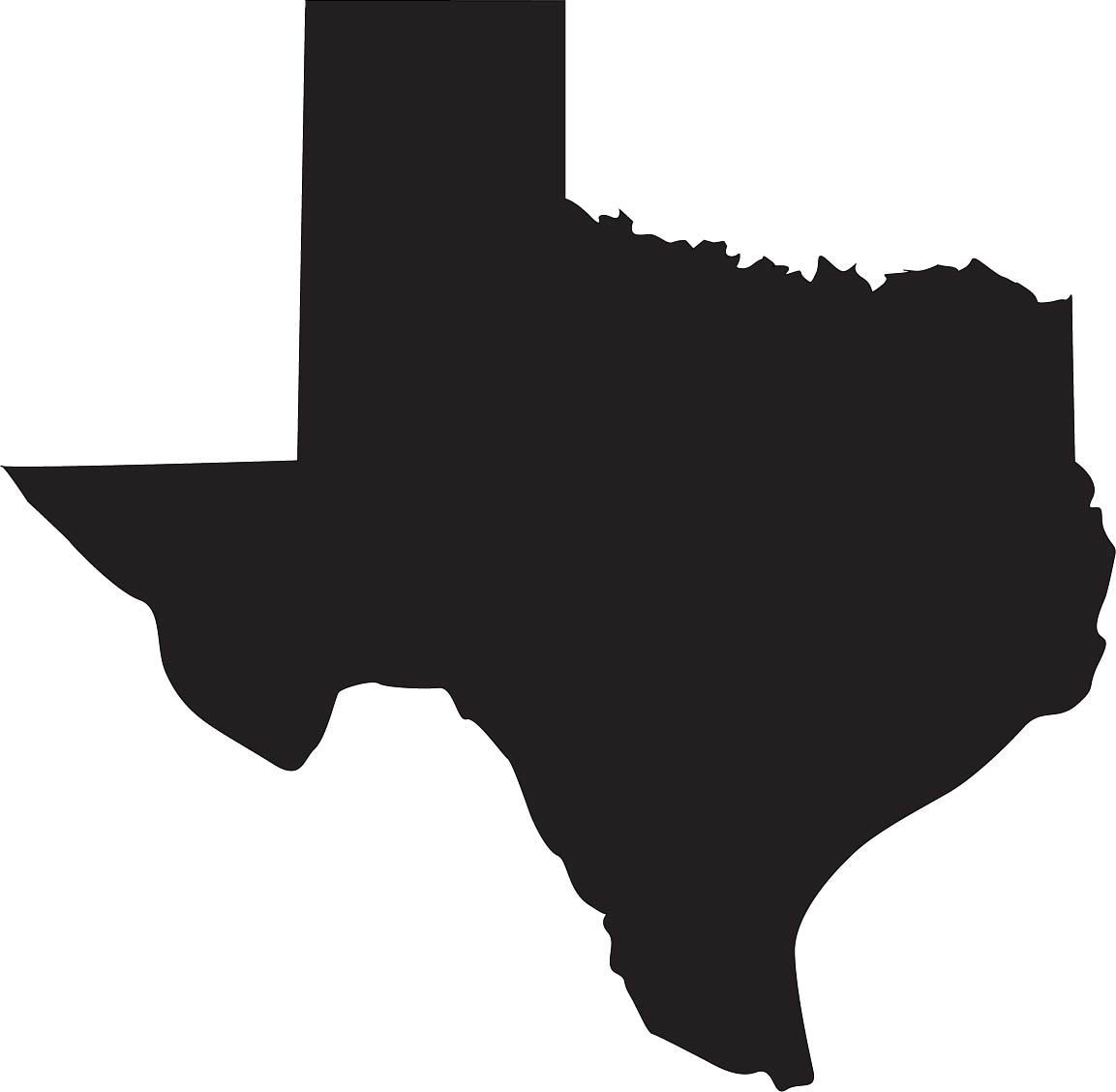
My first three words were all tangible and easily traceable: Happiness (cat), Balance (shoes), and Home (Texas). I wanted these three basic symbols to be the foundations of the more stylized alterations: Harmony (scale), Travel (paper airplanes), Serenity (mountains). I knew I could incorporate these stylized symbols into the traced ones, and still add my abstract designs: Movement, Geometry, and Growth. Once I had my words picked out, the design process began!
I traced my three basic symbols from photos I found on the internet (shown below).


Once I had those traced in illustrator, I used hand drawing and illustrator pen tool to design my stylized symbols (shown below).


Finally, I used a combination of both illustrator and my own drawing to complete my abstracts (shown below)

I eventually blended a few of the words together to create different symbols (shown below).

From these, I picked my final 3 symbols (shown below).


It was a really interesting and exciting process to actually blend the symbols together. Having other classmates and Tuan critique my work either by editing the actual illustrator file themselves or just offering verbal advice, I was able to expand my depth of creativity. I enjoyed this phase the most because I realized how all the work I had put in prior to this phase was necessary. Had I started at the combining phase before having any idea what my foundation symbols looked like, my finished product would not have looked so polished.
I had to make many decisions regarding what I wanted my symbols to represent, determining how I could portray these representations in my symbols, and how to creatively tweak each symbol so they were unique. Although I am happy with the finished product, I think personally I could have done better at each individual stage. The qualities of a good symbol entail the design principles balance/harmony, scalability, and simplicity. I think my symbols fall under these categories, but they could be massaged even further. I spent a lot of time thinking of ways to modify and evolve each symbol from a basic stage to be more custom, including perusing through Pinterest boards and gaining inspiration from other students’ work in the classroom. If a rubric were used to classify my symbols as “good” or “bad” in reference to the categories mentioned earlier, I think my symbols would be considered “good” simply because they are within the boundaries of the categories; however, there could be more thoughtfulness to them. I personally find myself to be my hardest critique when looking at my work, so by taking a step back and comparing my work to that of the class, I am able to appreciate it more.
My designs embody what I wanted them to represent. The paper airplane within the star denotes my desire for travel but my fear of being homesick, the yin-yang cat describes the love for my cats and their calming effect on keeping me sane and balanced, and the Texas symbol represents my Texas roots. The design of the symbols enhance the content by offering creative representation of parts of my life. Incorporating the two ideas into each symbol is far more interesting to look at than both symbols presented separately.