Visu Sem Blog Post #5
Part 1
These are the grouping of self-portraits I took for my Photo 1 class, the objective of the project was to learn about vantage point, finding interesting perspectives on self, and to experiment with black and white coloring. This was our second project and we did it on our smart phones to help us better understand the world with a black and white lens. I worked with different black and white filters to see the differences between them and edited them until they were a strong image. As far as the concept of vantage point and personal perspective, some the images I took because they featured what I think to be my stand out features including my beat up legs my bun, and my glasses. But overall I worked hard to get interesting photos that highlighted who I was and served as strong black and white photos.
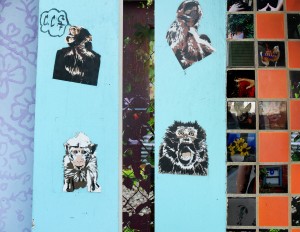
This is the first 2D/Photoshop based collage we are doing in my Visual Studies class, the objective of the project is to help us get a better understanding of Photoshop as well as to work to create images and art outside of our own pre-notions to result in a sense of harmony. To achieve that sense of harmony we studied Gestalt, to learn about what goes into a strong composition for instance in the collage above I have the Gestalt concepts of repetition, and containment.
Part 2
What is the strongest aspect of this work?
The coloring of the blue, purple, and orange. They work very well together especially since the shade or orange is very burnt and is a stark contrast to the blue.
What is the weakest aspect?
The center section that was the border to a store door, with layered vines and fencing. It seems out of place to the general urban aesthetic. There almost too much going on in the image it seems as if every part of the background images have been manipulated even though they haven’t.
How can the composition or form be improved?
The composition could be improved with less action in the image, it needs to be more simple. This could be achieved by removing the vine and fence image from the center. It could be even more simplified to by having only the right image with the smaller images in the tile.
How can the project be strengthened conceptually?
I think in order to my product stronger for this particular project I need to start thinking of it in the same way I try to use my photography as a tool for social justice. I need to start forming this collage and thinking about it as a way to comment on social issues so that maybe I might ended up with more depth and love for my work.
How can the project be strengthened technically?
Work with less.

