SoCo 2/3 ⎮ Visual Studies I
My first round of photos were centered around the extremely general theme of colors/typography, so for this second round I’ve narrowed my theme down to just one color – blue. The color of the ocean, the sky, and the US Postal Service, blue is known for its calming qualities. So where does this calming hue find its place on the hip and cool and always-moving South Congress Avenue?
Most of South Congress is green and grey, colors that play into other students’ themes of nature/urbanization. The color blue is much less obviously placed; blue is in the details – it’s on the underside of a roof (1), topping the trash cans (3), and coating Amy’s Ice Cream (2) one of, if not the only, completely blue buildings on South Congress. The three pictures I’ve posted below full size are unified as a group by their common hue. They each embody multiple aspects of Gestalt Theory, which I’ve analyzed in the captions for each.
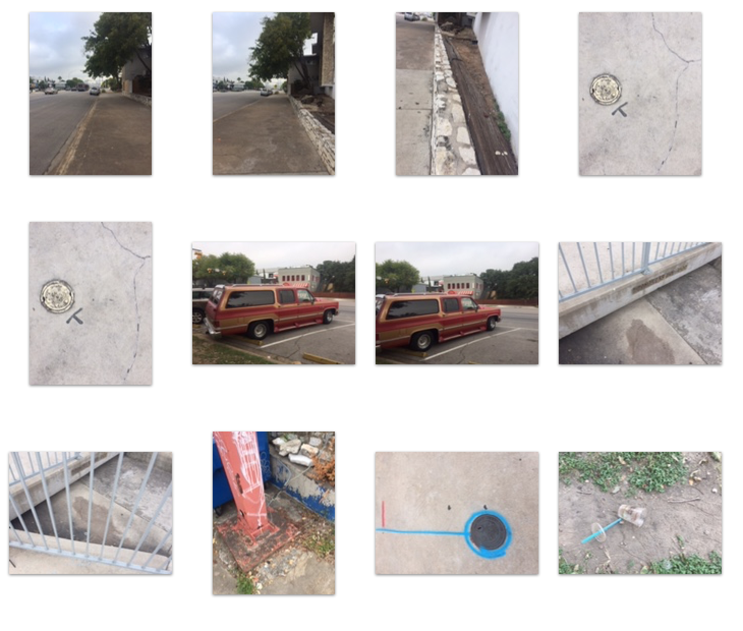
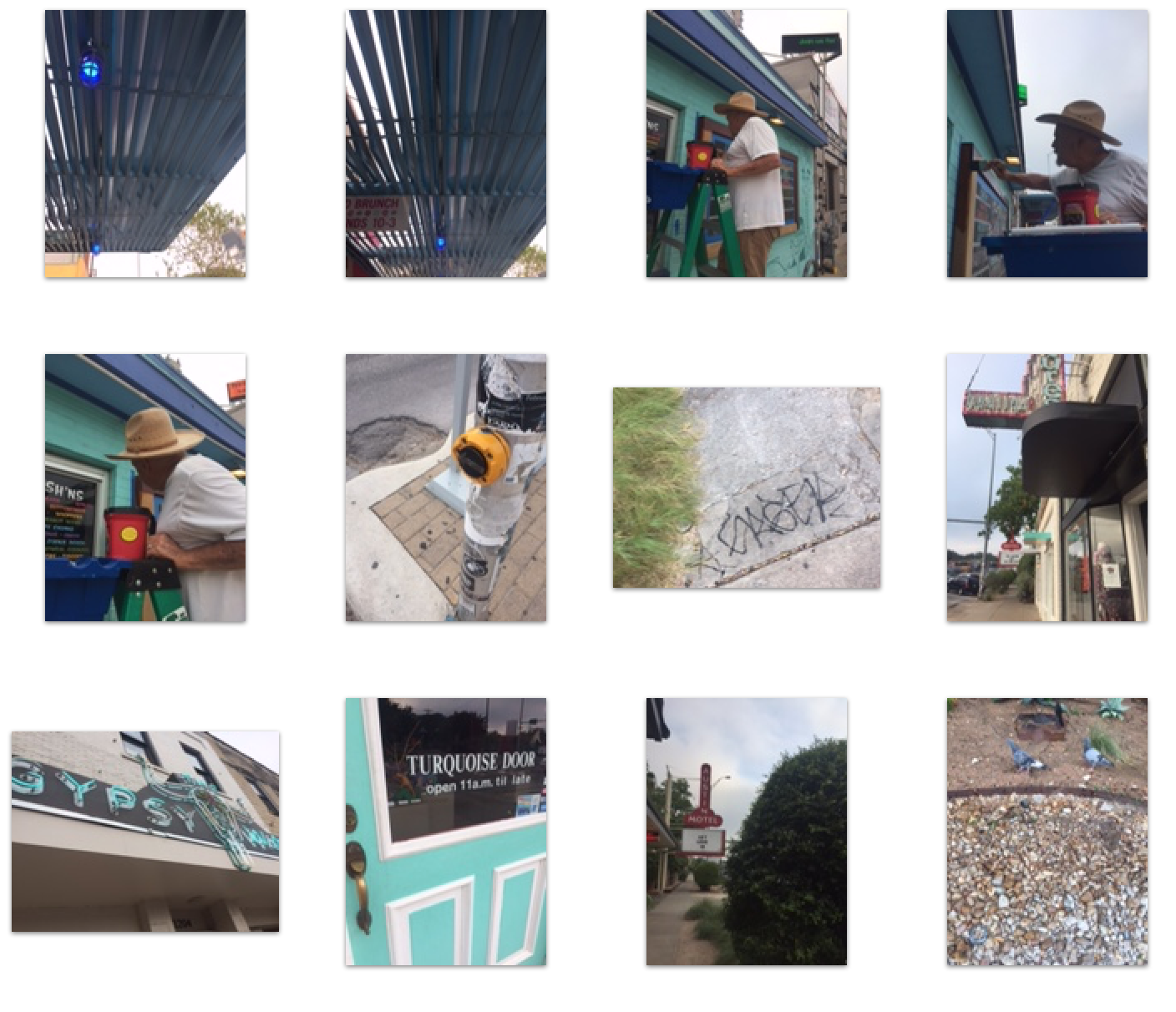
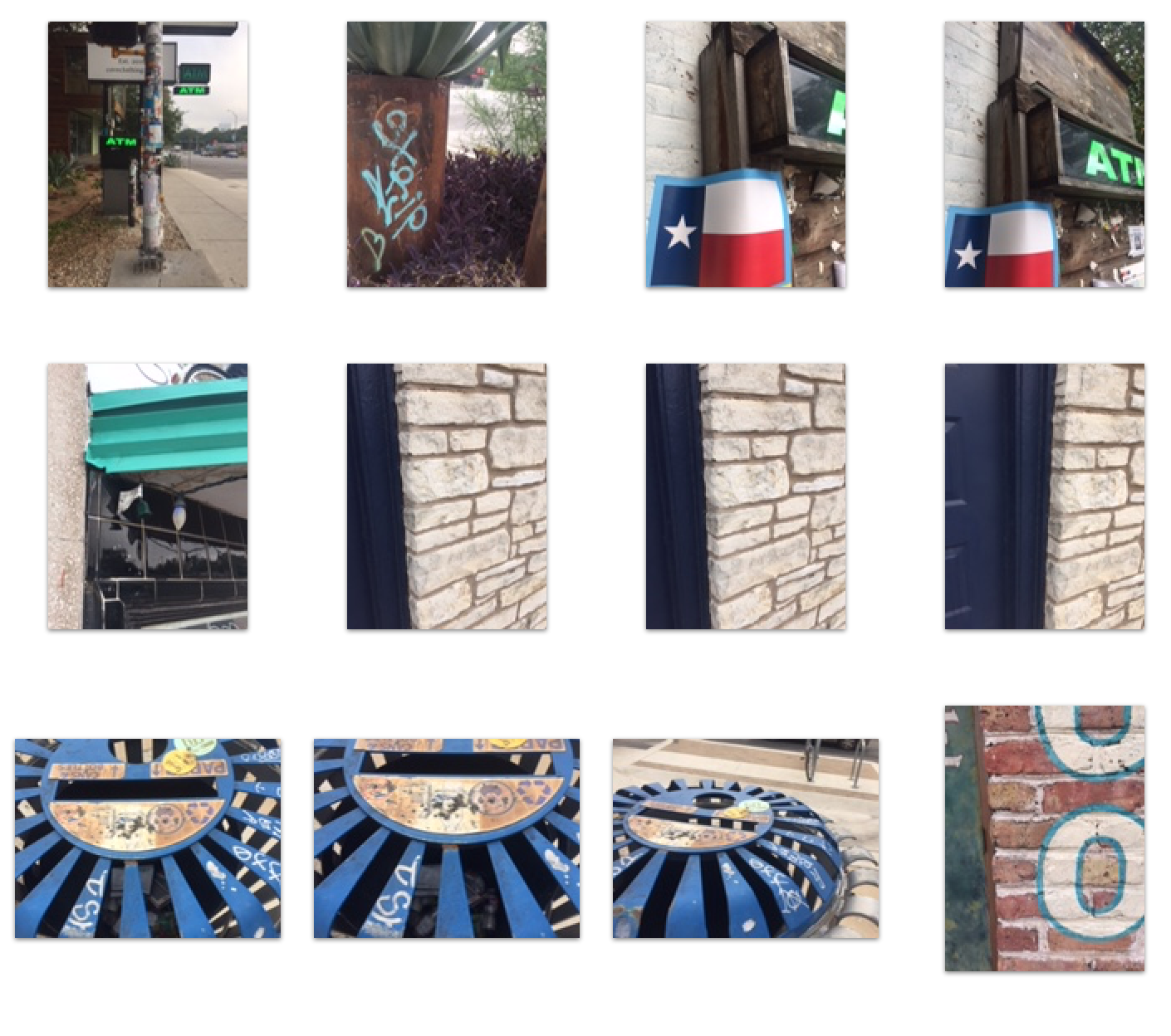
In an attempt to downplay the tourist-y vibe that many of my first round pictures captured, I’ve focused on details and parts of buildings/signs. I think by capturing aspects of larger things, that the “I’m taking a picture of this sign downplays the of taking pictures of whole “things,” which is what a tourist does.
Bill talked last Monday about how so few of us took pictures of people, so I took that as a challenge to get at least one shot with a real life human. In the second picture you’ll notice a man staining the wood around the menu sign. He was so nice when I explained that I went to St. Ed’s and I’m in this class and could I please take a picture of him. I had to wait for the traffic light to change to cross the street to get over to where he was and I was really wanting to back down and just go take some pictures of harmless stickers but I walked myself across the street and asked this nice, old man if I could take his picture. Ta-da. Real life human photographed: check.

The slats of the blue roof run off the page towards a vanishing point. This creates a sense of motion for the viewer via the law of common fate. The orange and yellow hues of the building in the bottom left corner connects with the orange spot on the sign in the bottom right corner to create high contrast with the blue roof because they are complementary colors. The two blue lights grab the viewers attention and emphasize the linear qualities of the roof. The law of similarity is employed by the repeating pattern of the roof slats. By placing the large block of blue color in the top of the composition, the image as a whole is not bottom heavy, and the variety of colors in the lower fifth of the image ground the photograph.

This picture is chalk full of different shades of blue. The law of similarity draws the eye to see the white handle of the bucket as similar and parallel to the painter’s arm – the eye sees two horizontal lines that ground the photograph. The line of common fate draws the eye back along the roof line. The large white negative space created by the cloudy sky gives the eyes a place to rest from the massive saturation overload on the left side. The bright green of the billboard contrasts strongly with the red of the “HANDy Paint Pail,” creating visual interest. The overall color scheme of this photo is red, green, blue – the three hues of the eye’s cones, so this image is particularly dynamic.

This image has a strong complementary color scheme. The law of similarity emphasizes the circular shape of the hole in the top and its circular base. The inside of the slats making up the sides of the trash can be seen through the slats of the trash can lid in blue, creating an interesting repeating pattern. The law of closure completes the circular hole at the top of the image.