what did you already know about type, before attending this class?
Before entering this class I had a base foundation from typography 1. I knew about the different styles of type (old style, slab, serif, sans serif, et.c). I would say that I didn’t pay much attention to the importance of typography however. I wasn’t paying attention to type crimes and niceties, however now I am conscious of those things and am aware that I need to pay close attention to them.
how does this class fit in and expand what you already knew?
This class expanded my knowledge of using multiple typefaces together and establishing hierarchy with them. It helped me to discern what goes well together and what doesn’t, although I still to believe I have a lot to learn. This class helped me expand my knowledge by thinking about type in a different dimension and using it to create a message when necessary.
what did you love about the semester?
I loved that this semester I was challenged. I think every semester presents a new challenge for me and I get to expand my knowledge and learn something new. I loved that I was able to use after effects because although I hated it while using it, it was a very cool program to dive into and now I feel I have a whole other opportunity with design. I also liked that this semester we were able to really organize ourselves and develop plans for how we would accomplish projects. It helped me to understand that deadlines are important and refinement is really necessary.
do you “see” it? what are the pieces of “it”? how do they fit together?
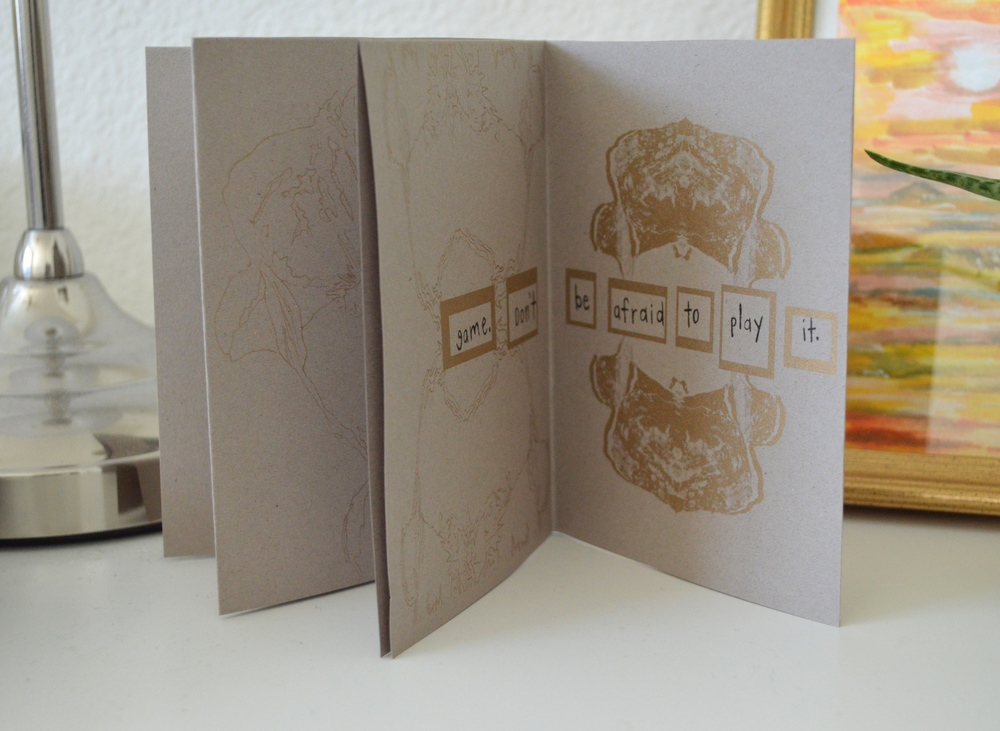
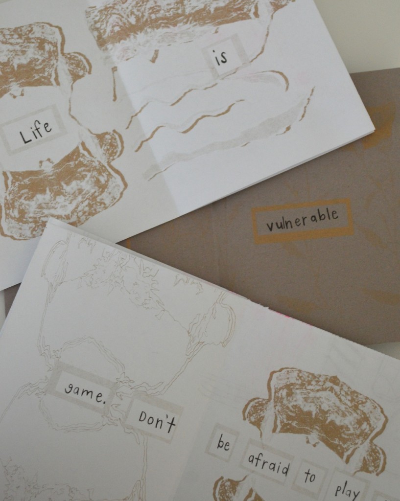
I see a lot of things. There are also a lot of pieces. In terms of design there’s a lot going on, and you have to keep your eyes wide open, and even then you won’t see it all. I’m assuming by pieces you mean everything. The pieces are the time, the work, the skills, the 10,000 hours and everything in between. In terms of this last project, there were a lot of pieces. The type, the hierarchy, the grids, the color, the images, those god awful ads, the people, the titles, the time, the places, the days, the speakers, the moderators, the panelists the sponsors. There was a lot going on. How do they fit together… they do… if you distinguish them … and find the right balance.
did you ask enough questions? did you get enough answers?
I think I asked enough questions, and I liked getting answers. I enjoyed that sometimes we had to answer our own questions as that happened a lot in the real world, and I’m glad also that when I needed help I was able to get the help that I needed.
are you putting in enough practice time?
At the beginning of the semester I felt that I could be putting in more time. However these past couple months I have definitely felt a difference in my work ethic and getting things done when they need to get done. I think having free time after class gave me a lot of time to keep working and as well going to the lab, and participating in extracurricular activities. I feel proud of the time and work that I have put in and I know with more time i’ll keep growing and learning things.
are you getting enough feedback?
I think I do get a lot of feedback, but I think I would be good to get more. I think it would be helpful to have people question our work and ask us why we made certain choices, that way we can be aware of our decisions and think critically to see whether or not we made the best choice. I enjoy getting feedback because it helps me think about my actions as a designer and the choices that I am making.
were you part of class crits?
Yes. Although I don’t think many of my classmates were so it was kinda hard to get good feedback from them. I think class critiques are really important because as jimmy would say it calls our work into crisis and helps us reevaluate. I do wish my classmates took them more seriously because I think it would have been very beneficial for us.
were you at desk crits?
Yes. I think i missed one because I was sick, but I was there for most and they really helped me to stay on track and think about where I was going.
is your life in order?
I would like to think so. I think it’s a little chaotic sometimes, but i enjoy every minute of it and the challenges that it brings. I don’t like when I’m not busy so I think I have a lot of things under control.
how could Tuan’s class be a more creative and fun place to be?
Tuan I like you class and the fact that we get to do work in you class. You always offer good insight and talk about things going on outside of the classroom. You give us suggestions and guide us but you don’t baby us and I like that you expect us to show up with the work and ready to go. I enjoyed having you as a teacher and you have taught me a lot about myself and the possibilities that lie ahead. I am looking forward to being on the board with Command G and seeing what sorts of events and things we can start.
how much have you grown? what is the distance between yourself at the beginning of the semester and now?
I feel that I have grown so much this semester. I feel more confident in myself and I feel I’ve developed a good work ethic. I learned things that I didn’t already know and as well continued to develop the things that I already knew. I am pushed to put in the hard work and I know at times it isn’t easy, but I love that I get to learn about something I am passionate about and enjoy doing.

 Historical Context: