Plotter Lesson
The plotter assignment was my second time using the vinyl cutter, but with a different purpose. I was introduced to a pen plotting method for this assignment and used techniques in Illustrator to create interesting line drawings that the plotter could reproduce. Additionally, this project emphasized the use of creating rules before the finished product to make them more spontaneous. My rules consisted of listening to Christmas music on the radio, and creating lines that could represent the rhythm of each song. I blended the lines to create the final shape that was to be plotted through the vinyl cutter. However, I took my assignment a step farther by plotting on fabric with metallic fabric paint pens rather than using paper and ballpoint or gel pens. I felt that using a different material would enhance the idea behind my plotters as holiday gifts, because I get very excited about the Christmas/winter holiday season and wanted my plotter designs to serve an additional purpose beyond decorative posters. The plot featured below represents Tchaikovsky’s Nutcracker Suite.
Zine Lesson
The zine project was created through a unique truism that has positively impacted my life, and potentially the lives of others. My truism is based on my family’s way of always having a positive outcome whenever there are challenges that we face, whether as individuals or as the family as a whole. Additionally, as a side-assignment to the zine, I created chromatic-type styled lettering of the words that made up the truism my zine featured. I created a hierarchy through the positioning and scale of the words to emphasize parts of the phrase that I considered more important visually for the truism. Like the specimen posters in Typography 1, these zines were printed on the Risograph and then hand cut and folded to turn into small booklets.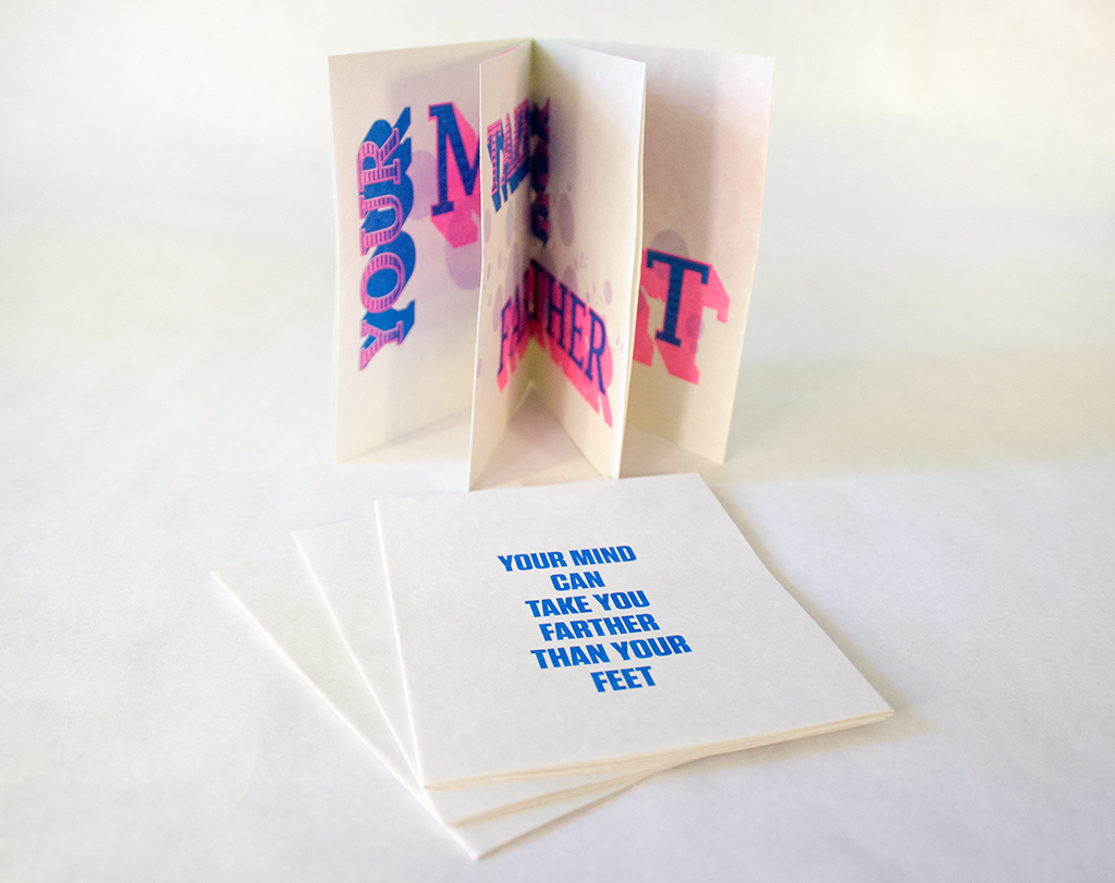
-

- Cover Pages
-

- Spread 1
-

- Spread 2
-

- Spread 3
Style Lesson
The style lesson was used to creatively interpret various aspects of “style”, such as what creates a style and why a certain style might be important. For this assignment, I was part of a group of three, and we were assigned the task of creating portraits that resembled three individual styles, one of which had to resemble the “preppy” style of the 1980s, one that was of our choosing, and the last would be a blend of the two. My group members and I decided to imitate a “bohemian” style alongside the “preppy” style. To do so, we focused on fabrics and patterns. The preppy fashion we studied was primarily made up of solid colors and similar fabrics, whereas bohemian fashion was heavily reliant upon patterns, earthy tones, and varying fabrics. We used those aspects of each style to put together outfits and photograph them, and I was the member who dressed in the “bohemian” style. A studio was chosen for the preppy style because it is often very refined and sterile, influenced more by status than things, my group felt, whereas bohemian fashion is more influenced by nature and physical objects.
Object Lesson
For the object lesson, I watched a film and then attempted to create a matchbook, or matchbox, design that could perhaps have been part of the props on set. The matchbook design is intended to be a reflection of the film and set design, as well as having potential to be an actual product of the time and setting of the film that I chose to study. For my particular matchbook, I watched the film Snowpiercer and observed the setting that most of the film revolves around: the sharp divide between the rear train cars and the front train cars. The digital design of my matchbook was simple, and I instead relied upon physical properties to give it interest and make it fit into the setting that I chose. I recreated the logo of the industry that built and funded the train, and printed it on silver paper that was representational of the elite class for which the train was originally furnished. I printed two copies to reflect a “before and after” of the product; a free novelty item to boarding passengers versus a utilitarian possession to those who need the warmth it provides.


Mapping Project: Cognitive Map
The last map was a decision map reflective of an important decision that I have made or will have to make. The focal point of my map is deciding where to live once I graduate college and begin to pursue a career. Currently, I live at home, but once I graduate, I’ll need to find my own place. This decision map served to visualize the major questions that I’ll have to consider before choosing a place, and gives two options for each. The information is structured as a combination of decision map structures, but particularly pulls influence from “pros-and-cons”, “preference trees”, and “elimination by aspects” structures. This map relied heavily on creating universal symbols to represent my choices, and I really enjoyed the process of translating text into images.
Mapping Project: Information Map
The second map I did turned a set of raw data (a yearly bank statement) into more easily visualized categories. To do this, I divided the information by category of spending (necessities versus leisure activities, bills versus food, et cetera) and displayed the monetary totals of this information as pie graphs. I was able to create symbols to represent these categories of expenses to avoid cluttering the poster with too much text, or text that would be too small to read from a longer distance. The map is organized as a two-page spread, able to display all of the expenses in one graph, or divided between necessity and leisure.
Mapping Project: Artifact Map
This first map was a personal geography map. Rather than making a map showing the viewer my route from home to school, I made the subject of the poster more useful for me. My commute to school would have been quite ineffective and boring to create and display, so I wanted something more engaging for myself and anybody viewing it. The final map shows twelve of the closest bookstores to St. Edward’s, within the boundaries of Highways 71, 290, and 183. Because I don’t spend much of my time in Austin (and even less time north of the river), I wanted to be able to figure out the best places to go to unwind, and for me, I love taking sporadic trips to bookstores. So I decided to make a map that could indicate which places would be the best to go to. 
Symbol Methodology
The symbol assignment was a way to practice iterating a final idea through the use of an umbrella concept and sub-categories. My inspirations for the symbol assignment were different natural environments. My umbrella concept, was “biomes”. Each of my nine initial iterations of symbols was an interpretation of a different biome, and two of the final symbols were then a unique combination of multiple biomes. The non-objective symbols were the most difficult for me to create because I often think very literally about my work and tend to see an end goal and work toward it rather than the other way around, so coming up with a method to draft form before assigning an idea to it seemed backward, and still does. Eventually, though, I was able to create forms that blended multiple biomes while still being unique.
ARTS1311 – Reading Responses
Reading | WTF is Design & Art anyway?
1. What is the purpose of a designer, do they always work for a stakeholder?
A designer’s purpose is to please consumers visually, to influence and induce the need for creative thinking while also making design (and, consequently, art) understandable for a wider audience. They need not always work for “stakeholders”, but this is the most common and comfortable setting of a designer because of a designer’s duty to please consumers (as stated above).
2. Is the artist always a self-expressive narcissist?
I wouldn’t be so quick to call them narcissistic, but they certainly have more freedom for self-expression in their products because artists have no obligation to any particular audience or consumer. While a designer primarily works for others, artists can create what pleases them individually, and it is more like good fortune that a “consumer” is interested in their work.
3. Can the designer/artist exist?
Well, I should like to think so. At the very least, there could be circumstances in which “true” art and “true” design may intermingle and are consumed as a blend of the two.
Personal Reflection
1. What is your personal view of the difference between the designer and the artist?
My difference of definition between these two is who their work is for; the consumer. As mentioned above, artists create work primarily for themselves whereas a designer always considers a client first.
2. Which are you, why?
I would say I’m a designer. I hardly create art of my own volition; I usually need an assignment or people who give me suggestions or options to work with.
ARTS1311 – Project 1 – Reflection
Overall, I felt that this project went well. The process was complex, but I think that helped when I reached the finished piece. I think that my piece strongly represents what I wanted it to, by juxtaposing shadows and light and reversing their definitions.
-

- Sketches/line inventories
-
- Sculpture
-
- Student review
-

- Final piece
Wikipedia Reader
The Wikireader was a more in-depth exploration of grid structure and text formatting, like the grid booklet was. In addition to paying attention to grids and text, the Wikireader also introduced image formatting to the booklet. Space had to be made in the margins or aligned with the text to let the images become a coherent part of the booklet, and not a distraction from the text. Therefore, the grid system I chose allowed for images to be featured in the margins beside the primary text column, or even intersect with the text without becoming a distraction. I was able to modify the text styles (using character and paragraph styles in InDesign) to differentiate headers from the body text, as well as the article information from notes and references.


Proportional Grid Booklet
The grid booklet was a method of exploring how to respect margins and line spacing for compositions that are very text-heavy. The grid that served as the basis for this booklet was based on the final trim size of the booklet. In this project, I was able to explore more styles of text formatting and deviating from “default” margins and typeface styles. Such examples of this in the booklet are the header styles and pull quotes to emphasize information from the text that could otherwise be overlooked. It was also important to me to use paragraph and character styles in InDesign to make the formatting so much quicker for such a long document; especially for the parts of the speech that were rapped rather than spoken.


Type Specimen Poster
The type specimen poster was a lesson on how type can be arranged in a style that creates interest to the viewer as something more than just another set of characters on the page. The posters I did emphasizes the use of intentional space on the page and of a limited color palette to create a product printed with a Risograph printer that holds more interest than a “normal” text-based poster. Additionally, the poster was meant to highlight the display font that I created. I chose layouts that highlighted single characters, examples of the text in a phrase/paragraph, as a word, and provided the entire specimen sheet for the font. The final posters that I printed with the Risograph machine utilized perspective/scale and opacity to create a visual hierarchy to emphasize the characters that made up the poster. Three of the posters were printed with flat-color Risograph ink, but the fourth was printed with gold-tinted ink on black paper.


Display Typeface
The display font that I created is dubbed “Storybook”. There were restrictions on how to approach the font as far as what types of shapes were offered to construct the font, similar to the monogram, but the rest was up to me. This font was my response to a prompt about rejecting reality in favor of careless childhoods and storytelling. The response was to make a font resembling the importance of reflecting on how simple childhood is when you have no other realities to pay attention to. “Storybook” is a display font that takes influence from traditional, simple serif fonts and adds a medieval ornament in place of a traditional serif to make it a bit more playful and reminiscent of fantasies and storytelling, like something you’d find in a storybook.
Monogram
The monogram project served as an introduction to understanding how fonts are constructed, and how to pay attention to the anatomy of type characters to create a cohesive set of initials. It was also a study of how to iterate creative results with limited approaches and rules of the parts that made up the characters. Lastly, this assignment was a study of cohesion, intent, and craft. Not only did I have to pay attention to the letters’ anatomy, such as cap height, x-height, and baseline, but the form of the letters and the variation of stroke/weight had to be cohesive and intentional. In my case, I attempted to imitate a calligraphic style with distinct variations of stroke.

VISU 1100: Blog Post #12
-Part 1-
Kim Garza- I really enjoyed Kim’s presentation because she, like the other graphic design presenters, have shown me that there is a vast range of careers for graphic designers, something that puts my mind at ease when I think about what it is that I really want to do with my degree. I liked how she showed us the process of her projects, specifically her collaboration process with the Eventurist app. I look forward to having her as a professor.
Tammie Rubin- My sister is currently interested in ceramics (although she prefers clay to plastic), but I thought it was very interesting to hear Tammie’s process of creating her work and the purpose behind each piece of hers. I like how her art comes from more abstract connotations of words such as “chimera” and “nature”, and how she thinks of her art as 3D collage more than simply a piece of functional pottery.
James Scheuren- I enjoyed looking at James’s photos. You could clearly see the thought behind the work, the meaning behind each piece. I liked his initial statement that photos were indexes of what had already been. I always find images more appealing when they are spontaneous instead of staged, so I liked how that was James’s focus when he took the photos of the things that had just happened because of human interaction with objects.
-Part 2-
Overall I enjoyed this class. You guys were all funny, but you also had serious, important points that I enjoyed listening to and I feel that they helped put my mind at ease and made me feel more secure that my major, graphic design, really is what I want to be doing. If I had to give any critical feedback, I think the only feedback I could give is for Bill to not get sick again?? Haha.
VISU 1311_Project #2 Reflection_Loren Gamez
Overall, I disliked the collage project because it’s simply something that I don’t think enough about. I don’t have the “abstract” mind that I feel is required for a successful collage. Thus, I went with what I knew, and that was a digital collage that had the feel of being its own image (something “magazine worthy” instead of “fine art worthy”, as was said during the critique).
I admired how abstract or well planned other collages looked, and it made me curious as to what their thought processes were for creating it. Instead of “thinking outside the box”, I confined myself to what I knew, and I think that was reflected in my collages. For me, I played it safe because I grew stubborn with physically cutting apart images that I was tired of anyway.
After hearing the critiques, I don’t think I really would have done anything differently. I don’t feel as though I would have been satisfied with any of the physical collages that I might have tried to do, so I still would have gone the digital route.
VISU 1100: Blog Post #11
-Part 1-
Tuan: I enjoyed Tuan’s presentation, because some of the things he has done are similar to what I have done; specifically the use of his designs for “gift” art for family and friends. Several times my family members or close friends have approached me and asked me to conceptualy design a poster or a t-shirt for them. Only a handful of these have actually been put to use, but at least they serve as practice.
Hollis: I liked Hollis’ use of artwork to depict memories. Since my maternal grandfather’s passing and my maternal grandmother was diagnosed with Alzheimer’s, I’ve become more and more fascinated with memory and our emotional relationships to them, especially the polar opposites that are joy and grief. Having personally experienced these, and watched my mother experience them for her parents, there’s always a part of me nagging to express my comment on these emotions through my artwork.
Bill: I liked how Bill described the “pathway” of his career, and how there were high points and low points. I think about this often, and wonder what my own career will look like in future years with high points and low points of my own.
-Part 2-
Year 1: Find a long-term internship position that hopefully turns into a paid full-time job.
Year 2: Continue the internship or full-time job.
Year 3: Have a full-time job as a graphic designer, hopefully for advertising or book-cover design.
Year 4: Promotion within job, or seek a new job with higher pay?
Year 5: Have a high paying career as a professional designer. Preferably for book-cover or advertising.
My long term goal, as far as having a degree from college is concerned, is to have a long-term job that I love and where I can do what I love. In order to do this, I will have to be able to be flexible with my skills and improve them in any way that I can in order to “polish my resume” and be noticed for my work and what I am capable of as a prospective designer.
VISU 1311: Creativity Blog Post #12
I found the video, The Way Things Go, to be very surprising in how well it was able to hold up for such a long time. Each action has a consequence on the next action, and yet they are all connected so well, and the precision and timing of each action that occurs is nearly flawless.
The chain reaction that is caused from the precise relationship of each object to the next is something that must have taken a very long time to perfect. Several variables must have gone into play, and they all had to connect in a way that could keep the chain going.
I especially liked how liquid chemicals and fire played such a large role in this. The one constant that seemed to recur throughout the reaction was that liquids could be counted on to go in a very specific direction and to carry a specific weight. As more liquid collided with the next object in the reaction, the pressure is what allowed the chain reaction to continue.
Gravity, though, probably had the largest role to play. Each action was connected through gravity, because each object’s weight could be counted on to have the same relationship to gravity over and over again, and this was critical to the entire chain reaction so that both cause and effect could take place.
VISU 1311: Creativity Blog Post #11
Listening to David Blaine was stressful to me. I can’t imagine putting myself in the situations that he has been in. I kept asking myself how he could continue to do things like he did when most of his attempts were nearly fatal.
However, on a less perilous note, I can understand where he is coming from. The overarching themes of his presentation were sustainability and practice. To get to the point of holding his breath for 17 minutes, Blaine had to teach his mind and body to sustain his life for an extended period of time. Not only that, but to do so, he had to practice keeping his heart rate steady in a stressful environment.
Sustainability can go for pretty much anything. In my drawing class we have discussed how to sustain a drawing and an idea, and the same can be applied to projects in Visual Studies as well. Practicing sustainability is of course the easiest way to get there, to keep trying to reach that point where you know something has succeeded, or is finished.