

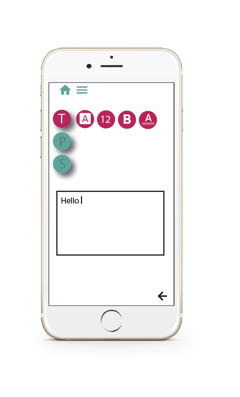

For this project we had to follow the rules of googles material design. I choose bright colors and a simple layout which was my interpretation of googles material design. I had a lot of fun designing this interface because I felt like it could be a real app. I wanted to focus mine on people that are always busy and on the go. I also incorpated a camera icon so if someone needed to insert a picture into their notes that option would be available. I also applied drop shadows on the buttons to indicate that they are moveable.