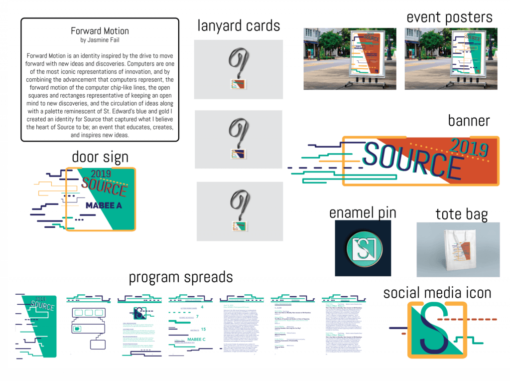
I think this project was the most challenging one I’ve done so far. I have never done a large, organization based project like this one before, and it forced me to tackle new challenges in ways I wouldn’t have thought of, like how to effectively order and organize data that sometimes repeated, all within a time and material constraint. These limitations also impacted how I designed the pamphlet, as I ran into a lot of difficulties trying to create an identity for the project that both interacted with the content but didn’t overpower it. In the end I think I found a good balance between content and design between the colors and graphics used. My favorite page of the program would have to be the table of contents because of how the graphic elements are interwoven between the text. Over all, I think my best work was in the event posters and banners, because I feel like I made effective use of the space and created a dynamic layout within my parameters.

