Object Lesson

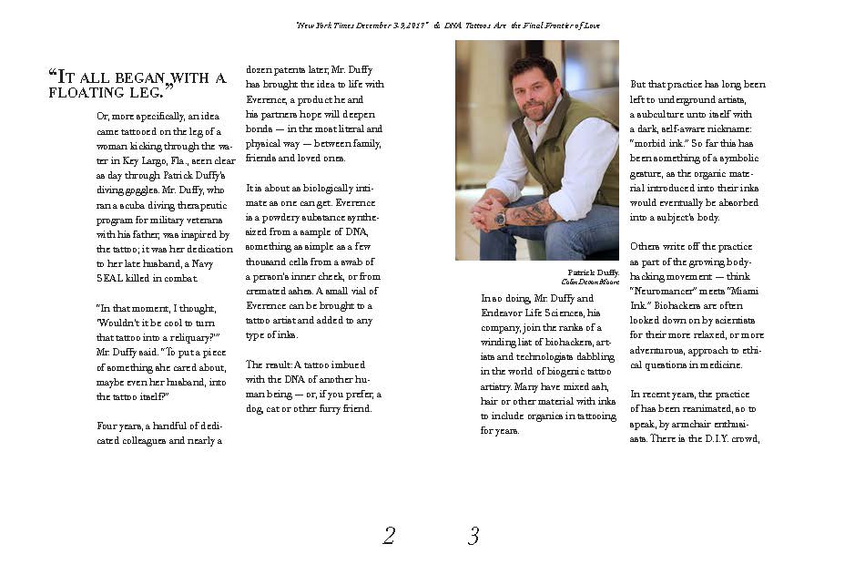
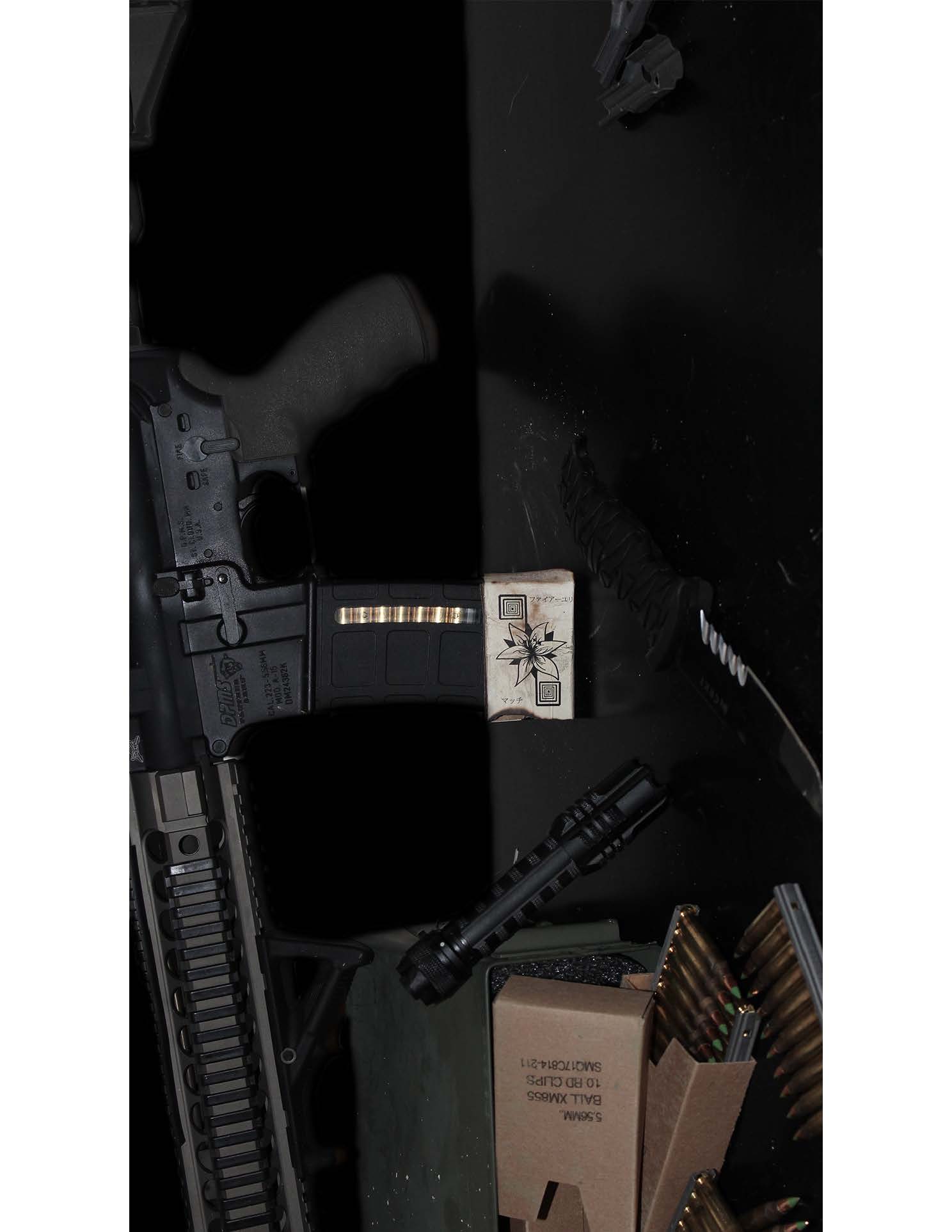
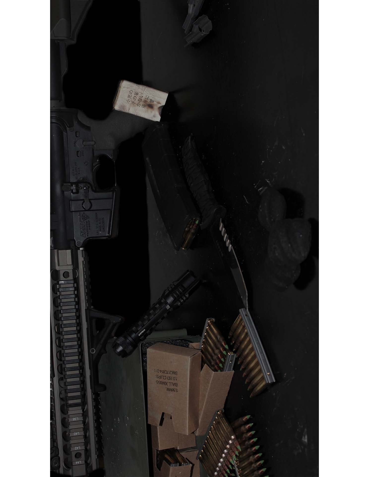
Having been designed around the idea of this being a prop for the movie Snowpiercer, it fit perfectly in with the post apocalyptic theme. Having been extremely worn down and used in extreme conditions it has seen its better days and is a Japanese matchbox since that is where the train in the movie was created and the character who held this prop was also Japanese.

Mapping Project: Information Map

Comparing what all was bought as organic and not showed how healthy Tony Pierce was and also the percentage of what the persons diet was based on their groceries was deduced and shown in a simple pie graph, on of the easiest graphs to be able to compare sizes. The first proportion graph shows what nutritionists believe to be a healthy well balanced diet and Tony Pierce’s diet is found below.

Mapping Project: Artifact Map

Customized to me personally as this is the neighborhood I live in and are some of the most common walk routes I take my dogs. This map gives me the chance to best choose my route for the day and can compare the different advantages and disadvantages to each route and adding the distance for each was also helpful. 

Symbol Methodology

These symbols are wrapped around the idea of wildlife and wanting to preserve and protect nature as well. The first symbol strongly stands for that idea, as the wolf is encased around a protective coating and is preserved like an egg while the leaf is much more simple and the last one is more abstract.

NY Times Pamphlet

Redesigning a NY times article into our very own pamphlet was a thrill, I wanted my designs to have a pattern and the same feeling on every page as you flip through the article in my own format. It helped to bring attention to everything that was important and gave the article more life by the way it was laid out.

Display Typeface

Inspired by the quote “I cannot understand you tis because you lean over my meanings edge and feel a dizziness of the things I have not said.” Which led me to create a not fully connected typeface that held edges with disconnected pieces of each letter and with these two main components it reflected the idea from the quote that there is an edge and a dizziness entangled within it.

Monogram

.

To create a monogram it requires your full initials and I had never made a monogram or had a want for one before so this was a new experience. I wanted to stick to creating a more symmetric and straight edged design since that was not usually what you see with monograms or even with the letter J.